
The name of a business sets the tone of an entity as well as defines the service expectations for potential buyers. Therefore, the success of a business weighs heavily on the company name. Additionally, a logo further defines a business, but it appeals to only one of our five basic humanistic senses–our sense of vision. A logo further defines a business and allows for easier visual recognition from buyers. So for today’s inspiration, we’ve rounded up a few well done logo designs that we hope will inspire your logo designs.
George Bokhua
George has designed a memorable icon using the gold ration technique resulting in a very dynamic and well proportioned logo.
Dinard da Mata
This is my favorite logo icon by far. Look how dynamic and aggressive the bear looks. The very sharp details and the way the eye is designed gives the aggressive feeling of the white bear.
Omar Msary
Not to many words to say about it–just a very smart design of the word “shade”.
Dimitrije Mikovic
We all know how important the logo is for a business, and this logo makes me want to choose this restaurant for a place to eat. It uses a flat clean design with a great handwritten italic font.
Tomas Salazar
I love the way this artist used a nice custom font in this logo to balance the curly details in the illustration.
Khawar Bilal
Khawar used the overlay technique in creating the icon for the logo. I also like the custom “A” from ‘LAND’–very memorable and unique.
Workflock and Chris Bernay
This logo has a strong bold font, specific for this kind of event where loud music blares. Also, the sharp details in the background express this kind of atmosphere as well. Great designed logo!
Stevan Rodic
We all know that Rome is well known for the Colosseum, so I really like how the Colosseum was implemented in that cup of coffee–great designed!
Vasil Enev
Very funny logo! Vasil did a great job working the icon into the font to create a very well balanced logo.
Andrei-Sergiu Urse
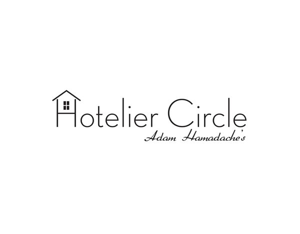
This is a very simple logo, I really like the “hotel” icon implemented into the “H”. I also like very much the font combination, very sleek!




These are great! Very clean, simple, and professional.
Thanks for sharing these logo designs with us. I agree that the logo of Dinard da Mata which is an aggressive bear does look quite different and makes it fell like real bear with the sharp details and a perfect eye.