
 I absolutely love Illustrator’s ability to create seamless and amazing patterns. They are easily one of Illustrator’s most devious features. I have had a couple instances when clients observed some of my work containing patterns and exclaimed, “That must have taken forever!” Since I know how simple and quick it actually was it is only right to do the humble thing and explain, “Yes, yes it did.” In this tutorial we are going to take one of Illustrator’s stock patterns (Dots) and create a realistic Speaker Grill/Guitar amp Illustration. Let’s create some vector nectar!
Tutorial Details
- Program: Adobe Illustrator CS +. Some differences in applications mentioned. (Illustrator CS6 used specifically in tutorial)
- Difficulty: Intermediate.
- Topics Covered: Shape Tools, Custom Swatches, Pattern Fills, Gradients, Pattern Coloration, Vignettes, Gradients along strokes.
- Estimated Completion Time: 20-30 minutes.
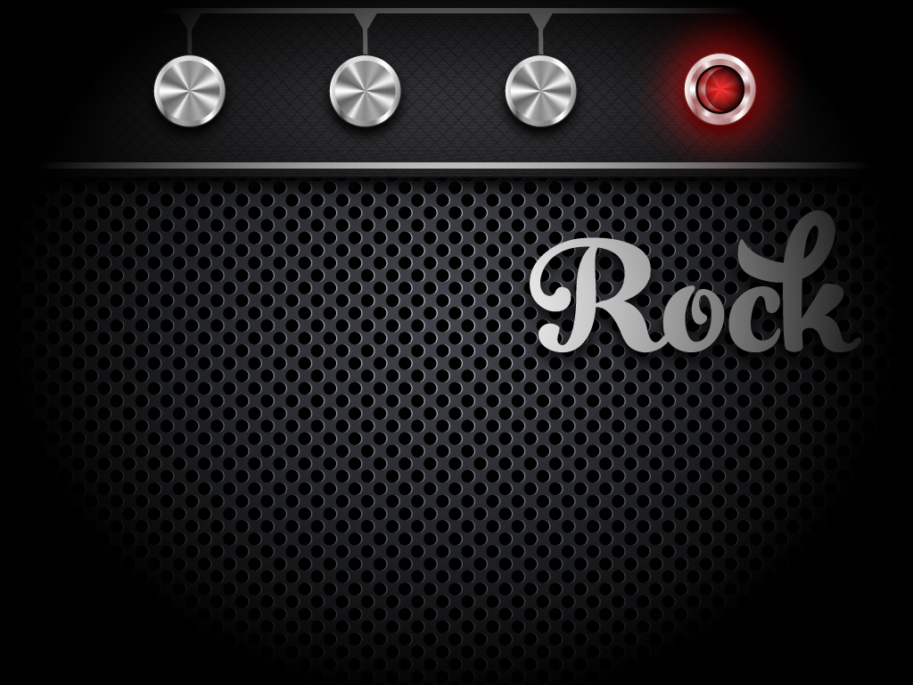
Final Image
Below is a final image of what we can create using the techniques given in this tutorial. These graphical assets are especially great for background images and GUI implementation.

Step 1 – New Document
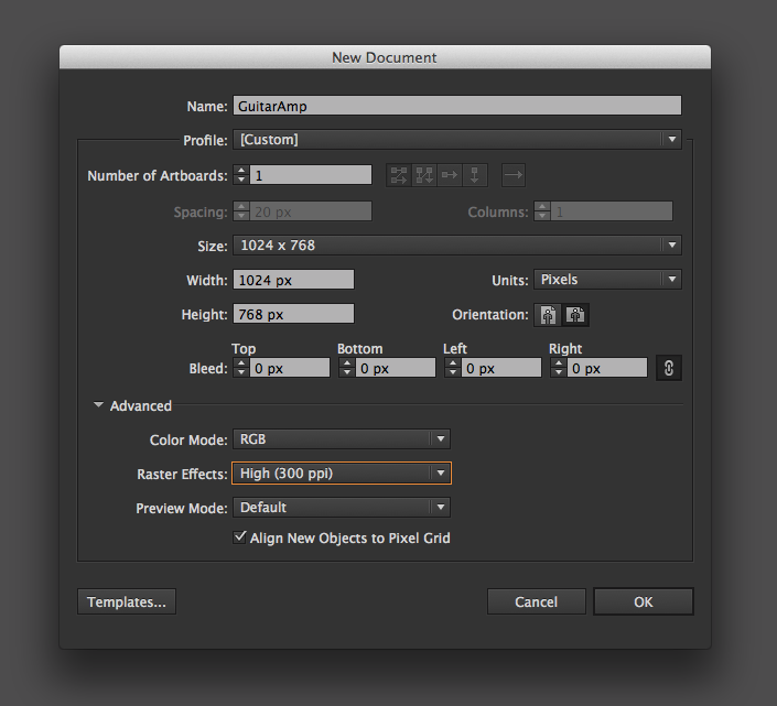
Let’s begin by creating a new Illustrator document. You can create any size document you fancy, but if you would like to follow along with my exact numeric variables given in this tutorial, then set your Artboard to be 1024 x 768 pixels. Since we are going to be implementing raster effects into our Illustration we want to be aware of our Raster Effect Settings. If your computer can quickly render high quality raster effects go ahead and set your raster effects now so we can see an accurate representation as we go. Otherwise, before you finish the project make sure to go to Effect>Document Raster Effect Settings and set your final resolution to best complement your final output. Remember, the higher the resolution the larger the file size.
Step 2 – Background
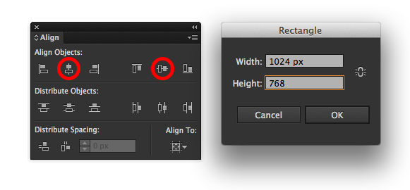
Now that we have a fresh document all ready to go, we need to create a solid rectangle to fill our entire Artboard. Hit shortcut “M” to bring up the Rectangle Tool. Unlike Photoshop and After Effects, Illustrator lacks the well needed feature to instantly fill the background with a solid color (Hint Adobe). The next best way to do this is double-click the Artboard with our Rectangle Tool. This will bring up our Rectangle Options. By manually inputting the same dimensions of our Artboard and hitting okay, we can create a background layer to perfectly fill the Artboard. With the Align Panel open click these two icons to horizontally and vertically align our background.
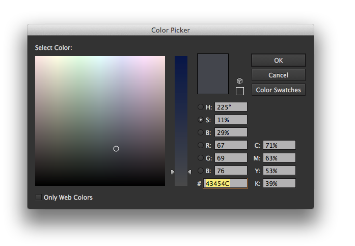
We need to fill our background layer with a nice medium-grey color. The default grey swatches in the Basic RGB profile are a little warm for my liking. I filled my background with a cool-grey color. By double-clicking the Fill Icon in the Tools Panel we can bring up the Color Picker to create our own color. Here are the values and Hexadecimal (43454c) for the grey I used. You can click and drag the Fill Icon to the Swatches Panel to create the new swatch for later use.
Step 3 – Pattern Layer
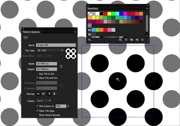
Now that we have a nice background, go ahead and select the shape and make a copy with shortcut Cmd(Ctrl)-C. Create a new layer on top of our Background layer and name it “Grill“. Hit Cmd(Ctrl)-Shift-V to paste in place the same shape on our new layer. This will become our Pattern Layer. Let’s apply a dot pattern by accessing the Swatch Library in the Swatches Panel. To find our desired pattern, click on Patterns>Basic Graphics>Dots. We will be using the 10 dpi 50% swatch.
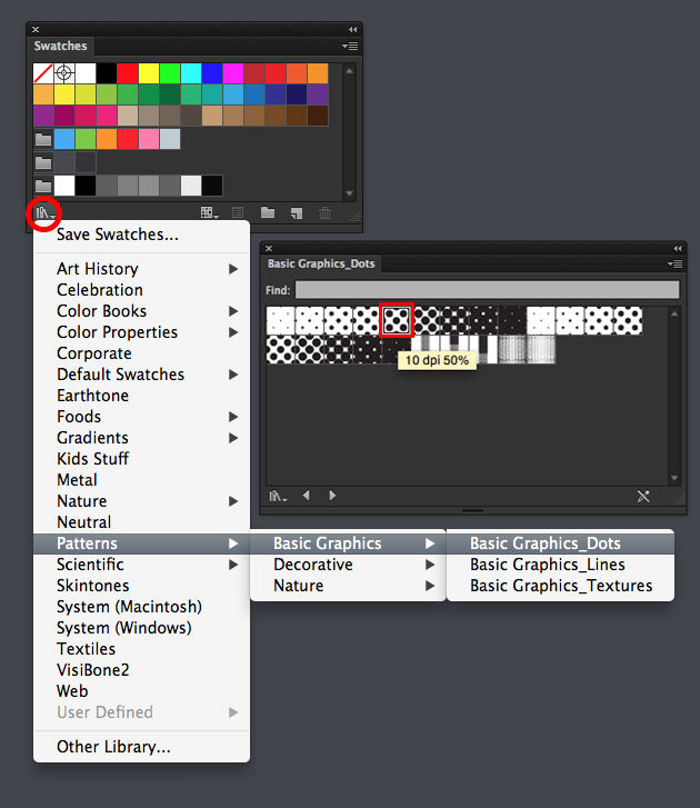
Step 4 – Recolor Pattern
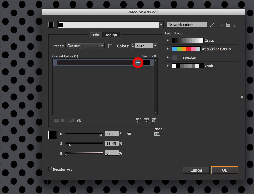
In this step we need to recolor our dot pattern to be a rich black (R-0, G-0, B-0) (C-50,M-50,Y-50,K-100). By default the dot pattern is a dark grey. The easiest way to accomplish this is by using the Recolor Artwork panel. With the Dot Pattern Layer selected, go up to the Control Panel and select the little color wheel icon to access this feature. In the Recolor Artwork panel, we should see the grey color we wish to change under our current colors. (Important) In order for color changes to take place within our pattern, we must make sure we click on the tiny slash within the panel and change it to an arrow. (See Picture Below) This is easily one of the most obscure and ridiculous buttons in all of Illustrator’s user interface. ( Did you know it existed?) With the arrow enabled, we can now recolor our Dot Pattern by manipulating the color sliders or simply inputting 0,0,0, in the HSB text fields.
(For CS6+ Users Only)
Alternative Coloring Method
By applying the Dot Pattern fill to our Grill Layer Shape, Illustrator will automatically place that swatch in our current Swatch Panel. By double-clicking our pattern swatch within the Swatch Panel, Illustrator will automatically isolate our applied pattern and bring up the swatch’s Pattern Options (Huzzah!). By hitting “Y” to bring up the Magic Wand tool, we can click on a single dot within our pattern’s replication box to select all “Parent” dots at once. Now all we need to do is select our color of choice, which in this case will be a rich black. Hit “Esc” to see our newly applied color.
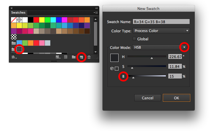
Step 5 – Create Highlight Swatch
This wouldn’t be a realistic looking speaker grill if we didn’t have a sexy highlight on each dot of our pattern. Firstly, we need to create the color we want to apply as the highlight. Essentially, the highlight color is just going to be a “lighter” variation of our background layer color 43454C . Create a new swatch based off of this color by clicking on it in the Swatches Panel and selecting the New Swatch icon. This will automatically open up the New Swatch Options. The easiest way to create a new highlight or low-light based off an original color is by making sure your color mode is set to HSB and making good use of the Black Slider. By decreasing the black, we can create a natural highlight color. Click okay and our new swatch will be ready to use in the Swatches Panel. While we are at it, create one more new swatch with increased black to be used later in the tutorial for a low-light.
Once again, let’s isolate our dot pattern by double clicking it in the Swatches Panel. Hit shortcut “Y” to bring up the Wand Selector and select the dots in the same manner as when we originally changed the pattern color. With the dots selected, we are going to copy them by hitting Cmd(Ctrl)-C. Paste a new set of dots in place by hitting Cmd(Ctrl)>Shift>V. We can apply our new highlight swatch by clicking on it in the swatch panel. With the new dots still selected, we can now send them behind the black dots with Cmd(Ctrl)-Shift-[. Offset the highlight by nudging with the arrow keys or selecting and shift dragging the highlights. Since this step is a little confusing, please reference the dandy animated GIF below.
(For Older Illustrator Versions)
Luckily, there is also a way for you to the Isolate the pattern as well! Simply drag the Dot Pattern Swatch outside of the Swatch Panel and drop it onto your Artboard. With everything selected (Dots and Square), hit Cmd(Ctrl)-C to make a copy and paste in place the same grouping by hitting Cmd(Ctrl)>Shift>V. With our new dots created, we can use the same instructions above to create a highlight . Regroup (Cmd-G) all dots and drag the entire thing back into the Swatch Panel. Apply the new pattern swatch to the Grill Layer Shape.
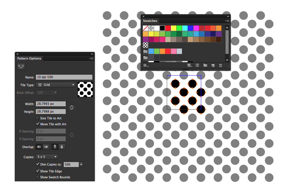
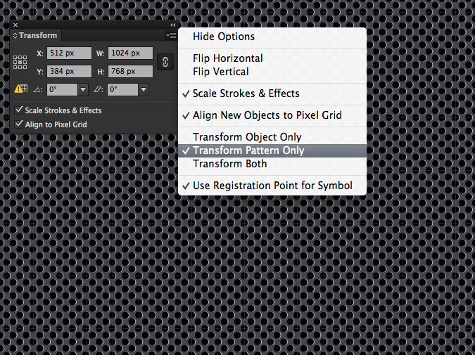
Step 6 – Transforming the Pattern
We now have a finished speaker grill. The only problem that still remains is the scale of the dots. This step is mostly a personal preference of how large or small you wish the pattern is within your Illustration. The pattern is still a little small for my preference, so in order to transform and scale the pattern without affecting the shape its contained in we need to bring up the Transform Panel by going to Window>Transform. It’s necessary to select the Transform Options in the top right corner and insuring “Transform Pattern Only” is selected. Next, click on the Chain Link Icon to constrain proportions. You can input the dimensions to personal preference but for me a value of 2000 within the width field is a good size.
Step 7 – Create a Vignette with a Radial Gradient
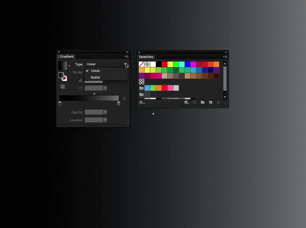
Its really simple to create a nice Vignette effect in Illustrator by using a transparent radial gradient. Click on the Target Icon (that little circle to the right of the layer) in our Background Layer to select everything on that layer. Hit Cmd(Ctrl)-C to copy it. Now hit the New Layer Icon in the Layers Panel to create a fresh new top layer. Paste the rectangle shape into place on this new top layer by using shortcut Cmd(Ctrl)-Shift-V. By doing so, we should only be seeing a solid grey rectangle covering our entire Illustration. This shape will become our Vignette. Now go to Window>Gradient to bring up the Gradient Panel. With our shape still selected, select the Gradient Icon within the Gradient Panel to change our rectangle into a Gradient. From the Gradient Type drop-down menu, select Radial to convert our gradient. Click and drag the rich black swatch from the Swatches Panel directly onto the Gradient Slider for Both sliders. Select the Left Gradient Slider and drop its Opacity level to 0%.
Step 8 – Applying our customized pattern to Guitar Amp
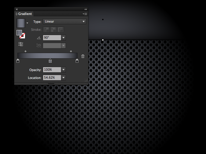
On a new layer under the Vignette, create a new rectangle shape spanning the width of the document. This shape will serve as the back of the control panel for our amplifier. Enable a Linear Gradient unto this layer and put the angle at 90 degrees. In the left and right color slider, we will fill the color with the darker color swatch we made in step 5. Hold “Alt” and click and drag one of these sliders into the middle of the Gradient Annotation and release to create a new center color. Fill that middle slider with a original background color 43454C. I dragged both of my color stops towards the ends of my annotation to insure I have a tighter gradient. For extra depth, you can place a drop shadow on this layer by going up to Effect>Stylize>Drop Shadow.
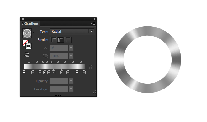
Step 9 – Conical Gradients using gradients along stroke
CS6+ Only (sorry peeps)
Prior to Illustrator CS6, conical gradients could only be achieved using a couple different unconventional and time consuming methods. CS6 has given us the ability to apply gradients to strokes enabling us to create fast and easy conical gradients. Let’s begin creating our Amplifier Knob by making a quick ellipse using the Ellipse Tool “L”. By holding down “Shift” while dragging out the ellipse, we can create a perfect circle. Even though the final product looks like it has a fill, the conical gradient is only composed of a stroke, so we can set our fill to none using shortcut “/”. With the shapes stroke selected, apply a gradient using the same methods shown in previous steps. Metallic graphic styles are created by using a combination of many light and dark color swatches placed in a random order. You can create your own very simply by using a similar method of grey and white combinations similar to the example below. Make sure you have Gradient Along Stroke selected in the Stroke Options of the Gradient Panel, it is the only stroke option that will produce a conical gradient. At this point, all you need to do is increase the stroke size until the ellipse becomes filled entirely with the gradient. This will inadvertently increase the size of your knob. Simply scale it back down using shortcut “S.”
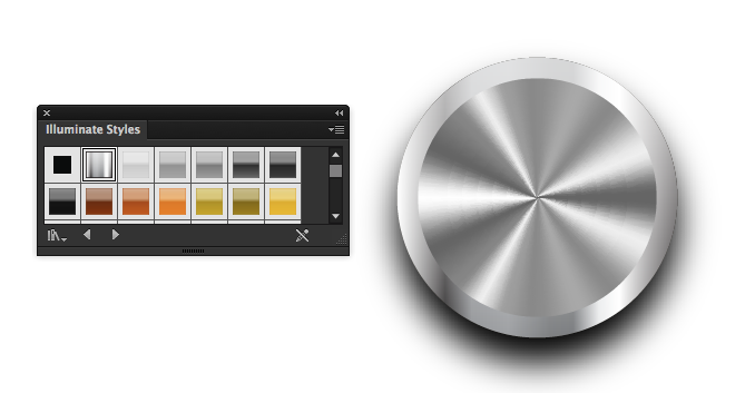
To give our knob a more realistic look, we will create a metallic outer edge to our knob. Simply create a larger ellipse behind our original and fill it with a nice Illuminate Graphic Style. Access this particular Graphic Style by going to Window>Graphic Styles. Within the Graphic Styles Panel, select the Graphic Styles Libraries Icon in the bottom left and from the fly-out menu select Illuminate Styles. I used the “Silver Ribbon” Graphic Style. I also applied a drop shadow on the knob to give it a little more depth.
From here on out, you can add your own personal touches and details to complete a unique guitar amp of your own using the same methods shown in this tutorial. I added a white stroke and additional patterns to my panel, as well as a nifty “On” light using the same techniques as the conical gradients embellished with a little red outer glow. Don’t forget a nice little branding using some white type and a little drop shadow to raise it up from the grill. Way to go vector cadet!
Tutorial by Dan Grady
www.DanGrady.net
YouTube Channel


nice tutorials..I will try then..btw I am not really expert on Ai..:P
In step 8 i see the lines in your pattern but in step 9 the lines are gone. How do you get rid of the lines in the pattern?
Awesome stuff.
w0w, an awesome, fantastic tutorial as I was looking for. Thanks a lot for sharing. Loved and learned from it a lot. Thanks again
Great tutorial. Nice use of a standard illustrator pattern and the end result looks fantastic!
I’ve tried this in CS5 and when you create the shadow pattern that’s all fine. But if you nudge it to the side, the surrounding box is moved but the pattern stays static inside.
Hi Neil, I amended some of the instructions above to try and make that step easier for CS5 users. Drag the swatch out and keep it grouped. With it still selected make a copy and paste in place your new dots for the highlight. Recolor them to a nice highlight color and nudge them over. Send them behind the black dots and group everything. Lastly, drag your grouping back into the swatch panel. Hopfully that helps, let me know.