
 In the following steps, you will learn how to create a simple stopwatch illustration in Adobe Illustrator. For starters, you will learn how to prepare your document and how to set up a simple grid. Next using basic tools and effects along with the Appearance panel and the Pathfinder panel, you will learn how to create the main shapes of the stopwatch. Taking full advantage of the Appearance panel and using several Transform and Warp effects, you will learn how to make the smaller stopwatch components and how to add subtle shading and highlights. Finally, you will learn how to easily recolor your stopwatch.
Tutorial Details
- Program: Adobe Illustrator CS5 – CC
- Difficulty: Beginner-Intermediate
- Topics Covered: Basic Tools and Effects, Transform techniques and the Appearance panel, Basic Blending and Vector Shape Building Techniques
- Estimated Completion Time: 45 minutes
Final Image
As always, this is the final image that we’ll be creating:

Step 1
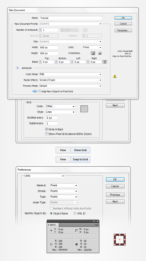
Hit Command + N to create a new document. Enter 600 in the width and height boxes then click on the Advanced button. Select RGB, Screen (72ppi) and make sure that the Align New Objects to Pixel Grid box is unchecked before your click OK. Enable the Grid (View > Show Grid) and the Snap to Grid (View > Snap to Grid). You’ll need a grid every 5px, so simply go to Edit > Preferences > Guides > Grid, enter 5 in the Gridline every box and 1 in the Subdivisions box. You should also open the Info panel (Window > Info) for a live preview with the size and position of your shapes. Do not forget to set the unit of measurement to pixels from Edit > Preferences > Unit > General. All these options will significantly increase your work speed.
Step 2
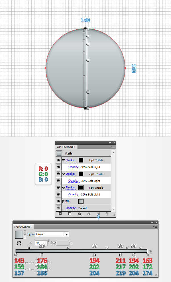
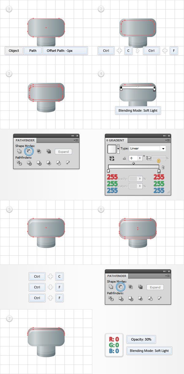
Using the Ellipse Tool (L), create a 140px circle and fill it with the linear gradient shown in the following image. Make sure that this new shape stays selected and focus on the Appearance panel (Window > Appearance). Add a 4pt stroke and select it. Set the color at black, align it to inside, lower its Opacity to 30% and change the Blending Mode to Soft Light. Keep focusing on the Appearance panel, make sure that the stroke is still selected and simply click the Duplicate Selected Item button (pointed by the little, blue arrow in the following image). This should add a copy of the selected stroke. Select this new stroke, and simply decrease the weight from 4pt to 2pt. Select this 2pt stroke, and duplicate it using that same Duplicate Selected Item button. Select this third stroke, and simply set the weight at 1pt. The white numbers from the Gradient image stand for Location percentage.
Step 3
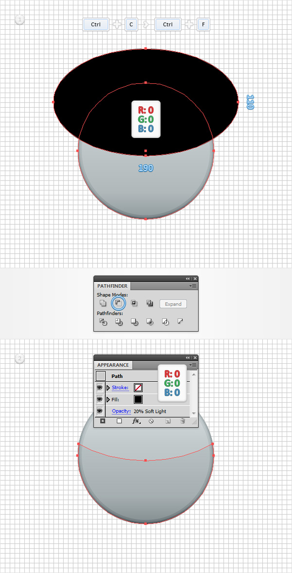
Make sure that your 140px circle is still selected and make a copy in front (CTRL + C > CTRL + F). Using the Ellipse Tool (L), create a 190 x 110px shape, fill it with black and place it as shown in the first image. Select this new shape along with the copy made in the beginning of the step, open the Pathfinder panel (Window > Pathfinder) and click the Minus Front button. Select the resulting shape, and focus on the Appearance panel. First, select the three stroke and simply remove them. Next, select the fill. Replace the existing linear gradient with a simple black, lower its Opacity to 20% and change the Blending Mode to Soft Light.
Step 4
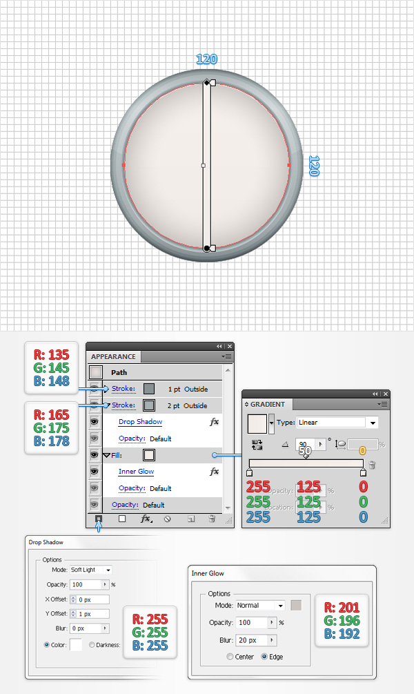
Using the Ellipse Tool (L), create a 120px circle, fill it with the linear gradient shown below and place it as shown in the following image. Make sure that this new shape stays selected and focus on the Appearance panel. First, select the fill and go to Effect > Stylize > Inner Glow. Enter the properties shown in the following image and click OK. Return to the Appearance panel and add a 2pt stroke. Select it, set the color at R=165 G=175 B=178, align it to outside and go to Effect > Stylize > Drop Shadow. Enter the properties shown in the following image and click OK. Get back to the Appearance panel and add a second stroke using the Add New Stroke button (pointed by the little, blue arrow in the following image). Select this new stroke, make it 1pt wide, set the color at R=135 G=145 B=148 and make sure that it’s aligned to outside.
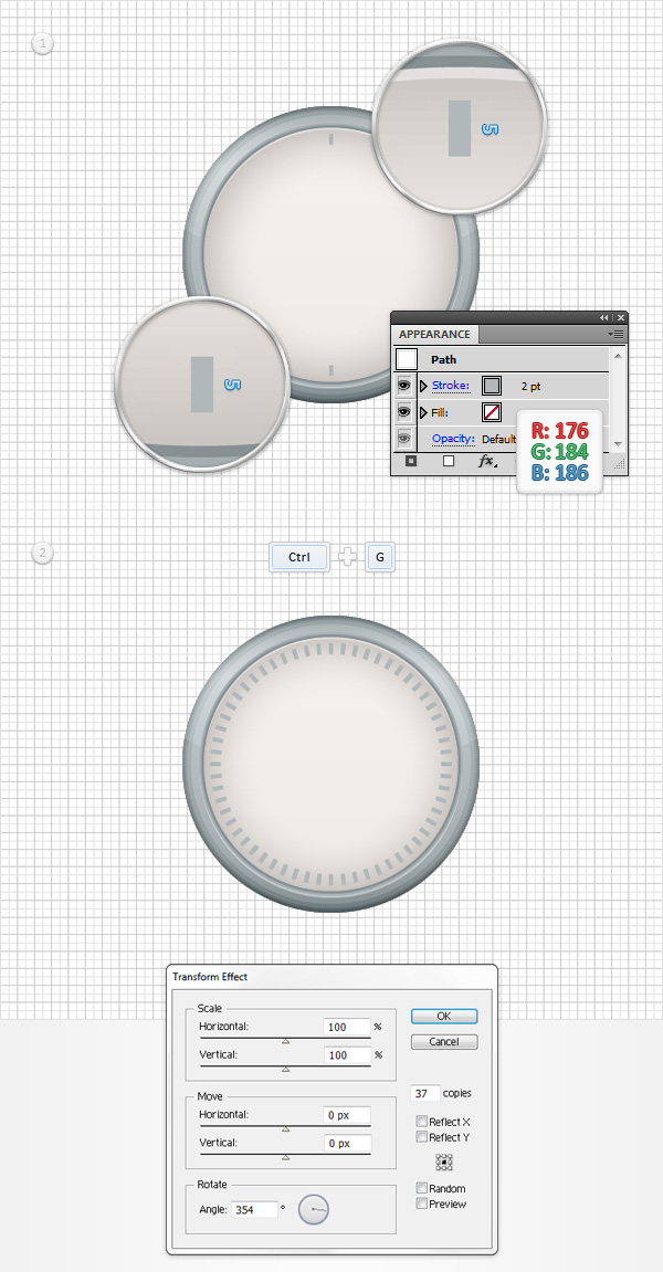
Step 5
For this step you will need a grid every 1px, so go to Edit > Preferences > Guides & Grid and enter 1 in the Gridline every box. Using the Pen Tool (P), create a 5px, vertical path, add a 2pt stroke and set its color at R=176 G=184 B=186. Duplicate this new shape (CTRL + C > CTRL + F). Place these tiny, new paths as shown in the first image then Group them (CTRL + G). Make sure that this new group is selected and go to Effect > Distort & Transform > Transform. Enter the properties shown in the following image and click OK.
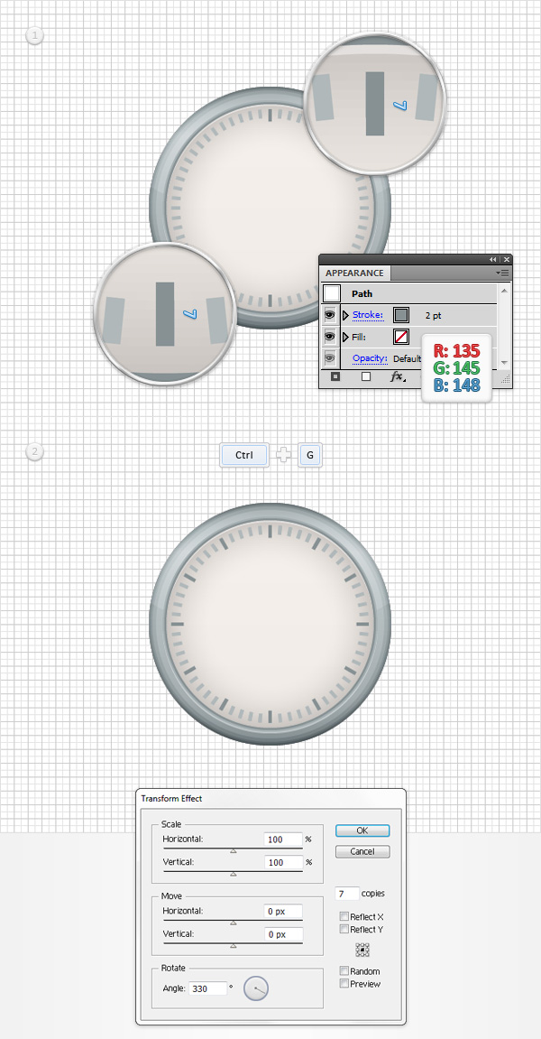
Step 6
Using the Pen Tool (P), create a 7px, vertical path, add a 2pt stroke and set its color at R=135 G=145 B=148. Duplicate this new shape (CTRL + C > CTRL + F). Place these tiny, new paths as shown in the first image then Group them (CTRL + G). Make sure that this new group is selected and go to Effect > Distort & Transform > Transform. Enter the properties shown in the following image and click OK.
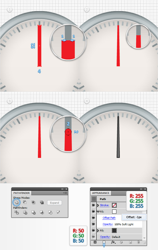
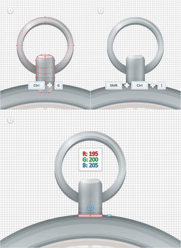
Step 7
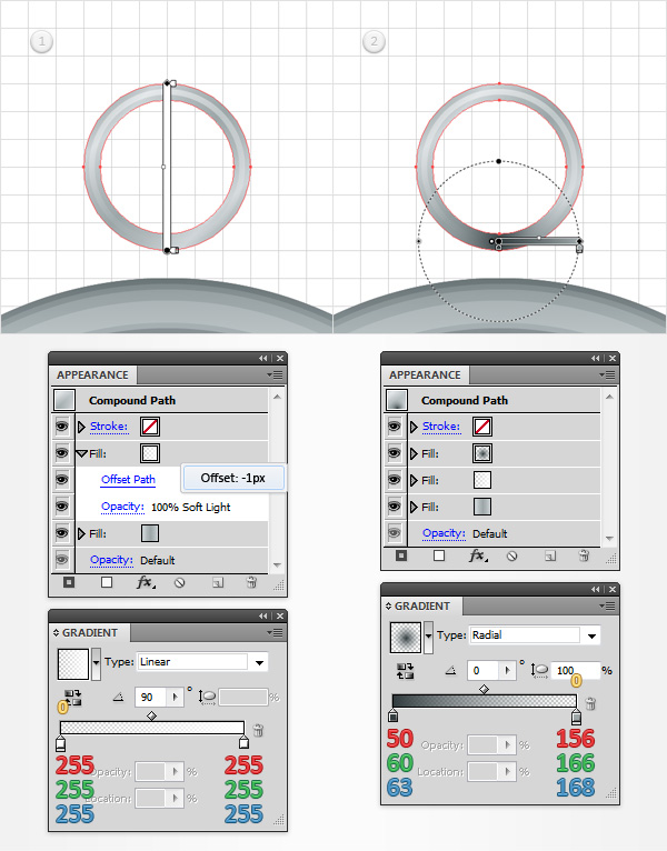
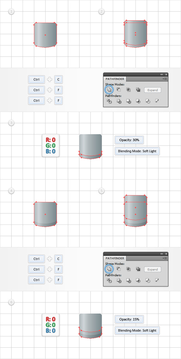
Using the Rectangle Tool (M), create a 4 x 52px shape, fill it with red and place it as shown in the first image. Focus on the top side of this new rectangle and pick the Direct Selection Tool (A). Select the left anchor point and drag it 1px to the right then select the right anchor point and drag it 1px to the left. Switch to the Ellipse Tool (L), create a 2px circle, fill it with the same red and place it as shown in the third image. Select both shapes made in this step and click the Unite button from the Pathfinder panel. Select the resulting shape and replace the red with R=50 G=50 B=50. Make sure that this dark shape stays selected, focus on the Appearance panel and add a second fill using the Add New Fill button (pointed by the little, blue arrow in the following image). Select this new fill, set the color at white, change the Blending Mode to Soft Light and go to Effect > Path > Offset Path. Enter a -1px Offset and click OK.
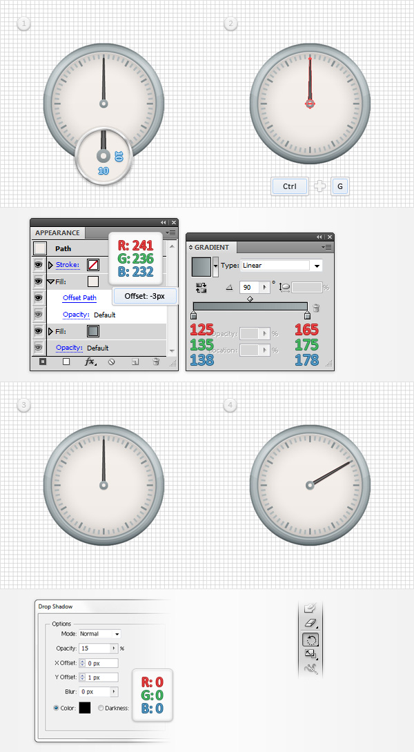
Step 8
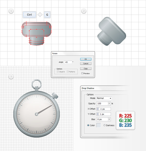
Return to “gridline every 5px“, so simply go to Edit > Preferences > Guides & Grid and enter 5 in the Gridline every box. Using the Ellipse Tool (L), create a 10px circle, fill it with the linear gradient shown in the following image and focus on the Appearance panel. Add a second fill for this new shape, select it, set the color at R=241 G=236 B=232 and go to Effect > Path > Offset Path. Enter a -3px Offset and click OK. Select this tiny circle along with the clock hand shape and Group them (CTRL + G). Make sure that this new group is selected and go to Effect > Stylize > Drop Shadow. Enter the properties shown in the following image and click OK. Finally, you can easily rotate this group using the Rotate Tool (R). Grab this tool, select the clock hand group, place the reference point in the middle of that tiny circle then simply click & drag to rotate the clock hand.
Step 9
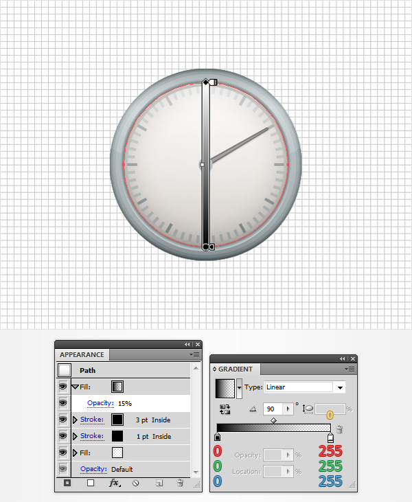
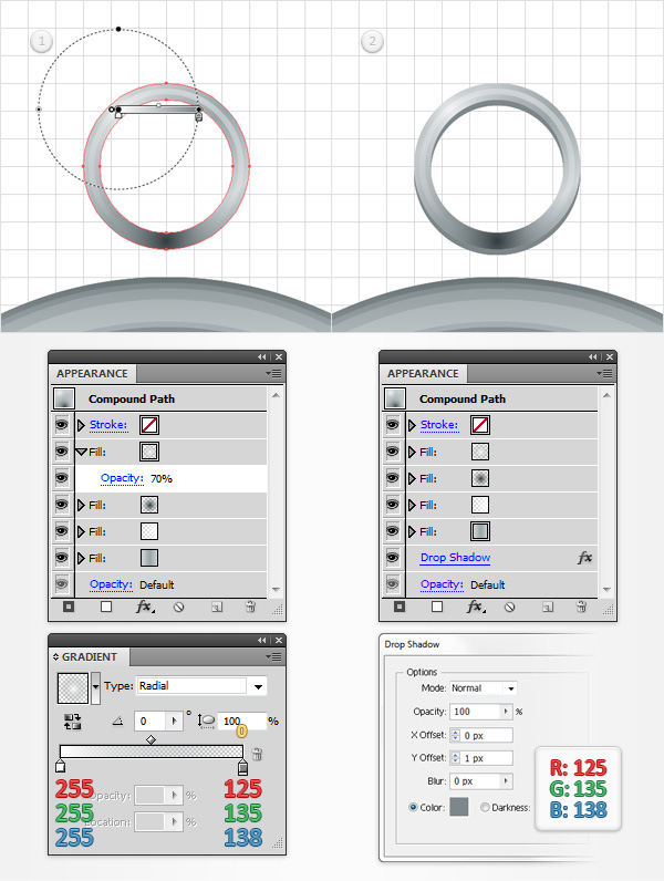
Using the Ellipse Tool (L), create a new 120px circle, fill it wtih the linear gradient shown below and place it as shown in the following image. The yellow zero from the Gradient image stands for Opacity percentage. Make sure that this new shape stays selected and focus on the Appearance panel. First, select the fill, lower its Opacity to 65% and go to Effect > Path > Offset Path. Enter a -3px Offset and click OK. Keep focusing on the Appearance panel and add a 1pt, black stroke. Align it to inside, change the Blending Mode to Soft Light and lower its Opacity to 30%. Add a second stroke for this shape, make it 3px wide, align it to inside, make sure that the color is set at black then lower its Opacity to 20% and change the Blending Mode to Soft Light.
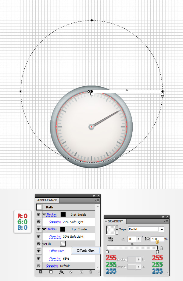
Step 10
Make sure that the shape made in the previous step is still selected and focus on the Appearance panel. Add a new fill, drag it in the top of the Appearance panel, lower its Opacity to 15% and use the linear gradient shown in the following image. Remember that the yellow zero from the Gradient image stands for Opacity percentage.
Step 11
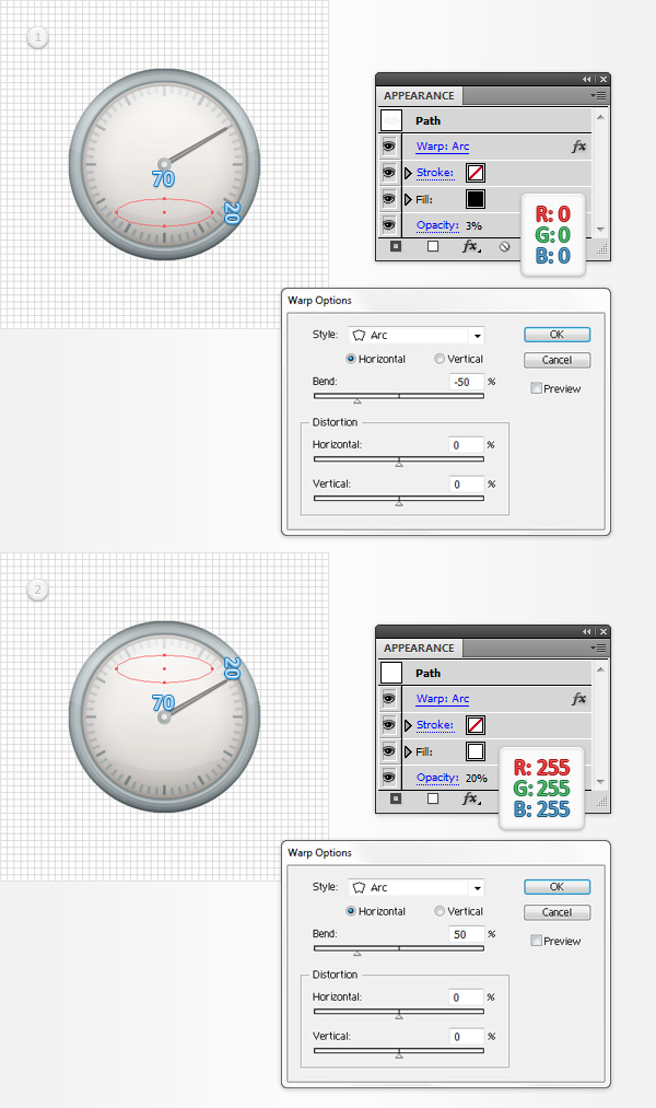
Using the Ellipse Tool (L), create a 70 x 20px shape, fill it with black, place it as shown in the first image, lower its Opacity to 3% and go to Effect > Warp > Arc. Enter the properties shown in the first image and click OK. Make sure that the Ellipse Tool (L) is still active and create a new 70 x 20px shape. Fill it with white, place it as shown in the second image, lower its Opacity to 20% and go again to Effect > Warp > Arc. Enter the properties shown in the second image and click OK.
Step 12
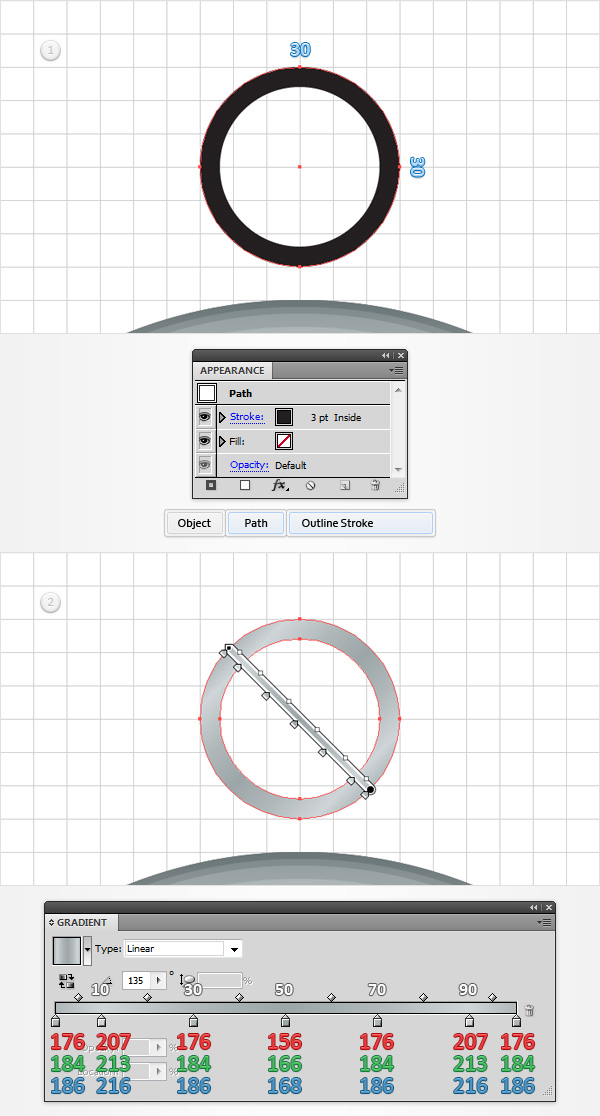
Using the Ellipse Tool (L), create a 30px circle and place it as shown in the following image. Make sure that this new shape has no color set for the fill, add a 3pt, black stroke, align it to inside and go to Object > Path > Outline Stroke. Select the resulting shape, focus on the Appearance panel and replace the existing fill color with the linear gradient shown in the following image.
Step 13
Make sure that the shape made in the previous step is still selected and focus on the Appearance panel. Add a second fill for this path and select it. Use the linear gradient shown in the first image, change the Blending Mode to Soft Light and go to Effect > Path > Offset Path. Enter a -1px Offset and click OK. Return to the Appearance panel and add a third fill for this path. Select it and simply add the radial gradient shown in the second image.
Step 14
Make sure that your 30px compound path is still selected and focus on the Appearance panel. Add a fourth fill for this path, select it, use the radial gradient shown in the first image and lower its Opacity to 70%. Return to the Appearance panel, select the entire path (simply click on the “Compound Path” piece of text from the top of the Appearance panel) and go to Effect > Stylize > Drop Shadow. Enter the properties shown in the following image and click OK.
Step 15
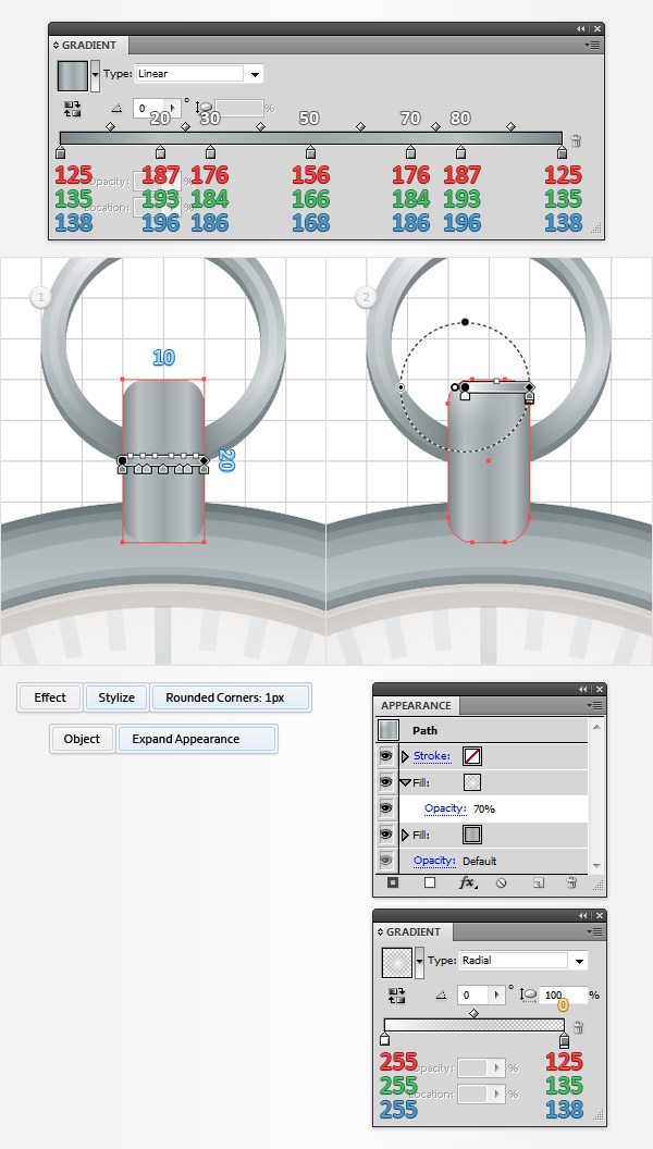
Using the Rectangle Tool (M), create a 10 x 20px shape, fill it with the linear gradient show below, place it as shown in the first image and go to Effect > Stylize > Rounded Corners. Enter a 1px radius, click OK and go to Object > Expand Appearance. Make sure that this new shape stays selected, focus on the Appearance panel and add a second fill. Select it, use the radial gradient shown in the following image and lower its Opacity to 70%.
Step 16
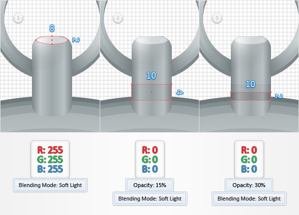
Switch to “gridline every 1px“, so go to Edit > Preferences > Guides & Grid and enter 1 in the Gridline every box. Using the Ellipse Tool (L), create an 8 x 2px shape, fill it with white and change the Blending Mode to Soft Light. Pick the Rectangle Tool (M), create a 10 x 4px shape, fill it with black, place it as shown in the second image, lower its Opacity to 15% and change the Blending Mode to Soft Light. Continue with the Rectangle Tool (M), create a 10 x 2px shape, fill it with black, place it as shown in the third image, lower its Opacity to 30% and change the Blending Mode to Soft Light.
Step 17
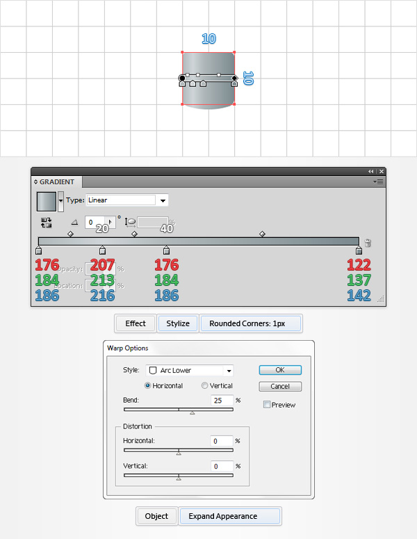
Select all the shapes made in the last five steps and Group them (CTRL + G). Select this new group and send it to back (Shift + CTRL + [ ). Using the Rectangle Tool (M), create a 10 x 1px shape, fill it with R=195 G=200 B=205 and place it as shown in the third image.
Step 18
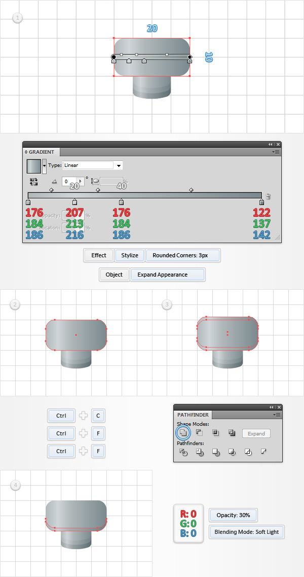
Return to “gridline every 5px“, so simply go to Edit > Preferences > Guides & Grid and enter 5 in the Gridline every box. Using the Rectangle Tool (M), create a 10px square, fill it with the linear gradient shown below and go to Effect > Stylize > Rounded Corners. Enter a 1px radius, click OK and go to Effect > Warp > Arc Lower. Enter the properties shown in the following image, click OK and go to Object > Expand Appearance.
Step 19
Disable the Snap to Grid (View > Snap to Grid) then go to Edit > Preferences > General and make sure that the Keyboard Increment is set at 1px. Select the shape made in the previous step and make two copies in front (CTRL + C > CTRL + F > CTRL + F). Select the top copy and move it 1px up using the up arrow from your keyboard. Reselect both copies and click the Minus Front button from the Pathfinder panel. Fill the resulting shape with black, lower its Opacity to 30% and change the Blending Mode to Soft Light. Reselect the shape made in the previous step and make another two copies in front (CTRL + C > CTRL + F > CTRL + F). Select the top copy and move it 3px up using the up arrow from your keyboard. Reselect both copies and click the Minus Front button from the Pathfinder panel. Fill the resulting shape with black, lower its Opacity to 15% and change the Blending Mode to Soft Light.
Step 20
Enable the Snap to Grid (View > Snap to Grid). Using the Rectangle Tool (M), create a 20 x 10px shape, fill it with the linear gradient shown below, place it as shown in the following image and go to Effect > Stylize > Rounded Corners. Enter a 3px radius, click OK and go to Object > Expand Appearance. Disable the Snap to Grid (View > Snap to Grid) then select the resulting shape and make two copies in front (CTRL + C > CTRL + F > CTRL + F). Select the top copy and move it 1px up. Reselect both copies and click the Minus Front button from the Pathfinder panel. Fill the resulting shape with black, lower its Opacity top 30% and change the Blending Mode to Soft Light.
Step 21
Reselect the rounded rectangle made in the previous step and go to Object > Path > Offset Path. Enter a -1px Offset and click OK. Select the resulting shape and make a copy in front (CTRL + C > CTRL + F). Select this copy and move it 1px down. Reselect both copies and click the Minus Front button from the Pathfinder panel. Fill the resulting shape with the linear gradient shown below and change its Blending Mode to Soft Light. Reselect the rounded rectangle made in the previous step and make two copies in front (CTRL + C > CTRL + F > CTRL + F). Select the top copy and move it 1px down using the down arrow from your keyboard. Reselect both copies and click the Minus Front button from the Pathfinder panel. Fill the resulting shape with black, lower its Opacity to 30% and change the Blending Mode to Soft Light.
Step 22
Enable the Snap to Grid (View > Snap to Grid). Reselect all the shapes made in the last four steps and Group them (CTRL +G). Select this new group and go to Object > Transform > Rotate. Enter a -45 degrees angle and click the OK button. Select this rotated group and place it as shown in the third image. Focus on the Layers panel (Window > Layers), open this fresh group, select the bottom shape and go to Effect > Stylize > Drop Shadow. Enter the properties shown in the following image and click OK. In the end things, should look like in the third image.
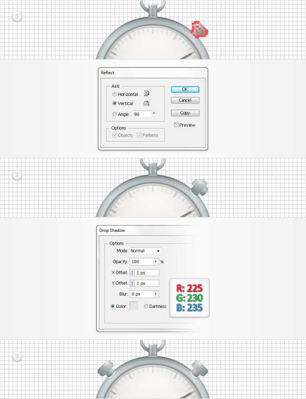
Step 23
Make sure that your button group is still selected and go to Object > Transform > Reflect. Check the Vertical box and click the Copy button. This will create a horizontally, flipped group copy. Focus on the Layers panel, open this new group, select the bottom shape and move to the Appearance panel. Open the existing Drop Shadow effect and edit it as shown in the following image. Select this entire new group, drag it to the left and place it as shown in the third image.
Step 24
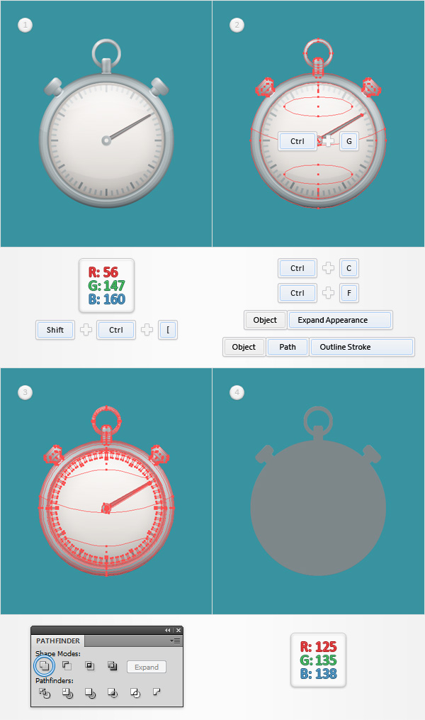
Using the Rectangle Tool (M), create a shape of your Artboard, fill it with R=56 G=147 B=160 and send it to back (Shift + CTRL + [ ). Move to the Layers panel and lock this rectangle to make sure that you won’t accidentally select/move it. Select all the shapes that make up your stopwatch and Group them (CTRL + G). Select this new group and make a copy in front (CTRL + C > CTRL + F). Select this group copy, go to Object > Expand Appearance and Object > Path > Outline Stroke then click the Unite button from the Pathfinder panel. Fill the resulting shape with R=125 G=135 B=138. Move to the Layers panel, double click on this new shape and simply name it “recolor“.
Step 25
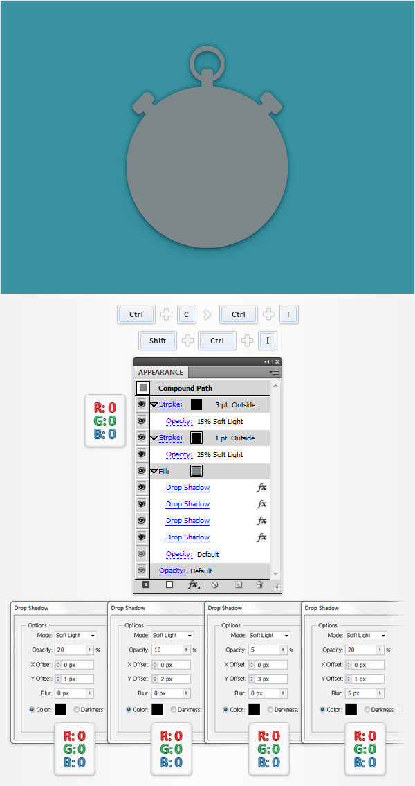
Select your “recolor” shape, make a copy in front (CTRL + C > CTRL + F) and send it to back (Shift + CTRL + [ ). Focus on the Layers panel, double click on this copy and rename it “shadow“. Make sure that your “shadow” shape stays selected and focus on the Appearance panel. Add a 1pt, black stroke, align it to outside, change the Blending Mode to Soft Light and lower its Opacity to 25%. Add a second stroke for this shape, make it 3pt wide, set the color at black, align it to outside, change the Blending Mode to Soft Light and lower its Opacity to 15%. Keep focusing on the Appearance panel, select the existing fill and add the four Drop Shadow effects shown in the following image (start with the left one).
Step 26
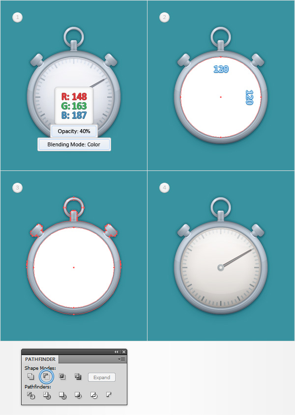
Now, here’s a simple blending technique that you can use to easily recolor the stopwatch. Select your “recolor” shape, replace the existing fill color with R=148 G=163 B=187, lower its Opacity to 40% and (most importantly) change the Blending Mode to Color. Here’s what you have to do if you don’t want to recolor the stopwatch screen. Using the Ellipse Tool (L), create a 120px circle, fill it with a random color and place it as shown in the second image. Select this new circle along with the “recolor” shape and click the Minus Front button from the Pathfinder panel. Move to the Layers panel, double click on the resulting shape and name it “recolorFrame“. In the end things should look like in the fourth image.
Step 27
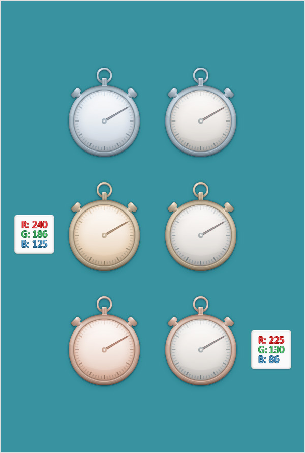
Finally, here are two other colors that you can use to recolor your stopwatch. Feel free to try a different color or even a gradient.
And We’re Done!
I hope you’ve enjoyed this tutorial and can apply these techniques in your future projects.

Author:Andrei Marius
Andrei Marius is a self taught vector artist who is trying to make a living doing something that he likes. He spends most of his time working in Adobe Illustrator, trying to avoid the Pen Tool. You can find most of his vector experiments at this little website dedicate to Illustrator VforVectors.


I have a problem with step 4. The gradiant you provide is to put it mildly F’ed up. When i go with what it says, i get a vastly different outcome than on your example. Can you please provide the correct gradient. Would be very apreciated.
Niels Schut
Excellent Tutorial. Greetings from Venezuela
Quite detailed. Good work.
yay! i was in need of a clock tutorial. i need it for my infographics work. really nice of you for making one. thank you!
Excellent Tutorial and Tips! I am a programmer but i always read your designing tips. Really great!