
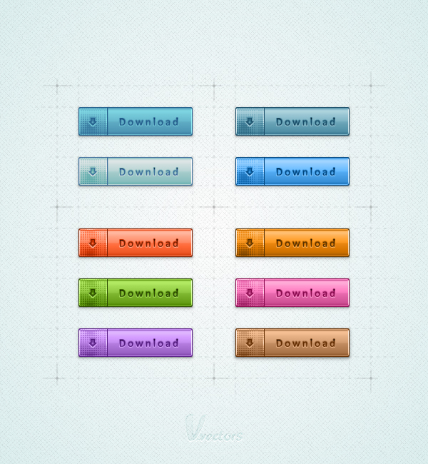
 In the following tutorial you will learn how to create a set of download buttons in Adobe Illustrator. For starters you will learn how to set up a simple grid. Once your document is set up, you will create the main shapes using basic tools and effects along with some simple vector shape building techniques. Next, you will learn how to take full advantage of the Appearance panel, how to use a built-in pattern and how to edit a small piece of text. Finally, using basic blending techniques you will learn how to easily recolor your buttons.
Tutorial Details
- Program: Adobe Illustrator CS5
- Difficulty: Beginner-Intermediate
- Topics Covered: Basic Tools, Effect and Blending Techniques
- Estimated Completion Time: 45 minutes
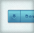
Final Image
As always, this is the final image that we’ll be creating:
Step 1
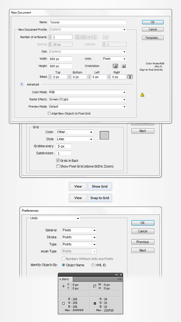
Hit Command + N to create a new document. Enter 600 in the width and height boxes then click on the Advanced button. Select RGB, Screen (72ppi) and make sure that the “Align New Objects to Pixel Grid” box is unchecked before your click OK. Enable the Grid (View > Show Grid) and the Snap to Grid (View > Snap to Grid). For starters you’ll need a grid every 5px. Simply go to Edit > Preferences > Guides > Grid, enter 5 in the Gridline every box and 1 in the Subdivisions box. You should also open the Info panel (Window > Info) for a live preview with the size and position of your shapes. Do not forget to set the unit of measurement to pixels from Edit > Preferences > Unit > General. All these options will significantly increase your work speed while building your download buttons.
Step 2
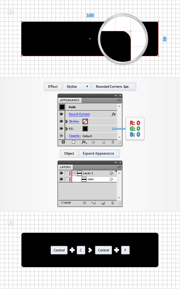
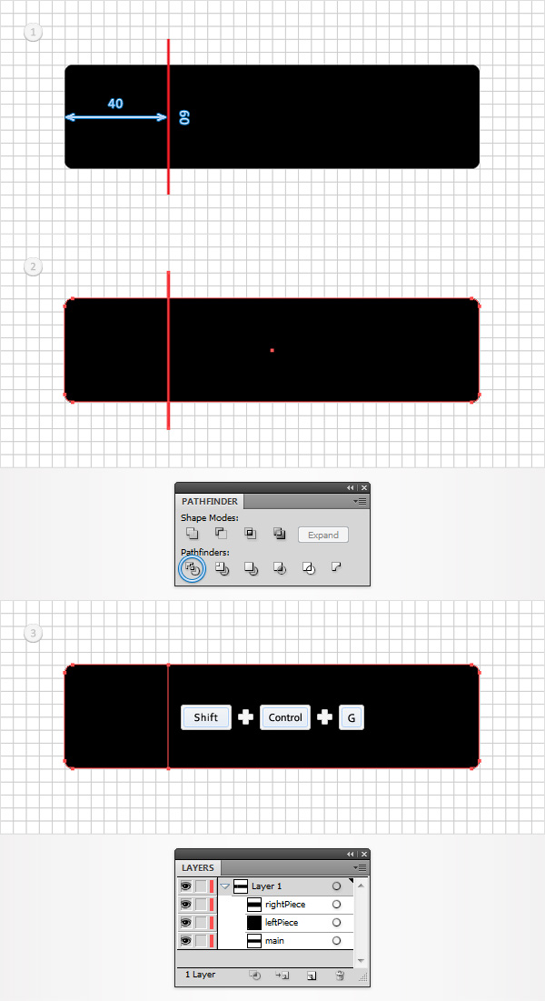
Set the fill color at black, remove any color from the stroke and pick the Rectangle Tool (M). Create a 160 by 40px shape, make sure that it stays selected and go to Effect > Stylize > Rounded Corners. Enter a 3px radius, click OK and go to Object > Expand Appearance. Move to the Layers panel, double click on this black rounded rectangle and simply name it “main”. This will make it easier for you to find it later. Select “main” and make a copy in front (CTRL + C > CTRL + F), you’ll need it for the next step.
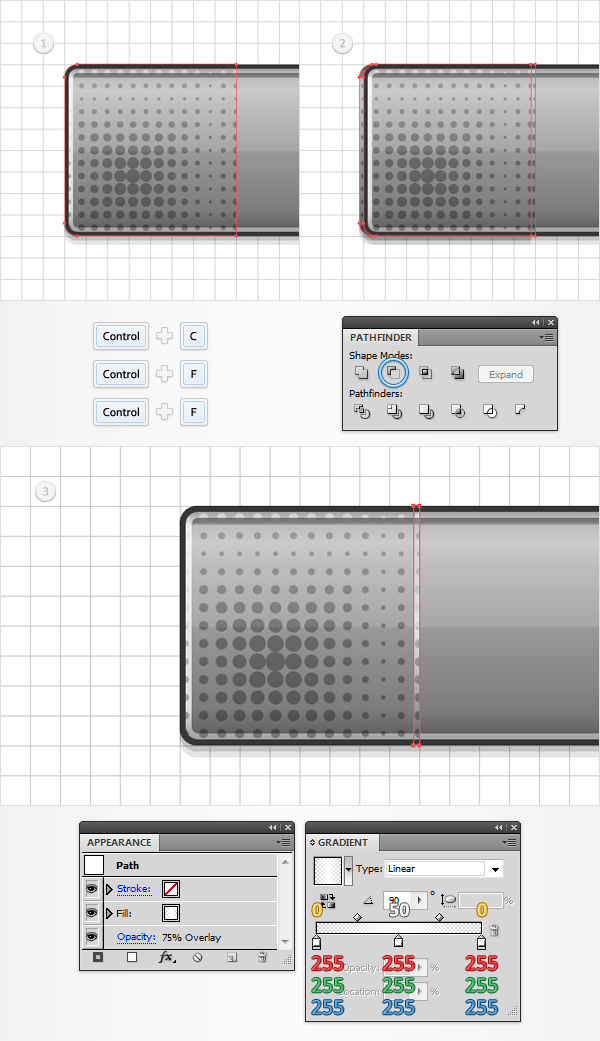
Step 3
Pick the Pen Tool (P), draw a 60px, vertical path and place it as shown in the first image. Select it along with the “main” copy, open the Pathfinder panel (Window > Pathfinder) and click on the Divide button. Move to the Layers panel, make sure that the newly created group is selected and simply hit Shift + CTRL + G to ungroup it. In the end you should have two new shapes. Keep focusing on the Layers panel, double click on the smaller new shape and name it “leftPiece”. Move to the other shape made for the download buttons in this step and name it “rightPiece”.
Step 4
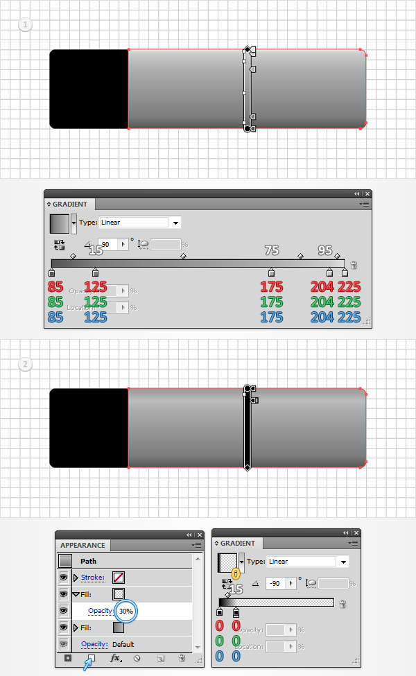
Select “rightPiece” and replace the flat black used for the fill with the linear gradient shown in the first download button. Make sure that “rightPiece” stays selected, focus on the Appearance panel (Window > Appearance) and add a second fill using the Add New Fill button (pointed by the little, blue arrow in the second image). Select this new fill, lower its Opacity to 30% and use the linear gradient shown in the second download button. The white numbers from the Gradient image stand for Location percentage while the yellow zero stands for Opacity percentage.
Step 5
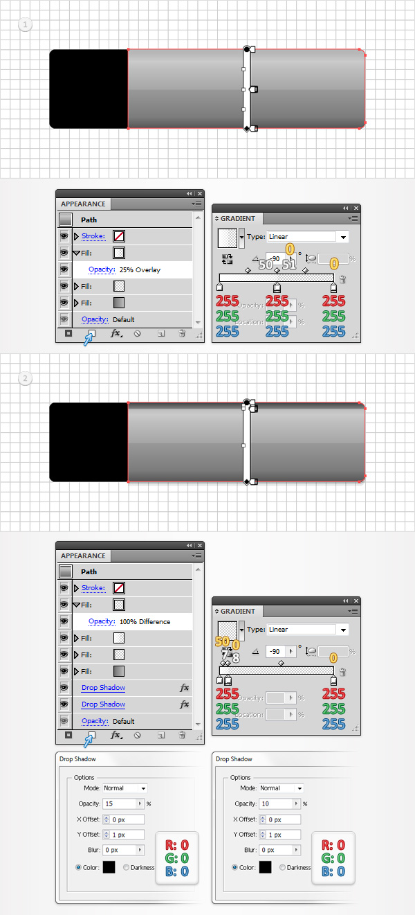
Select “rightPiece”, make sure that it stays that way and focus on the Appearance panel. Add a third fill for this download button using that same Add New Fill button. Select this new fill, lower its Opacity to 25%, change its Blending Mode to Overlay and use the linear gradient shown in the first image. Return to the Appearance panel and add a new fill for your “rightPiece”. Select it, change the Blending Mode to Difference and use the linear gradient shown in the second download button. Get back to the Appearance panel, select the entire path (simply click on that “Path” text from the top of the Appearance panel) and go to Effect > Stylize > Drop Shadow. Enter the properties shown in the left window, click OK and go again to Effect > Stylize > Drop Shadow. Enter the properties shown in the right window and click OK.
Step 6
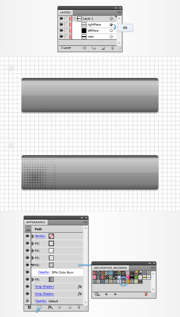
Next, you need to copy the properties used for “rightPiece” and paste them onto “leftPiece”. Here is how you can easily do it. Go to the Layers panel, focus on the right side and you’ll notice that every shape comes with a little circle, it’s called a target icon. Hold Alt, click on the target icon that stands for “rightPiece” and simply drag onto the circle that stands for “leftPiece”. In the end things should look like in the first image. Select “letPiece”, focus on the Appearance panel, add a new fill, select it and drag it right above the bottom fill. You will need a built-in pattern for this fifth fill. Go to the Swatches panel, open the fly-out menu and go to Open Swatch Library > Patterns > Decorative > Decorative_Modern. A new window with a set of built-in patterns should open. Make sure that the new fill is still selected, add the “Optical Squares 2” pattern, lower its opacity to 30% and change the blending mode to Color Burn.
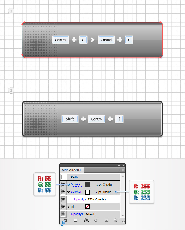
Step 7
Focus on the Layers panel, select “main”, make a copy in front (CTRL + C > CTRL + F) and bring it to front (Shift + CTRL + ] ). Make sure that this copy stays selected and focus on the Appearance panel. Remove the color from the fill and add a 2pt stroke. Select it, set the color at white, align it to inside, lower its Opacity to 75% and change the Blending Mode to Overlay. Add a second fill for this new shape using the Add New Stroke button (pointed by the little, blue arrow in the second image). Select this new stroke, make it 1pt wide, align it to inside and set the color at R=55 G=55 B=55.
Step 8
Disable the Snap to Grid (View > Snap to Grid) then go to Edit > Preferences > General and make sure that the Keyboard Increment is set at 1px. Select “leftPiece” and make two copies in front (CTRL + C > CTRL + F > CTRL + F). Select the top copy and move it 1px to the left using the left arrow from your keyboard. Reselect both copies and click on the Minus Front button from the Pathfinder panel. Select the resulting shape, focus on the Appearance panel and simply hit the D key from your keyboard. This will replace the existing Appearance attributes with the default ones (white fill and black stroke). Remove that black stroke then replace the white from the fill with the linear gradient shown in the following image. Lower its Opacity to 75% and change the Blending Mode to Overlay.
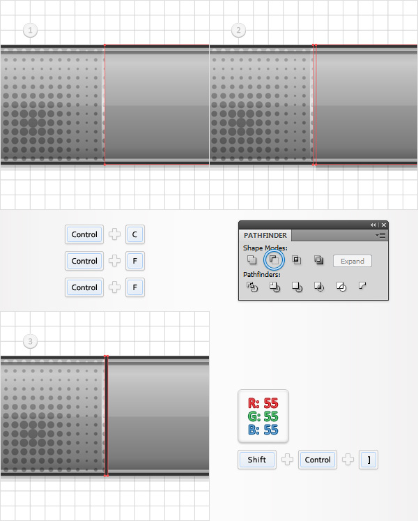
Step 9
Select “rightPiece” and make two copies in front (CTRL + C > CTRL + F > CTRL + F). Select the top copy and move it 1px to the right using the right arrow from your keyboard. Reselect both copies and click on the Minus Front button from the Pathfinder panel. Select the resulting shape, bring it to front (Shift + CTRL + ] ), focus on the Appearance panel and simply hit the D key from your keyboard. Remove that black stroke then replace the white used for the fill with R=55 G=55 B=55.
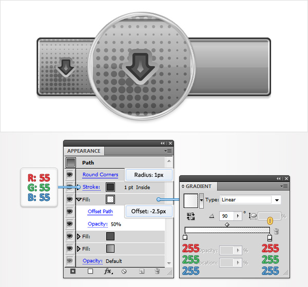
Step 10
Enable the Snap to Grid (View > Snap to Grid). For the following step you will need a grid every 1px. So, go to Edit > Preferences > Guides & Grid and enter 1 in the Gridline every box. Set the foreground color at R=85 G=85 B=85, pick the Rectangle Tool (M), create a 6 by 5px shape and place it as shown in the first image. Continue with the Rectangle Tool (M), create a 12 by 6px shape and place it as shown in the second image. Focus on this second rectangle and switch to the Direct Selection Tool (A). Select the bottom anchor points and go to Object > Path > Average. Check the Both button and click OK. This will turn your little rectangle into a triangle. Select it along with the rectangle made in the beginning of the step and click on the Unite button from the Pathfinder panel. Make sure that this new shape stays selected, focus on the Appearance panel and add a second fill. Select it, drag it below the existing fill, add the linear gradient shown below and go to Effect > Path > Offset Path. Enter a 1.5px Offset and click OK.
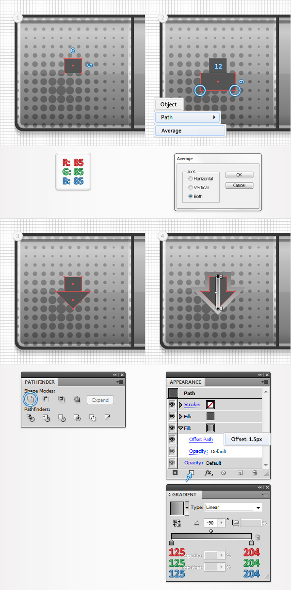
Step 11
Make sure that your arrow shape stays selected, focus on the Appearance panel and add a third fill. Select it, add the linear gradient shown below, lower its Opacity to 50% and go to Effect > Path > Offset Path. Enter a -2.5px Offset and click OK. Return to the Appearance panel, add a 1pt stroke, align it to inside and set the color at R=55 G=55 B=55. Finally, select the entire path and go to Effect > Stylize > Rounded Corners. Enter a 1px radius and click OK.
Step 12
Using the Type Tool (T) and add your “Download” piece of text on the download buttons. Use the Calibri font, set the size set at 15pt, the leading at 18pt and the tracking at 200 then pick a dark color for the text. Make sure that your piece of text is selected focus on the Appearance panel and hit that Add New Fill button. Select this new fill and use the linear gradient shown in the following image.
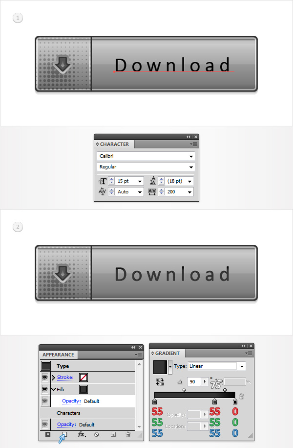
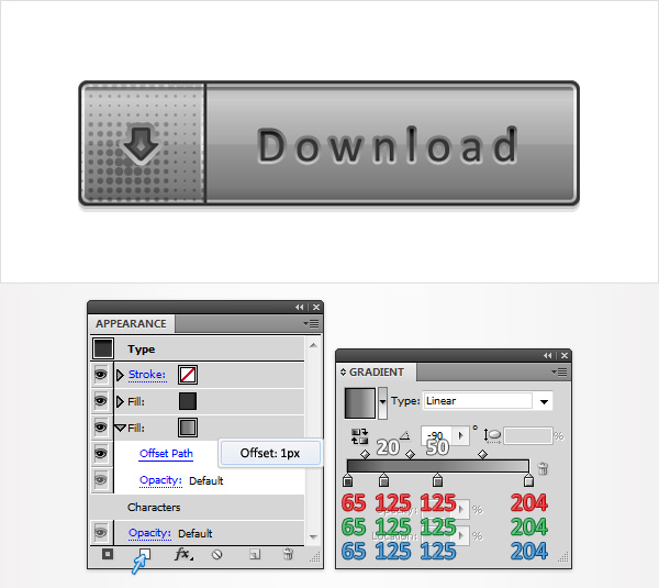
Step 13
Reselect your piece of text for the download buttons, focus on the Appearance panel and add a second fill. Drag it below the existing fill, use the linear gradient shown in the following image and go to Effect > Path > Offset Path. Enter a 1px Offset and click OK.
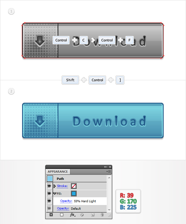
Step 14
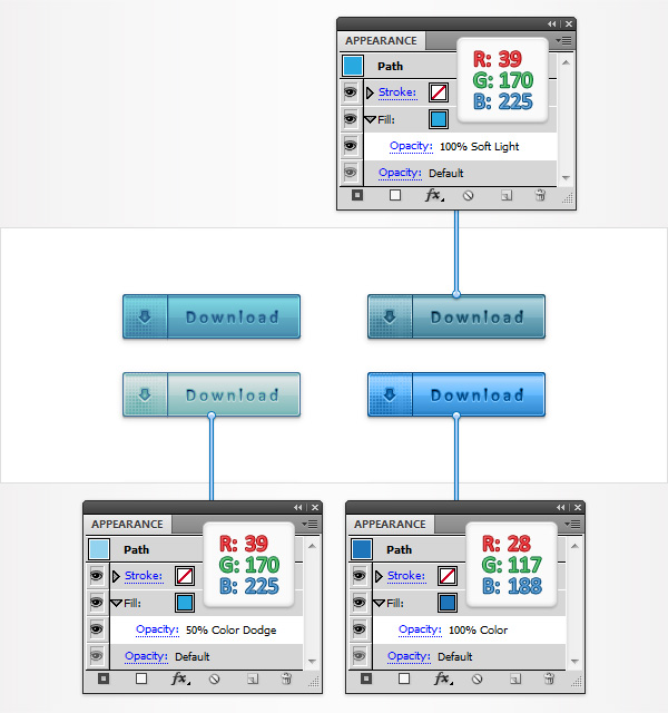
Focus on the Layers panel, select “main”, make a copy in front (CTRL + C > CTRL + F) and bring it to front (Shift + CTRL + ] ). Make sure that this copy stays selected and focus on the Appearance panel. Replace the black with R=39 G=170 B=225, lower its Opacity to 55% and change the Blending Mode to Hard Light.
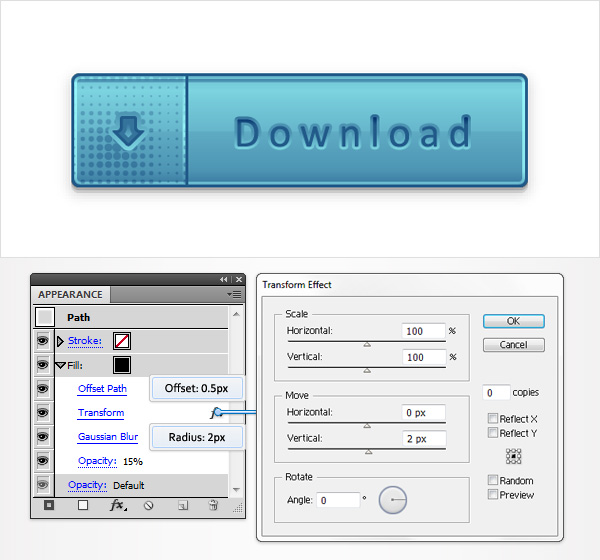
Step 15
Focus on the Layers panel, select “main”, lower its Opacity to 15% and go to Effect > Path > Offset Path. Enter a 0.5px Offset, click OK and go to Effect > Distort & Transform > Transform. Enter the properties shown in the following image, click OK and go to Effect > Blur > Gaussian Blur. Enter a 2px radius and click OK.
Step 16
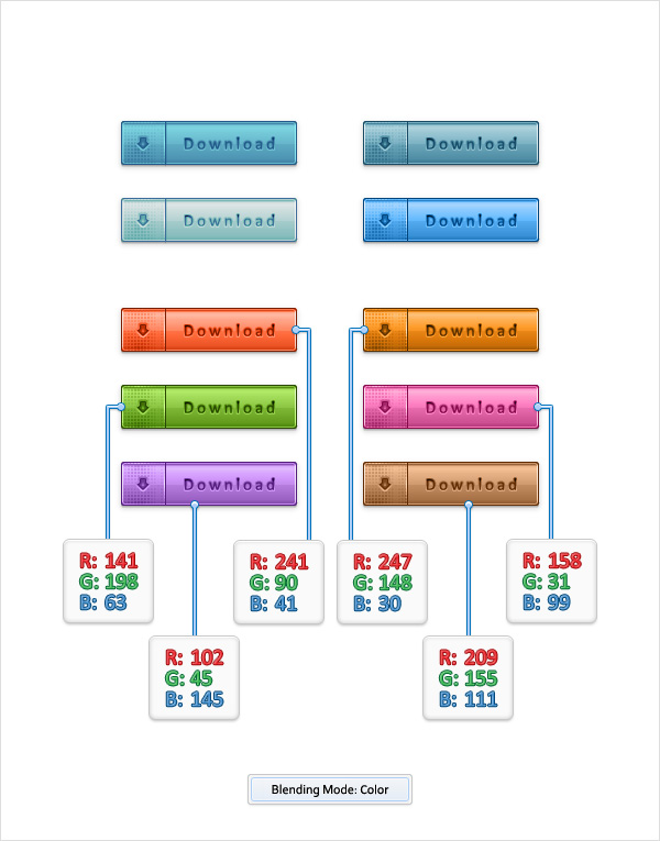
Finally, here are some other blending modes that you could use to recolor your download buttons.
In this case the most effective blending mode is the one called Color. Here are some examples.
And We’re Done!
I hope you’ve enjoyed this tutorial for a set of download buttons and can apply these techniques in your future projects.

Author: Andrei Marius
Andrei Marius is a self taught vector artist who is trying to make a living doing something that he likes. He spends most of his time working in Adobe Illustrator, trying to avoid the Pen Tool. You can find most of his vector experiments at this little website dedicate to Illustrator VforVectors.


I’m also commenting to make you understand what a amazing experience my wife’s daughter found viewing your web page. She mastered several things, not to mention what it’s like to have an excellent teaching character to make the mediocre ones with no trouble learn about various extremely tough subject matter. You truly did more than readers’ desires. Thank you for offering those productive, safe, revealing not to mention fun tips on this topic to Julie.
This is very Amazing and Very Informative Article we get a lot of Information from this article we really appreciate your team work keep it up and keep posting such a informative articles.
Good work friend I read some articles that you posted in your blog. I just want to admire blog and your work. Thanks for posting such posts here.
This blog was how do I say it? Relevant!! Finally I have found something which helped me. Thanks!
Thanks for putting in much effort for this information.
Lovely tutorial, thanks for sharing.
Ohh thank you so much iam new for web designing this article helps me a lot for creating such a nice download button. Thank you once again.
i have illustrator cs6 and cannot find this…
Go to the Swatches panel, open the fly-out menu and go to Open Swatch Library > Patterns > Decorative > Decorative_Modern
Not a bad tutorial, however somewhat untimely. This “style” of button is going away very quickly as the “flat” design trend is picking up steam. No one is using those types of buttons anymore in their designs.
July what is a “flat” design?
never heard of it..or I didn’t notice the name
anyway, can you help me to learn what is that?
Great thanks
It’s true that Flat Design is a style which is popular at the moment, but it’s not the best style to choose in all instances, and not all clients necessarily want it.
What I’ve found is that design trends are often cyclic, and it’s quite likely that soft-gradient graphics like this will become favoured again at some point. And when they do, here’s a handy tutorial on how to achieve it. So it’s all good. 🙂