
 In this tutorial you will learn how to create a realistic Wacom Bamboo Tablet in Adobe Illustrator. You will find out how to add shadows and highlights to your Wacom Tablet using different Blending Modes, how to use the Round Any Corner Script and finally, how to create a nice textured background. Let’s begin!
Tutorial Details
- Program: Adobe Illustrator CS5 – CC
- Difficulty: Beginner-Intermediate
- Topics Covered: Gradient Tool, Basic Tools and Effects, Transform techniques and the Appearance panel, Scripts, Patterns
- Estimated Completion Time: 1 hour
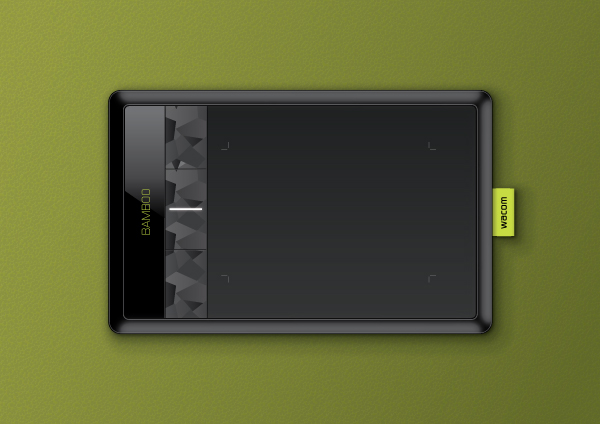
Final Image
This is the final image that we’ll be creating at the end of Part II: 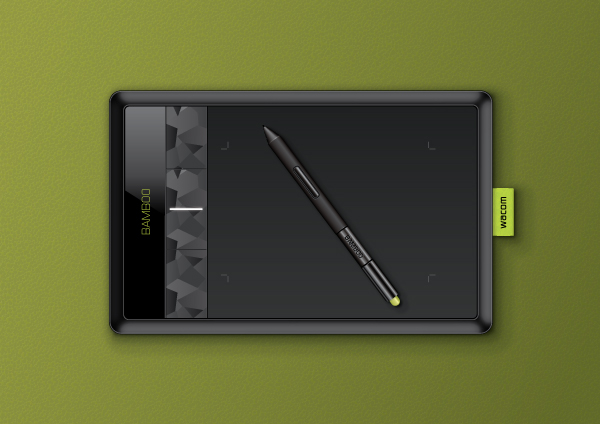
Create a Wacom Bamboo Tablet –
Part I of II
Step 1
Open Adobe Illustrator and create a new document (Ctrl + N). Select CMYK Color Mode, 300 PPI Raster Effects and make sure that Align New Objects to Pixel Grid is unchecked.
Next, go to Edit > Preferences > General and set the Keyboard Increment to 1px. 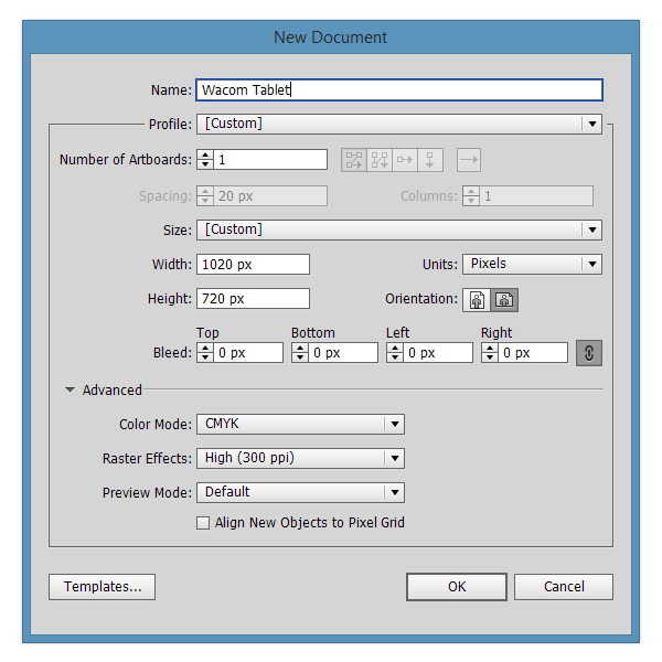
Step 2
Pick the Rectangle Tool (M) and draw a 650 x 412 px rectangle. Fill it with Black (C=0 M=0 Y=0 K=100). With the shape still selected, go to Effects > Stylize > Round corners and enter a value of 20 px. Focus on the Appearance Panel (Window > Appearance), add a Black (C=0 M=0 Y=0 K=100) stroke of 1 px and from the Stroke Panel (Window > Stroke) select Align Stroke to Outside. Add a new stroke by clicking on the lower left square in the Appearance panel, and set the color to C=0 M=0 Y=0 K=80. Then, from the Stroke Panel (Window > Stroke), select Align Stroke to Inside. 
Step 3
Pick the Rectangle Tool (M) and draw a 600 x 364 px rectangle with no stroke. Go to Effect > Stylize > Round Corners and add a value of 9 px. Add a linear gradient (Window > Gradient), set the angle to 90 degrees. Select the left slider from the Gradient Panel and set the color to C=70 M=63 Y=61 K=56. Then select the right slider and set the color to C=70 M=63 Y=61 K=75. 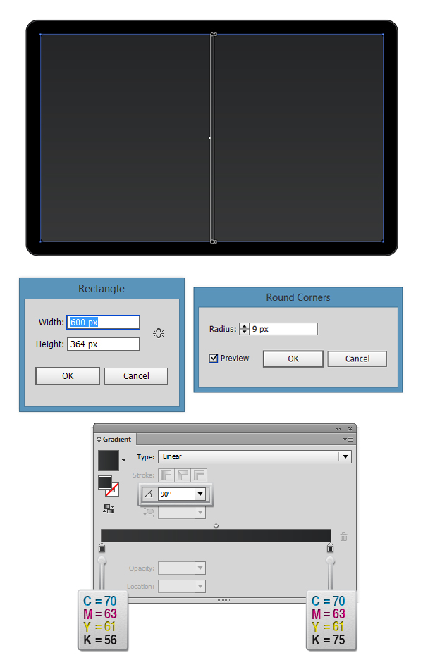
Step 4
Pick the Rectangle Tool (M), draw a 70 x 364 px rectangle and fill it with a light color in order to see it better (it doesn’t matter what color). Add a 2 px black (C=0 M=0 Y=0 K=100) stroke, then, from the Stroke Panel (Window > Stroke), select Align Stroke to Outside. Focus on the Appearance panel, and add a new 1 px stroke as before, and set the color to C=0 M=0 Y=0 K=80, then, from the Stroke Panel (Window > Stroke) select Align Stroke to Outside. After this, select the shape and make a copy in front of it (Ctrl + C > Ctrl + F). 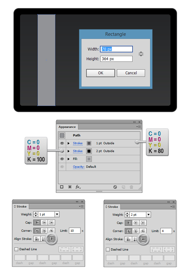
Step 5
Now pick the Pen Tool (P) and draw some random shapes with sharp corners and make sure that you cover the previous shape we’ve made. Fill them with grayscale gradients (Window > Gradient). Feel free to experiment–it doesn’t really need to look like in the screenshot I made. After you’re done, select all the shapes and group them (Ctrl +G). Focus on the Layers Panel and move the rectangle we’ve previously made in step 4 on top of the other shapes. Select the shape from step 4 and the group and then go to Object > Clipping Mask > Make (Ctrl + 7). 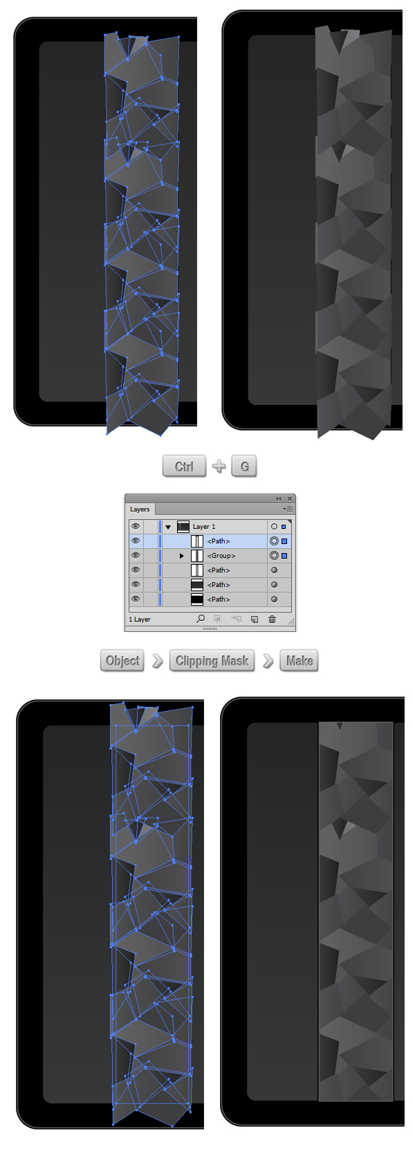
Step 6
Pick the Rectangle Tool (M), draw a 70 x 364 px rectangle and fill it with Black (C=0 M=0 K=0 Y=100). Add a 1 px black (C=0 M=0 Y=0 K=100) stroke, then, from the Stroke Panel (Window > Stroke), select Align Stroke to Outside. Focus on the Appearance Panel, and add a new 1 px stroke and set the color to C=0 M=0 Y=0 K=80. Then, from the Stroke Panel (Window > Stroke), select Align Stroke to Inside. 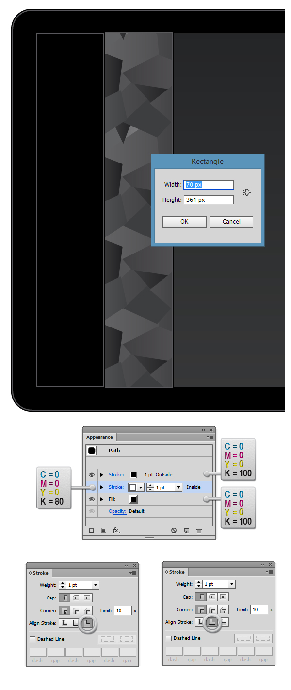
Step 7
For this step, you’ll need the Round Any Corner script. You can find it in this article 20 Free and Useful Adobe Illustrator Scripts. Save it to your hard drive, return to Illustrator and grab the Direct Selection Tool (A). Select only the anchor point highlighted in the image and go to File > Scripts > Other Script. Open the Round Any Corner script, enter a 9px radius and click OK. Now make a copy in front of the shape (Ctrl + C > Ctrl +F). 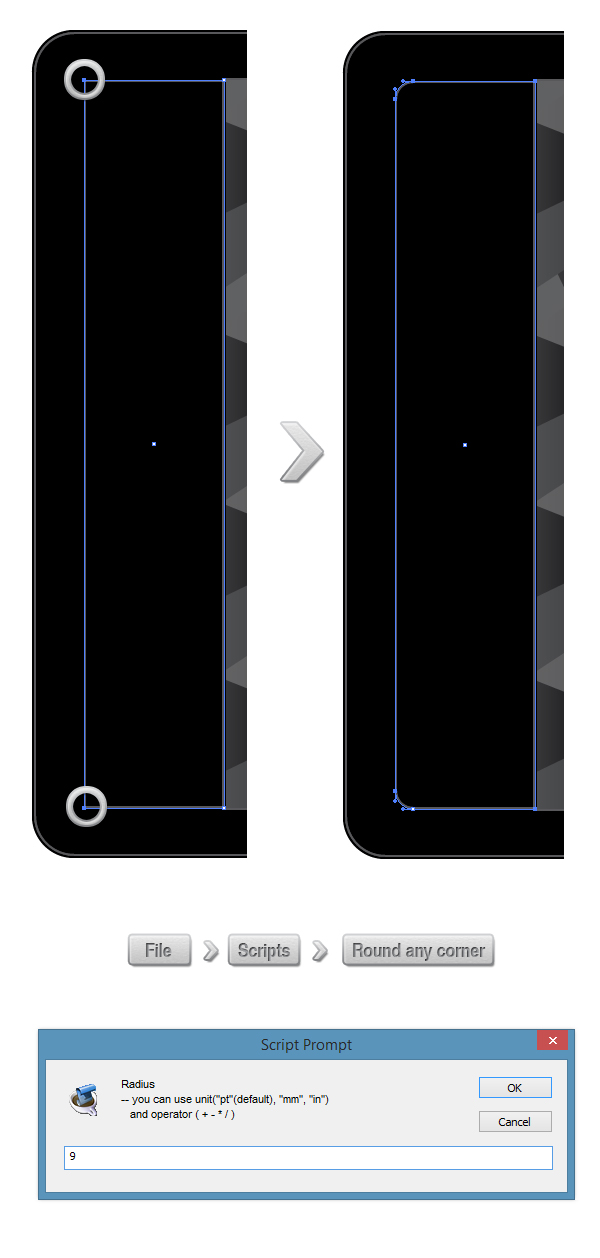
Step 8
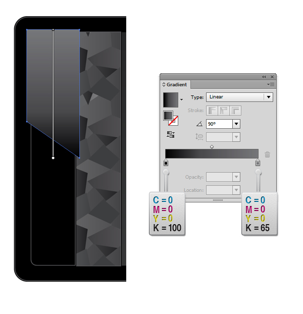
Now pick the Pen Tool (P) and draw a shape similar to the one from the screenshot. Add a linear gradient fill by going to Window > Gradient, then from the Gradient panel change the angle to 90 degrees, pick the left slider and set the color to Black (C=0 M=0 Y=0 K=100), then select the right slider and set the color to C=0 M=0 Y=0 K=65.
Step 9
Select the copy of the shape we’ve made in Step 7 in the Layers Panel, and move it on top of the others. Select both the shapes from Step 7 and from Step 8 and go to Object > Clipping Mask > Make (Ctrl +7). 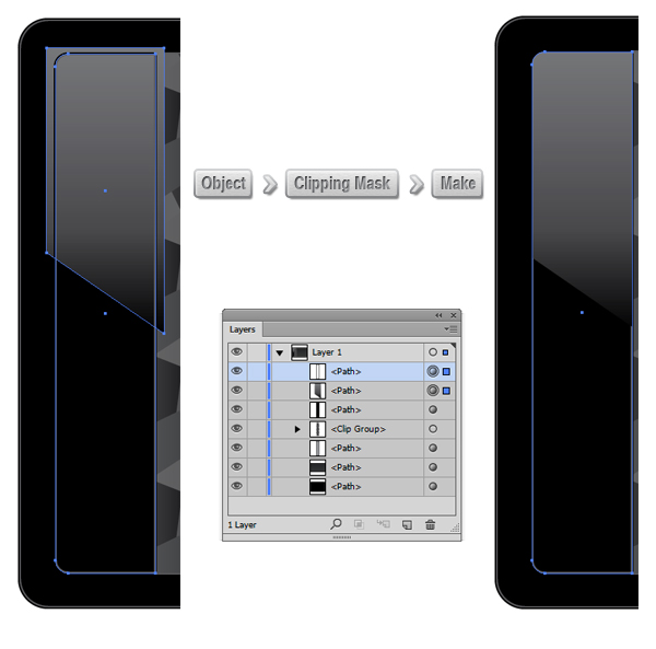
Step 10
Select the clipping mask we’ve previously created, and using your keyboard arrows, move it 1 px to the left. 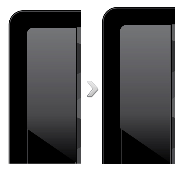
Step 11
Pick the Rectangle Tool (M) and draw a 600 x 364 px shape. Go to Effect > Stylize > Round Corners and enter a value of 9 px. Select the shape, and from the Appearance Panel, delete the fill. Add a 1 px stroke and set the color to C=0 M=0 Y=0 K=80, then, from the Stroke Panel (Window > Stroke), select Align Stroke to Outside. Focus on the Appearance panel, and add a new 2 px stroke and set the color to C=0 M=0 Y=0 K=100. Then, from the Stroke Panel (Window > Stroke), select Align Stroke to Inside. 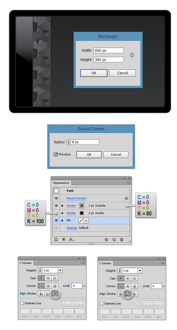
Step 12
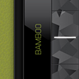
Pick the Type Tool (T) and write the word BAMBOO as you see in the image below. Set the font to Continuum Light (free font download here), the size to 20 px and the color to C=30 M=0 Y=92 K=0. With the text selected, use the Rotate Tool (R) to rotate the type 90 degrees. 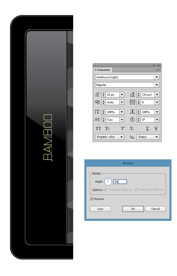
Step 13
Draw a simple line like in the image below with the Pen Tool (P), set the stroke color to White (C=0 M=0 Y=0 K=0), then set the stroke width to 3 px. Now go to Effects > Stylize > Outer Glow and enter the same properties as in the screenshot. 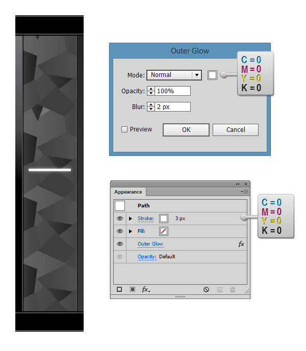
Step 14
Pick the Pen Tool (P) and draw two simple lines as in the image below. Set the stroke color to Black (C=0 M=0 Y=0 K=100) and the stroke width to 1 px. Select both shapes, go to Effects > Stylize > Drop Shadow and enter the same values as in the image below. 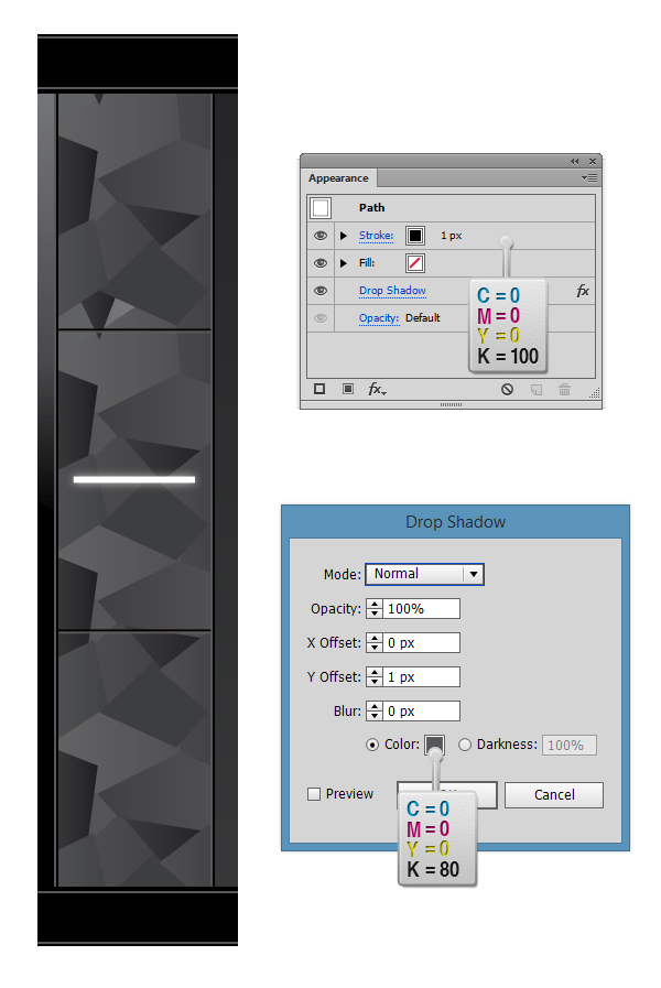
Step 15
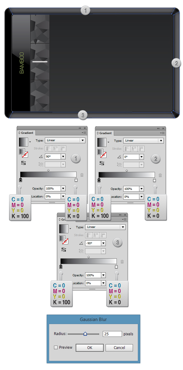
Pick the Pen Tool (P) and draw three shapes like in the image below. Using the Gradient Panel (Window > Gradient), add a Black to White gradient. Depending on what shape you select, change the angle from the Gradient panel to 90 degrees for the first shape (1), 0 degrees for the second shape (2) and -90 degrees for the third shape (3). Now select all three shapes, go to Effects > Blur > Gaussian Blur and enter a value of 25 px.
Step 16
Using the Rectangle Tool (M), draw a 650 x 412 px shape with no fill or stroke. Select the shape and the three shapes we’ve created at step 15, then go to Object > Clipping Mask > Make (Ctrl + 7). 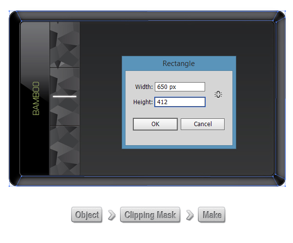
Step 17
Using the Pen Tool (P), draw simple lines as in the screenshot below. Set the stroke color to C=0 M=0 Y=0 K=70 and the stroke width to 1 px. Select them all and group them (Ctrl + G). 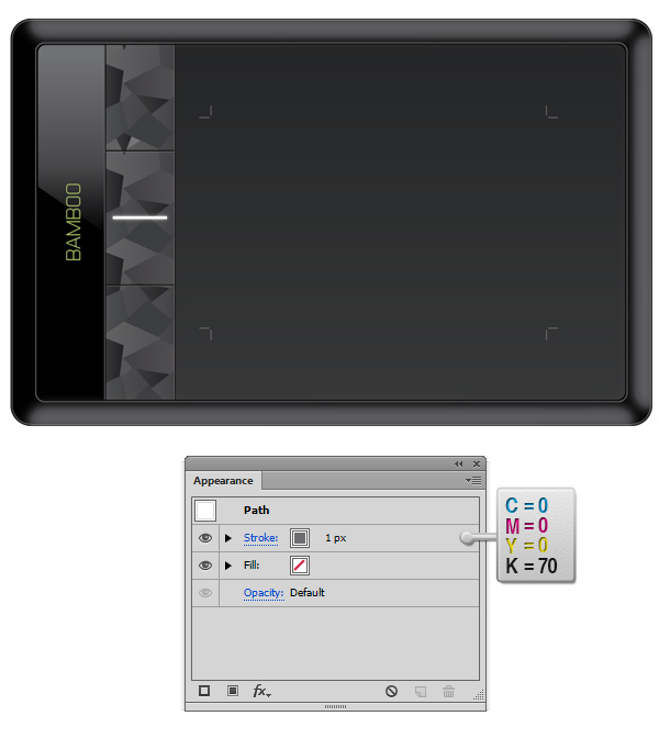
Step 18
Pick the Pen Tool (P) and draw a shape similar to the one in the screenshot below. Fill it with C=26 M=0 Y=90 K=0. Also delete the stroke from the Appearance Panel (Window > Appearance). Now focus on the Layers Panel and move the shape below all shapes (Ctrl + Shift + [ ) 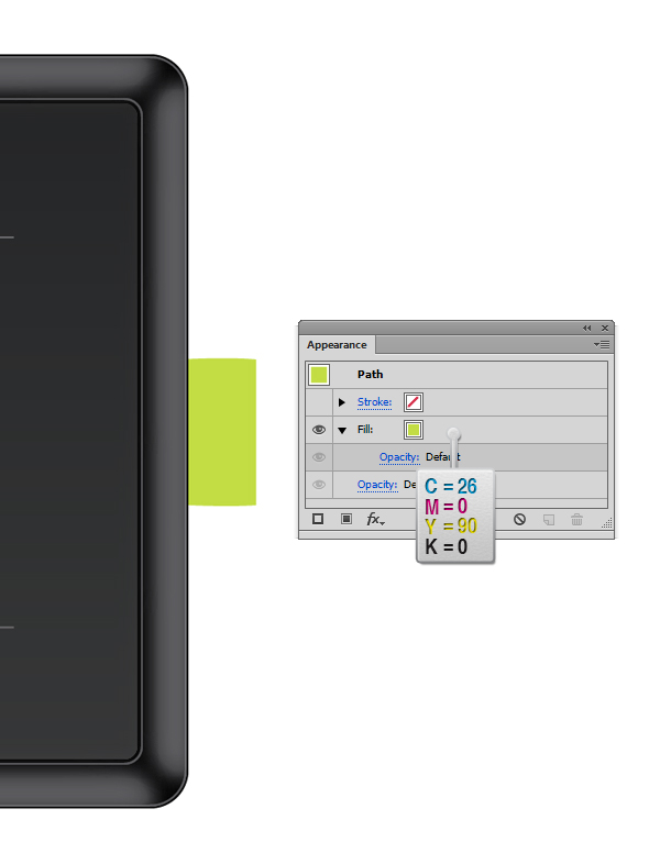
Focus on the Appearance Panel, add a new fill, and from the Gradient Panel (Window > Gradient), apply a white to black gradient. Pick the Gradient Tool (G) and move the Gradient Annotator, as in the image below. Change the location to 59.6% as in the image below. Go to the Appearance Panel and lower the opacity of the gradient fill to 30%, then set the blending mode to Multiply. 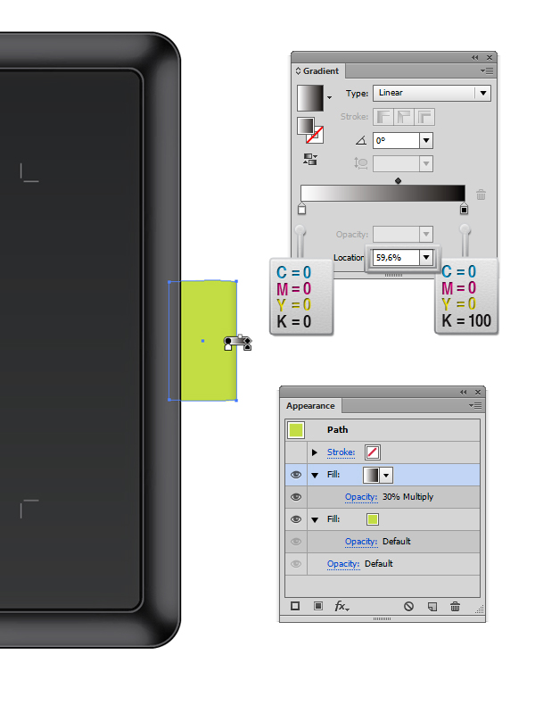
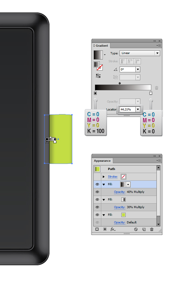
Focus on the Appearance Panel, add a third fill, and from the Gradient Panel (Window > Gradient), apply a black to white gradient. Pick the Gradient Tool (G) and move the Gradient Annotator, as in the image below. Change the location to 44.21%, as in the image below. Go to the Appearance Panel and lower the opacity of the gradient fill to 40%, then set the blending mode to Multiply.
Step 19
Pick the Type Tool (T) and write the word Wacom as you see in the image below. Set the font to Continuum Medium, the size to 18 px and the color to black. Use the Rotate Tool (R) with the text selected to rotate the type 90 degrees. 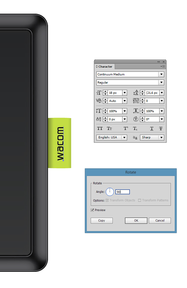
Step 20
Now select the shape we’ve made at Step 2 and the shape we’ve made at Step 18 and group them (Ctrl + G). 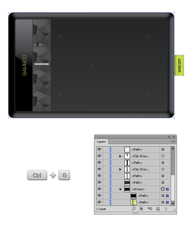
Step 21
Select the group we’ve made, go to Effects > Stylize > Drop Shadow and enter the values from the first Drop Shadow dialog box from the image below. Go again to Effects > Stylize > Drop Shadow, hit Apply New Effect when the alert dialog box appears and enter the values written in the second Drop Shadow dialog box from the screenshot. Go again to Effects > Stylize > Drop Shadow, hit Apply New Effect when the alert dialog box appears and enter the values written in the third Drop Shadow dialog box from the screenshot. 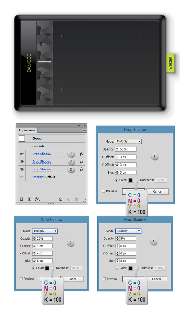
Step 22
Now let’s create the background! Pick the Rectangle Tool (M) and draw a 1020 x 720 px shape. Delete the stroke and add a color fill C=48 M=28 Y=100 K=0. (To place this new rectangle behind the other elements, select it and go to Object > Arrange > Send to Back) 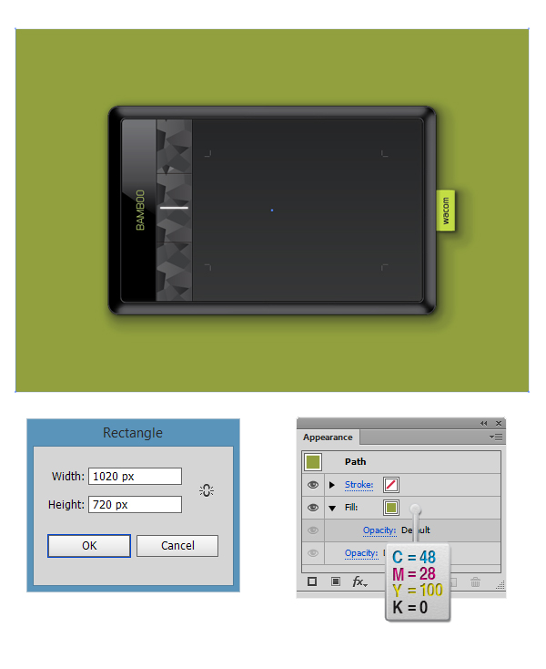
Step 23
Now let’s add a texture to our background! Focus on the Appearance panel), and add a new fill, lower the opacity to 10%, then, using the techniques from the Creating Seamless Textures tutorial, create your own unique texture. 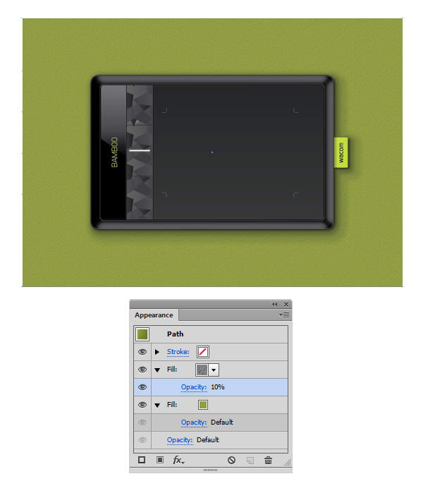
Step 24
Add a new fill from the Appearance panel, and from the Gradient panel, add a black to black gradient, then select the left slider and set the opacity to 0%. Change the angle of the gradient to -22.9 degrees. Now from the Appearance panel select the gradient fill, lower the opacity to 39% and set the Blending Mode to Multiply. 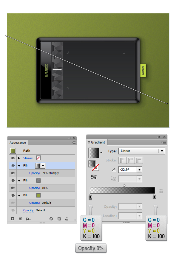
And we’re done! End of part one. Stay tuned for part two.
![]()
Author: Andrei Urse
My name is Andrei Urse. I’m a graphic designer from Romania. I love creating logos and complex vector art using Illustrator, but I also use Photoshop and InDesign on a daily basis. You can find all of my work on Behance.


I am hoping somebody could help! I have just found
a Youtube video that shows the particular Graphics Monitor I am looking to
buy. I have been trying to decide for a long time, but I am trying to find a specialist to let me know
what they think about the Graphics Monitor. I’m just unsure if this is best Graphics Monitor for me
personally!
Loved the tutorial, amazed at what can be done with the right tools and Im just a beginner. Very happy with the outcome of my Tablet. Onto Part II. Thanks.
Thank you so much for this! It’s a very helpful and comprehensive tutorial, even for someone who’s just started using illustrator! I was able to follow along and get 99% of the steps right! 🙂 I also love the mango illustration on your website! Cheers.