

Just because we’re working in Illustrator doesn’t mean we have to create clean geometric artwork all the time. With just a couple tips and some custom artwork you can create 100% vector artwork that is grainy, dusty, and dingy – an awesome grunge font vector. Plus, these grunge font vector techniques are easy to apply to all kinds of graphics other than typography.
Tutorial Details: Custom Grunge Font Vector
- Program: Adobe Illustrator CS5
- Difficulty: Expert
- Topics Covered: Live Trace, Live Paint Bucket, Grain Effects
- Estimated Completion Time: 1-1.5 hours
- Required Materials: Pen and Paper
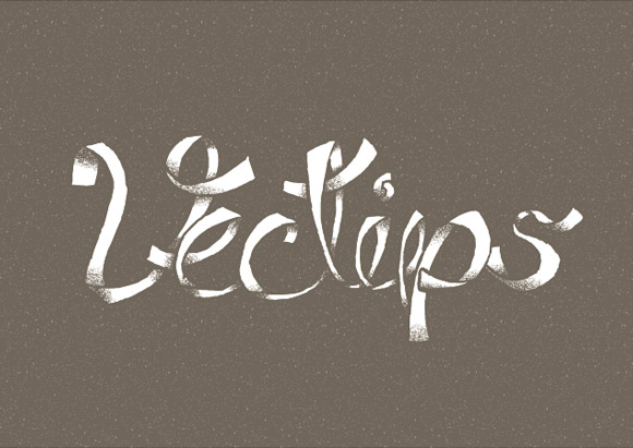
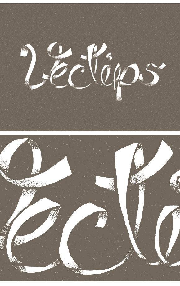
Final Image: Grunge Font Vector
Below is the finished grunge font vector treatment we will be completing. Yours will probably look different but this is not a bad thing!
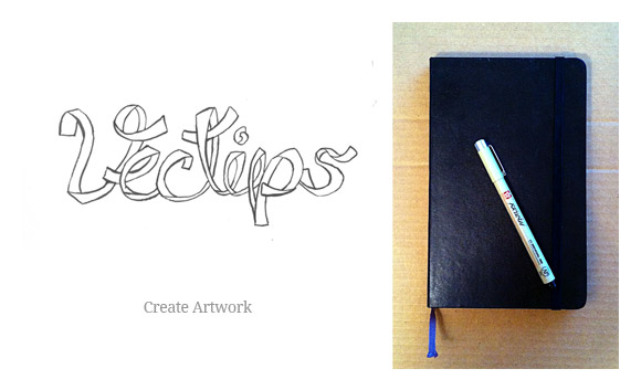
Step 1
For the first step you need for this grunge font vector tutorial is to go sans-computer and create some custom artwork. Create some type with paper and anything that makes a mark. I like using Pigma’s Brush Pen and my trusty Moleskine. If you are not that comfortable with creating custom type, you can print out some type from Illustrator at 20% black and trace with your pen, marker, or whatever you are using.
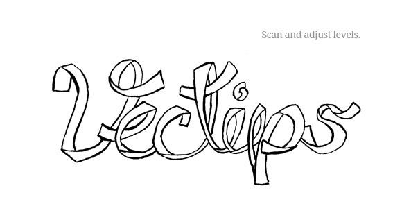
Step 2
Scan your custom artwork and in an image editor, adjust the contrast as much as possible without loosing detail, and save someplace you’ll remember in your computer. The start of your grunge font vector!
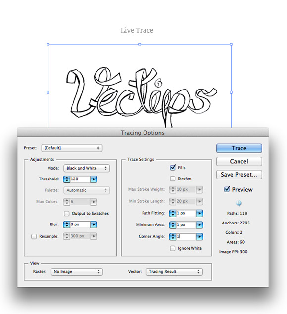
Step 3
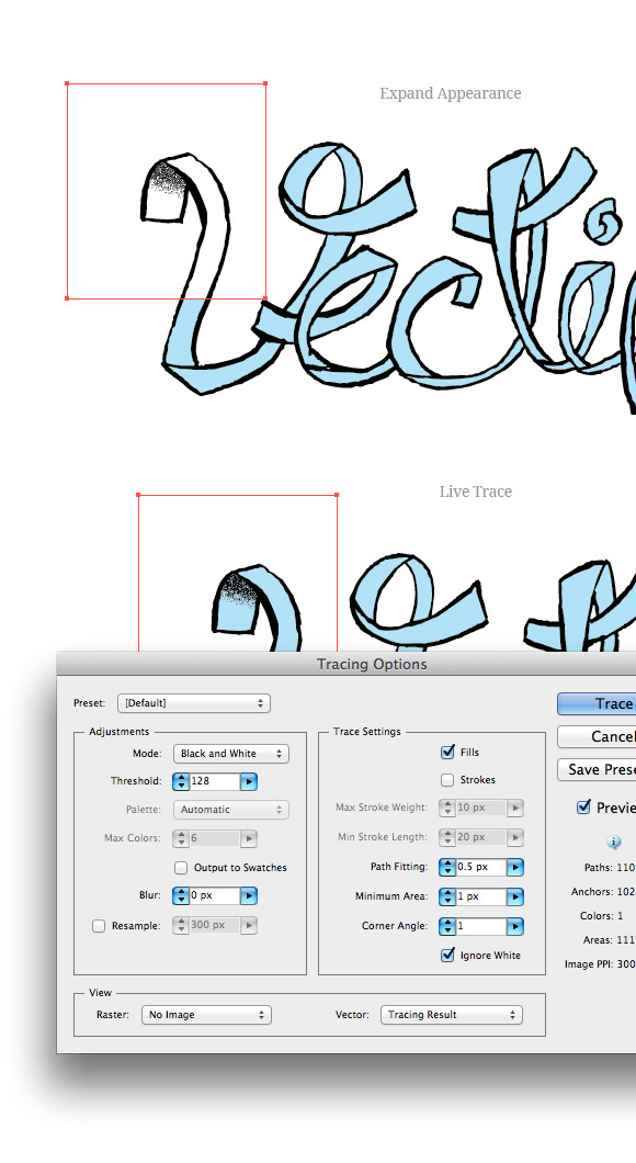
Now we can actually take this grunge font vector into Illustrator! In a new document, place you scanned image, select it, and open Illustrator’s tracing options from the Control panel. I like to keep the trace pretty close to the original so I use the setting below.
- Mode = Black and White
- Threshold = Adjust depending on your scan. I usually keep mine at the default 128.
- Blur = 0
- Fills = Checked
- Strokes = Unchecked
- Path Fitting = 1
- Minimum = 1
- Corner Angle = 1
- Ignore White = Checked
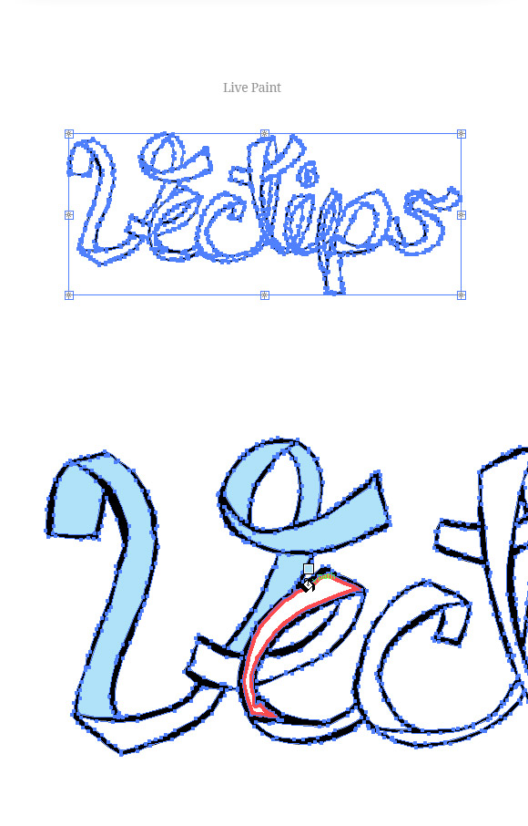
Step 4
Press the Live Paint Button from the Control panel and use the Live Paint Bucket tool (K) to fill the enclosed areas of your grunge font vector with a color. The color doesn’t have to be anything aesthetically pleasing, just something to distinguish from the the other outlines and artboard.
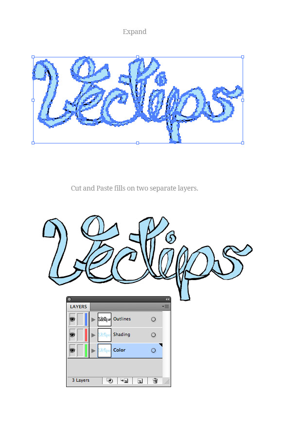
Step 5
Expand the Live Paint Group and Ungroup all the objects. Use the Magic Wand Tool to select just the colored fill object. Cut these shapes and Paste In Front in two separate layers. You should now have a total of three layers in your grunge font vector. Label the first “Outlines”, the second “Shading” and the third “Color”.
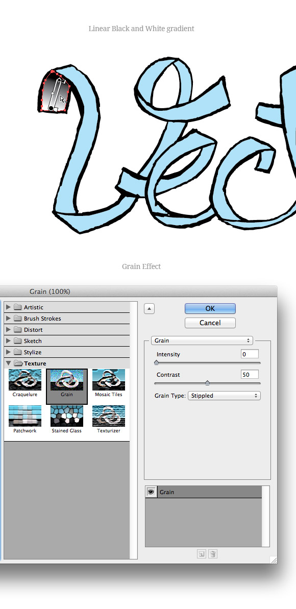
Step 6
On the “Shading” layer, select one of the colored fills, and fill it with a black and white linear gradient. Adjust the gradient so the direction mimics your designated light source. With the gradient selected, choose Effects > Grain. In the Grain dialog, change the Intensity to 0, the Contrast to 50 and the Grain Type to Stippled.
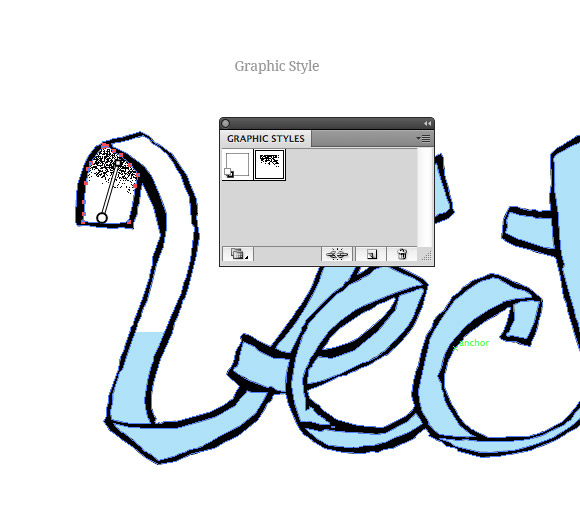
Step 7
You are going to be doing these steps a number of time and to make it go a little more quickly, I suggest saving a Graphic Style with your gradient grain styling. With the new gradient grain object selected, click the New Style Graphic Style button in the Graphic Styles panel.
Step 8
Expand the Appearance of the gradient grain and trace the expanded image using the same Live Trace settings as before expect change the Path Fitting to .5 px. Expand it and you are done with the first one!
Step 9
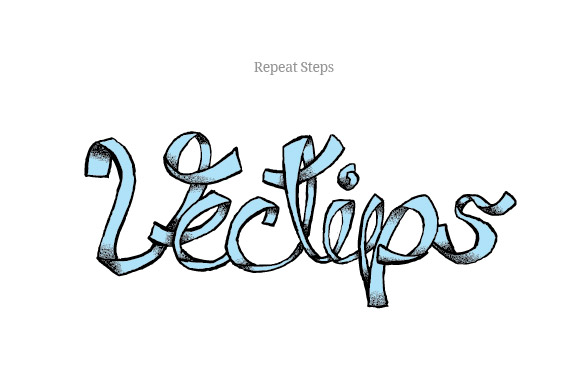
Apply your graphic style to the next shape in your grunge font vector, adjust the gradient, expand, and trace. Repeat these steps until you have completed all the shapes. Look at that awesome grunge font vector! So unique.
Step 10
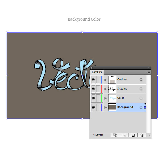
In another layered called “Background”, create a rectangle and fill with your desired color.
Step 11
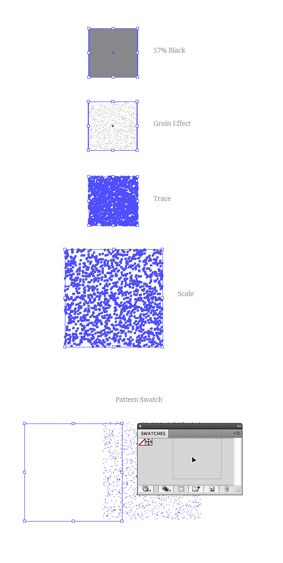
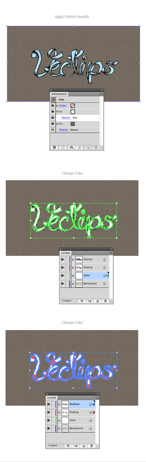
Create a 50×50 px rectangle and fill it with a 57% black. Apply the same Grain effect as before, expand the effect, and trace it with the same setting as the previous grain trace. Expand the trace and scale the texture to 100x100px. Change the fill to White and drag the texture into the swatches panel. This will create a nice seamless texture swatch. The tiling is not perfect, but it is good enough for this project.
Step 12
Select the background color, apply the new pattern swatch to a new fill layer in the Appearance panel, and change the opacity to your liking. Change the color of you “Color” layer to White and the “Outlines” and “Shading” To your background color. You’re done with your custom grunge font vector!
Applying the techniques of your grunge font vector
I really suggest you to try these grunge font vector techniques on other projects and not just recreate the tutorial. If you’re like me, you will really learn how to utilize and understand the steps when applying them to something totally different than the final result of the tutorial.


very good.
This is so useful for my work. Thanks a lot!
Really good tutorial!
I just can’t get the grain effect like yours on step 7, especially when intensity is set on 0. When I move up intensity it looks better, but after tracing it’s so nice as yours, dots are loosing. Wondering what’s my mistake?
Thanks
I got a question according to the step 9… How to apply graphic style to the next shape twice in different places?? i’m confused
Thank you, thank you, and thank you x1 million!
Your site definitely has the most useful tutorial and tips ever!!!
cool and easy to understand tutorial. Thanks
cool~
Wow! i was looking for something like this. Awesome!
awesome tutor, but grain is not dot shape, it is become pixel shape
I really enjoy your tutorials! I’m getting back into design work after 10 years off to have children.
(but psst – typo in step two – “losing contast” not “loosing contrast.” Unless, in fact, your contrast is too tight and you want to loosen it. 😉
Really nice text treatment.
Good tutorial. Thank you
Great work nice…
This was SO awesome…THANK YOU!
Very cool – clean, but dirty, good work! Thanks!
It was nice and simple, I will try this on another project /typography I have. Thanks
Wau, nice work. I have to try it too.
Nice, Ryan. Your tutorials on how to create vector textures like you did above are utterly priceless! Seriously, great stuff.