
 In this tutorial we are going to learn how to recreate the illustration style used for Pop Art. This type of illustration is taken from a printing process named “Ben-Day dots“. The difference between the Ben-Day effect vs halftone effect is that for the first, the dots are always of equal size and distribution. To create this effect, we’re going to be using custom patterns and experimenting with different color combinations to achieve a truly pop art effect for our avatar. Lastly we are going to learn how to keep a pop art style consistent in your avatar no matter the image size. Let’s begin! 🙂
- Program: Adobe Illustrator CS5
- Difficulty: Intermediate
- Topics Covered: Shape Tools, Custom Swatches, Pattern Fills, Pattern Coloration, Pathfinder Tools, Brushes.
- Estimated Completion Time: 1 hour.
Tutorial Details
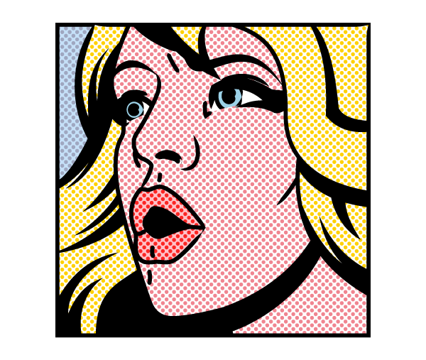
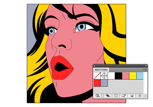
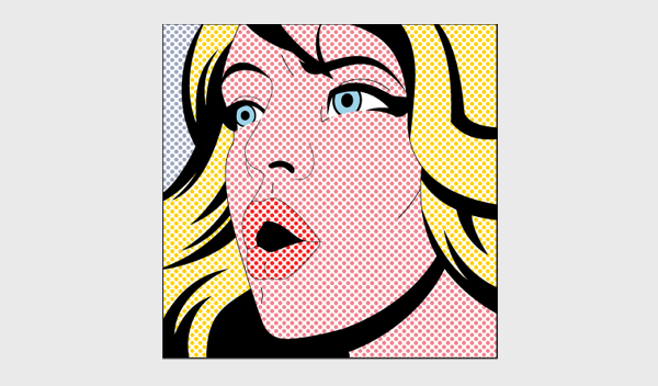
Final Image
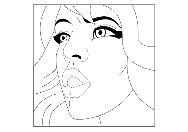
Step 1
We start from a line drawing of the face in close up. This line drawing could be with simple strokes, nothing too complicated.
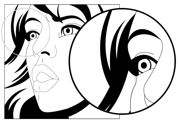
 Next we’ll create the shadows with objects filled with solid black. Use the Pen Tool (P) to draw the objects and try to give volume and movement to the illustration. Take a special look at how we drew the hair strokes and the shadow under the chin.
Step 2
Choose the colors you’d like to use in your illustrations. I chose the typical colors used in pop art illustrations to make a more obvious effect, but you can choose the colors that better represent your photo (if you made the drawing from a photo) or illustration.
Tip: Illustrator comes built in with a Pop Art swatches palette. To see it, go to your Swatches Panel (Window > Swatches) and click on the icon located in top right corner. In the menu choose Open Swatch Library > Art History > Pop Art.
Step 3
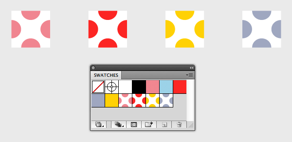
Next we’ll create the swatches for the dots background of the objects.
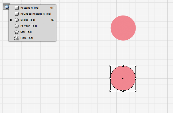
We need the grid guideline to make the dots swatch for every color. Reveal the grid by going to View > Show Grid. Make sure you have “Snap to Grid” enable. Go to View > Snap Grid to check if it’s enable. If it has a check mark next to it, it’s enable. If it doesn’t, click to enable.
Draw two circles with the Ellipse Tool (L). Hold the Shift key while drawing the ellipse to constrain the proportions and create the circle. The space between the circles would determine the predominant color in the swatch. The closer the circles are, the more predominant the circle’s color would be against the background color. Also, the more space the dots have, the more noticeable they would be to the human eye. In this tutorial I’d like them to be pretty noticebale.
Step 4
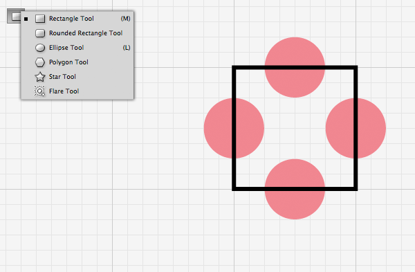
Now duplicate the two circles and rotate them 90 degrees using the Rotate Tool (R). Click and hold the Shift key to rotate in increments of 45 degrees. Next draw a square with the Rectangle Tool (M) where each side goes through the circles’ center point.
Step 5
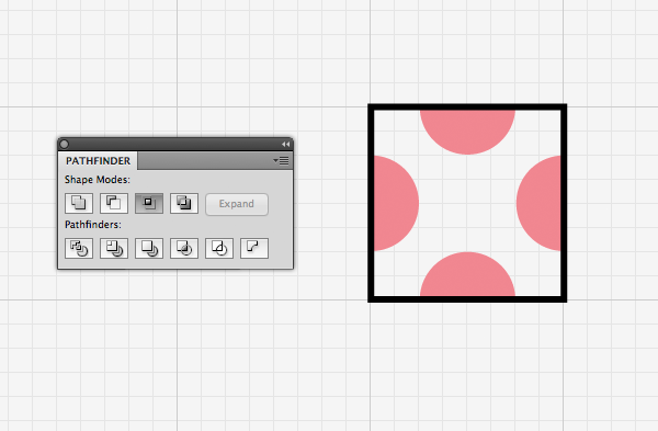
Now duplicate the square four times and intersect each instance with each circle using the Intersect Tool in the Pathfinder Panel. If you can’t see the Pathfinder Panel, you can go to Window > Pathfinder to reveal it. To finish the swatch, select the one square you have left and send it to the back by going to Object > Arrange > Send to Back.
Step 6
Duplicate four times each set of square + dots, one for each colors that our illustration has. Now fill each set of circles with the colors of our illustration. Finally, fill the square with white. Now we are ready to create the swatches from this elements! Select the first square with the circles inside and go to Edit > Define Pattern. Name your swatch if you’d like, and click OK to create the swatch. Repeat the process for the other colors. You’ll see the new swatches available in the Swatches Panel.
Step 7
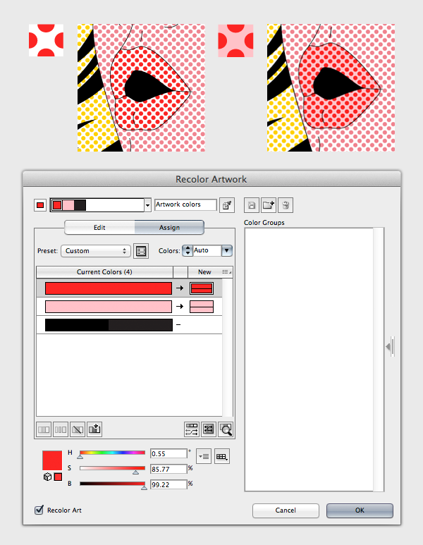
Replace the colors of the objects in our illustration with the new swatches. Select each object and click on the corresponding swatch in the Swatch Panel.
If you are unhappy with the way any of the swatches look as patterns in your illustration, you can play with the background color to create other tones. For example, I wanted to give a fuller effect to the lips. To achieve it, I changed the background color from white to pink. You can edit the swatches color by selecting it and going to Edit > Edit Color > Recolor Artwork. Locate the “Current” and “New” columns in this window and click on the color box under the New column to change the color. In this case I changed the white color to pink. Click OK to apply changes.
Step 8
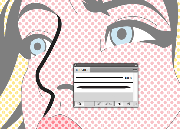
Now we are going to take care of the strokes used to give expression to the face. This are single strokes with no fill. There are some for the nose profile, cheeks, forehead, etc. Open the brushes panel (Window > Brushes) and click on the top right icon to reveal its menu. Select Open Brush Library > Artistic > Artistic_Ink.
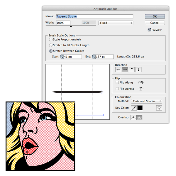
A new panel will appear. Now select one of the strokes and click on the bottom brush named “Tapered Stroke” in the panel we just opened. Do the same with the rest of the strokes. I applied the brush to all of my elements in the illustration to have the edges between them perfectly aligned.
Step 9
If the brush for the expression lines are too wide or too thin (depends on the size of your illustration), you can adjust the brush width. Go to the brush panel where you’ll find the brush you use for the expression lines. When you select a brush in any of the brush library panels, it’s added automatically to the main Brush Panel. Double click on the brush and in the Width slider, move the arrow to the left to make the stroke thinner or to the right to make them wider. Click OK when you’re finished.
Step 10
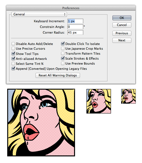
We are almost done. Since we are creating this effect for an avatar, you might want to make the dots smaller or bigger after seeing how it looks as a small icon. You can keep the width of the dots even if you change the illustration size. To do this open the preferences window (Illustrator > Preferences > General) and uncheck the “Transform Pattern Tiles”. Leave the “Scale strokes & Effects” checked to scale the expression lines.
Now you can have your avatar in several sizes without loosing the Pop Art effect.


Very informative article. Thanks Again. Will read on…
This is a great blog.
this was very helpful
I went through multiple tuts on working with the Color Halftone Effect. Nothing really worked the way I felt I wanted it. Your method works well and reminds me of how printers would create multiple halftones on a four-color press. I’m now experimenting laying down other colored halftones (without a white background) on top of the first halftone I laid down. So far, I’ve been able to create nice variations of skin-tones using the 64-color palette from the Golden Age comics. Thank you for a wonderful tutorial.
terrific tutorial I so appreciate the time you spent in providing a superior tutorial for us…
As a fan of Lichtenstein, I’ve gotta say, nice tutorial!