

In this tutorial you’ll learn how to take a “plain Jane” font and transform it into folded ribbons to create a stunning ribbon font text effect, perfect for your upscale designs. Combining use of the Shape Builder Tool and Appearance panel, you’ll have this project tied up in no time.
Tutorial Details
- Program: Adobe Illustrator CS5-CC
- Difficulty: Intermediate
- Topics Covered: Shape Builder Tool, Appearance panel, Path Offset
- Estimated Completion Time: 40 minutes
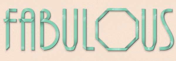
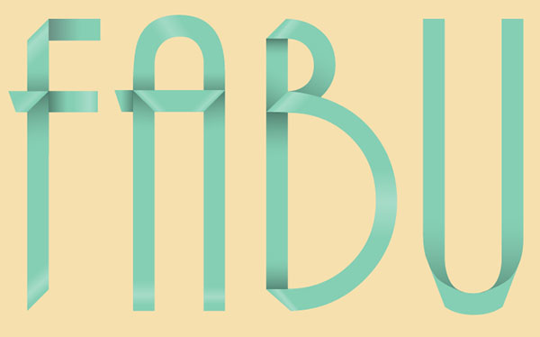
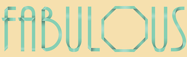
Final Image
Step 1
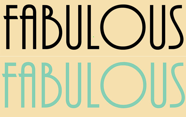
Create the background using a rectangle drawn over the artboard with the Rectangle Tool (M). Then, create the main text. I’ve chosen AR Bonnie, an Art Deco inspired font, since it lends itself wonderfully to the look of cut and folded ribbons or paper. Use the Text Tool (T) in order to write out your word–in this case, it’s “Fabulous”. Select your text and convert it to outlines by going to Type > Create Outlines. Alternatively, you can also Right-Click and select Create Outlines in order to do so as well. Chose a light pastel color (I’ve chosen mint) for your text group’s fill color.
Step 2
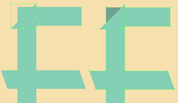
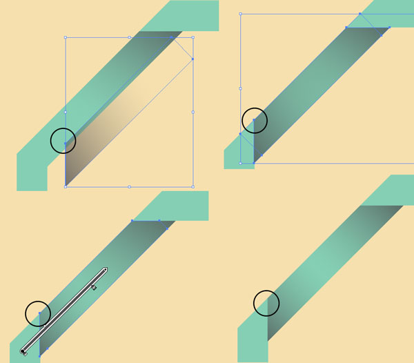
Ungroup (Object > Ungroup) your letters so you can easily work on each one in turn. For the “F” in “Fabulous”, let’s angle the top left corner so it’ll look like you’ve folded one strip of paper for the letter. Use the Pen Tool (P) to draw a triangle that cuts across the top corner of the “F” (see below). Select both the triangle and the “F” and, using the Shape Builder Tool (Shift – M) to select the leftmost portion of the “F” (see below). Deselect and Delete the triangle and the top left of the “F”.
Step 3
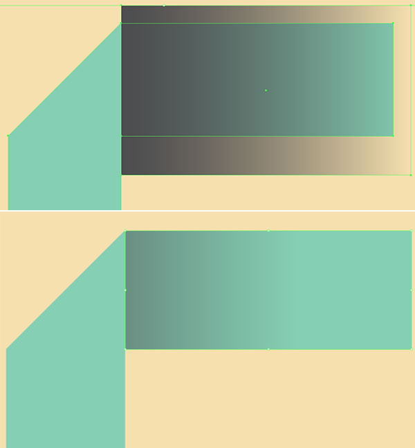
You’ll use two gradients for the entirety of this tutorial. The first is seen below in the Gradient panel. It is a Linear Gradient that goes from dark gray at 100% to 0% Opacity. Adjust the angle as needed (we’ll go over this in the steps that follow) with the Gradient Tool (G).
Step 4
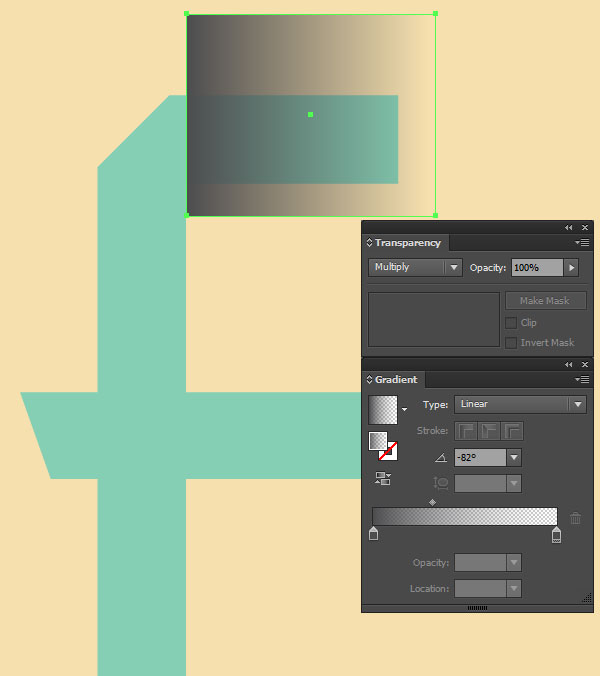
Use the Rectangle Tool to draw a rectangle that overlaps the top portion of the “F” and stops at its corner. Apply the gradient from Step 3 using the Gradient panel and make sure the darker color is on the left side. In this case, the gradient’s Angle is -82°. In the Transparency panel, set the Blend Mode to Multiply. Select both the gradient rectangle and the “F” and, once again using the Shape Builder Tool, select the non-intersecting portions of the rectangle, Deselect, and Delete the extraneous shapes. Reduce the Opacity of the shape in the Transparency panel to 70% or so.
Step 5
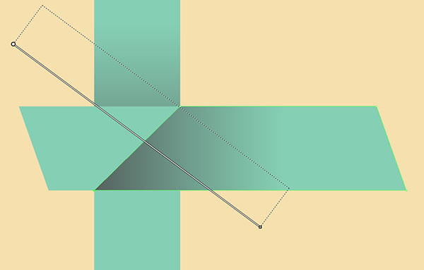
Let’s focus on the cross of the “F”. There are two gradient shapes pictured below: one right above the crossing mark and one that angles itself in the center of it. I drew the first with the Rectangle Tool and the second was Copied (Control – C) and Pasted (Control – V) from the top of the “F”. See the next step for all three gradients shown together.
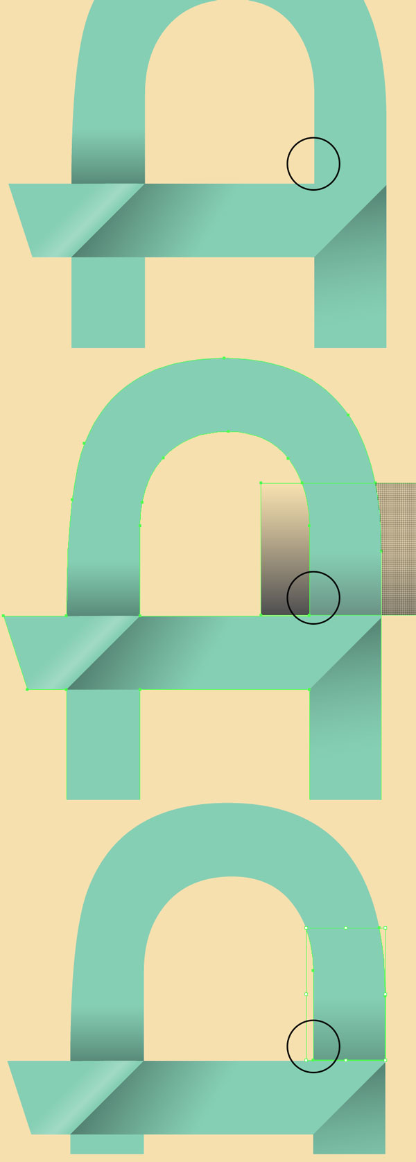
Step 6
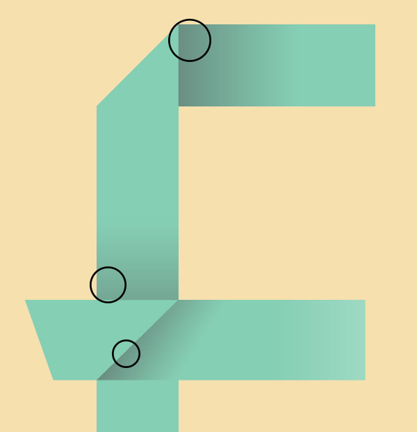
Let’s take a moment to check out the gradient shapes you’ve made so far in order to define the ribbons overtaking your text. Note the three circles seen below. The top one shows the first fold, the middle one shows the second, and the bottom one shows the third. It also shows how the top of the letter is folded above the lower half of the letter. It may help you to envision where to place shadows by taking a strip of paper and folding it into the letter you’re working on (this is exactly how I worked on the “F”).
Step 7
For the next letter, the “A”, your goal is to figure out which portions of the letter are folded under or over the next. Will the top of the “A” fold into the cross, or will the left side be set over it? You can draw shapes with the Pen Tool, delete extraneous portions of them with the Shape Builder Tool, and apply Gradients to your shapes as was done in the previous steps to the “F”. The shiny gradient seen below, is the same gray gradient used before, but its Blend Mode has been set to Screen in the Transparency panel.
Step 8
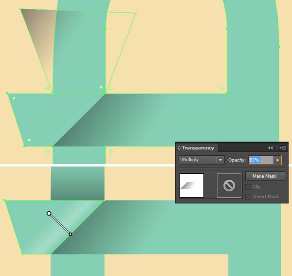
Note the over abundance of gradient shapes below. The basic step progression for adding gradients is outlined below: identify the cross-section of ribbon pieces, draw a gradient shape, and delete it from the letter.
Step 9
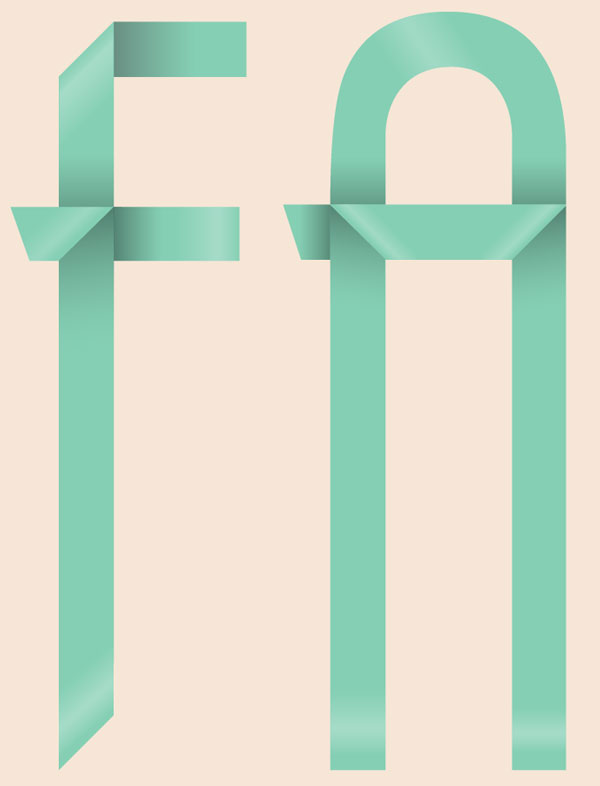
Let’s check out the number of gradient shapes on each letter below. The “F” has four shadow gradient shapes and four shiny highlight gradient shapes. The “A” has five gradient shadow shapes and five shiny highlight gradient shapes. We have six more letters to render, so let’s continue.
Step 10
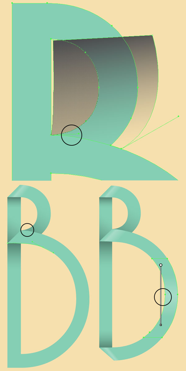
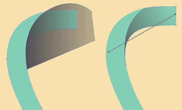
The gradient shadow shapes on the “B” help accentuate the curves of the letter. The first of the five seen below has dark gray concentrated on the right side of the first bump of the “B”. Trace the contour of the top of the second bump of the “B” with the Pen Tool in order to get the correct curve for that first shadow shape. Note (second circle below) how the letter is made of one piece of ribbon (or paper) and folds around the curves of the “B”. Also note (third circle below) how the highlight shapes appear after “folds” and highlight the curves. Adjust gradient angle by dragging the Gradient Tool across your highlight shape. The corners of the “B” were also angled in the same fashion as the “F” from Step 2.
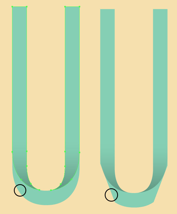
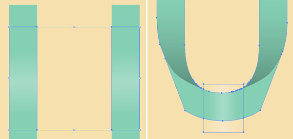
Step 11
For the “U”, Copy and Paste the letter twice. With both copied letters selected, hit Horizontal Align Left in the Align panel. Deselect the bottom “U” and Move the top “U” upwards so the curve of the top “U” lines up with the center of the curve of the bottom “U” (see below). Select both “U’s” and hit Intersect in the Pathfinder panel.
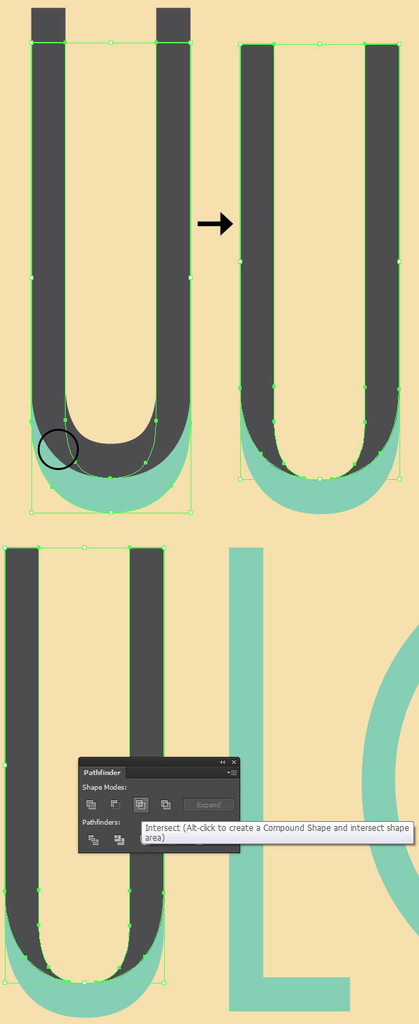
Step 12
Apply the shadow gradient used previously to the compound shape you created in Step 11. Angle the darker color at the bottom and reduce the Opacity to 60%. Cut into the “U”-shape as you did in Step 2, but be mindful of the width as the shape curves around the bottom.
Once again, just a check-up on the letters we’ve rendered so far.
Step 13
Make sure to add highlight shapes to the “U”. Since the letter “U” appears twice in this word, Copy and Paste its components over to the second “U” so you don’t have to repeat the process.
For the “L”, it’s pretty much the same process as the “F”, being all angles and no curves, so I’m skipping the “L” in this tutorial.
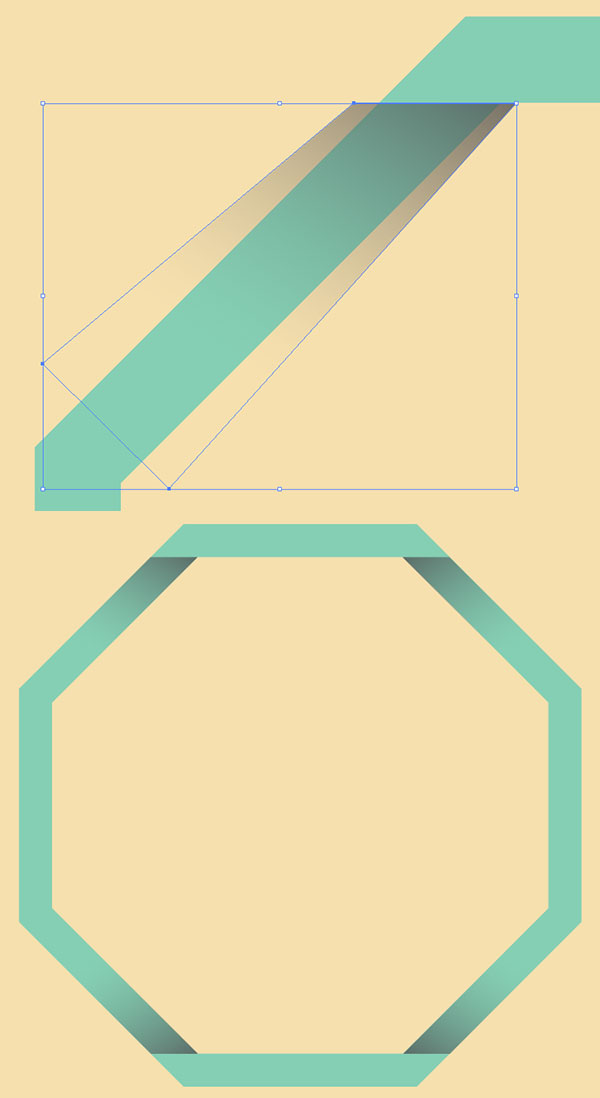
Step 14
Moving onto the next letter, delete the letter “O”. Use the Polygon Tool to draw a hexagon (8-sided) shape in its place. Select the hexagon and go to Object > Path > Offset Path…. For the Offset, type in -12px and hit OK. Select both hexagons and hit Minus Front in the Pathfinder panel.
Step 15
The shadow gradients on our newly-created “O” shape help define every other side as being layered over the top of the next one. Start with the topmost side and draw an angled shape with the Pen Tool that defines the top layer of the ribbon. Below you’ll see four gradient shapes. Once you delete extraneous portions of the first gradient shape with the Shape Builder Tool, you can Copy, Paste, and Reflect the shadow gradient to complete the other components seen below.
Step 16
Once you have the first four shadow gradients placed, Copy and Paste them again for the next four so every other side has two shadow gradients (see below). Make sure there’s highlight gradient shapes (as done on the other letters) on the other four sides of the hexagon.
Step 17
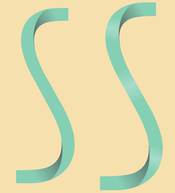
We’ve already created the “U”, so for the second instance of this letter, create a duplicate by hitting Copy and Paste (Cmd + C, Cmd + V) using the keyboard shortcuts. For the “S”, use the Pen Tool to draw a shape (see below) that begins at the top curve of the “S” and covers the top end.
Step 18
Repeat Step 17 for the bottom of the “S” and draw highlight gradient shapes with the Pen Tool on the top, middle, and bottom portions of the “S”.
Step 19
Group together your letters and their components. At this point we’re ready to create some sparkles, add shadows, and add a texture to the background.
Step 20
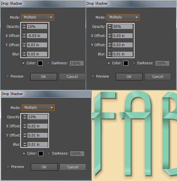
Select your text and add three separate instances of Drop Shadows in the Appearance panel (you’ll find it under Stylize in Illustrator Effects). The details for each are as follows with:
- Mode: Multiply, Opacity: 10%, X Offset: -0.03 in, Y Offset: 0.03 in, Blur: 0.03 in, Color: Black
- Mode: Multiply, Opacity: 50%, X Offset: 0.03 in, Y Offset: 0.03 in, Blur: 0.01 in, Color: Black
- Mode: Multiply, Opacity: 10%, X Offset: 0.02 in, Y Offset: 0.01 in, Blur: 0.01 in, Color: Black
Step 21
Copy and Paste the background rectangle drawn in Step 1 and apply a Halftone Pattern to it in the Appearance panel under Effect > Photoshop Effects > Sketch > Halftone Pattern. As seen below, set the Size to 2, Contrast to 5, and Pattern to Circle.

Step 22
Use the Ellipse Tool (L) to draw small white circle of various sizes all over your text. Select all of them, Group together, and apply the following effect: Effect > Distort & Transform > Pucker & Bloat set at -91%. Expand your sparkles under Object.
How Fabulous, You’re Finished!
Well done you! Your ribbon text effect is complete. Push it further by connecting the letters in order to make it seem as though the text is from a singular ribbon on a spool, or play with other textures on both the background and the text in order to give it that DIY-feel.
Author: Mary Winkler
Mary works under the brand Acrylicana® designing apparel, jewelry, and illustrating for companies like Disney, Jakks Pacific, Envato, and more. Check out Acrylicana.com for more artwork, tutorials, and more.


Thanks very much i love your talent