
Welcome back to another Illustrator based tutorial, in which we’re going to take a close look behind the process of creating a Halloween themed chopped finger icon using nothing more than a couple of basic geometric shapes and tools.
So, assuming you already have the software up and running, let’s jump straight into it!
Tutorial Details: Chopped Finger Icon
- Program: Adobe Illustrator CS6 – CC 2019
- Difficulty: Beginner
- Topics Covered: Design Theory, Compositional Construction, Shape Alignment, Grid Positioning
- Estimated Completion Time: 25 Minutes
Final Image: Chopped Finger Icon

Step 1
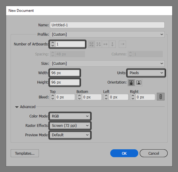
As we do with all of our projects, we’re going to kick things off by setting up a New Document, by heading over to File > New (or by using the Control-N keyboard shortcut), which we will then adjust as follows:
- Number of Artboards: 1
- Width: 96 px
- Height: 96 px
- Units: Pixels
And from the Advanced tab:
- Color Mode: RGB
- Raster Effects: Screen (72ppi)
- Preview Mode: Default
Quick tip: most of the indicated settings can be automatically triggered if you set the document’s Profile to Web, the only one that you’ll have to manually adjust being the Artboard’s Size (Width x Height).
Step 2
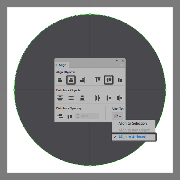
Once we’ve set up our project file, we can start working on the actual chopped finger icon by creating its background using an 88 x 88 px circle, which we will color using #48484c and then position to the center of the underlying Artboard using the Align panel’s Horizontal and Vertical Align Center options.
Step 3
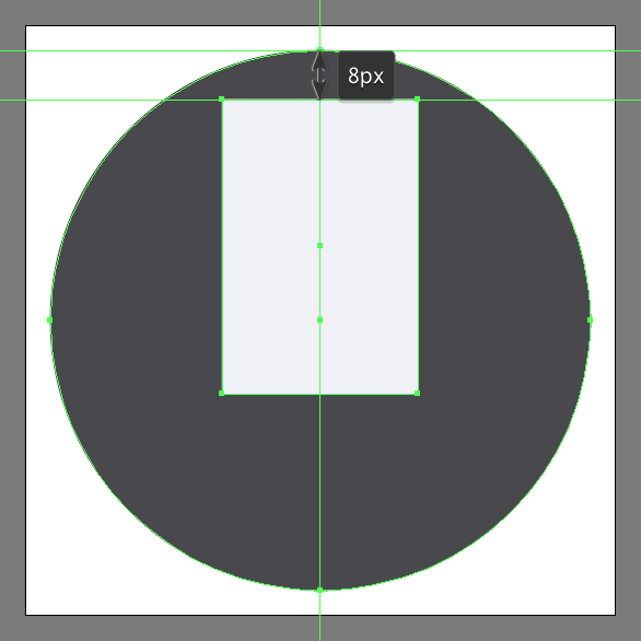
Add the main shape for the chopped finger icon using a 32 x 48 px rectangle, which we will color using #f0f0f7 and then position at a distance of 8 px from the larger circle’s top anchor point.
Step 4
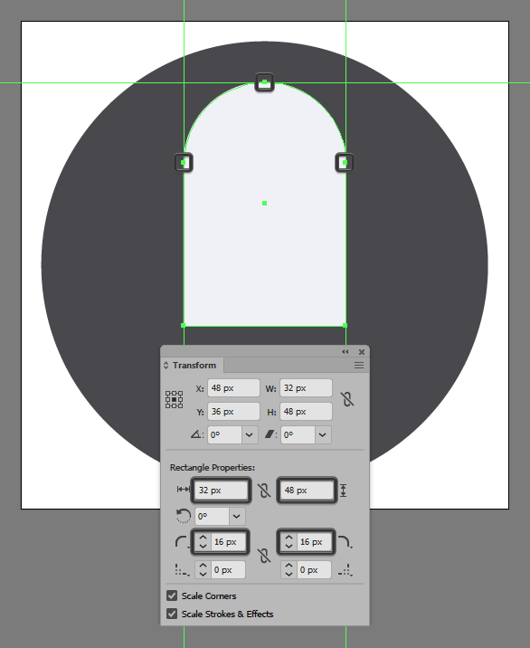
Adjust the shape that we’ve just created, by opening up the Transform panel, and then setting the Radius of its top corners to 16 px from within the Rectangle Properties.
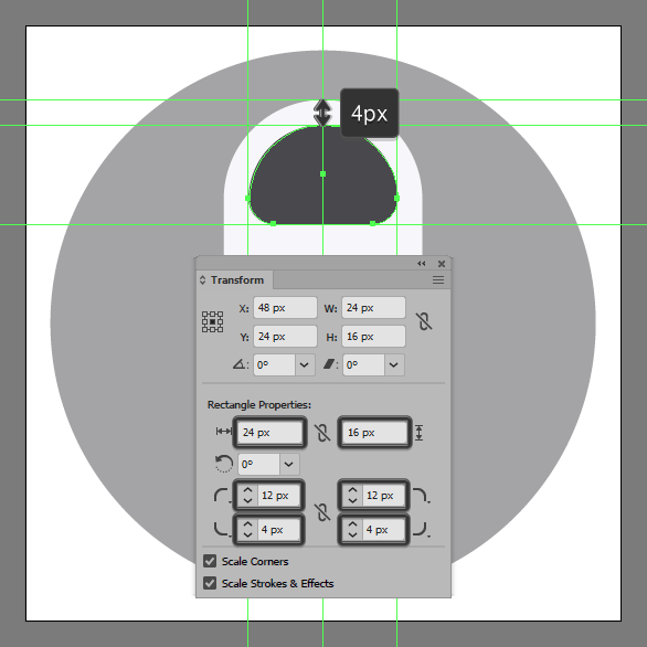
Step 5
Create the nail using a 24 x 16 px rectangle (#48484c), which we will adjust by opening up the Transform panel and then setting the Radius of its top corners to 12 px and its bottom ones to 4 px, making sure to position the resulting shape as seen in the reference image.
Step 6
Add the little highlight using a 4 x 4 px circle, which we will color using #f0f0f7 and then position onto the nail’s upper-right surface.
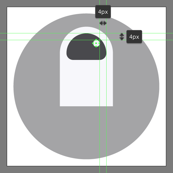
Step 7
Create the next detail using a 16 x 4 px ellipse, which we will color using #bababf and then position below the nail, at a distance of just 4 px.
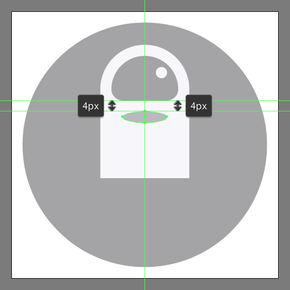
Step 8
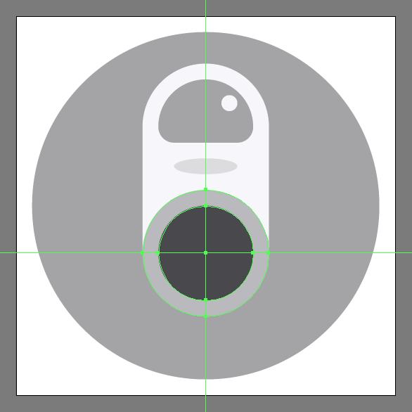
Add the main shape for the cut using a 32 x 32 px circle, which we will color using #bababf and then position as seen in the reference image.
Step 9
Create the inner section of the cut using a smaller 24 x 24 px circle, which we will color using #48484c and then position to the center of the previous shape.
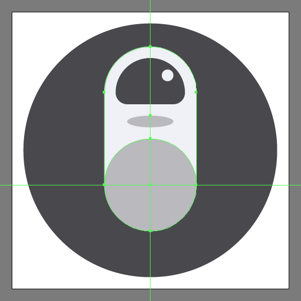
Step 10
Add the main shape for the visible section of the bone using a 16 x 22 px rectangle (#bababf), which we will adjust by setting the Radius of its top corners to 8 px, positioning the resulting shape as seen in the reference image.
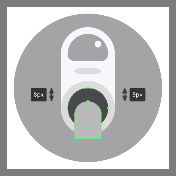
Step 11
Create a smaller 16 x 18 px rectangle (#f0f0f7), which we will adjust by setting the Radius of its top corners to 8 px, making sure to align the resulting shape to the previous one’s bottom edge.
Step 12
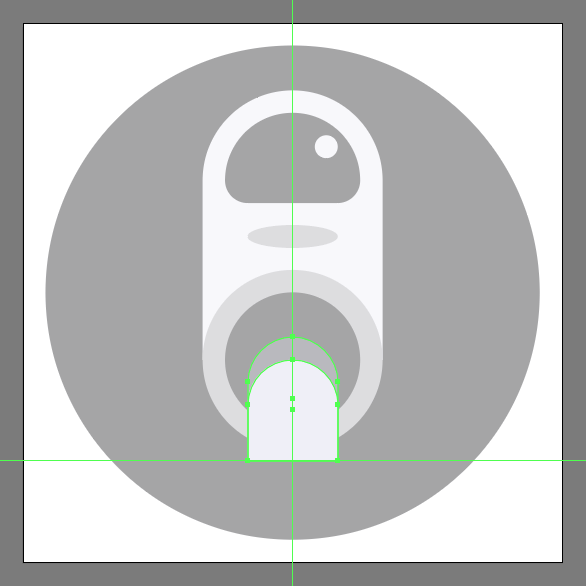
Finish off the chopped finger icon and with it the project itself, by adding two 12 x 12 px circles (#f0f0f7) to the bottom of the bone segment as seen in the reference image. Take your time, and once you’re done, make sure you select and group all of the finger’s composing shapes using the Control-G keyboard shortcut, doing the same for the entire chopped finger icon afterwards.
![]()
Awesome Job!
As always, I hope you had fun working on the project and most importantly managed to learn something new and useful during the process.
That being said, if you have any questions feel free to post them within the comments section and I’ll get back to you as soon as I can!

Author: Andrei Ștefan
Just another coffee addict / pixel grinder, creating colorful projects one pixel at a time.


