Today w e’re going to get our geek on, and learn how to create a simple retro-looking coding icon, using nothing more than the usual geometric shapes and tools that you probably already work with on a daily basis.
That being said, grab that coffee mug and let’s jump into it!
Tutorial Details: Coding Icon
- Program: Adobe Illustrator CS6 – CC 2016
- Difficulty: Beginner
- Topics Covered: Design Theory, Compositional Construction, Shape Alignment, Grid Positioning
- Estimated Completion Time: 30 Minutes
Final Image: Coding Icon

Step 1
As usual, we’re going to kick off the project by setting up a New Document by going over to File > New (or by using the Control-N keyboard shortcut) which we will adjust using the following values:
- Number of Artboards: 1
- Width: 128 px
- Height: 128 px
- Units: Pixels
And from the Advanced tab:
- Color Mode: RGB
- Raster Effects: Screen (72ppi)
- Preview Mode: Default
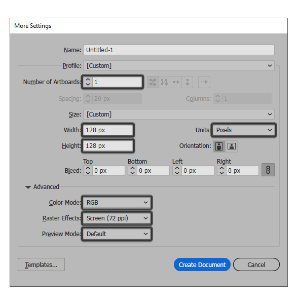
Quick tip: most of the indicated settings can be automatically triggered if you set the document’s Profile to Web, the only one that you’ll have to manually adjust being the Artboards Size (Width x Height).
Step 2
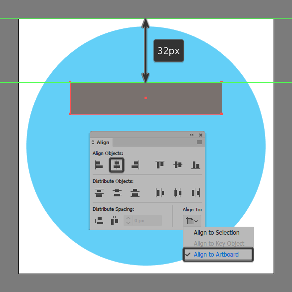
Once we’ve finished setting up our project file, we can start working on the actual icon, by creating its background using a 120 x 120 px circle, which we will color using #63D0F7, and then center align to the underlying Artboard using the Align panel’s Horizontal and Vertical Align Center options.
Step 3
Create the window’s upper section, using a 76 x 16 px rectangle, which we will color using #7A726F, and then center align to the Artboard, positioning it at a distance of 32 px from its top edge.
Step 4
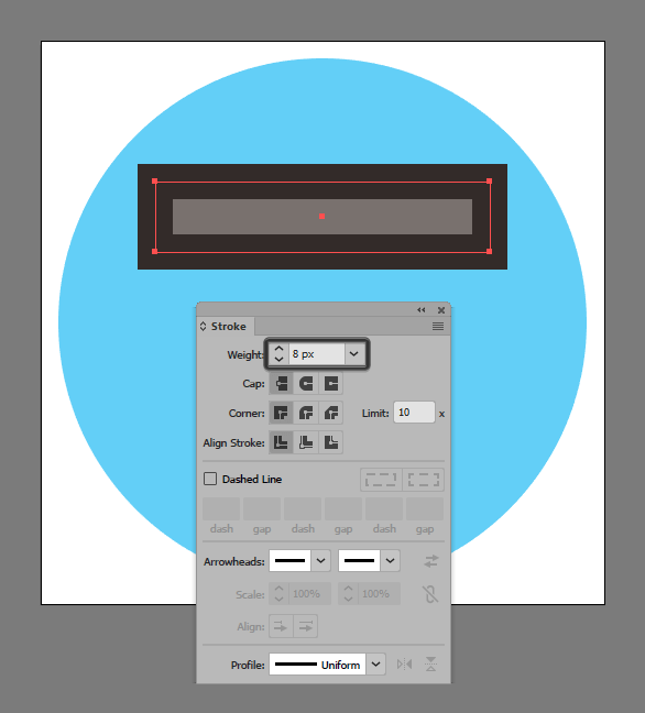
Give the shape an outline using the Stroke method, by first creating a copy of it (Control-C > Control-F) which we will adjust by setting its color to #302724. Then, flip its Fill with its Stroke (Shift-X), making sure to set its Weight to 8 px from within the Stroke panel.
Step 5
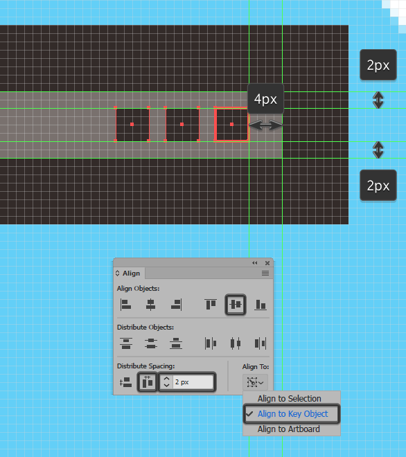
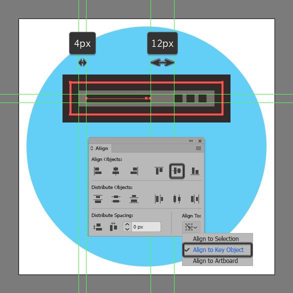
Create the little buttons that you would normally find on a program’s topbar, using three 4 x 4 px squares (#302724), which we will distance at 2 px from one another, grouping (Control-G) and then positioning them onto the right side, at a distance of 4 px from the larger outline.
Quick tip: the easiest way to position any shape with complete precision is to turn on the Pixel Preview mode (Alt-Control-Y) as I did, which will allow you to see the actual underlying pixel structure on which all your shapes are built on.
Step 6
Using the Pen Tool (P), create a 32 px wide 4 px detail line (#302724) which we will center align to the top section’s fill shape, positioning it at a distance of 4 px from the larger outline.
Then, once you’re done, select and group all the shapes (except the background) together using the Control-G keyboard shortcut.
Step 7
Create the main shape for the window’s bottom section using a 76 x 48 px rectangle, which we will color using white (#FFFFFF), and then center align to the shapes that we’ve just grouped.
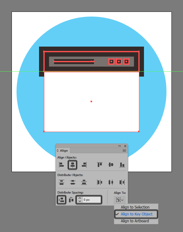
Step 8
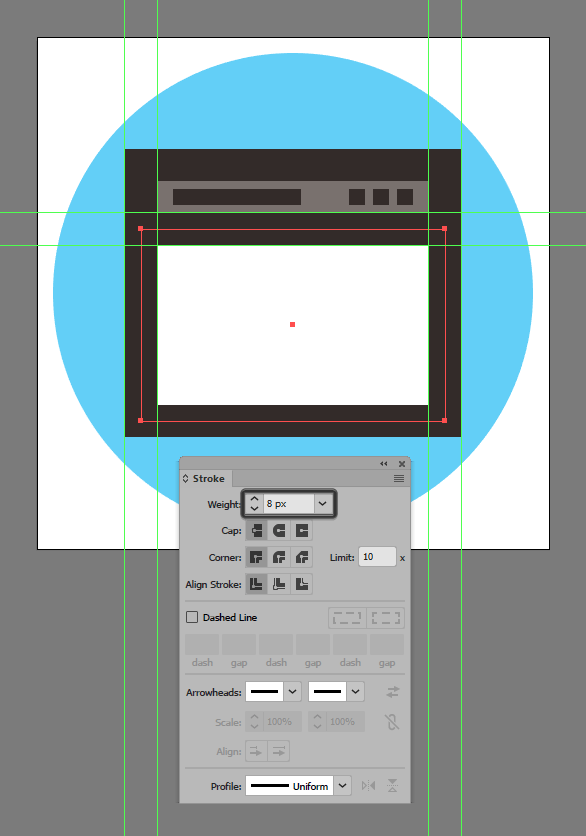
Give the shape that we’ve just created an 8 px thick outline (#302724) using the Stroke method, selecting and grouping (Control-G) the two together afterwards.
Step 9
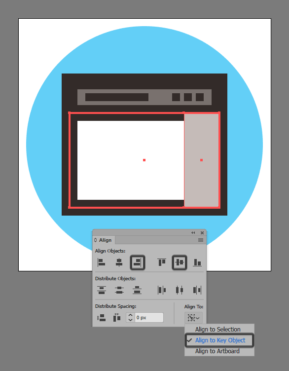
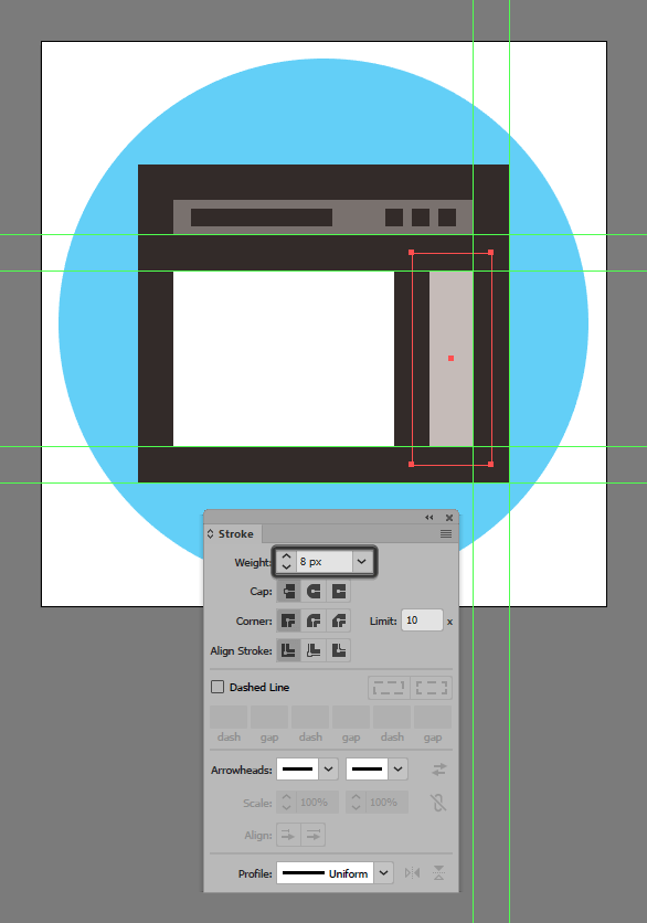
Start working on the window’s side section, by creating an 18 x 48 px rectangle, which we will color using #C6BCB9, and then center align to the right edge of the underlying shapes.
Step 10
Give the shape an 8 px thick outline using the Stroke method, making sure to change its color to #302724.
Step 11
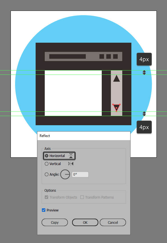
Create the up facing arrow, using a 6 x 6 px square (#302724) which we will adjust by adding a new anchor point to the center of its top edge using the Add Anchor Point Tool (+), removing the side ones afterwards using the Delete Anchor Point Tool (-). Then, once you’re done, position the resulting shape at a distance of 4 px from the larger outline’s top edge.
Step 12
Create the down facing arrow using a copy (Control-C > Control-F) of the one that we’ve just made, which we will horizontally reflect (right click > Transform > Reflect > Horizontal) and then position onto the opposite side of the side section. Once you’re done, select all the section’s composing shapes and group them together using the Control-G keyboard shortcut.
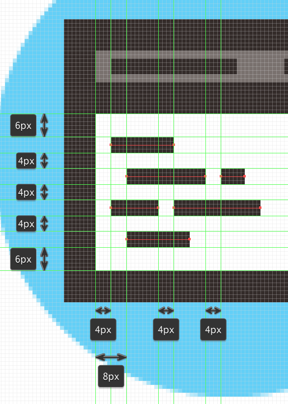
Step 13
For this next step, I’m going to let you get a little creative since you’ll have to draw in the little code lines using a 4 px thick Stroke line (#302724). So, take your time, and once you’re done, select and group (Control-G) all the lines together, doing the same for the entire icon afterwards.
Step 14
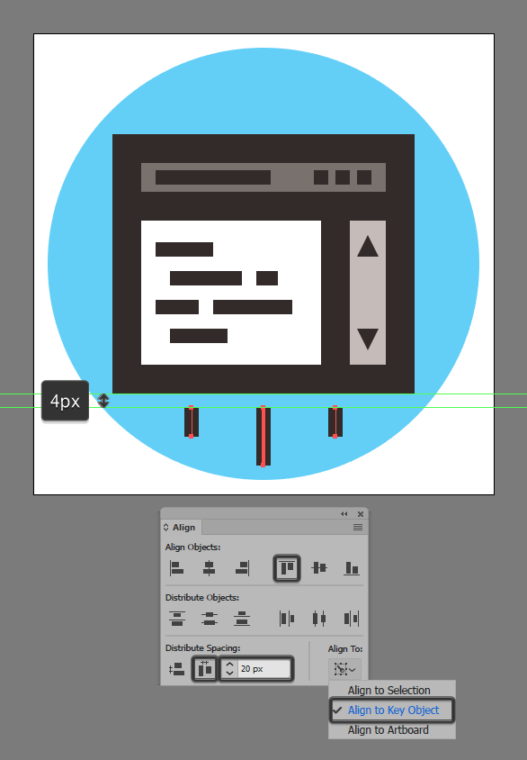
Finish off the icon, by drawing a 16 px tall 4 px thick vertical Stroke line (#302724) and two 8 px tall 4 px thick (#302724) side ones distanced at 20 px from it, which we will group (Control-G) and then center align to the larger window, at a distance of 8 px. Then, once you’re done, select and group (Control-G) all of the icon’s composing shapes as well.
Great Work!
There you have it guys, a clean straightforward tutorial on how to build your very own coding icon, using nothing but a couple of rectangles and some strokes. I hope you’ve managed to follow each and every step and most important learned something new during the process.
Author: Andrei Ștefan
Just another coffee addict / pixel grinder, creating colorful projects one pixel at a time.


