 Welcome back to another Illustrator based tutorial, in which we’re going to learn how to create a little receipt icon, using nothing more than a couple of basic geometric shapes, that we’re going to adjust here and there.
So, assuming you already have the software up and running, let’s jump straight into it!
Tutorial Details: Receipt Icon
- Program: Adobe Illustrator CS6 – CC 2019
- Difficulty: Beginner
- Topics Covered: Design Theory, Compositional Construction, Shape Alignment, Grid Positioning
- Estimated Completion Time: 25 Minutes
Final Image: Receipt Icon

Step 1
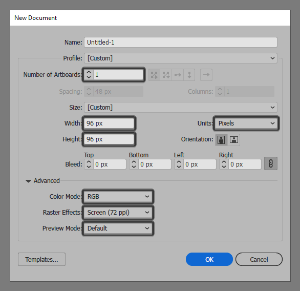
As with every new project, we’re going to kick things off by setting up a New Document, by heading over to File > New (or by using the Control-N keyboard shortcut), which we will then adjust as follows:
- Number of Artboards: 1
- Width: 96 px
- Height: 96 px
- Units: Pixels
And from the Advanced tab:
- Color Mode: RGB
- Raster Effects: Screen (72ppi)
- Preview Mode: Default
Quick tip: most of the indicated settings can be automatically triggered if you set the document’s Profile to Web, the only one that you’ll have to manually adjust being the Artboard’s Size (Width x Height).
Step 2
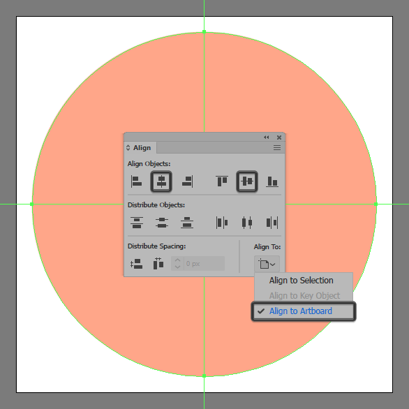
As soon as we’ve finished setting up our project file, we can start working on the actual receipt icon, and we will do so by creating the background using an 88 x 88 px circle, which we will color using #FFA88A and then position to the center of the underlying Artboard using the Align panel’s Horizontal and Vertical Align Center options.
Step 3
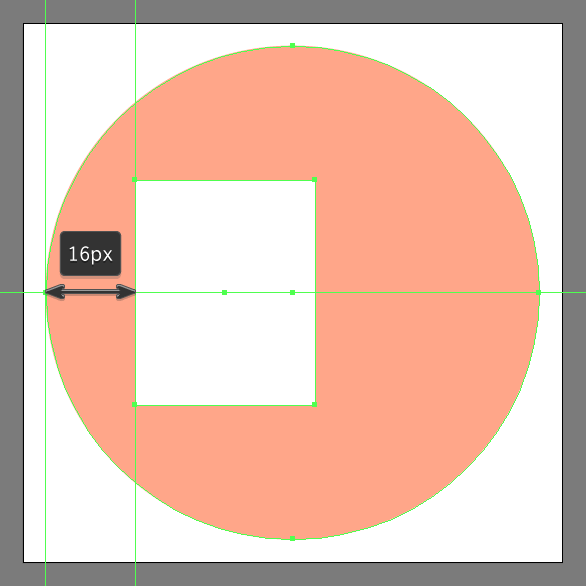
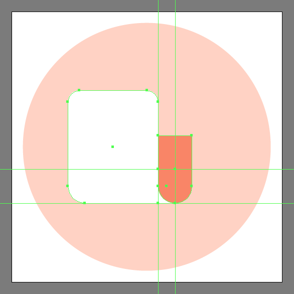
Add the main shape for the receipt icon’s front section using a 32 x 40 px rectangle, which we will color using #FFFFFF, and then position as seen in the reference image.
Step 4
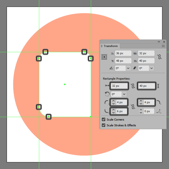
Adjust the shape that we’ve just created, by opening up the Transform panel, and then individually adjusting its corners, by setting the Radius of the top ones to 4 px and its bottom-left one to 6 px.
Step 5
Create the first fold using a smaller 12 x 24 px rectangle (#F98667), which we will adjust by setting the Radius of its bottom corners to 6 px, making sure to position the resulting shape as seen in the reference image.

Step 6
As you can see, as soon as we add the folded section, we’re left with a small gap between it and the receipt icon’s main body, which we’re going to fill in using a 6 x 12 px rectangle (#FFFFFF) making sure to position it underneath the two (right click > Arrange > Send Backward).
Step 7
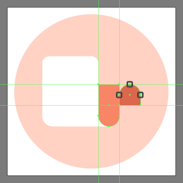
Add the second fold using a smaller 12 x 12 px square (#DD674B), which we will adjust by setting the Radius of its upper corners to 6 px, making sure to position the resulting shape as seen in the reference image.
Step 8
As we did with the previous fold, fill in the little gap using a 6 x 12 px rectangle (#F98667), by positioning it between the two shapes.

Step 9
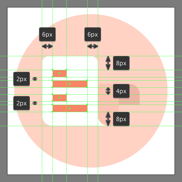
Add in the little text lines using two stacks of an 8 x 4 px rectangle (#F98667) followed by another wider 20 x 4 px one (#F98667), which we will position as seen in the reference image. Take your time, and once you’re done, make sure you select and group all four shapes together using the Control-G keyboard shortcut. You can then do the same for the entire receipt icon since we’re pretty much done working on it.
Step 10
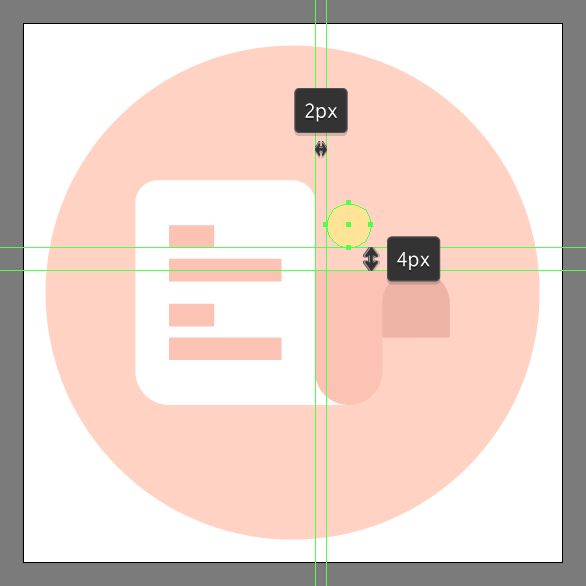
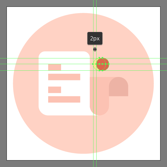
Create the front section for the first coin using an 8 x 8 px circle, which we will color using #FFE497 and then position above the first fold, at a distance of just 4 px.
Step 11
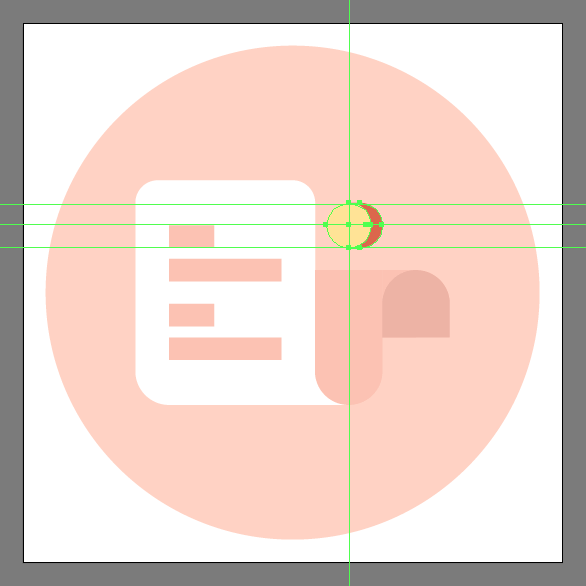
Add the coin’s side section using a copy (Control-C > Control-F) of the previous shape, which we will adjust by first changing its color to #DD674B, and then push to the right side by a distance of 2 px using the directional arrow keys.
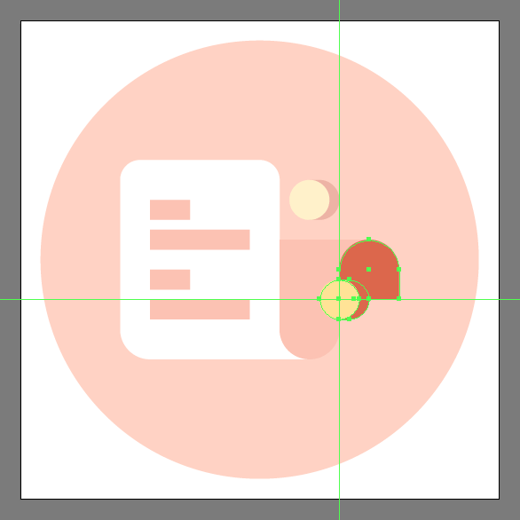
Step 12
Continue adjusting the shape by selecting its left anchor point using the Direct Selection Tool (A), and then immediately removing it by pressing Delete. Close the resulting path using the Pen Tool (P), making sure to extend it towards the center of the coin’s front section. Once you’re done, position the resulting shape underneath, (right click > Arrange > Send Backward) making sure to select and group the two together using the Control-G keyboard shortcut.
Step 13
Add the second coin using a copy (Control-C > Control-F) of the one that we’ve just finished working on, which we will position onto the receipt’s second fold, as seen in the reference image.
Step 14
Finish off the receipt icon, and with it the project itself by adding the little shadow using a 32 x 4 px ellipse, which we will color using #DD674B, and then position at a distance of 4 px from the receipt’s bottom edge. Once you’re done, don’t forget to select and group (Control-G) all of the icon’s composing shapes before finally hitting that save button.
![]()
Great Job!
As always, I hope you had fun working on the project and most importantly managed to learn something new and useful during the process.
That being said, if you have any questions feel free to post them within the comments section and I’ll get back to you as soon as I can!

Author: Andrei Ștefan
Just another coffee addict / pixel grinder, creating colorful projects one pixel at a time.


This unique blog is really cool and also diverting. I have found helluva useful advices out of this amazing blog. I ad love to visit it every once in a while. Cheers!
Hello Andrei,
this is a Professional and creative design, thanks for sharing your creative technique with us.