In t oday’s tutorial, we’re going to learn how to create a little iPhone icon using nothing more than a couple of basic shapes and tools.
So, assuming you already have Illustrator up and running, let’s jump straight into it!
Tutorial Details: iPhone Icon
Program: Adobe Illustrator CS6 – CC 2019
Difficulty: Beginner
Topics Covered: Design Theory, Compositional Construction, Shape Alignment, Grid Positioning
Estimated Completion Time: 25 Minutes
Final Image: iPhone Icon

Step 1
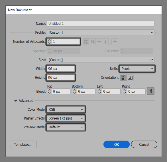
As we do with every new projects, we’re going to kick things off by setting up a New Document, by heading over to File > New (or by using the Control-N keyboard shortcut), which we will then adjust as follows:
- Number of Artboards: 1
- Width: 96 px
- Height: 96 px
- Units: Pixels
And from the Advanced tab:
- Color Mode: RGB
- Raster Effects: Screen (72ppi)
- Preview Mode: Default
Quick tip: most of the indicated settings can be automatically triggered if you set the document’s Profile to Web, the only one that you’ll have to manually adjust being the Artboard’s Size (Width x Height).
Step 2
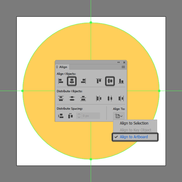
Once we’ve set up our project file, we can start working on the actual icon by creating its background using an 88 x 88 px circle, which we will color using #FFD05A and then position to the center of the underlying Artboard using the Align panel’s Horizontal and Vertical Align Center options.
Step 3
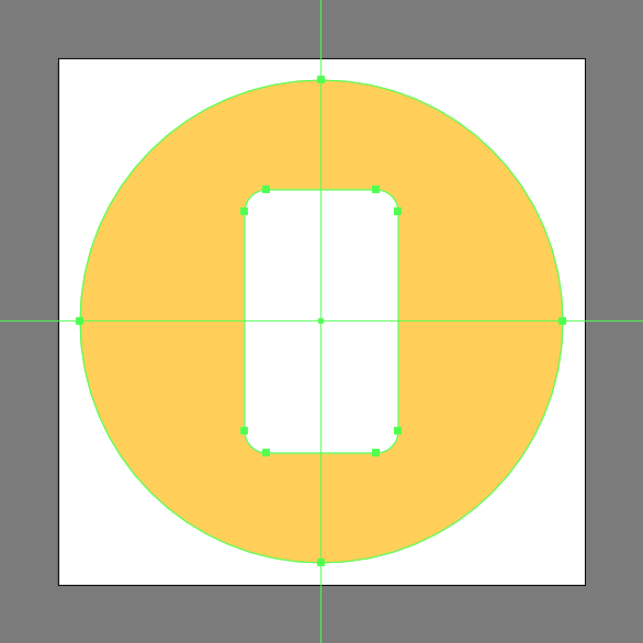
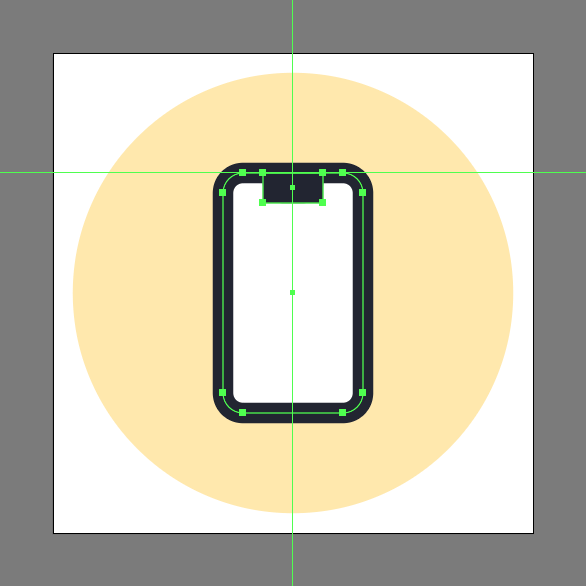
Create the main shape for the phone’s body using a 28 x 48 px rounded rectangle with a 4 px Corner Radius, which we will color using white (#FFFFFF), and then center align to the larger circle.
Step 4
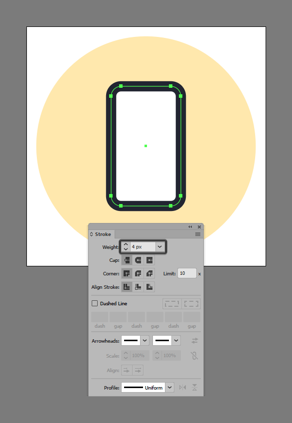
Give the shape that we’ve just created an outline using the Stroke method, by creating a copy of itself (Control-C) which we will paste in front (Control-F) and then adjust by first changing its color to #1C202D. Flip its Fill with its Stroke using the Shift-X keyboard shortcut, and then open up the Stroke panel and set its Weight to 4 px. Once you’re done, make sure you select and group the two shapes together using the Control-G keyboard shortcut.
Step 5
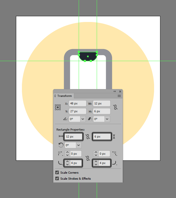
Create the main shape for the screen notch using a 12 x 6 px rectangle, which we will color using #1C202D and then center align to the larger body’s top edge.
Step 6
Adjust the shape that we’ve just created, by opening up the Transform panel, and setting the Radius of its bottom corners to 4 px.
Step 7
Finish off the phone and with it the project itself, by adding the three little detail rectangles, which we will color using #FFD05A and then position as seen in the reference image making sure to maintain a 4 px gap between them and the device’s outline. Take your time, and once you’re done, don’t forget to select and group (Control-G) all of them together, doing the same for the phone and the entire icon afterward.
![]()
Awesome Job!
As always, I hope you had fun working on the project and most importantly managed to learn something new and useful during the process.
That being said, if you have any questions feel free to post them within the comments section and I’ll get back to you as soon as I can!

Author: Andrei Ștefan
Just another coffee addict/pixel grinder, creating colorful projects one pixel at a time.


