
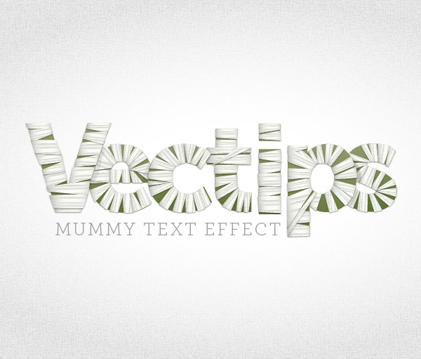
Fall is here and that means Halloween is right around the corner! Why not celebrate and get your designs mummified by creating a mummy text vector treatment? In this mummy text vector tutorial you will learn how to create this spooky treatment with some gradients and, of course, heavy use of the Appearance panel.
Final Image: Mummy Text Vector Treatment
Below is the final mummy text vector treatment we will be working towards.
Tutorial Details: Mummy Text Vector
- Program: Adobe Illustrator CS5 (You should be able to create this tutorial in CS4 but some of the tutorial images might look different.)
- Difficulty: Intermediate / Advanced
- Topics Covered: Gradients, Appearance Panel
- Estimated Completion Time: 1-1.5 Hours
Step 1
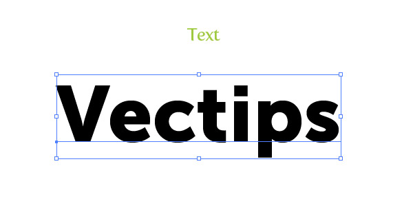
To begin your mummification with this mummy text vector treatment, create a new document and type out some text with the Text tool (T). I used Museo Sans 900 but you can use whatever font you like. I suggest starting with a bold sans-serif font to get the hang of the technique. When you create the wrap effect it might be harder on a script of serif font initially.
Step 2
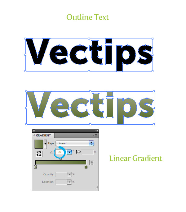
Outline your text (Command + Shift + O) and fill it with a linear gradient. Change the first color stop to a muddy green color, change the second color stop to a darker muddy green color, and change the Angle of the gradient to -90.
Step 3
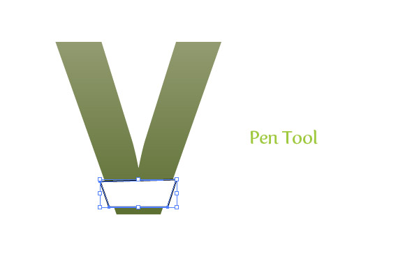
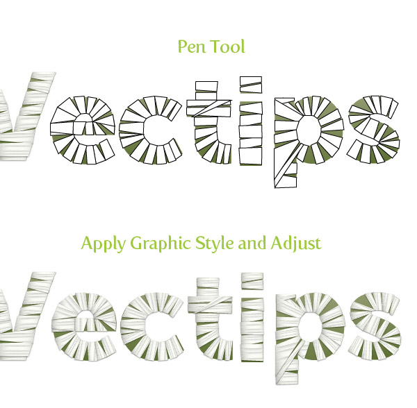
Now we got the base text, let’s start creating the mummy fabric for this mummy text vector. We are going to take this one letter at a time, so let’s focus on the first letter of your text. WIth the Pen tool (P) create a strip shape that covers a small portion of the letter. Make sure the shape overlaps the letter a little.
Step 4
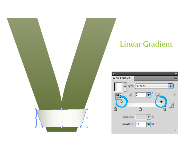
Take off any stroke on the strip and fill it with a linear gradient. Add one more color stop to the gradient so you have a total of three color stops. Change the first color stop to a gray color, the second color stop to white, and the third color stop to a gray slightly lighter that the first gray. Change the Location of the first middlepoint to 28 and the second middlepoint to 87.
Step 5
For this next gradient we are going to use a linear gradient with numerous color stops to create the fabric folds. With the strip shape selected, add a New Fill from the pop-up menu of the Appearance panel. Make sure you are working on the top layer and fill it with a linear gradient. Add six color stops to the linear gradient giving you a total of eight. Change the fill of the color stops in this order: white, gray, white, white, gray, white, gray white. Change the Angle of the gradient to -90. This next part is slightly tricky but we need to adjust the color stop locations and middlepoints to create the effect of fabric. Basically, we want the gray color stop to end more abruptly when blending into the white color stops, so drag the white color stops following the gray color stops really close to the gray color stops. Take a look at the image below to see what I am talking about. Next, open the list items in the Layers panel for the eight color stop gradient and set the Blending Mode to Darken.

Step 6
Create a new fill from the Appearance panel and fill it with a light gray color. With the new fill selected in the Appearance panel, go Effect > Texture > Texturizer. In the Texturizer dialog, change the Texture to Brick, the Scaling to 200 and the Relief to 50. Next, set the Blending Mode of the texture fill to Overlay at 12 percent opacity.

Step 7
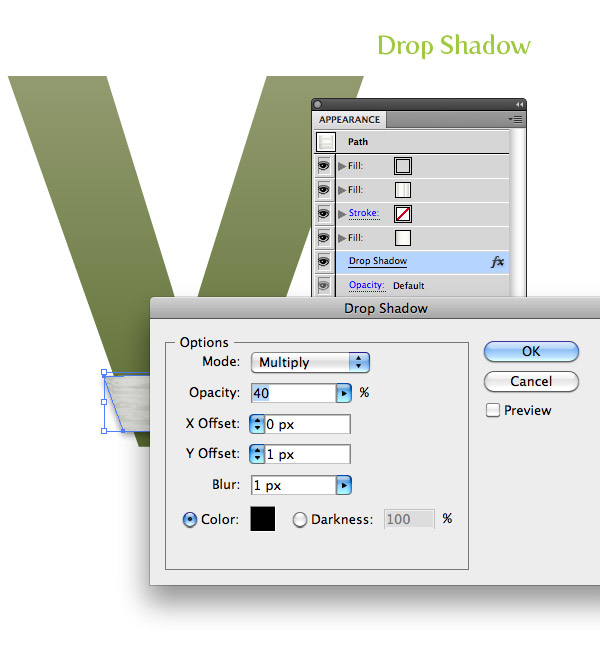
To give it a little more depth let’s add a drop shadow. We want to add it to the whole shape and not an individual fill, so select the “Path” at the top of the list in the Appearance panel. Once selected go Effects > Stylize > Drop Shadow. In the Drop Shadow dialog, change the Opacity to 40, the X Offset to 0, the Y Offset to 1 px, and the Blur to 1 px.
Step 8
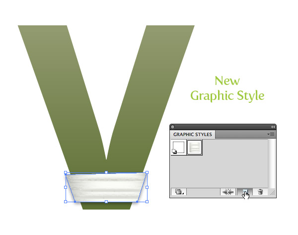
That is basically it for the creating the texture of the fabric of this mummy text vector. Now comes the tedious part, creating all the strips and applying the effect. The nice part is we can create a Graphic Style to apply to all the strips. To create the Graphic Style, simply select the strip we already created and press the New Graphic Style button in the Graphic Styles panel.
Step 9
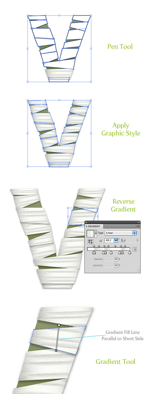
Now create a bunch of other strip shapes with the Pen tool around the first letter. When creating the strip shapes alternate the stacking order so some are on top and some are not. Next, select all the strips and apply your new Graphic Style to them. It’s looking pretty good but we need to adjust some of the gradients of the individual strips to add a slight variance from strip to strip. An easy way to this is to reverse the eight color stop gradient in some of the strips. Moreover, adjust every strips eight color stop gradient with the Gradient tool (G) so the Gradient Tool’s Fill Path (the line connecting the Start Point and End Point of the gradient when the Gradient Tool is active) is parallel with the shorter sides of the strips.
Step 10
Mummified! After you have finished the first mummy text vector letter, move on to the rest and create the strip shapes, apply the graphic style, and adjust each individual strip. It can get tedious, but the results are worth it. When creating the strips really think about how they actually would wrap around the form of a letter. If you are wrapping a elliptical shape, the strips would be thinner as the reach the axis of the elliptical shape. Also, think about how the strips would wrap around sections of letters like “t”. You might just have to play around until you get something you like (that’s what I did), even still, you probably will get some funky pieces. Another tip is to always adjust the gradient so the gradient Fill Path is parallel to the shortest side of a strip. For example, the eight color stop in the “e” is going a different direction compared to the first strip we created because of how it is positioned.Once the strips are ready, group each individual letter together, making it easy to move and rotate each letter.
Final Image: Mummy Text Vector
Here is the final mummy text vector image again. I adjusted the text to be a little closer together and created a background following the techniques from the Seamless Textures Tutorial.

Enjoy! Don’t get too spooked this Halloween season.


I visited various sites but the audio feature for audio songs current at this site is in fact
marvelous.
Really informative post.Much thanks again. Really Cool.
Awesome tutorial, we have featured it here : http://theneodesign.com/best-illustrator-tutorials-september-2014/
So, I love this tutorial, and I’m currently doing the mummified treatment on my company’s logo for Halloween, but mine just isn’t looking quite as nice as yours. I’ve followed every step very closely, but it’s not quite there. Any ideas? Thanks!
Very nice tutorial, thanks!