
Welcome back to another Illustrator based tutorial, in which we’re going to take a quick look behind the process of creating an ATM icon, and see what it takes to build one from scratch using just a couple of basic geometric shapes. So, assuming you already have the software up and running, let’s jump straight into it!
Tutorial Details: ATM Icon
- Program: Adobe Illustrator CS6 – CC 2020
- Difficulty: Beginner
- Topics Covered: Design Theory, Compositional Construction, Shape Alignment, Grid Positioning
- Estimated Completion Time: 20 Minutes
Final Image: ATM Icon

Step 1
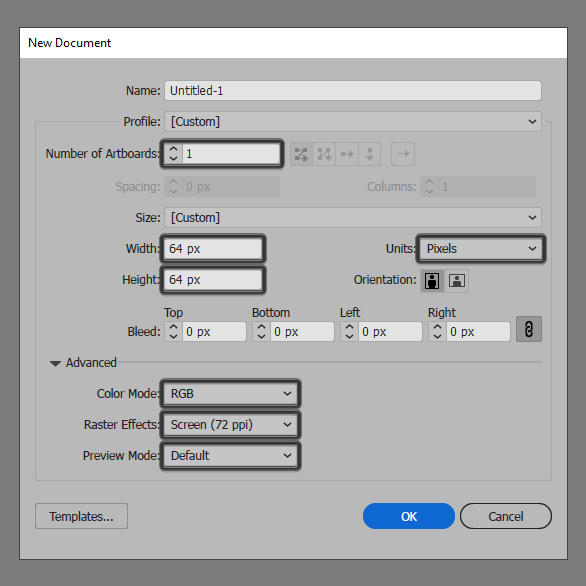
As with every new project, we’re going to kick things off by setting up a New Document, by heading over to File > New (or by using the Control-N keyboard shortcut), which we will then adjust as follows:
- Number of Artboards: 1
- Width: 64 px
- Height: 64 px
- Units: Pixels
And from the Advanced tab:
- Color Mode: RGB
- Raster Effects: Screen (72ppi)
- Preview Mode: Default
Quick tip: most of the indicated settings can be triggered automatically if you set the document’s Profile to Web, the only one that you’ll have to manually adjust being the Artboard’s Size (Width x Height).
Step 2
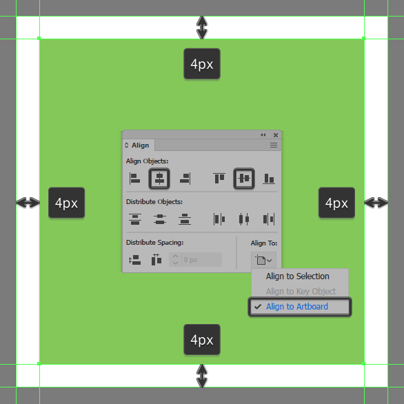
As soon as we’ve finished setting up our project file, we can start working on the actual icon, and we will do so by creating the main shape for the ATM’s body using a 56 x 56 px square, which we will color using #85c959 and then center align to the underlying Artboard using the Align panel’s Horizontal and Vertical Align Center options.
Step 3
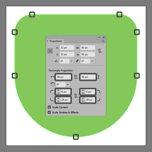
Adjust the shape that we’ve just created, by opening up the Transform panel, and then setting the Radius of its top corners to 8 px, and its bottom ones to 28 px, from within the Rectangle Properties section.
Step 4
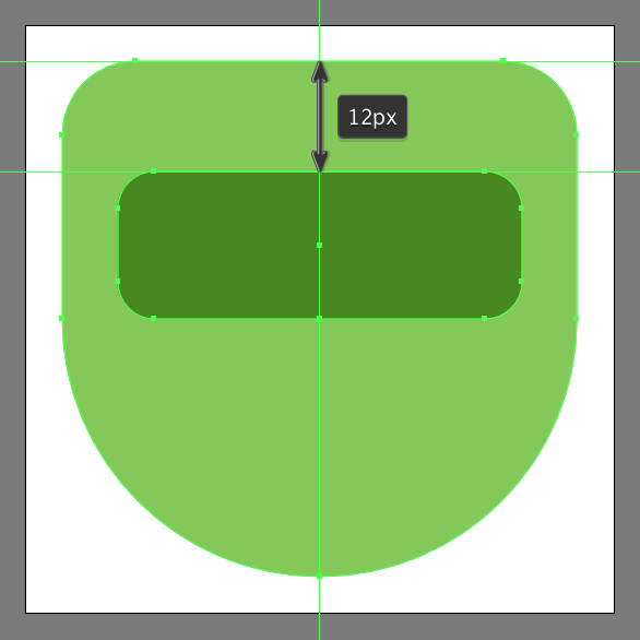
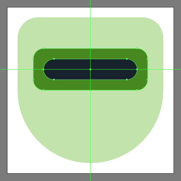
Create the main shape for the outer section of the cash dispenser using a 44 x 16 px rounded rectangle with a 4 px Corner Radius, which we will color using #46891a and then center align to the underlying Artboard, positioning it at a distance of 12 px from the larger shape’s top edge.
Step 5
Add the main shape for the dispenser’s inner section using a 36 x 8 px rounded rectangle with a 4 px Corner Radius, which we will color using #101d28 and then position to the center of the previous shape. Once you’re done, make sure you select and group the two together using the Control-G keyboard shortcut.
Step 6
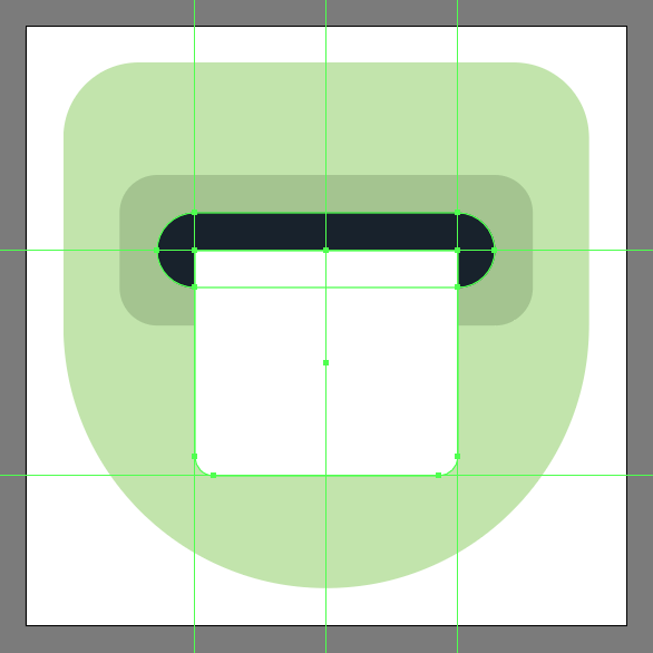
Create the main shape for the dollar bill using a 28 x 24 px rectangle (#FFFFFF), which we will adjust by setting the Radius of its bottom corners to 2 px from within the Transform panel. Once you’re done, position the resulting shape to the center of the dispenser’s inner section as seen in the reference image.
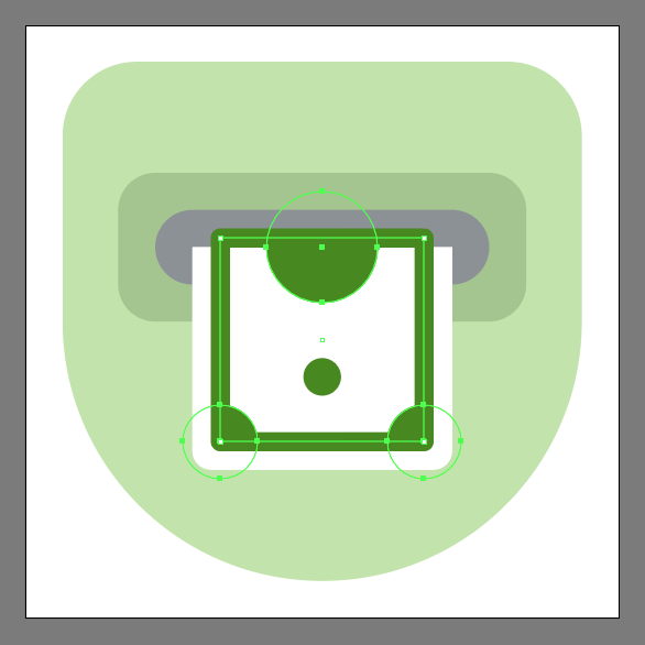
Step 7
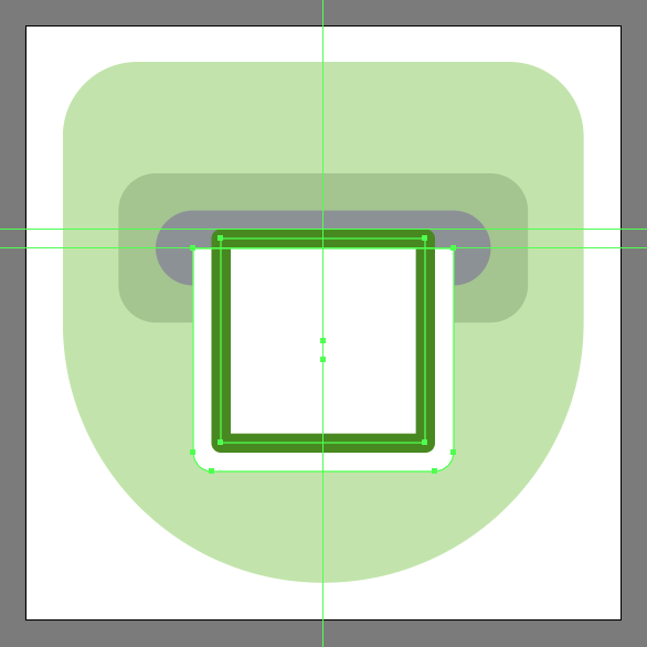
Add the bill’s inner frame using a 22 x 22 px square with a 2 px thick Stroke (#46891a) with the Corner set to Round Join, which we will position so that its outer edge falls off the surface of the larger underlying shape itself.
Step 8
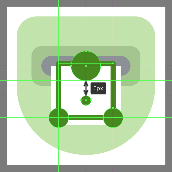
Create the remaining inner details (#46891a) using two 8 x 8 px circles for the lower corners, a 4 x 4 px circle for the inner section, followed by a larger 12 x 12 px one which we will align to the center of the bill’s top edge. Take your time, and once you’re done, make sure you select and group all four of them together using the Control-G keyboard shortcut.
Step 9
Mask the shapes that we’ve just grouped, by first creating a copy (Control-C) of the outer frame, which we will paste in front (Control-F) and then with both it and the group selected simply right click > Make Clipping Mask.
Step 10
Finish off the icon, and with it the project itself, by first selecting and grouping (Control-G) the masked details and the outer frame together, and then masking them using a copy (Control-C > Control-F) of the bill’s main body. Take your time, and once you done, select and group (Control-G) all of the bill’s composing shapes, doing the same for the entire icon afterwards.
Great Job!
As always, I hope you had fun working on the project and most importantly managed to learn something new and useful during the process. That being said, if you have any questions feel free to post them within the comments section and I’ll get back to you as soon as I can!

Author: Andrei Ștefan
Just another coffee addict / pixel grinder, creating colorful projects one pixel at a time.


Thanks for sharing this fine post. Very inspiring! (as always, btw)
Really informative article post.Really looking forward to read more. Will read on