
In today’s tutorial, we’re going to take a quick look behind the progress of creating a privacy icon, and see how we can take some simple shapes and turn them into a finished usable product. That being said, let’s jump straight into it.
Tutorial Details: Privacy Icon
- Program: Adobe Illustrator CS6 – CC 2020
- Difficulty: Beginner
- Topics Covered: Design Theory, Compositional Construction, Shape Alignment, Grid Positioning
- Estimated Completion Time: 20 Minutes
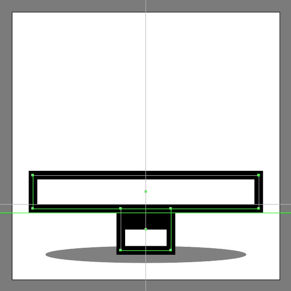
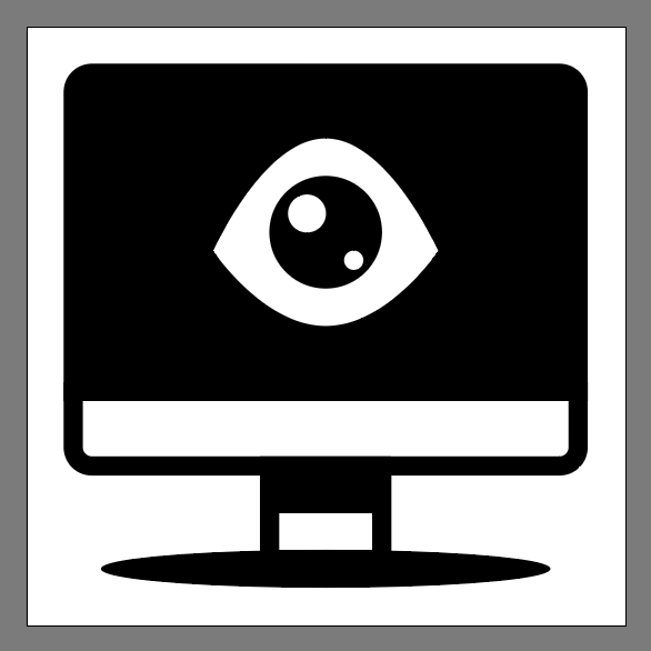
Final Image: Privacy Icon

Step 1
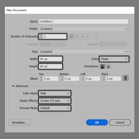
As with every new project, we’re going to kick things off by setting up a New Document, by heading over to File > New (or by using the Control-N keyboard shortcut), which we will then adjust as follows:
- Number of Artboards: 1
- Width: 64 px
- Height: 64 px
- Units: Pixels
And from the Advanced tab:
- Color Mode: RGB
- Raster Effects: Screen (72ppi)
- Preview Mode: Default
Quick tip: most of the indicated settings can be triggered automatically if you set the document’s Profile to Web, the only one that you’ll have to manually adjust being the Artboard’s Size (Width x Height).
Step 2
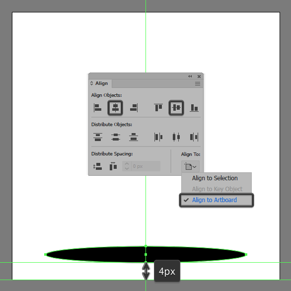
As soon as we’ve finished setting up our project file, we can start working on the actual icon, and we will do so by creating the main shape for the black hole using a 48 x 4 px ellipse, which we will color using #000000, and then horizontally center align it to the underlying Artboard using the Align panel, making sure to position it at a distance of 4 px from its bottom edge.
Step 3
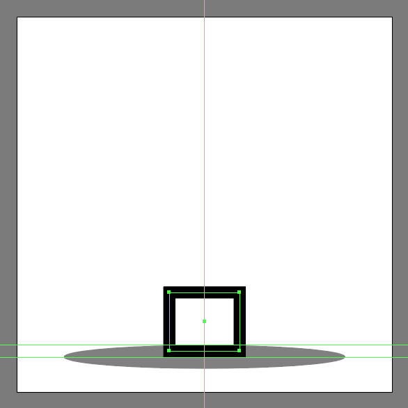
Add the main shape for the stand using a 12 x 10 px rectangle with a 2 px thick Stroke, which we will color using #000000, and then position onto the upper half of the larger ellipse.
Step 4
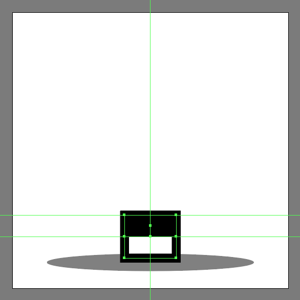
Create the hard shadow using a 12 x 5 px rectangle, which we will color using #000000 and then center align to the previous shape’s top edge, making sure to select and group the two together afterwards using the Control-G keyboard shortcut.
Step 5
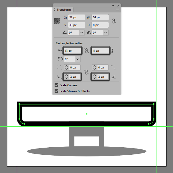
Create the main shape for the iMac’s lower body using a 54 x 8 px rectangle with a 2 px thick Stroke (#000000) which we will stack on top of the stand.
Step 6
Adjust the shape that we’ve just created by opening up the Transform panel, and then setting the Radius of its bottom corners to 2 px from within the Rectangle Properties subsection.
Step 7
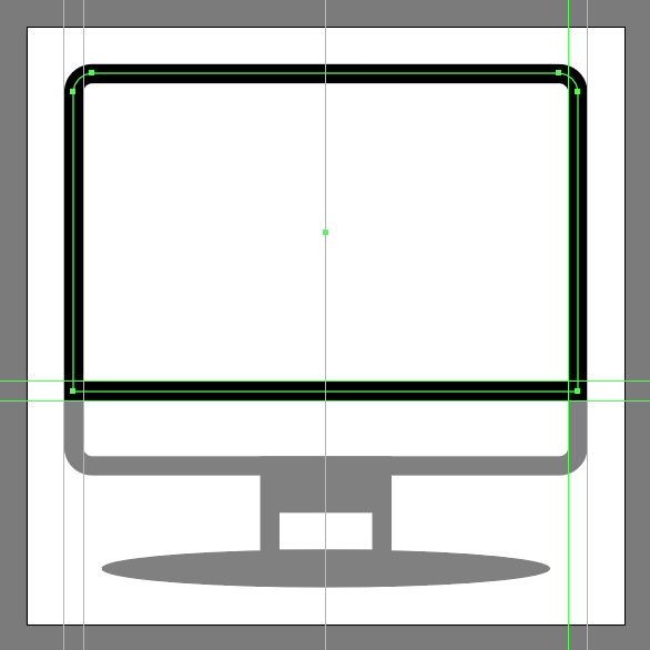
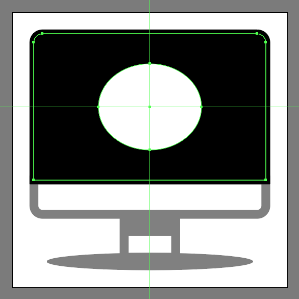
Create the Mac’s screen using a 54 x 34 px rectangle (#000000), which we will adjust by setting the Radius of its top corners to 2 px using the same exact method as before, making sure to position the resulting shape onto the previous section so that their paths end up overlapping.
Step 8
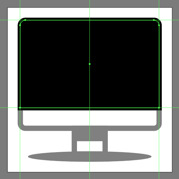
Quickly add the fill shape using a copy (Control-C > Control-F) of the one from the previous step, which we will adjust by flipping its Fill with its Stroke using the Shift-X keyboard shortcut. Once you’re done, select and group the two together using the Control-G shortcut.
Step 9
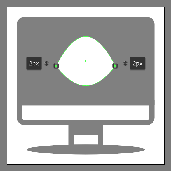
Create the main shape for the eye using a 24 x 20 px ellipse, which we will color using #ffffff and then position to the center of the underlying screen.
Step 10
Quickly adjust the shape that we’ve just created by pinching its side anchor points using the Anchor Point Tool (Shift-C), and then pushing them to the bottom by a distance of 2 px by first selecting them using the Direct Selection Tool (A), and then pressing the down arrow key twice.
Step 11
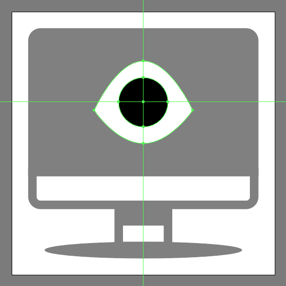
Add the pupil using a 12 x 12 px circle, which we will color using #000000 and then position to the center of the shape that we’ve just adjusted.
Step 12
Finish off the icon and with it the project itself, by adding the two highlights using a 4 x 4 px circle (#ffffff) followed by a smaller 2 x 2 px one (#ffffff), which we will position as seen in the reference image. As always, once you’re done, don’t forget to select and group (Control-G) all of the eye’s composing shapes, doing the same for the entire icon afterwards.
Great Job!
As always, I hope you had fun working on the project and most importantly managed to learn something new and useful during the process. That being said, if you have any questions feel free to post them within the comments section and I’ll get back to you as soon as I can!
Author: Andrei Ștefan
Just another coffee addict / pixel grinder, creating colorful projects one pixel at a time.


