
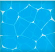
It is starting to warm up oustide, so it is only fitting we create a wading water texture vector, like in a pool. It is a relatively quick and easy technique using Illustrator’s Effects, Simplify, Offset Path and some bright colors.
Notes: Water Texture Vector
This tutorial was created with Illustrator CS3.
Keyboard shortcuts are displayed in orange. ⌘ is displayed for the Command key (mac), with the Ctrl key being the Windows equivalent (not displayed).
Rectangles
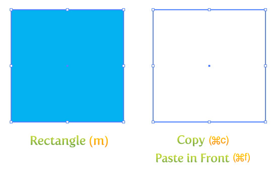
To begin our water texture vector tutorial, create a 5 inch by 5 inch rectangle with the Rectangle Tool (m). An easy way to draw an exact rectangle is to click on the artboard with the Rectangle Tool to bring up the Rectangle dialog to enter dimensions. Make the fill 100% Cyan with no stroke. Next Copy (⌘c) the rectangle and Paste In Front (⌘f). With the copied rectangle selected, make the fill white and the remove the stroke.
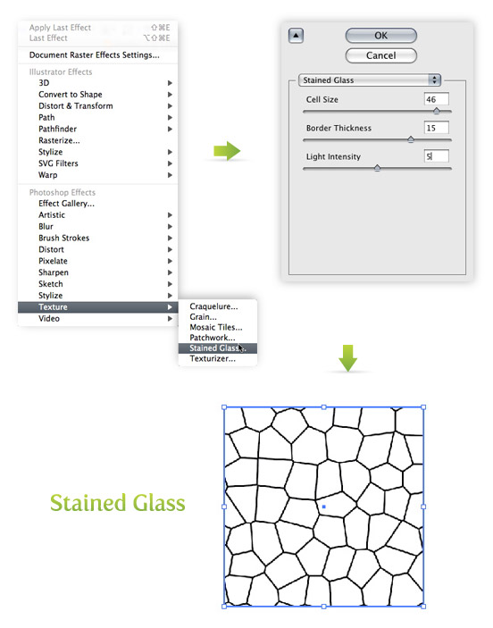
Effect
With the white rectangle still selected, go Effect > Texture > Stained Glass. When the Stained Glass Effect dialog comes up, change to following.
- Cell Size = 46
- Border Thickness = 15
- Light Intensity = 5
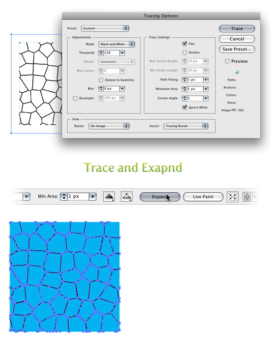
Next go Object > Expand Appearance. With the texture still selected, the Control Panel defaults to the Live Trace options. Click the arrow beside the Live Trace Button and select Tracing Options. Or you can go Object > Live Trace > Tracing Options. You don’t have to change all the options, just the ones below.
- Mode: Black and White
- Path Fitting: 1px
- Minimum Area: 1px
- Corner Angle: 1
- Ignore White: Check this box
I like to save this preset in the Tracing Options. It makes it easy to recall these setting. Next, Press the Expand button on your tool bar.
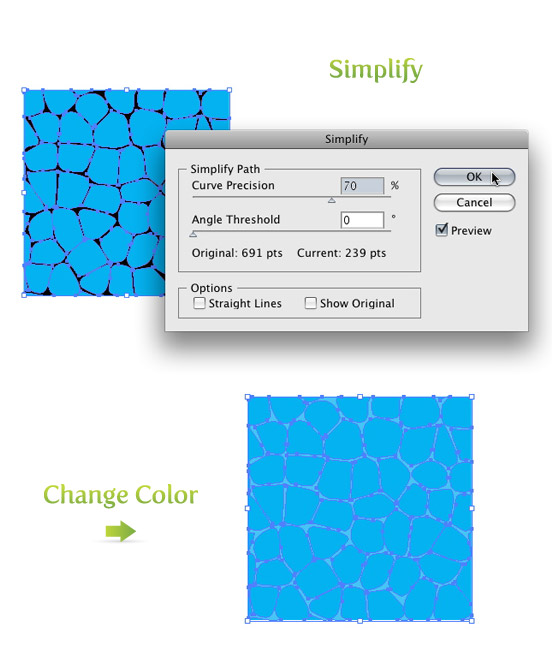
Simplify
With the texture for the water texture vector still selected, go Object > Path > Simplify. Within the Simplify dialog, change the Curve Precision to 70% and the Angle Threshold to 0 and press OK. Next, change the color of the texture to 70% Cyan in the Color Panel.
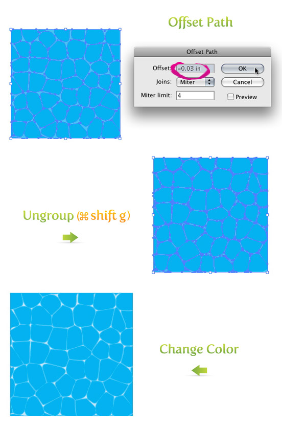
Offset Path
With the texture still selected, go Object > Path > Offset Path. Within the the Offset Path dialog, change the Offset to -0.03 inches and press OK. Now you can see it created a condensed copy of the original path. Ungroup (⌘ shift g) the original texture from the condensed texture by going Object > Ungroup. You will have to do this two times to completely ungroup the original texture and the condensed texture. Once ungrouped, select the condensed texture and change the color in the Color Panel to a 25% Cyan.
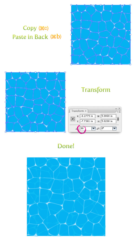
Depth
To give the water texture vector a little more depth, Copy (⌘c) the original texture, Paste In Back (⌘b), rotate 90 degrees form the Transform Panel, and change the color to 85% Cyan.
Now you have some nice wading water! Might not be as refreshing as being in a real pool, but at least you can illustrate one!
Later This Week
Stay tuned for the next texture tutorials!


Very nice post. I just stumbled upon your weblog and wished to say that I have really enjoyed browsing your blog posts. In any case I will be subscribing to your feed and I hope you write again soon!
Great article and very well explained. It was nice for me to read it. Thanks for answering the questions on my mind about pool textures
thanks for the tutorial, here’s my result with slightly different settings: http://superawesomevectors.com/water-texture-free-vector-background/
Looks good. Never seen this done this way before.
Very useful, thanks for the tutorial.
Thank you, thank you, thank you
love your tutorials thanks so much rype, really helps me out.
However in the water texture totorial, i get stuck after the offset path dialog, as i have nothing to ungroup here:((
no idea where i would have gone wrong, pls help me out, 🙂
thnaks;)
Why won’t Illustrator let me do the “stained glass”. It’s grayed out for me. 🙁
Thanks thanks thanks ! 🙂
This is awesome! You’ve added another dimension on how i use illustrator. Thanks
wow, really interesting and useful for me.
Ah, I had it set to 72. I guess I’ll have to take this setting into consideration for all future Illustrator works.
Bobbito,
The glow looks nice!
I was thinking about what else could be wrong with the settings in the Stained Glass. It might be the Document Raster Effects Settings. I have my set to 300 ppi. I would be interested to see what yours are set at. You can go Effect > Document Raster Effect Setting. I’m thinking the lower Raster settings would make the Stained Glass settings in the tutorial appear bigger.
I added some glow to it in mine.
Here.
Copied the condensed texture layer, placed it behind the original, filled the copy with white, used .75 gaussian blur, and lowered opacity to 50%.
Thanks for changing the picture. My experience with tutorial sites like this has led me to believe that comments are meaningless. This is a pleasant surprise. 🙂
Following the text of the tutorial exactly (as I did the first time) still gives me a big “Y” in the box. I assumed that using the stained glass texture on a 5×5 box in Illustrator CS3 would give the same results for everyone. If you got different results than I figure there’s something different going on. Using lower settings on the 5×5 box (something in the 20s for example, and lower the Border Thickness) gives you an image more like the one above.
This is what I did the first time, just to complete the tutorial. I did it again today. The image came out very well. Not quite as bright and aquamarine as yours, but very nice nonetheless.
Thanks for the tutorial, it was exactly what I was looking for, and I’ll put it to very good use.
Bobbito,
The image was messed up, so I changed it. The copy in the tutorial was right.
If you follow the tutorial exactly, you shouldn’t have a problem. The big “Y” sounds like you box you are applying to effect to is two small. This effect is determinate on the size of the box. If you need to create a smaller box or shape with this effect, create it a the specified size them re-size it or you can mess with the “Cell Size” on the Stained Glass effect.
Let me know if that helps.
This didn’t work for me at all. I think the instructions are screwed. I got stopped right the “Effect” step. Looking at the picture: http://vectips.com/wp-content/uploads/2008/05/water_02.jpg two out of three pictures there refer to “Mosaic Tiles” while the other picture and the instructions refer to “Stained Glass”.
Using numbers as high as “46” “15” and “5” in the “Stained Glass” texture will get you nothing but a big, bold, “Y”. It looks someone wrote this and stopped paying attention to what they were writing early on.
And in contrast to the first poster, I’d say it looks more like The Legend of Zelda: The Wind Waker than Ocarina of Time.
This is nice, I had the similar water generated by a free tool http://www.lysator.liu.se/~kand/caustics/
The advantage is that the tool is able to generate a water (caustics) animation.
It’s quite suitable for sprite games and the cartoon look can be used nicely.
I’d love to see some examples of this in use if you have them!
pravoooooooooooo
It would also make cool spider webby looking fibers.
Thanks Rype, I have never really look into the Texture filter in illustrator. I hope you can post some examples of how you use it for other illustrations. That would be great!
Well said! I should of posted some examples of how I use this technique. I use it for logos, stylized illustrations, and children illustrations.
Great technique. Playing around with even more duplicated and rotated layers gives other interesting effects. Also blurring a bit may help. Experimenting is the key. Thanks!
Unfortunately, like the poster said above, it doesn’t look like water. It is a bit too “cartoony” for a practical use.
It seems the water of the game “Zelda, Ocarina of Time.” Nice!