 Flat design is front and center in the design world, so this week’s inspirational roundup is all about FLAT DESIGN.
So sit back and let these vectors inspire your next flat design piece. Do you have a flat design vector you’d like to share? If so, post the link in the comments below.
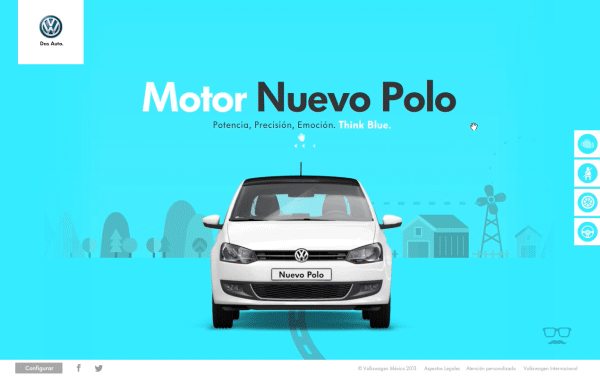
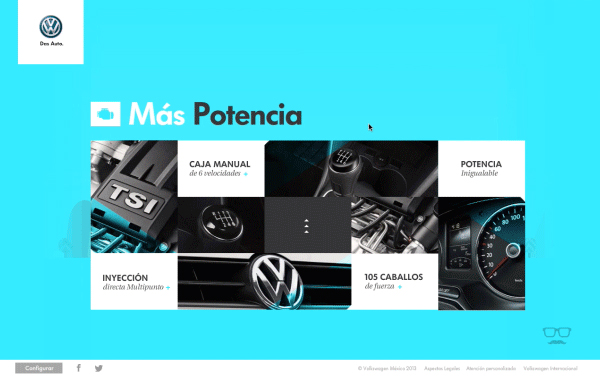
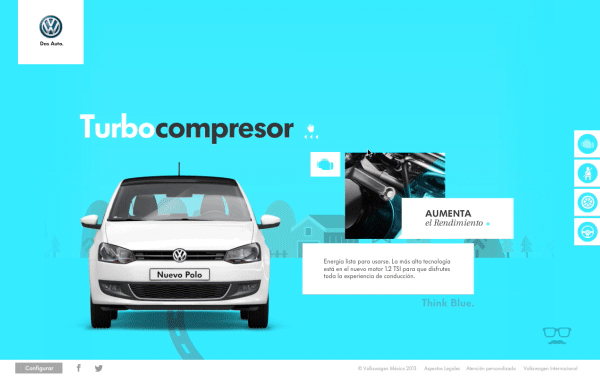
Jesús Barajas
Jesus did a great job on this website especially by combining the flat design with the complex car image. I also like very much the background color and the Windows 8 style tiles from the second preview.
French Toast
When you create a flat design, the small details make the difference between a boring design and a great one! Here I like the subtile drop shadows and sand serif font–very clean and visible.
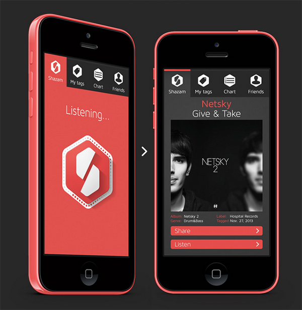
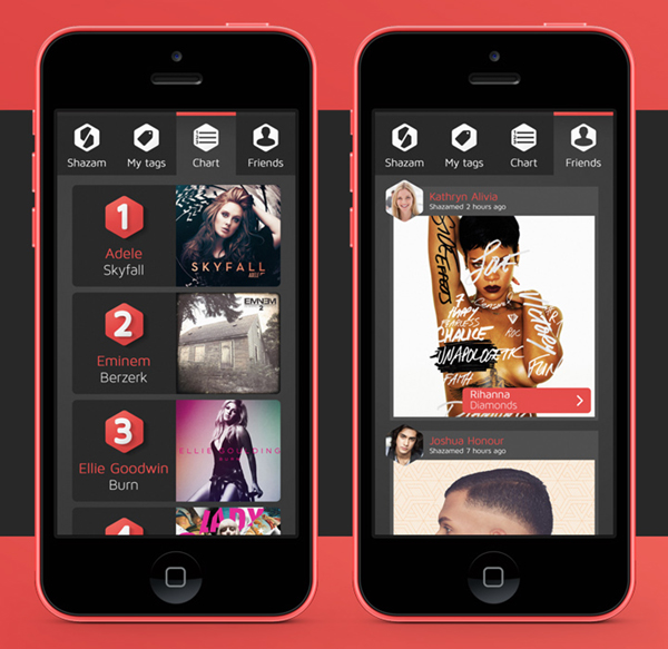
George Kordas
Here we have another flat design concept with a lot of transparency. I think the blurry background–a strong design trend currently–has a strong impact over the interface George created.
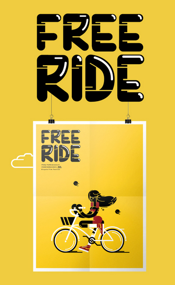
Panfilia Iannarone
Look at the small details in this image like the highlights on the type and also the movement highlights on the wheels. Definitely creates for a very dynamic image.
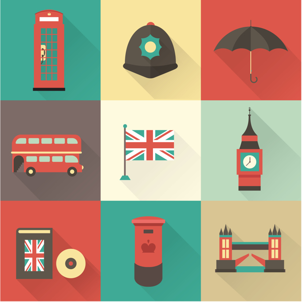
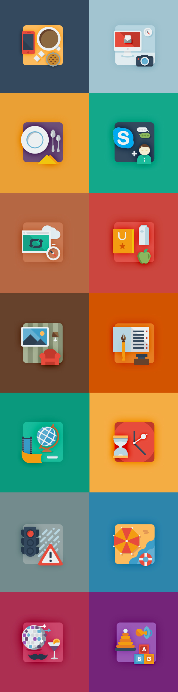
Irina Kerasoshvili
Great usage of colors and shapes to create simple but very effective various icons (Halloween, London, clocks). Click on one of the images to see the rest of the collection!


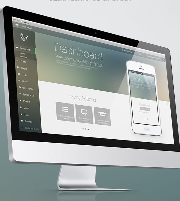
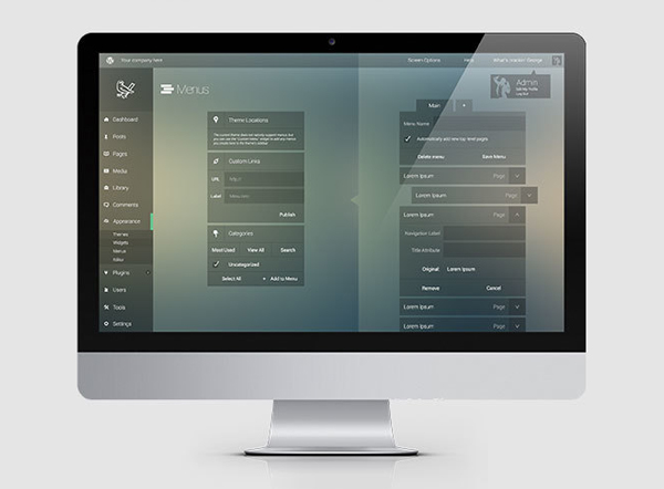
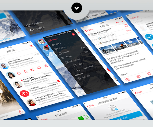
Android 5.0 UI Design Concept by Codebuild
Again a very good combination of white, clean font with a blurry background. Also, on the music player, I like the fact that the album cover is very small and doesn’t cover 70% of the screen as seen in other music players on the market.

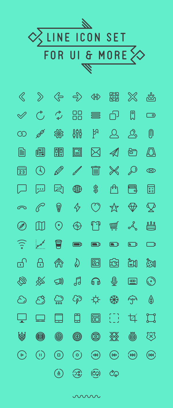
Situ Herrera
Sleek and free! You can download this awesome minimalistic icon pack for free by clicking on the image below!
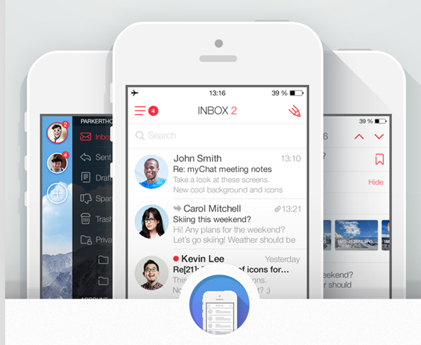
Eugen Dolgov, Pavel Skripkin, Evgeny Belyaev, Alexander Kirov and Slava Yashkov
Coining a phrase from part art teachers, “White space is your friend.” This piece exemplifies this design rule very well which provides a positive impact over the user experience. Very clean, simple and a lot of white!
Anton Shineft
I love the fact that Anton used classic blurry drop shadows instead of those trendy long shadows! Well done Anton!
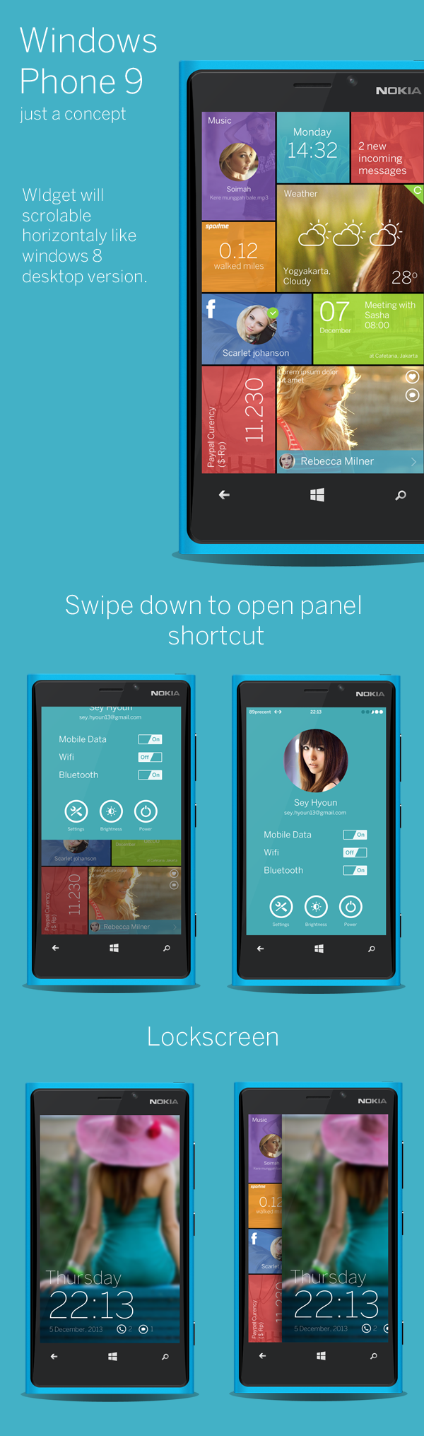
Ghani Pradita
From my point of view, Windows Phone has one of the best User Interfaces, and Ghani did a impressive update on it! I like that every tile has a background, and even though they are faded, they still have a great impact over the UX. Another thing I like is that Ghani added vertical tiles, nice touch!
Guillaume Kurkdjian
Those animations are very funny, and Guillaume did a great job with the colors and shapes! Discover the full collection by clicking on one image below.
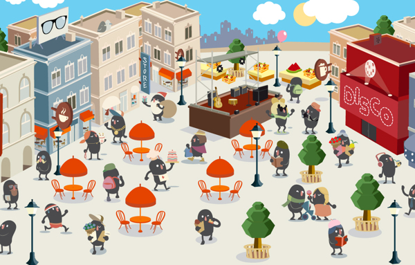
Panfilia Iannarone
Happy holidays! Do you see the Santa with the present in his hand? 😀