
This week’s roundup showcases a few of our picks of unique, creative, and basically well-done vector infographics. Here are 14 vector illustrations that give new life and inspiration to the infographic, previously thought to be nothing but boring and flat. Prepare to be inspired to reach new design levels…
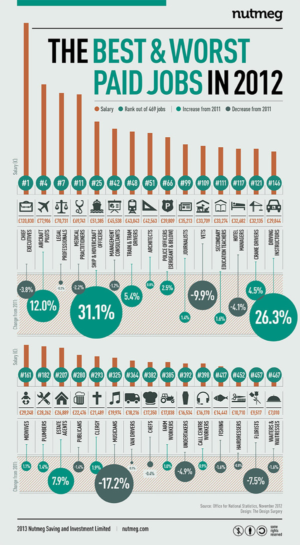
Nutmeg infographic by The Design Surgery
This infographic presents the information very clear due to the clean layout and the very nice color combination, and the diagonal stripped pattern in select places gives this piece an added level of interest.
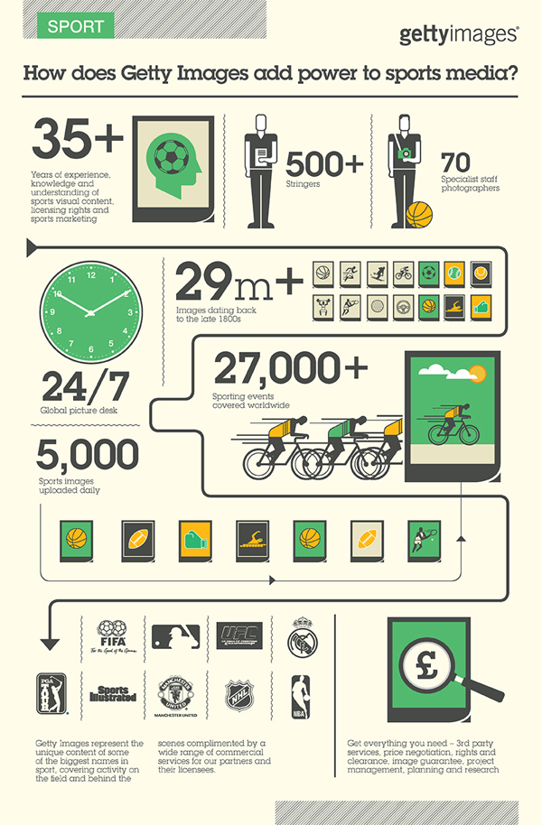
Getty Images Infographic by The Design Surgery
Again a very nice infographic by The Design Surgery using the trendy flat style.
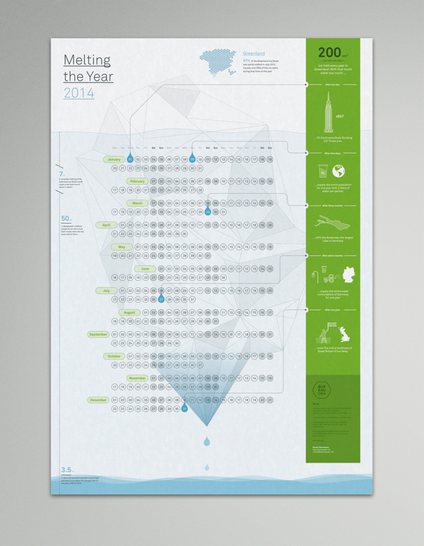
Bureau Oberhaeuser Calendar 2014 by George Kordas
The color combination is outstanding, I do like very much the faded background image that represents ice melting.
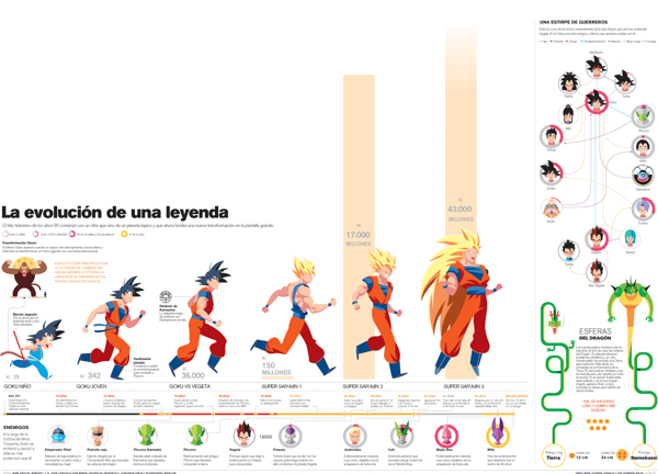
Dragon Ball Z infographic by Dan Mora
For the Dragon Ball Z fans this is a very cool infographic. 🙂
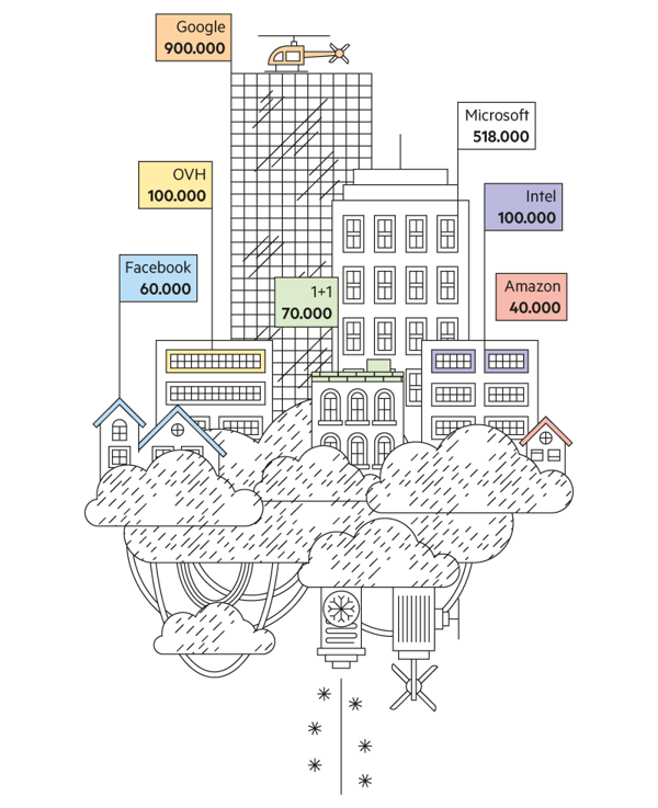
The cloud is not invisible infographics by relajaelcoco
The more simple the design is, the more easily you can read information from an infographic. This one uses the minimalistic style and I must admit it has a great layout that’s easy to read. Plus, the creativity behind the presentation of what is basically a bar chat sets this piece apart from the rest.
Bionic Hill by Eugene Pylinsky
A more futuristic infographic, with some great effects but still easy to view the info (you just need to know Russian :D)
Imaginary Factory by Jing Zhang
Jing Zhang made an awesome job on this one–very creative! Click on the images below to see the rest of the project!
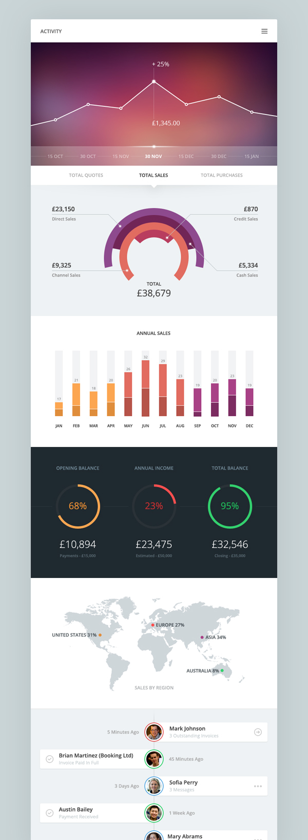
Piotr Kwiatkowski
Simple design, great usage of white with some nice discreet effects at the bottom of the infiographic. The blurry background, which we’re seeing highlighted in several design mediums these days, is nice too.
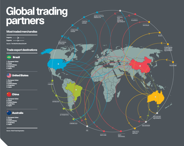
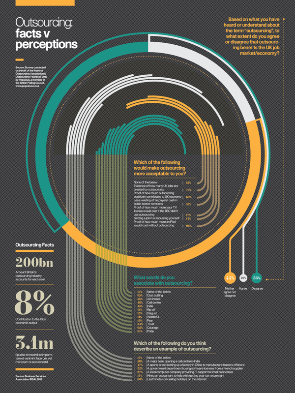
Infographics: Raconteur/The Times by The Design Surgery
Although it looks very complicated… the colors and the unique visual approach in this chart make it very easy to understand how things work.
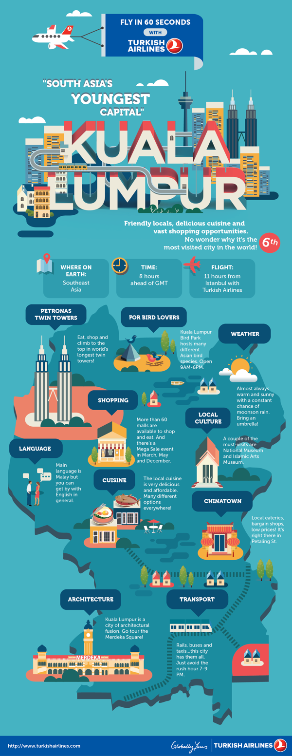
Kuala Lumpur city guide by Jing Zhang
If you plan to visit Kuala Lumpur, this fun, colorful guide to is a great start (heck–this piece almost MAKES me want to go there). Again Jing Zhang used the flat style to create the infographic and she did a great job again!
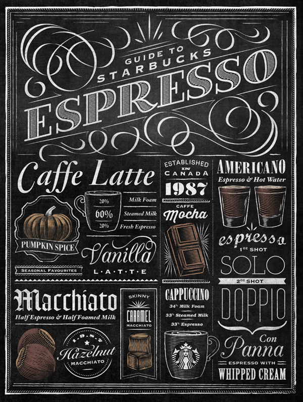
Starbucks Espresso Guide Typographic Mural by Jaymie McAmmond
I love the retro style exhibited by the fonts Jaymie used. Although there are over 10 fonts there (typically a design “no-no”), Jaymie redefines the rules by managing to combine them perfectly.
Wedding Invitation by Jonathan Quintin
I think this is the most ingenious wedding invitation ever! I’ve posted the entire infographic because it’s awesome!
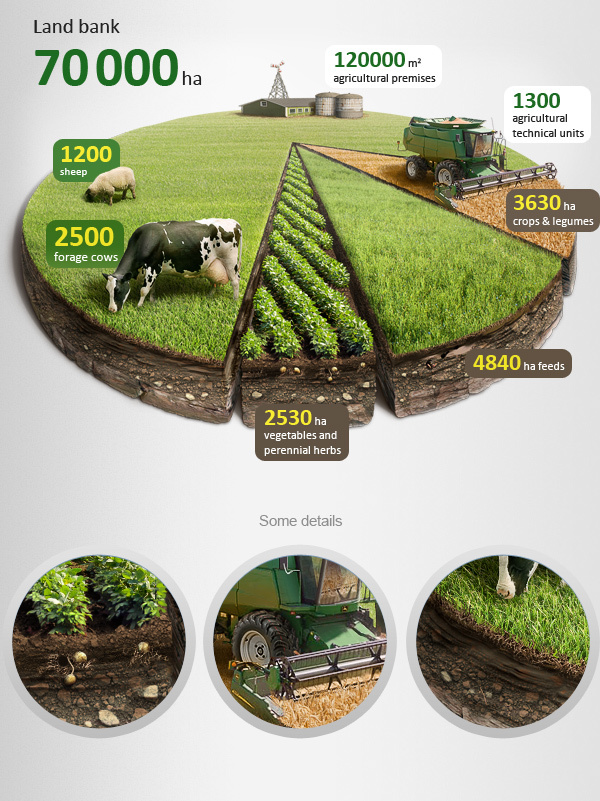
Agricultural Infographics by Anton Egorov
This is my favorite vector because of the ultra realistic style and the great details seen, for example, in areas like the shadows! Impressive work and… Anton made a tutorial for this one, so click on the image below in order to see the make of!
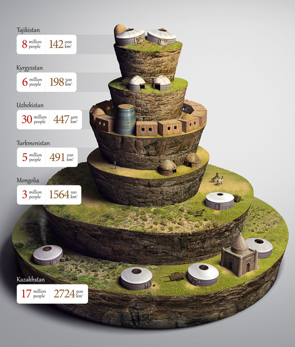
Infographics for Corporate Monthly Bulletin by Anton Egorov
Again Anton did an outstanding job on this one. Impressive details like the grass, the earth. Simply perfect.









Why people still make use of to read news papers when in this technological world all is available on web?
Muchos Gracias for your blog. Really thank you! Great.
Very neat blog post.Much thanks again. Will read on