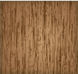
Everyone needs a solid wood texture, and Vectips is here to help! The steps for this wood texture technique are very similar to the previous Brushed Metal Texture tutorial. It uses the same Graphic Pen effect but stretched a little more. It also uses the Warp Tool and Twirl Tool. Also like the other texture tutorials, this technique is easy and applicable in logos, icons, interfaces or pretty much anything.
Notes: Wood Texture Vector
This tutorial was created with Illustrator CS3.
Keyboard shortcuts are displayed in orange. ⌘ is displayed for the Command key (mac), with the Ctrl key being the Windows equivalent (not displayed).
Rectangles: Wood Texture Vector
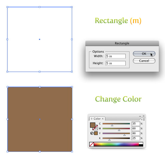
To begin to carve out your own wood texture design, create a 5 inch by 5 inch rectangle with the Rectangle Tool (m). An easy way to draw an exact rectangle is to click on the artboard with the Rectangle Tool (m) to bring up the Rectangle dialog to enter dimensions. Fill the rectangle with a light brown and take off the stroke.
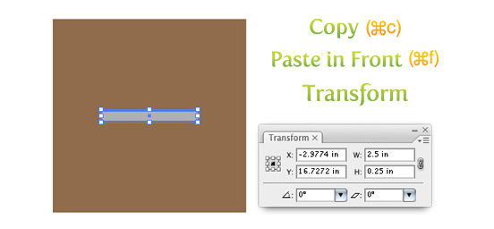
Next Copy (⌘c) the rectangle and Paste In Front (⌘f). With the copied rectangle selected, change the dimensions for the width to 2.5 inches and the height to .25 inches in the Transform Panel and fill the rectangle with a 40% black.
Texture
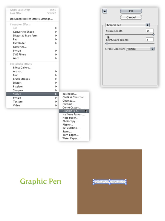
Select the smaller rectangle and go Effect > Sketch > Graphic Pen. When the Graphic Pen Effect dialog comes up, change the following settings.
- Stroke Length = 15
- Light/Dark Balance = 2
- Stroke Direction = Vertical
Trace and Expand
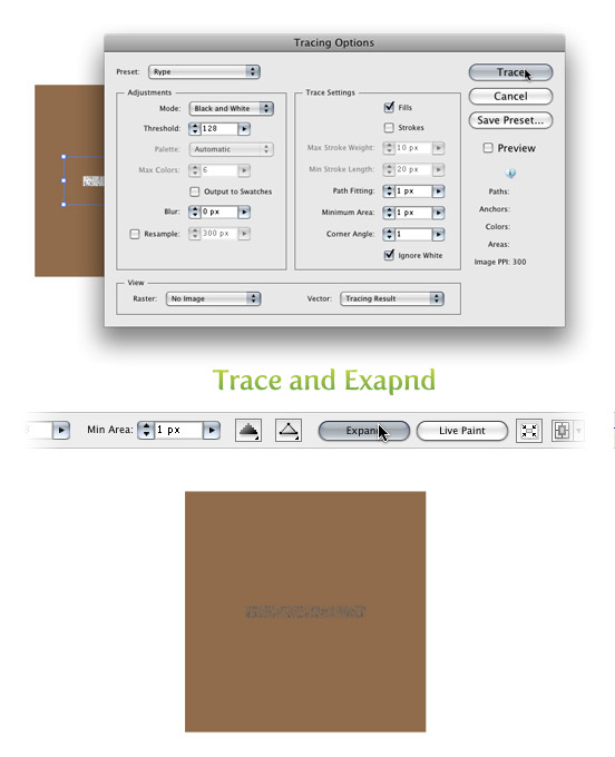
With the texture selected go Object > Expand Appearance. With the texture still selected, the Control Panel defaults to the Live Trace options. Click the arrow beside the Live Trace Button and select Tracing Options. Or you can go Object > Live Trace > Tracing Options. You don’t have to change all the options, just the ones below.
- Mode: Black and White
- Path Fitting: 1px
- Minimum Area: 1px
- Corner Angle: 1
- Ignore White: Check this box
I like to save a preset in the Tracing Options. It makes it easy to recall these setting. If you have read previous tutorials, you will see I use these setting all the time for tracing. Next, press the Expand button on your tool bar.
Transform and Color
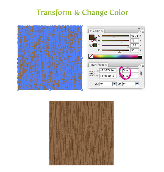
With the texture selected on your wood texture vector, change the width to 5 inches and the height to 5 inches from the Transform Panel. Next, change the color of the texture to a darker brown than the first rectangle.
Warp Tool
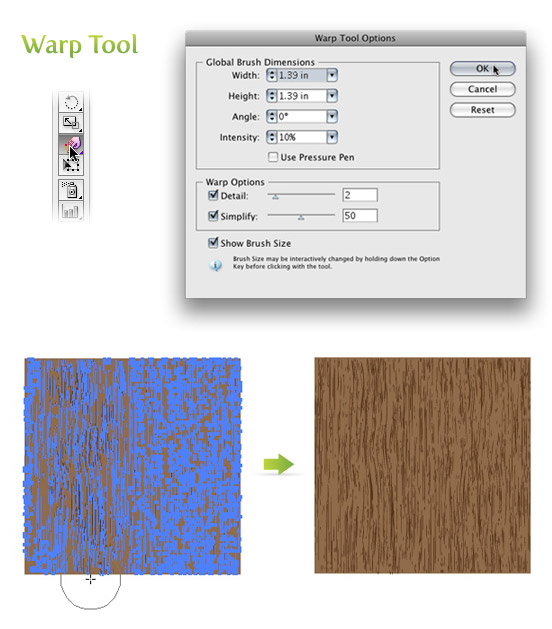
Double click on the Warp Tool (shift r) in the Tools Panel to bring up the Warp Tools Options dialog. They are probably on the default settings, but if they are not, press the reset button on the right of the dialog. Once the settings are back to default, change the Intensity to 10% and click OK.
Select just the texture and click and drag with the Warp Tool (shift r). I like to go up and down and slightly back and forth. You can do as much or as little as you want.
Twirl Tool
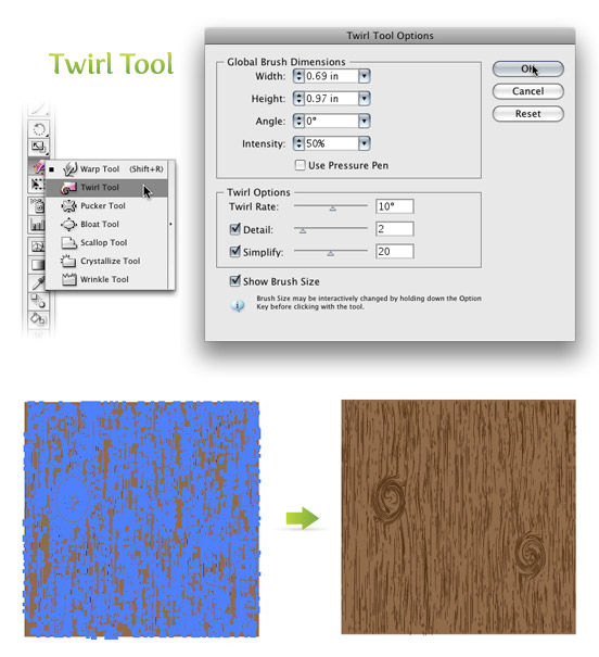
Click and hold down on the Warp Tool (shift r) in the Tools Panel to bring up the other transform tools. Pick the second tool in the list called the Twirl Tool. With this tool you can add some knots to your wood texture if you want. Double click on the Twirl Tool in the Tools Panel to bring up the Twirl Tool Options dialog. Below are the settings I change.
- Width =.69 (50pts)
- Height =.97 (70pts)
- Twirl Rate =10°
- Simplify = 20
With the texture selected, click and hold on the texture until you are happy with the knot. The Twirl Rate is slow so it is easy to see when you need to let go.
Experiment with Wood Texture
You can experiment quite a bit with this wood texture vector technique. You can change the dimensions of the Warp Tool and Twirl Tool to create different wood grains and shapes of knots.
Below are some examples using this wood texture.
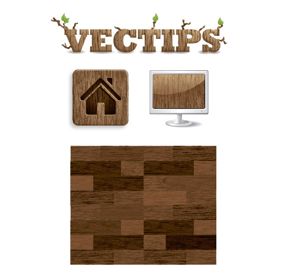
Hope you can use this wood texture vector tutorial to create your own designs that go against the grain and are out of the box.


what’s about tracing options at step “Trace and Expand” for AI CC 2015?
A very easy and awesome technique to learn. Thanks a lot!
What do you mean by “40% black”? I’m new to graphics and design so I’d appreciate an explanation of what that means and how you set that? Are you referring to opacity, by any chance?
Thanks,
Ray
If you are using Illustrator, when you are using CMYK, which means cyan, magenta, yellow and black, there is a color panel on the top right. Set your K slider to 40%.
Opacity is a different story.
Cheers,
Ken