
If you have read some of my other type tutorials, you know I love the Appearance panel. This tutorial is no different. Using the Appearance panel, some gradients, and transforms, you can create a polished lifted type treatment. Using the Appearance panel makes it super easy to apply the treatment to other fonts and vector elements.
Final Image
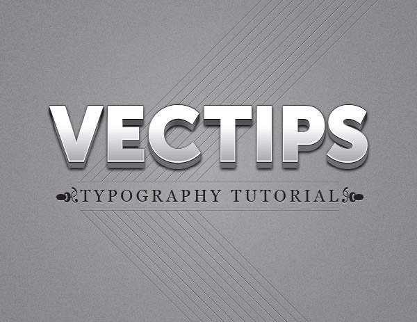
Below is the final type treatment we will be working towards.
Tutorial Details
- Program : Adobe Illustrator CS5
- Difficulty: Intermediate
- Topics Covered: Appearance Panel
- Estimated Completion Time: 15-20 minutes
Step 1
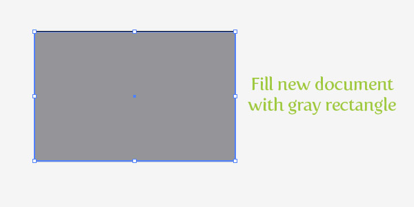
In a new document, use the Rectangle tool (M) to create a rectangle the size of your document and fill it with a gray color. Having a background color from the beginning will make it easier to see the changes we will be making to the text.
Step 2
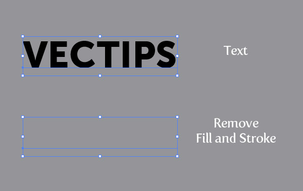
With the Type tool (T), type out some text. Mine is around 100pt for big header text, but you can adjust the text to fit your needs. Next, remove any fill and stroke from the text, we will be directly adjusting these in the Appearance panel.
Step 3
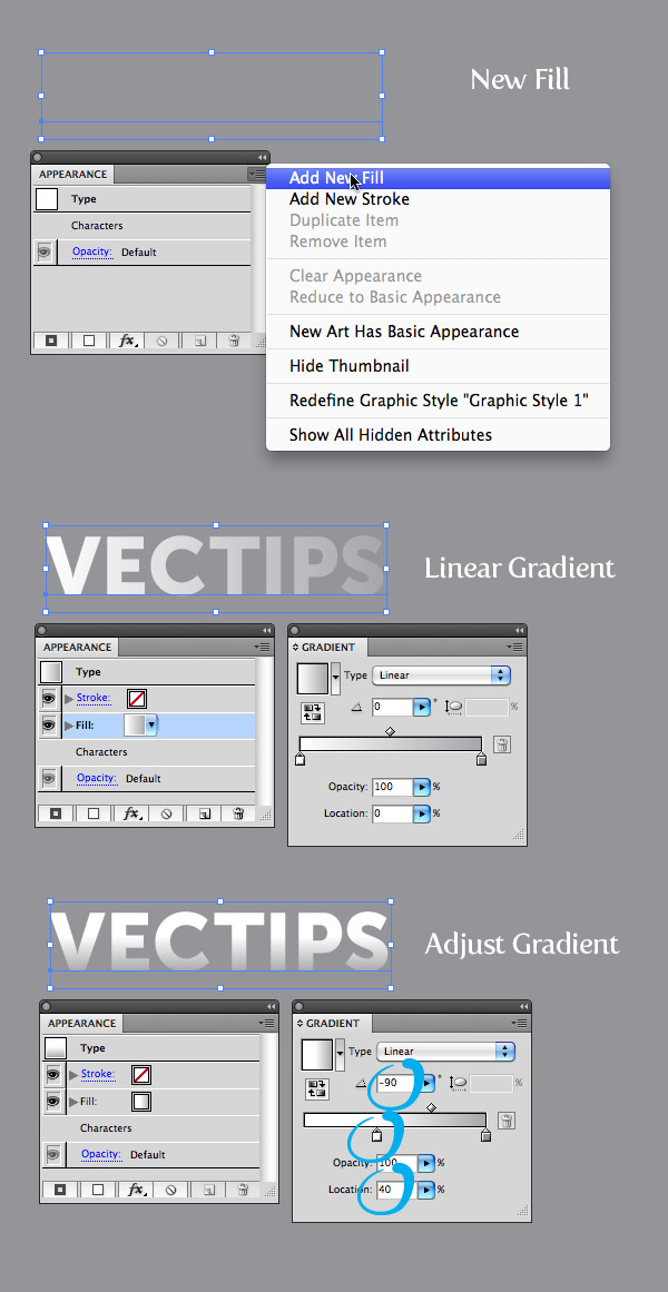
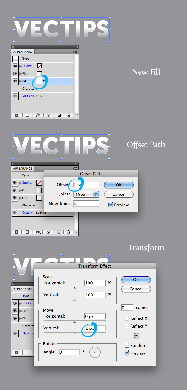
With the text selected, choose Add New Fill from the pop-up menu of the Appearance panel. Change the new fill to a linear gradient with the first color stop white and the second a light gray. From the Gradient panel change the Location of the first white color stop to 40 and change the Angle to -90.
Step 4
From the Appearance panel, create a new fill like in the previous step, fill it with white, and make sure the white fill is below the first gradient in the Appearance panel. Select the white fill in the list and go Effect > Path > Offset Path. In the Offset Path dialog change the Offset to 1 px. With the white fill still selected in the Appearance panel list, go Effect > Distort & Transform > Transform. In the Transform Effect dialog, change the Vertical Move to 1 px.
Step 5
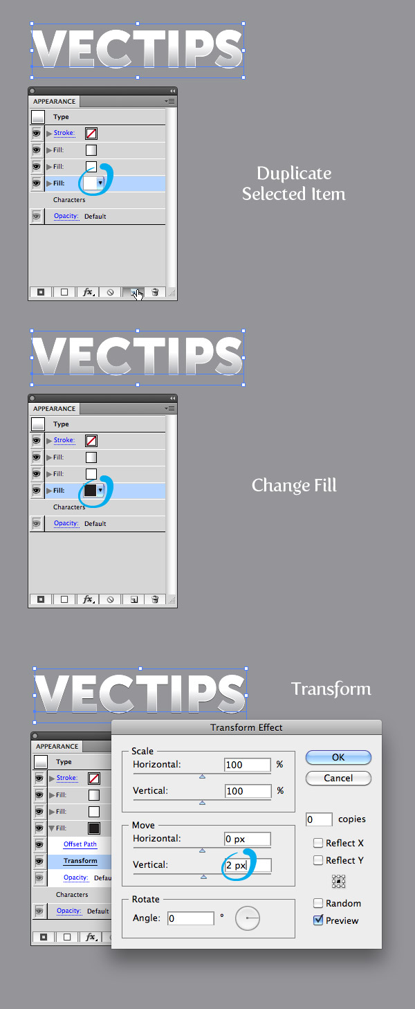
From the Appearance panel, select the white fill, and press the Duplicate Selected Item button at the bottom of the panel. Select the bottom copy and fill it black. Expand the attributes on the fill by pressing the small arrow to the left of the fill thumbnail if it is not expanded already. Still in the Appearance panel, click on Transform to open the Transform Effect dialog and change the Vertical Move to 2 px.
Step 6
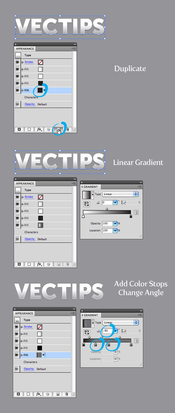
Duplicate the black fill like in the previous step and change the fill to a linear gradient. Add two more color stops to the linear gradient and change the first to black, the second to a dark gray, the second to a slightly lighter gray than the second, and the fourth to a gray slightly darker than the second. Next, change the Angle to -90.
Step 7
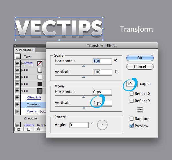
Expand the attributes of the new linear gradient in the Appearance panel, and click on the Transform Effect. With the Transform Effect dialog open, change the number of Copies to 10 and the Vertical Move to 1 px.
Step 8
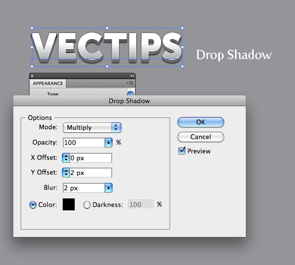
With the four color stop gradient fill still selected in the Appearance panel, go Effect > Stylize > Drop Shadow. In the Drop Shadow dialog, change the Opacity to 100, the X Offset to 0, the Y Offset to 2, and the Blur to 2. That is pretty much it!
Step 9
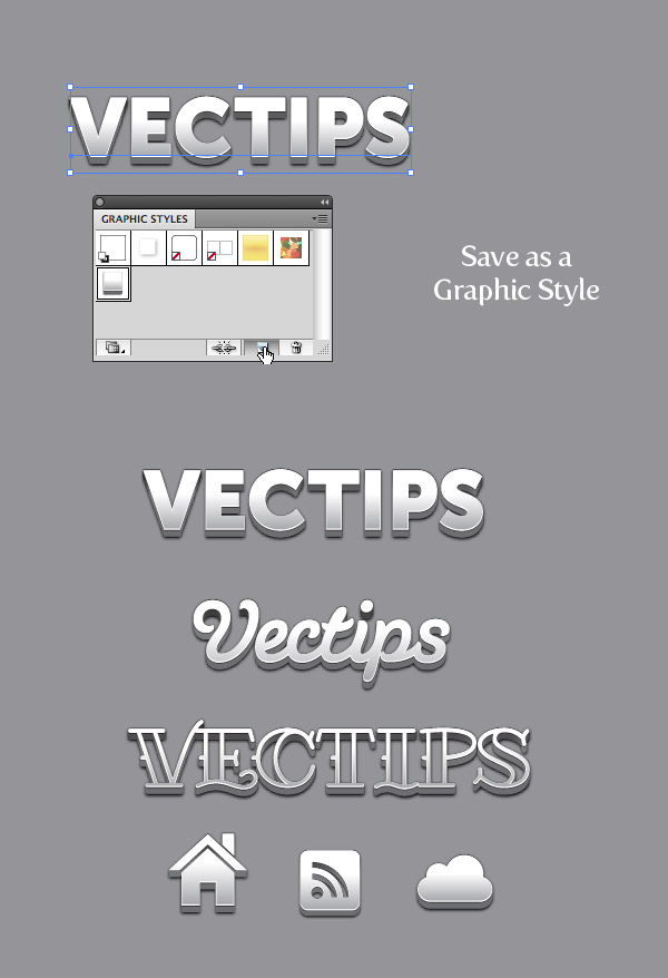
You can save the treatment as a Graphic Style to easily apply to other type and vector objects. Simply select your text and press the New Graphic Style button in the Graphic Style panel. Now press the new graphic style with any object to apply the style. Pretty cool!
Final Image
At this point you can make the treatment better by jazzing up the background with some grain textures and simple offsets to other text.


Good thanks
But I wish there is a video tutorials in attachment to that
thank you for your great site.
thanks a lot
really funny and dats very true.
How can you get rid of the page/step look on the angles of the letters? Is this possible?
I know this Tut is now going on 5 years old, but what a classic one. I just love it. Any chance you remember the font you used? Nice even weights on it. Thanks again.
-em
Think I found it. Looks very close to Avenir Next (bold). Close enough for me, anyway. Thanks again, Ryan. Great work.
-em
wonderful tutorial. Thanks!
I have a question: you use 2 acorn like symbols on the plate, will to tell me which font you used?
Arnulf
Thanks for this tutorial. I know it’s already 4 years old, but I’m having one small problem with this: when I make it smaller it completely changes… the offset path completely overtakes the text. I tried outlining both text and stroke and still have the same results. Any way to fix this? I’m using it for a package logo and need it in a much smaller version.
Nevermind. Expand Appearance did the trick.
Thanks Sir, Awesome Tutorial
Great tutorial, congratulations. Works perfectly with CC 17,1 newest version. Wish you a lot of success and please publish more of this wonderful guides.
Muchas gracias que bien aporte
What a terrible tutorial… they don’t go through step by step…
for instance . Don’t assume we know how!
“Transform Effect”
“Offset Path” they don’t tell us how to find these, when they’re multiple ways this can be done through the menu, that would apply a completely different effect from what was intended.
Come on!
I’m sorry for the confusion. We’ll certainly keep this in mind for future tutorials. After performing the Transform Effect and the Offset Path comments the first time, both of these commands should appear in the Appearance panel. Also, I’ve updated one of the instances of “Transform Effect” so that the instructions are more clear.
Thank you a lot! Great tut!
Hola, todo va muy bien hasta el paso 7, donde lo que pasa es que queda como la “sombra” hacia arriba y no hacia abajo como el que tu haces, y no es gris si no negra
Hey Daniela–if I understand you correct, you’re having issues with the drop shadows appearing the correct direction and color. Our instructions are only suggestions so simply edit your drop shadows settings until your desired look is obtained.
thanks a lot
really funny and dats very true
This is very well made tutorials, congrats sir!
thnkas to share that great tutorial.
Thanks a lot!! I cant express how much helpful this is to me!
sir, how to remove fill anyway
Wonderful tutorial. For me it takes 50 minutes to complete instead of 15 – 20 minutes. Thank you.
Thanks buddyy….VERY good & simple tut
Thank you so much for this – produces some beautiful results – nice and tidy processes Thanks! 🙂
Wonderful explanation. I had no problems on CS6.
Thank you!
Love it! Thanks so much 🙂
that was so cool , they way you explained
Cool,
is it true? or it’s just me,
when I save the work az a New Graphic Style and close de document, it desappears!
so, until now I just miss 2 of the graphic styles that I actually Saved!
can someone help please???
THANK YOU!, i can’t say any more. I’m new using illustrator and you just made my life a bit easier 🙂 perfect explanation and 1 by 1 steps
Thanks, Mr. Vectips. I needed to create this look for a client under a tight deadline, and your tutorial saved the day.
NM!! I figured it out! YAY! Thanks!
It turns out great but when I place it in an InDesign document, it puts a white background on it. and I cant get rid of it. What am I doing wrong?
Astonishing resault and one of the best text tutorials I’ve seen! ;] Thank you!
Thanks buddyy !!
This is a great Tutorial! Thank you so much! Came out perfect 🙂
I want to put you in my toolbox.. or back pocket whichever is more comfortable.. genius, tutorial in layman terms, I easily followed in CS3, got same result as guys above.. top offset rather than below but proved I could play around a bit & achieve several effects. I want more…
LOL @ your comment elaine, but i agree , do you come on a pocket version? haha
this looks great and easy to follow! thank you! helped a lot creating a logo.
Good Day
As a beginner in Ai I have to say your tutorial was more then perfect I had no problem following your directions and I thank you for taking the time to help us learn.
Wonderful. Good tutorial.
Awesome tutorial. As a novice in illustrator, this is a very helpful tut.
I’m curious to find out how did you do the smaller font, can you provide a tutorial for that please?
Thanks for this. I was just designing a logo for somebody and running out of ideas. I just applied this effect to one of the designs and they approved it! The best thing about it is when they wanted the logo text to be changed I didn’t have to redo the whole thing from scratch like I used to. As it’s editable I just retyped it out. Fantastic!
Hi, I was wondering what font did you use for the “Vectips” lettering in Step 9? I love the cursive font but can’t find it on my Illustrator
I’m stomped, when I try to do the offset path the command menu is as if that function does not apply in other word the offset path function is not hihglited and it does not work.
What am I doing wrong? HELP…
Really great work, Once again brilliant use of the appearance panel.
very nice!
Hi!
I liked it
This technique is very good for Text Effects! Can you post the same technique using any logo.
Just saved my skin on a logo I’m working on — this fits absolutely perfect! Thanks.
I so enjoyed it.
Great effect. Is this possible to make it in photoshop cs5 as well?
Ok, I’m not sure why, but I don’t think that when I made it that it looked the same… Any thoughts? What did I do wrong?
[IMG]http://i56.tinypic.com/348534k.png[/IMG]
http://tinypic.com/r/348534k/7
thanks so much!
hey looks good, but im wondering how you did that fine lines in the final result, is there any effect you used, the look kinda 3d’ish.
thanks
marc
Can any one help me ?
where is appearance panle option in photoshop cs5.
This tutorial is for Illustrator, not Photoshop.
It’s clean and nice work !
I’ll try it 😀
Thanks !!!
The Best !!! ( my one wasnt exacly from the first time but it’s look cool)
step 7 mistake – not 1 px vertical move, but -1px.
Awesome
Thanks for this amazing VECTIP!
organize file give me!!
interesante
Just change unit at Edit>Preferences>Units & Display Performance
Change unit in General Box.
Thanks sharing your knowledge. Your tutorials are just great!!!!
so cute~~!!!真喜欢~~~
I managed to do this in CS3 as well, just had to change the vertical offsets to negative values (as most of you) to get the proper result.
Be sure to read the tutorial throughly and compare your result to every step in the tutorial and you should be just fine.
Got this result: http://grab.by/73I9
How did you do the step 2 ^^’ ?
Just remove the colors for fill and stroke like so: http://grab.by/73Id
Just amazing! Thank you for all the help that you give to all us 🙂
很好,很喜欢,太厉害了!GOOD!
Really cool man!!! That’s a tight text effect!
Thanks a lot, worked perfectly in my CS4, just had the volume or shadow effect upside down, but it isnt that important, looks as cool!
Saw a tutorial on how to create something similar in plain CSS3… but this looks way better!
Great tut. Another weapon in my arsenal!
Cool technique– thanks! I had no problems doing in CS4– just had to change the vertical offsets to negative values to get the required angle.
Precisely…I did the same thing and created two styles, one for a top offset and one for a bottom offset..
This looks like an awesome tut!! Can’t wait to try it out!!
Thanks.
This is Great!
Thanks for the new Graphic Style!
awesom! thanks!
very nice. Thank for tutorial
You are the best! Low bow
This is absolutly adorable work!
Thanks 🙂
oh that’s a nice one!
Hiay, thanks a lot. It looks great!
I did it in CS2, I’m pretty sure you’ll be able to do it in CS1 as well…
Love it
I’m using CS3 and the only “impossible” step is the “offset path” one. The result is quite the same ^_^
This is amazing. nice work. I love the fact you can apply it to anything once its made. just a shame i don’t have CS5 yet.
This is pretty sweet. And I don’t wanna be an ass people, but if you actually read from top to bottom, he says what version he is using. Now go read again!
haha sweet!
I am using CS4 and i didn’t even came closer to something like this. Have you done this on CS5, please help.
“Tutorial Details
Program : Adobe Illustrator CS5
Difficulty: Intermediate
Topics Covered: Appearance Panel
Estimated Completion Time: 15-20 minutes”
right under the main picture….
Reading goes a long way.
Muito bom o tutorial!!! Fiz aqui no CS5 e deu tudo certo!!!! Vale a pena fazer esse tutorial!!!
Help! I had trouble with this tutorial. I’m using CS4; are you perhaps using CS5? I could come close to your example if I used negative numbers. instead of positive, on the vertical transforms, but I couldn’t figure out how to apply a drop shadow. Such a lovely type style you’ve developed, and I would so like to be able to recreate it!
Effect—-> Stylize—> Drop Shadow….
I tried to do it on CS3, and I guess the biggest difference is that Illustrator CS3 won’t allow me to use pixels as a unit.
If you want pixels as a unit, Type px after the number. Ex: 1 px = 1 pixel
I used points as a unit rather than pixels, and I still got the same result. I have CS5 though, so I’m not sure.
Same…
I bow to your use of the appearance palette sir. Really stellar work!