 Location based software and peripherals are very popular these days. So, In this beginner/intermediate Illustrator tutorial, I will show you how to create a stylized GPS icon using simple shapes and gradients. Using these basic techniques, you can easily create other icons, logos, and illustrations.
Final Image
Check out the final image below. This will give you an idea of what we will be working towards.
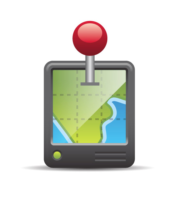
Tutorial Details
- Program: Adobe Illustrator CS4
- Difficulty: Beginner / Intermediate
- Estimated Completion Time: 30 minutes
Step 1
In a new document, create a 200 px wide by 235 px tall rectangle with the Rectangle tool (M).
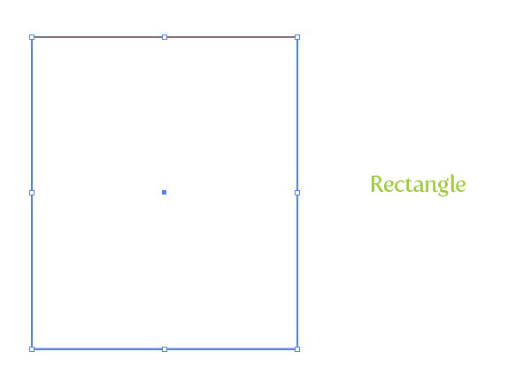
Step 2
With the rectangle selected, go Effect > Stylize > Round Corners. In the Round Corners dialog, change the Radius to 20 px.
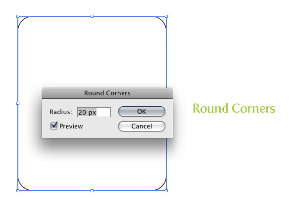
Step 3
Fill the rectangle with a linear gradient from the Gradient panel. Change the first Color Stop in the gradient to a grey color and change the second Color Stop to a dark grey color. Change the Location of the gradient to 85 by selecting the middle location point on the Gradient Slider and typing 85 in the Location field. Adjust the gradient with the Gradient tool (G) by clicking from the top of the rectangle to the bottom, making the lighter part of the gradient at the top of the rectangle.

Step 4
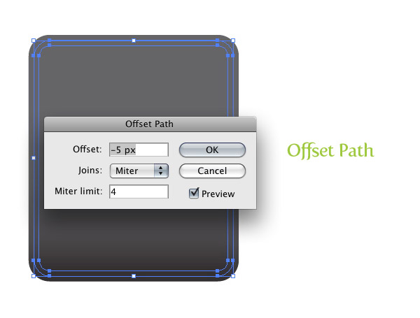
With the rectangle selected, go Object > Expand Appearance. Next, go Object > Path > Offset Path. With the Offset Path dialog open, change the offset to -5 px.
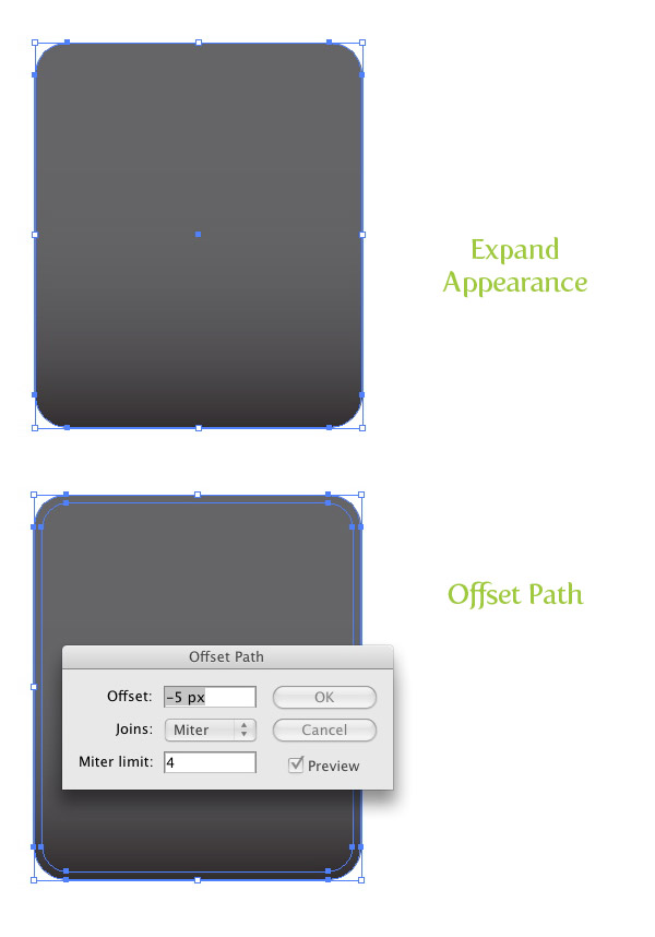
Step 5
With the Offset shape selected, go Object > Path > Offset Path. In the Offset Path dialog, change the Offset to -5 px.
Step 6
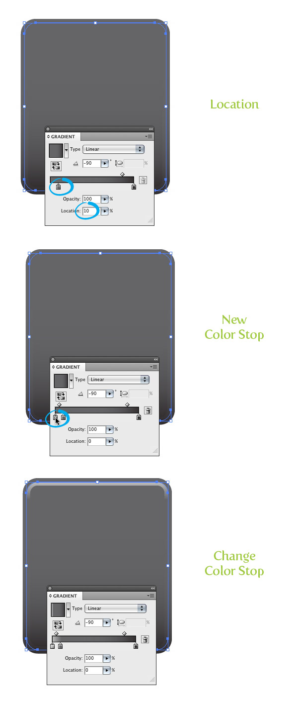
Select the first offset rectangle and select the first Color Stop. Once selected, change the Location by typing in 10 in the Location filed in the Gradient panel. Add another Color Stop to the left of the first Color Stop by clicking right below the Gradient Slider. Change the color of the New Color Stop to a light grey color.
Step 7
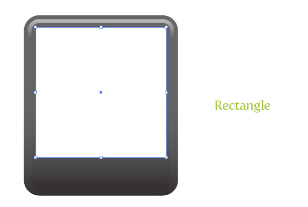
Create a 170 px by 170 px rectangle with the Rectangle tool (M) and place it below the second offset shape in the middle of all the rectangles.
Step 8
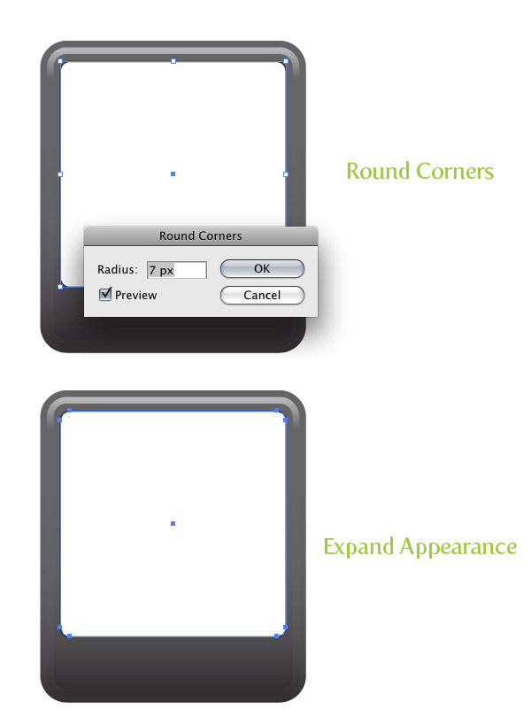
With the new rectangle selected, go Effect > Stylize > Round Corners. In the dialog, change the Radius to 7 px. Next, go Object > Expand Appearance.
Step 9
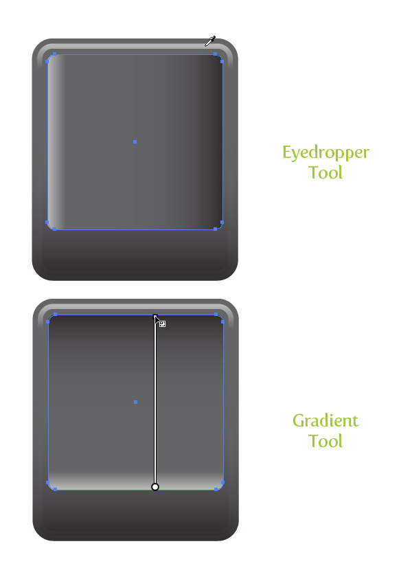
With the rectangles still selected, use the Eyedropper tool (I) and sample the gradient of the second offset rectangle (the one with the lightest grey included). Adjust the gradient with the Gradient tool (G) from bottom to top, so the darker part of the gradient is at the top of the rectangle.
Step 10
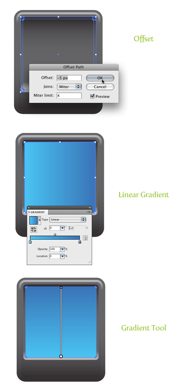
With the latest rectangle still selected, go Object > Path > Offset Path and change the Radius to -5 px. Fill the offset shape with a linear gradient with the first Color Stop a cyan color and the second a darker cyan color. Adjust the gradient from bottom to top.
Step 11
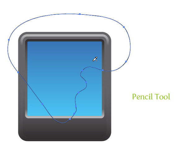
With the Pencil tool (N), draw a land mass over the blue rectangle. The part of the land mass that you want to go to the edge of the blue screen, just draw it outside the bounds of the blue screen shape. You can also use the Pen tool (P) to draw the land shape, but I find the Pencil tool (N) works great for creating natural shapes.
Step 12
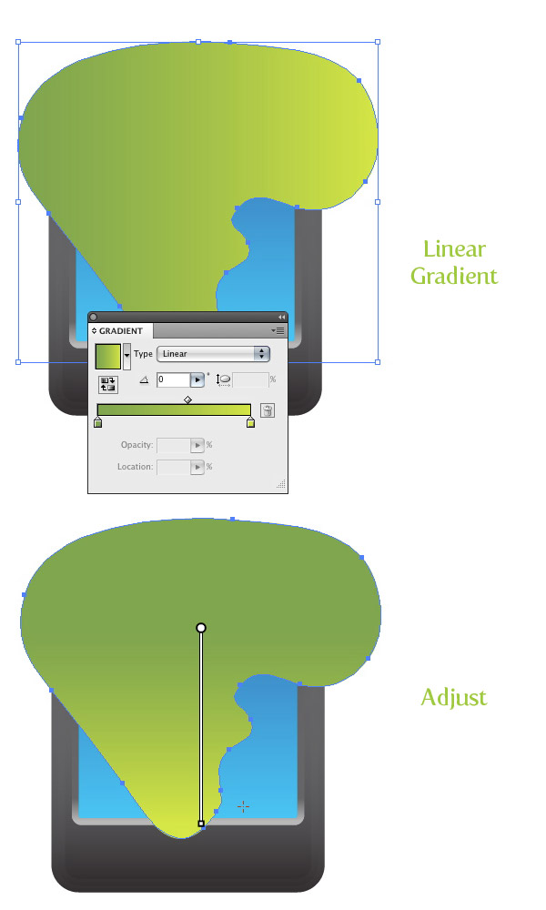
Fill the land shape with a linear gradient with the first Color Stop green and the second a darker green. Adjust the gradient form top to bottom.
Step 13
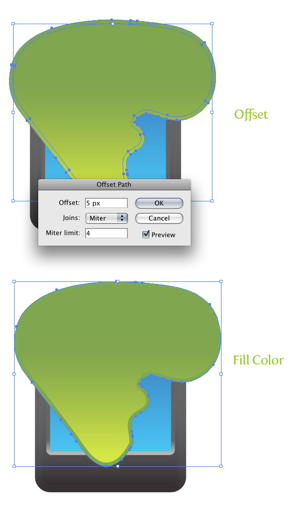
Offset the land shape by 5 px. Change the fill of the offset to a dark green color.
Step 14
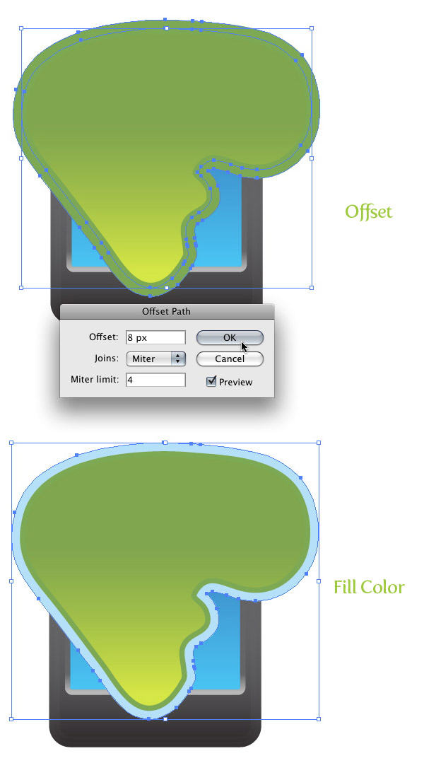
Select the land offset and offset it by 8 px. Change the fill to a light blue color.
Step 15
Select the blue screen shape, Copy (Command + C), and Paste in Front (Command + F). Select all the Land shapes and the screen copy and press the Divide button in the Pathfinder panel. With the Direct Selection tool (A), select and delete all shape that go outside the blue screen shape border.

Step 16
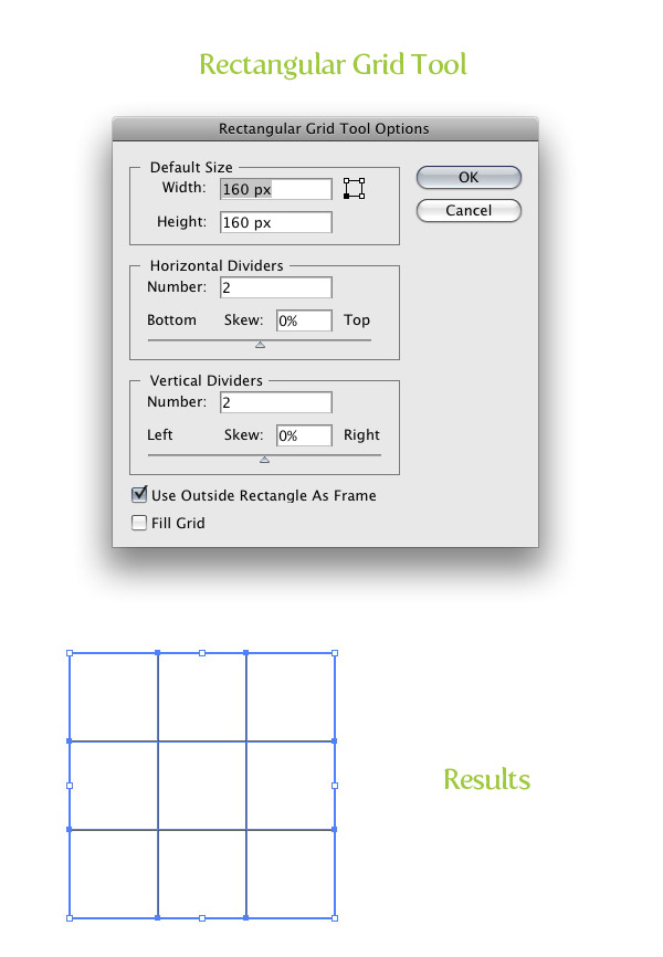
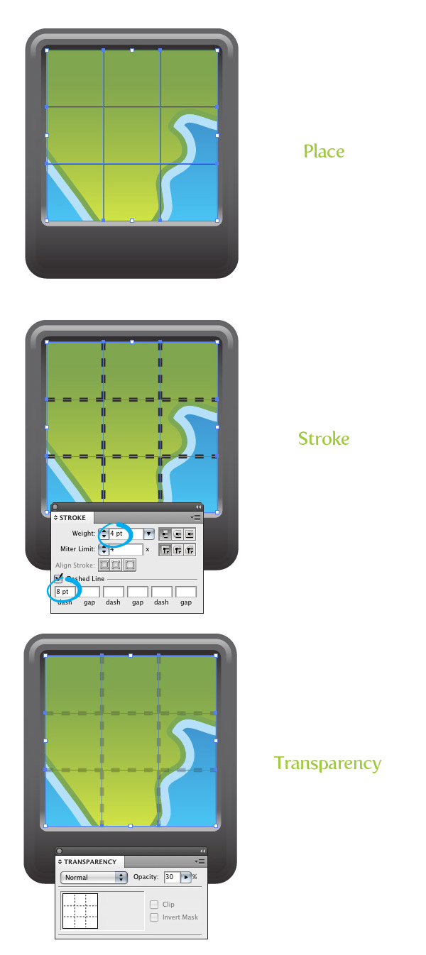
With the Rectangular Grid tool (located under the Line Segment tool in the Tools Panel), click on the artborad to bring up the Rectangle Grid Tool Options. In the dialog, change the width to 160 px, the Height to 160 px, the Number of Horizontal Dividers to 2, the Number of Vertical Dividers to 2, and press OK.
Step 17
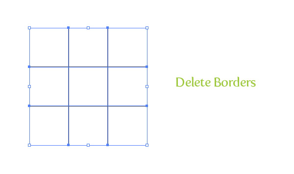
With the Direct Selection tool (A) select the borders of the new grid and delete them.
Step 18
Place the grid over icon so it is centered on the screen. In the Stroke panel, change the font weight to 4, check the Dashed Line check box, and type 8 for the first Dash input field. Next, change the Opacity to 30 from the Transparency panel.
Step 19
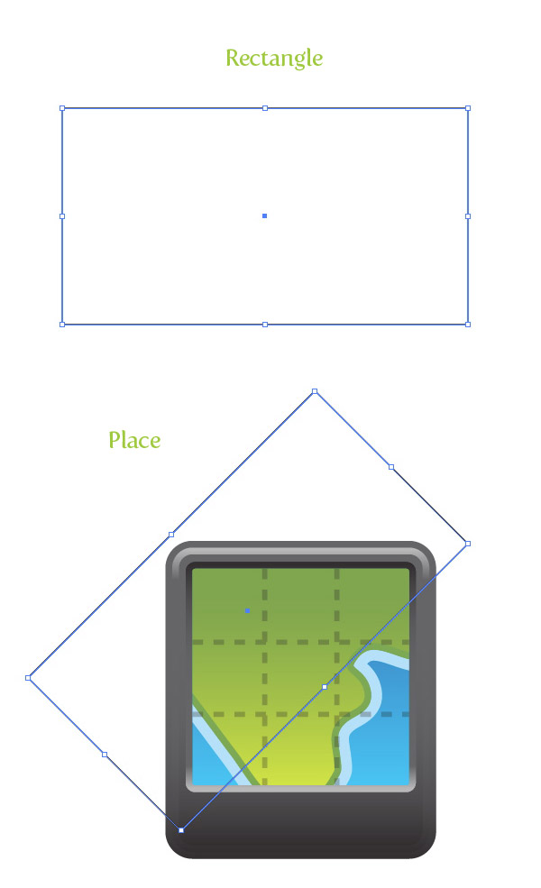
Create a rectangle at least 300 px wide by 160 px tall. Rotate the rectangle 45 degrees with the Selection tool (V) and place over the screen just below the top right side.
Step 20
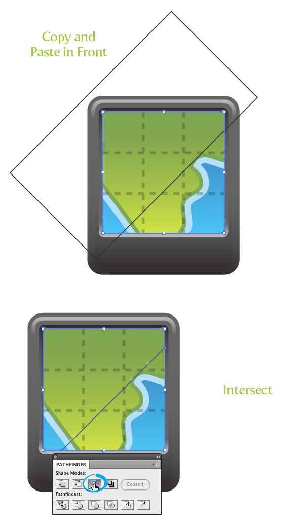
Select the blue screen shape, Copy (Command + C) and Paste in Front (Command + F). Select the rectangle and screen copy and press the Intersect button in the Pathfinder panel.
Step 21
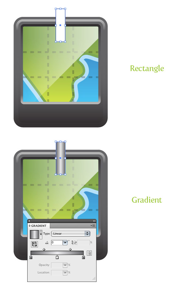
Fill the new shape with a linear gradient with both Color Stops white. Change the first Color Stop’s Opacity to 0, change the location of the middle point to 40, and change the Opacity of the second Color Stop to 60.

Step 22
Create a 20 px by 70 px wide rectangle and place it over the top part of the icon, so about a third of it is hanging off. Fill the rectangle with a three Color Stop linear gradient. Change the first Color Stop to a dark grey, the second to a light grey, and the third to a dark grey.
Step 23
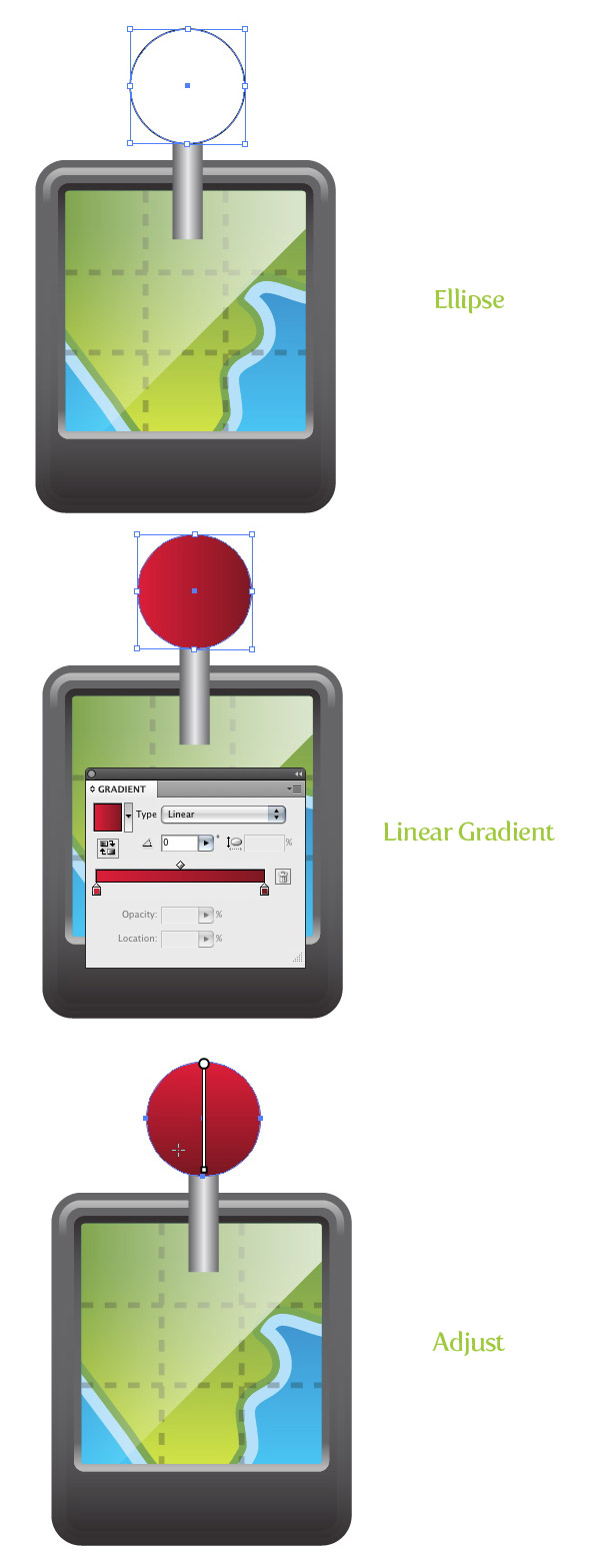
Create a 76 px by 76 px ellipse with the Ellipse tool (L) and place it on top of the previous rectangle. Fill the ellipse with a linear gradient with the first Color Stop red, and the second a dark red. Adjust the gradient from top to bottom, making the lighter part of the gradient at the top of the ellipse.
Step 24
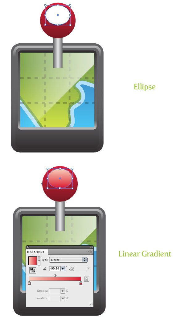
Create a 53 px wide by 42 px tall ellipse and place it toward the top of the previous ellipse. Fill the ellipse with a lighter red linear gradient than the previous and adjust the gradient from top to bottom.
Step 25
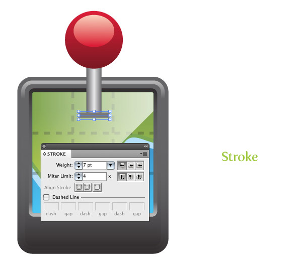
Create a 7 pt dark grey line with the Line tool (\) over the bottom part of the pin shape.
Step 26
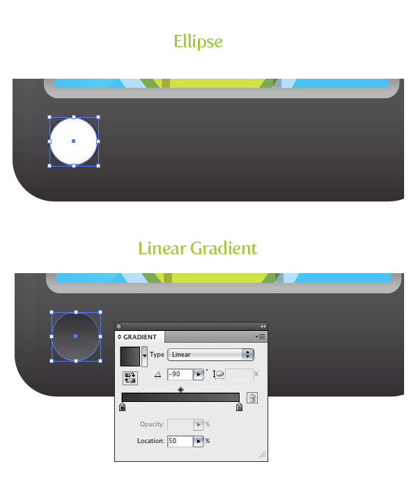
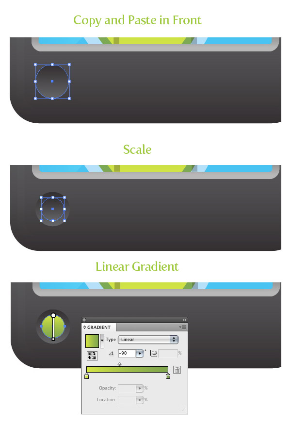
Create a 23 px by 23 px ellipse over the bottom left part of the icon. With the Eyedropper tool (I), fill the ellipse with the gradient from the first main body shape. Change the Location of the middle point to 50 and adjust the gradient from bottom to top so the darker part of the gradient is at the top of the ellipse.
Step 27
Copy (Command + C) and Paste in the Front (Command + F) the ellipse. With the Selection tool (V), scale down the copy slightly. Fill the ellipse with the same green gradient used for the land shape and adjust the gradient so the lighter part of the gradient is at the top of the ellipse.
Step 28
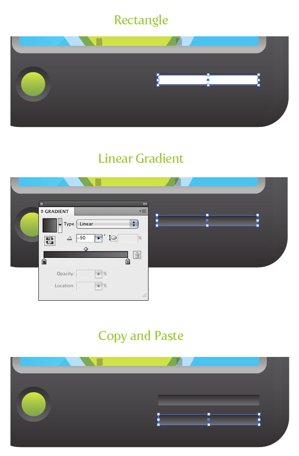
Create a 67 px wide by 7 px tall rectangle and place it on the right bottom side of the icon. FIll the rectangle with the same gradient as the bigger ellipse created in the previous steps. With the Selection tool (V), hold down Command (Ctrl for Windows) and Shift, and drag a copy of the rectangle below the first.
Step 29
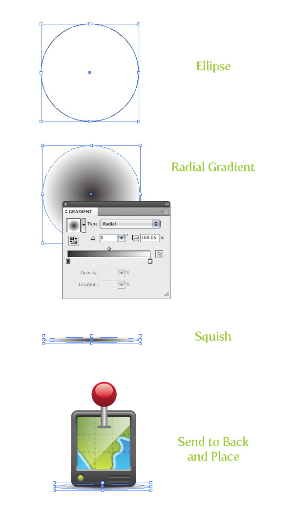
Create a 300 px by 300 px ellipse and fill it in with a radial gradient from the Gradient panel. Make the first Color Stop black and the second white. Squish the ellipse with the Selection tool (V) to a tenth of the ellipse original size. Go Object > Arrange > Send to Back (Command + Shift + [) and place the center of the ellipse by the bottom edge of the icon. All done!
Final Image
Below is the final image again.


Thanks so much for the article.Really looking forward to read more. Really Cool.
Hello. magnificent job. I did not expect this. This is a splendid story. Thanks!
I’ll right away grab your rss feed as I can’t find your e-mail subscription link or newsletter service. Do you have any? Kindly let me know so that I could subscribe. Thanks.
whoah this weblog is great i like studying your posts. Stay up the good work! You understand, many persons are searching around for this information, you could aid them greatly.
Thank you for every other wonderful post. Where else may anybody get that type of info in such an ideal means of writing? I’ve a presentation subsequent week, and I am on the search for such information.
We stumbled over here from a different website and thought I may as well check things out. I like what I see so now i am following you. Look forward to going over your web page repeatedly.
Howdy are using WordPress for your blog platform? I’m new to the blog world but I’m trying to get started and set up my own. Do you require any html coding expertise to make your own blog? Any help would be greatly appreciated!
Does your blog have a contact page? I’m having trouble locating it but, I’d like to send you an email. I’ve got some ideas for your blog you might be interested in hearing. Either way, great blog and I look forward to seeing it expand over time.
wonderful post, very informative. I wonder why the other experts of this sector don’t notice this. You must continue your writing. I’m confident, you have a great readers’ base already!
Heya! I just wanted to ask if you ever have any issues with hackers? My last blog (wordpress) was hacked and I ended up losing a few months of hard work due to no data backup. Do you have any methods to protect against hackers?
You really make it seem really easy along with your presentation but I to find this topic to be really something which I think I would never understand. It sort of feels too complex and extremely wide for me. I am looking forward for your subsequent post, I’ll try to get the hold of it!
Hello! This is my first visit to your blog! We are a collection of volunteers and starting a new project in a community in the same niche. Your blog provided us useful information to work on. You have done a wonderful job!
Hiya! Quick question that’s totally off topic. Do you know how to make your site mobile friendly? My website looks weird when viewing from my iphone. I’m trying to find a theme or plugin that might be able to correct this issue. If you have any recommendations, please share. Cheers!
Very nice post. I simply stumbled upon your weblog and wanted to say that I’ve truly enjoyed browsing your weblog posts. In any case I will be subscribing for your feed and I’m hoping you write again very soon!
Great tutorial!!! Only problem I had was at the end where you said to send the shadow to the back, I know what you mean, but it won’t send it to the back for some reason?
I am very greatful with you. I am learning a lot. Thank you.
Hello Sir,
I am beginner in illustrator. I found this tutorial very useful. Keep up the good work. and I’m really thankful to you because I’ve learned some new techniques.
Great design thanks for sharing
Thanks for the brilliant tutorial on how to create a stylist GPS icon. It is very interesting to know.
good tuto thank you man
Good job .Nice tutorial, thank you
Thanks for this great article.good job ..
Very interesting… that’s a great idea.
thank you …
thank you very cool design good job
THANK YOU FOR YOUR WORK
I found it difficult to get the initial bevel using the expand/offset…I can’t select the first offset rectangle individually, and it stops me from proceeding. Do you mean to have individual rectangles or just the offsets?
Ed
Maybe if you try to Ungroup them, it would be easy to select? Is that what you are talking about?
wow…..
an artist….awesome
Nice tutorial, thanks
Nice tutorial. I really need to start using Illustrator again.
Great tutorial, I’m still using Adobe Illustrator CS3 so I don’t think I can adjust the gradients and transparencies quite the same way.
really cool, thanks.
technically guides there in whole tutorial for make a professional vector. thanks
I like this one!
Nice GPS 😀
Good Job Bro!
This is awesome thanks!
Thank you for your great tips!!!!
Love the tut!
Thanks for the tutorial! I find that i use different method to achieve the same thing that you do in the tutorial. Yours is definitely more efficient. Like the inner highlight of the gps body. i use to do the offset and then subtract it, leaving a border shape only. and the use of gradients in this tutorial makes much more sense than using transparecy masks.
Your tutorials are always fun
Great tutorial, thanks. Learnt some nice techniques from this – always good to find alternative methods. Cheers Ryan.
Great tutorial. Always enjoy seeing your methods because even though I could do something like this, I find I’m never as efficient as I could be after reading your tuts! Thanks