

Illustrator has the ability to add raster effects to elements like outer glows, inner glows, and drop shadows. Vector art is great because you can scale them to any size. That is why I try not to use the raster effects in final output. One area this creates a problem, is drop shadows, but there are a couple of easy ways to add drop shadows using blends and gradients rather than raster effects.
Notes
This tutorial was created with Illustrator CS3.
Keyboard shortcuts are displayed in orange. ⌘ is displayed for the Command key (mac), with the Ctrl key being the Windows equivalent (not displayed).
Gradient Drop Shadows – Hover
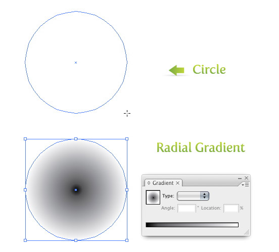
First draw a ellipse with the Ellipse Tool (l). When you are drawing the ellipse, hold down shift to constrain the height and width to make a perfect circle. Next, fill the circle with a Radial Gradient from the Gradient Panel and take off the stoke. Make the inside color of the gradient black (the left swatch on the Gradient Slider) and make the outside color white (the right swatch on the Gradient Slider).
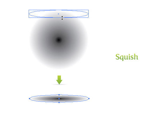
Select the circle with the Direct Selection Tool (v), grab the bottom handle, and squish the circle to about 1/8 the original size.
Next, place you artwork over the newly created drop shadow so the bottom of the artwork sits in the middle of the gradient. Done!

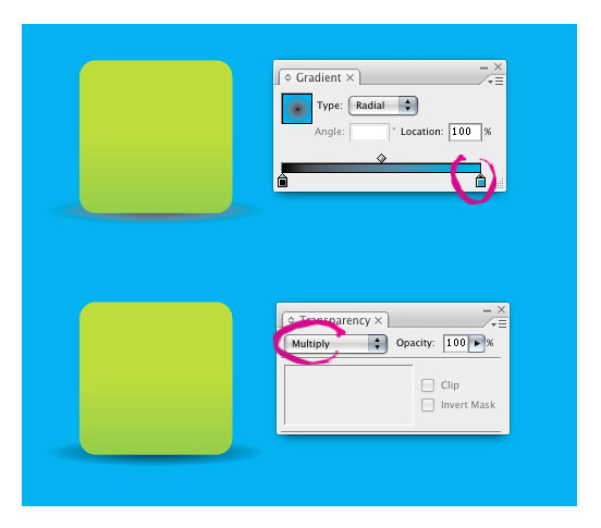
If you want the drop shadow over a particular color, you have some options. You can either change the white swatch in the Gradient Slider to match your background or select Multiply from the left drop-down menu in the Transparency Panel. Multiply is great for complicated backgrounds.
Gradient Drop Shadows – Perspective
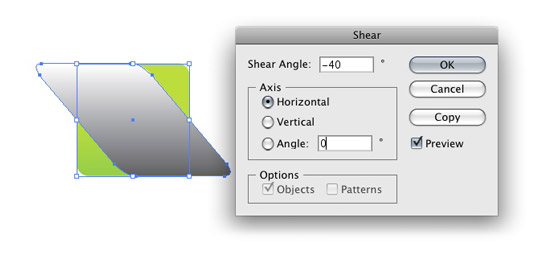
Start with the object you want to add a drop shadow to, Copy (⌘c) the object and Paste In Front (⌘f). Create a Linear Gradient (>) from the Gradient Panel, and keep the default black and white gradient swatches. Use the Gradient Tool (g) and click and drag from the top of the object to the bottom, so black is at the bottom of the object.
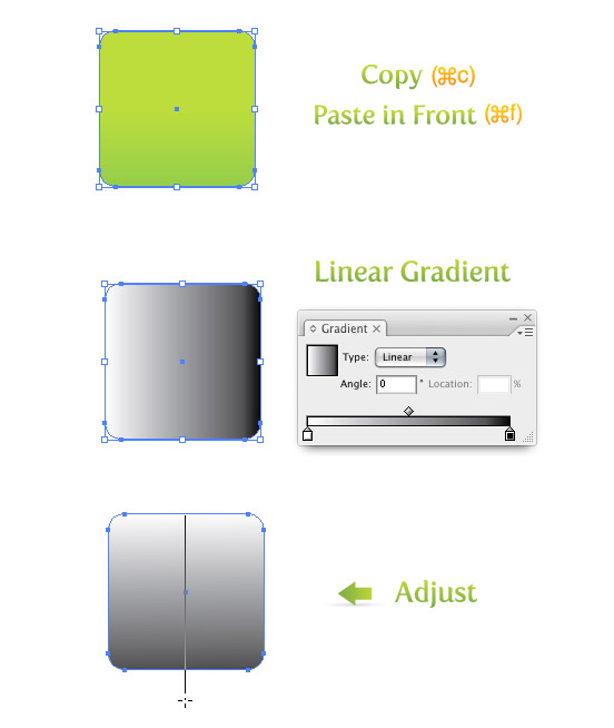
Next, go Object > Transform > Shear, to bring up the Shear dialog. Change the Shear Angle to -40, select Horizontal, change the Angle to 0 and press OK. Send the gradient behind the original shape by going Object > Arrange >Send Backward (⌘[).
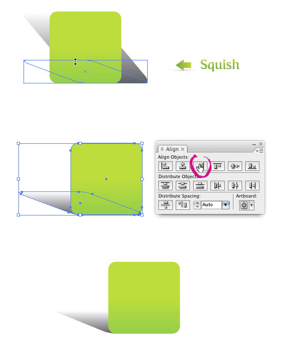
Select the gradient with the Direct Selection Tool (v), grab the top handle, and squish the gradient to the desired angle. Next, select both shapes and press the Horizontal Align Right button from the Align Panel, and scale and move as desired. All done!
You can also change the color of the white swatch on the Gradient Slider or set the object to Multiply if you want to put the drop shadow on a color background.

Blend Drop Shadows
Gradient Drop Shadow are great, but the Blend Drop Shadows are more versatile for complex shapes and objects.
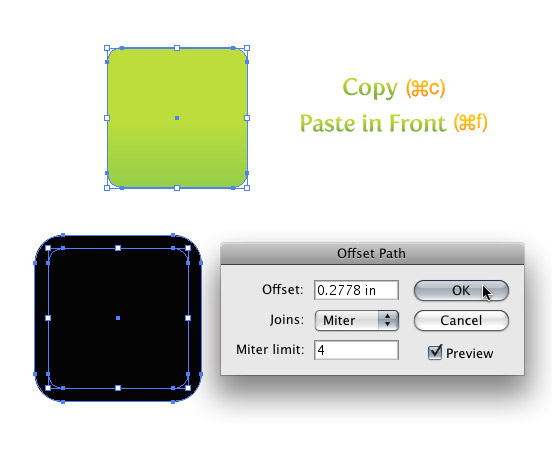
Select the object you want to add a drop shadow to and Copy (⌘c) the object and Paste In Front (⌘f). Fill the object with black and take off the stroke. Next, go Object > Path > Offset Path. In the Offset Path dialog you are going to want to change the Offset. I haven’t found any consistent way to proportionately create an offset for any sized object. I have tried to use percentages, but get varied results from time to time. The best way I came up with, is the treat the offset like a stroke by filling in the Offset number with a point value. In the example I show below, I typed 20 pt for the Offset (the pic below shows .2778 in because Illustrator converts the value to your documents unit value).
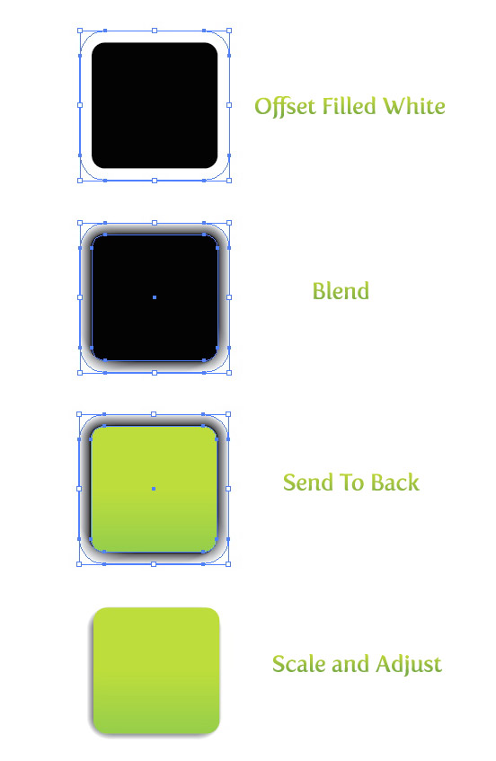
Once you get the Offset how you like it, fill it with white. Next, select both the white and black objects an create a Blend by going Object > Blend > Make (⌘ alt/option b). With the blend still selected, send it behind the original artwork by going going Object > Arrange >Send Backward (⌘[). Now, scale and move the blend for the desired effect!
Just like the Gradient Drop Shadows, you can place the Blend Drop Shadows over color. You can set the drop shadow to Multiply or change the color of the white object in the blend to match the background color.

Example Uses
Below are some basic examples of using these drop shadows, but there is room for a great deal of experimentation and exploration!


Thank you! This solved a problem I have been having in Illustrator CC doing designs for large-scale signage with dropshadow effects. 😀 😀
hi there, Nice tips but it has the same problem as the real drop shadow effect when it is flatten… I did every things as instructed looked great but when I flattened the transparency form the object menu I can see the white thick lines around the drop shadow!!!
Arjun-I’d like to learn more about your technique. Can your design stand successfully by simply not flattening the transparency?
Hi! very helpful!! great tutorial!
This has helped me a LOT! thank you
very useful technique, suitable for microstock site as they don’t accept raster shadow
Excellent tutorial! I never thought that there can be techniques which will make shadows look so real and still make the vector scalable!
Very usefull. Thank you!
Awesome tips, thank you. Got me round a drop shadow problem on large signage.
Great one!
Very helpful Amazing tips!!!!
Thx a lot for the tip!
I was making a A0 size scientific poster and wanted to add dropshadows around the frames of various sections. The built-in raster drop shadows sent my file size to a whooping 800Mb. With your vector version, the file weights 5 MB. lol!
Thank you so much. I am learning a lot.
Great tip!
Thanks Vectips!
Fantastic tips, thanks a lot, just what I was looking for.
Amazing technique. Anyway, please add another using gradient mesh for shadow as I have seen some advanced designers doing this.
you great !!!!!
….’fill the circle with a Radial Gradient from the Gradient Panel and take off the stoke.’
What does ‘take off the stoke’ mean and how to do it? My gradient panel (or result) doesn’t look like yours. I fill it with a radial gradient but I can’t have not a radial or get rid of the little left and right ‘boxes’. As you can tell I am a newbie on AI! Please explain this anyone?
Thanks, Lina
Ah, just tired, it’s supposed to be ‘stroke’ of course.
But I still can’t get my gradient like yours.
Very nice trick indeed. Top tip 🙂
thanks for tutorial
To offset a oddly shaped object, I give it a stroke and fill then expand it. I delete the newly expanded stroke shape, then give the newly expanded fill shape a stroke, fill it, and expand that. I continue this until its small enough that it fits nicely inside the original shape 🙂
What about if the background is not a flat color. How can I make a drop shadow with a texture background color?
It kind of depends. Are you creating the piece for stock art? Is there any requirements about transparency? If not, you can select Multiply from the Transparency panel.
Corel rules!!!
Hello, Great tutorial. But for some reason when I create more than one icon with this drop shadow, illustrator starts to slow down. For example ill try to move the icon and illustrator just lags for a while before I can move the icon. I’m assuming this method makes your files really large?
Or maybe I’m dong something wrong.
Would appreciate any help, thanks!
Yeah it will probably add to the file size. I don’t seem to have to much a problem. What kind of computer are you running? I find that the raster drop shadows at 300 dpi (Effect > Stylize > Drop Shadow) adds a lot size to my files as well.
Hi,
I am having a problem with this as the drop shadow shape I want needs to have a circle cutout in it (it’s a label) and I’ve not found out how to get the blend to work with the hole cut into the rectangle shape? Is there are way around this?
Yours gratefully,
Lorraine
Ps.
I am so grateful to you for what you share on your site, it rocks.
Thanks! The way Blends work, it make it almost impossible to get the drop shadow looking right without the “cutout” being blacked-out. You might just have to get more creative. Create the Drop shadow blend, mask out the hole in the middle and then create another blend for the hole in reverse. I’m not sure that makes much sense, but just experiment.
What is the project for? I tend to use the non-raster techniques for stock illustration purposes. If the element you are creating is for print or web use, you can probably get away with using the raster Effects drop shadow.
The project is for stock illustration purposes,… I tried the raster effects drop shadow and it didn’t look as good as your idea, so I opted for doing a blend in a circle placed on top, it ended up looking just fine.
I appreciate your comments, it was nice knowing that I managed to work it out for myself (bit of a confidence boost for me) (\:D
Keep up the super work!
Thanks a lot.
Lorraine
Glad to hear it worked out!
thanks great tip VECTIPS
When making drop shadows for multiple/complicated shapes using the blend method, I get a thin faint line where the shadows overlap (from the Multiply mode I suppose). To correct this, I created a third white object (largest) which then is blending a white object to a white object to a black object. Gets rid of the faint lines….but creates enough tone that it makes the shadow look bigger (not good).
Any suggestions?
hey, great site i really like your tutorials.
now to my problem. I have a transparent object (70% transparency) which represents a stripe of white-yellowish paper. and underneath it should get a drop-shadow but i dont want the drop shadow underneath to make my paper-stripe look greyish.
You could try Copying the transparent object, Paste in Back, and change the fill to a 100% white. That way the only color showing through is white and it is the same shape as the transparent object. Let me know if that helps.
Great tips, a question tho. Instead of using filter drop shadow, if you apply it as an effect – is that still raster?
Yeah it will still be raster artwork.
@ Dan
That is a great way to add a drop shadow, but it creates raster artwork. If you have uploaded vector stock artwork to a site like iStockphoto.com, you will be annoyed that they don’t allow raster objects in the artwork. That is when I use a technique like this, to get the same effect, but still be considered vector art.
With effects you could duplicate your object behind the original, apply a gaussian blur filter and shift it to the side a little.
Dale,
Try Expanding the Appearance by going Object > Expand Appearance. Let me know if that works.
Helpful, I was really looking for shadows on type. I was have a problem when trying to repeat a logo on a package upside down on the file. When flipping the logo image it does not flip the shadow. I find shadows in illustrate so frustrating and can’t understand that they still don’t work like the do in photoshop. Can you help?
Wonderful 🙂 .. like it
Got it! Still not sure why this wasn’t working before…
Not only does this scale well, it looks much better when working with tiny icons in Illustrator.
Thanks so much! This has definitely replaced ‘Apply Dropshadow’ for me.
I’d love to know how you sorted this. My shape is an offset of some rounded text, but when I offset my offset and blend them, I get a grey bar as well 🙁
Nice! I like the look/vibe of your site.
Here’s a refinement for matching the gradient into a solid color: add the background color to the black end of the gradient. EG: for 100% cyan background, mix black in gradient as 100c0m0y100K. Also fixes grayness in the middle of Black>color gradients in general.
Thanks for tips n tuts
Fantastic tips!
Thanks!
i created an icon a few days back and was wondering why my shadow looked odd when i resized it, this method is what i should have done.
thanks
Never thought of doing shadows that way, great tip
Not sure what could be wrong…
I’m sure you tried this, but are the rounded corners expanded?
I can’t get this to work with a ’rounded corners’ object. When I made the blend, I just get a thick solid grey bar around the black box…
-_-;
Thanks for the tips!
Great, it is so simple that never had crossed my mind doing shadows that way. Great site!
Thanks Andrej! I was pretty excited.
I also do it with blends mostly. Nice tut.
BTW: Congrats on the featured illustrator at IS 😀
Gradient Drop Shadows is actually the oldest trick to create any decent color blend or drop shadow before filter or effect showed up in Illustrator (like Illustrator 3.0). I am glad people still remember to use this.
Guao..! very smart, thanks for sharing
Great site. Keep the tips coming.
Thanks for the tip!
good one!
this is another impressive one 🙂
Thanks! I learn a lot about illustrator from you 🙂
Great tips!
Very good! I like your site!
Interesting tips!
nice, definitely a good tip. I like that you did blend, and didnt just lower the opacity.