
In this tutorial I will show you how to create a simple retro type treatment. Even though its simple, it uses some powerful Illustrator features. If you have read my tutorials before, you know this means the Appearance panel! Along with the Appearance panel, we will be using some texture effects, Warp effects, and some simple layering.
Final Image
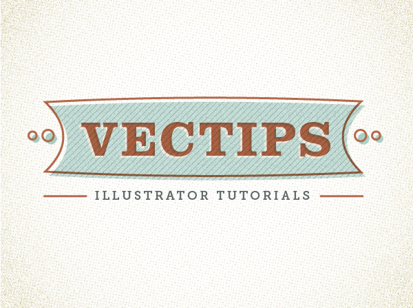
Below is the final type treatment we will be working towards.
Tutorial Details
- Program: Adobe Illustrator CS5 (You should be able to create this tutorial in CS4 and CS3 but some of the tutorial images might look different.)
- Difficulty: Beginner / Intermediate
- Topics Covered: Appearance Panel, Effects
- Estimated Completion Time: 15-20 minutes
Step 1
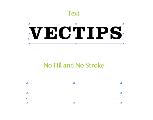
Create a new document and type out some text with the Text tool (T). I used Clarendon Bold at 48 pt. Take off any stroke and fill on the text.
Step 2
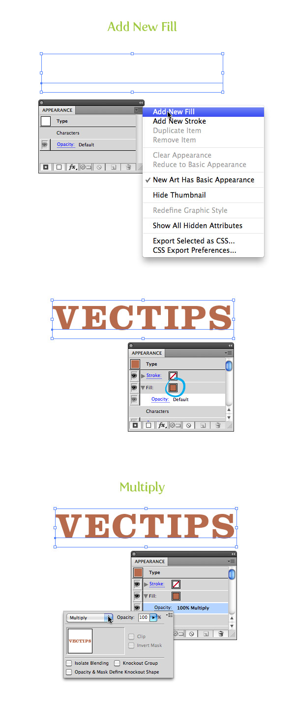
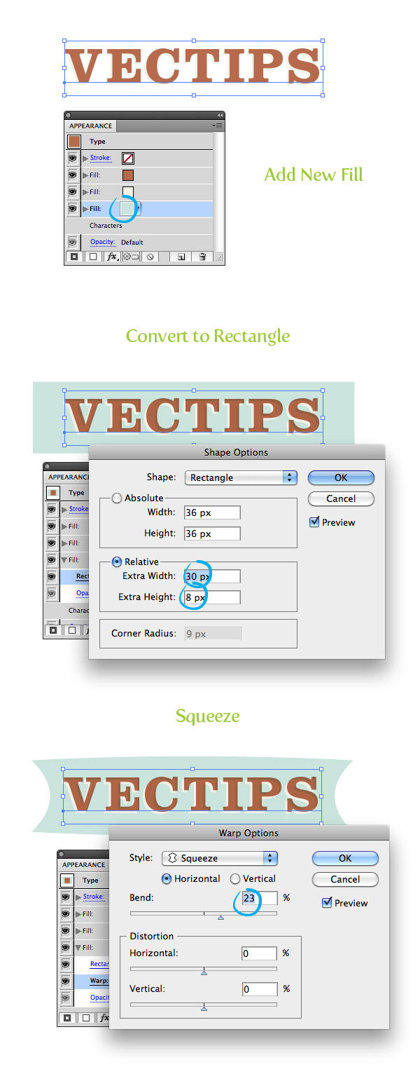
With the text still selected, choose Add New Fill from the pop-up menu of the Appearance panel. Fill the new fill with a reddish orange color. In the Appearance panel, press the drop-down arrow for the new fill to reveal its attributes. Press the Opacity link and change the Blending Mode to Multiply.
Step 3
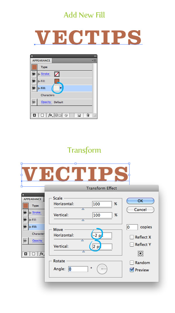
Create another new fill in the Appearance panel, select the bottom fill item, and fill it with a light yellow color. With the light yellow fill item selected in the Appearance panel, go Effect > Distort & Transform > Transform. In the Transform dialog, change the Horizontal Move to -2 px and the Vertical Move to 2 px.
Step 4
Create another new fill, select the bottom fill item, and fill it with a light aqua color. With the aqua color fill item selected, go Effects > Convert to Shape > Rectangle. In the Rectangle dialog, select the Relative radial button, change the Extra Width value to 30 px and the Extra Height to 8 px. With the aqua fill item still selected, go Effects > Warp > Squeeze. In the Warp Options dialog, select the Horizontal radial button and change the Bend to 23.
Step 5
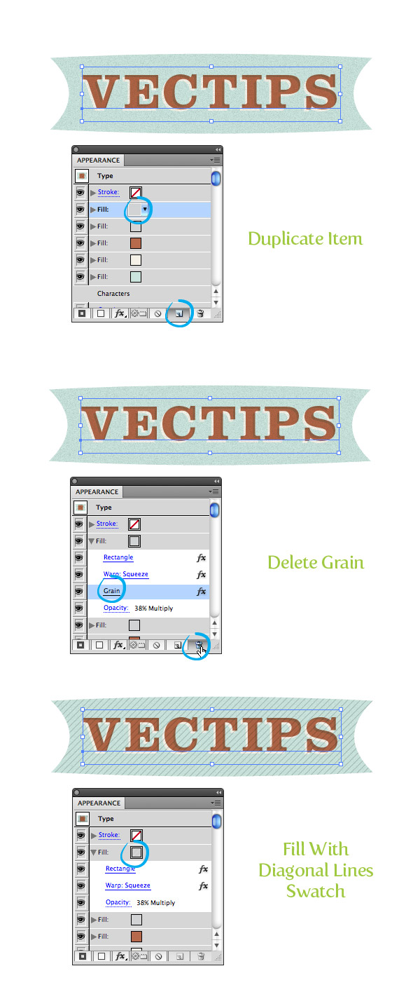
With the aqua item selected, press the Duplicate Selected Item button at the bottom of the Appearance panel. In the Appearance panel drag one of the aqua copies above the first reddish fill item. Change the fill of the top item to a light gray. With the item still selected, go Effects > Texture > Grain. In the Grain dialog, change the Intensity to 78, the Contrast to 50, and the Grain Type to Sprinkles. Change the Blending Mode of the gray fill to Multiply and change the Opacity to 38.

Step 6
Duplicate the grain fill item, select the top copy, and expand the attributes. Select the Grain attribute and press the trash icon at the bottom of the Appearance panel. Fill the selected item with a Diagonal Line swatch (this can be found by pressing the bottom left Swatch Libraries icon in the Swatches panel then navigating Patterns > Basic Graphics > Basic Graphics_Textures).
Step 7
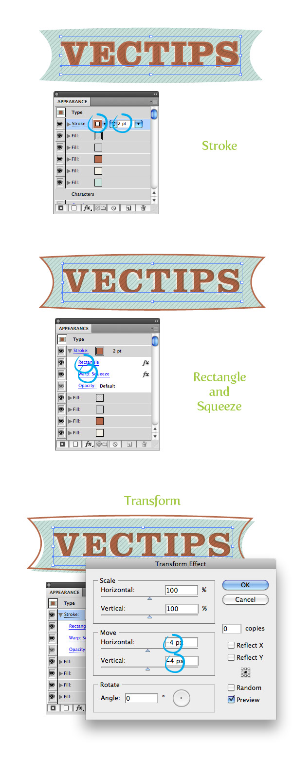
Select the empty stroke item at the top of the Appearance panel, (if your empty stroke item is not at the top, drag it up to the top) fill the stroke with your reddish color, and change the weight to 2 pt. Change the stroke to have the same rectangle and squeeze settings as the previous fill items and set the Blending Mode to Multiply. With the stroke still selected, go Effect > Distort & Transform > Transform and in the Transform dialog, change the Horizontal Move to -4 px and the Vertical Move to -4 px.
Step 8
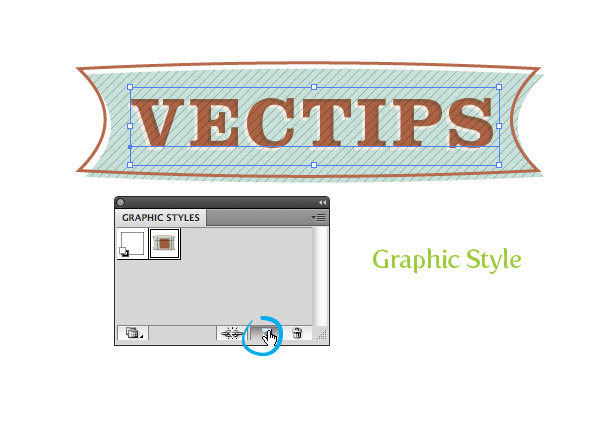
That’s pretty much it for the text treatment! I like to save it as a Graphic Style so I can apply it to other artwork. To create a Graphic Style, select the text and the press the New Graphic Style Button in the Graphic Styles panel. Now you can add the effect to other elements like in the final preview image.
Final Image
Again, here is the final image!


Magnificent website. Plenty of helpful information here.
I am sending it to a few pals ans also sharing in delicious.
And of course, thank you to your sweat!
Really appreciate you sharing this article post.Thanks Again. Really Great.
I am stuck on step 4. When I follow the directions to make the rectangle, nothing appears. Visibility is on for all fills, and I have tried several times. I’m very new to illustrator and this is for a class assignment. Thank you!
I am alway follow you website and your blog I think it is awesome!
Very Good Illustrator Tutorial ! Thanks for another one.
Great tutorial. I am a beginner so please excuse me… Everything turned out great, but when I try to reuse it I have a brown shape in the center of everything. How do I remove that so I just have the nice aqua?
Hi, when I create a new fill for the blue, the yellow fill above it disappears and I can’t see it. I’ve tried creating the rectangle and then changing the fill to blue, but this doesn’t work either. All fills have the eye checked
Ah ok, each new fill automatically moves to the top of the list. Always name your fills and layers I guess!
Hi,
Coming from years of working with Inkscape, Illustrator is a bit getting used to. Just not as logical as Inkscape. This tutorial is great to get into Illustrator.
My result looks just about the same.
Only difference is that my halftone and grain are a bit more rough then yours.
Has this to do with the image size?
Thanks again,
Wouter
How do you make the word centered? My words go off to the side. ):
Your way of explaining all in this piece of writing is genuinely good, all be able to effortlessly know it, Thanks
a lot.
I want to to thank you for this wonderful read!! I certainly
enjoyed every bit of it. I’ve got you book marked to
look at new things you post…
Wow! Thank you so much! So easy and useful:)
Saw this on Behance.
http://www.behance.net/gallery/Francis-Tuttle-Career-Training-Guide-2012-2013/5526843
too many steps lets just play cod
Thank you!! Turned out great!!
thanks bro
excellent tutorial bro,thanks!!!
Which illustrator are you using? I’m cs3 and i don’t have half of the options you have in yours. I can’t follow your tutorial. :[
Very nice Tutorial! Thanks a lot!
Well done. We linked to this tutorial in a blog piece.
This is SO good. Everything is really nicely broken down, it’s so pleasant to read and the end product looks really nice and authentic. Awesome stuff!
I like your illustrator tuts.
Great tutorial! Though i can’t seem to make the graphic style thing work. I save it but can’t use it on other documents – what am I doing wrong? 🙂
thanks! /Sara
when i searched for a style i found this one and very much like it.
thanks for sharing.
I appreciate this awesome tutorial. Thanks for this helpful tutorial.
Awesome tutorial… thanks for this, i haven’t been using most of the effects on this tutorial, learning is good…
The tutorial as a whole was awesome. I got stuck on the last part of step 6. After adding the basic texture I didnt see any lines at all. Im using CS3 I noticed my appearance panel is a little different.
i completely agree with you i have cs3 and i don’t have these options :[
I’m studying Graphic Design and I’m all new to this design stuff and I completed this tutorial with ease! I’m so happy! Thanks for the tutorial it really helped me!
thanks for sharing! so smart methods! thanks once more!
I just want to say thanks for sharing this tutorial. I’ve tried going for this look on my own only to be disappointed and frustrated. Finally got around to actually doing the tutorial and made a nice header for my blog. 🙂
Awesome tutorial!. nice and clear step by step guide to getting a satisfying end result! We definetly need things like these to help us learn the how to design without fustration on how to produce them! If only there are classes solely to learn about tutorials! how awesome that would be. Thank you for the time and effort putting this together for us to learn and open our eyes to. Greatly Appreciated! XD
Looks simple enough doesn’t it. The final copy looks like a great retro logo – excellent tutorial and I hope to have as much success..
Maybe you should change your logo to that one?
Thank-you VERY much for this tutorial. It’s great! I did the following with your tutorial. It is for a pennant design competition. Do you like it?
https://picasaweb.google.com/lh/photo/8wbLnwJiuYYHcw2fKNbPvUQp4OKizOM4jIF-DkcZOoQ?feat=directlink
Sam
Wonderful tutorial…though one question. When I make the light yellow shadow it appears in front of the orange text. How do I move it behind? Thanks so much!
Ah! Got it! You just move the fill layers up and down to create their order! Thanks again. Had fun doing this!
Thank you for this great tutorial. I´ve learnt and enjoyed a lot.
Hey! I’m stuck on step 6, “Duplicate the grain fill item, select the top copy, and expand the attributes.” How do you expand just the grain? Every time I expand, it expands the whole thing.
Thanks!
You need to tell the user to create a new document using PIXELS as their unit of measure. Otherwise, when they get to Step 3, they will type in -2in, 2in instead of pixels. This had me so confused. That tip would help this tutorial 🙂
Thanks for sharing! Nice tutorial! I like it!:)
thanks a lot!
Hi,
Great tutorial. I’m stuck on step 7 though – the stroke is being applied to the text instead of the squeezed box…
Any ideas?
Thanks
someday soon, i want to be able to do this too! i just downloaded a tutorial version of illustrator. love your tutorials!
Very Good Tutorial !
Fantastic. Thanks for the tutorial
Appearance tool is so great, it allow us to create a styling text, and it still editable.
how did you make the background?
great tutorial, thank you…but once i create the rectangle i lose the lighter offset type created in step 3…what am i doing wrong?
wow… cool tutorial…
i want to ask..
where i can get that background image at final image?
what’s the tag name?
sorry for my bad language hehehe…
thanks…
Can you make a video tutorial of this? Please.
Being a beginner, It really took me sometime to figure out the flow of work, but once I got it right, I got it going.
I also knew use of patterns, creating graphic styles and some warp things for robust graphic works. Thanks for this.
My final Output
http://i76.photobucket.com/albums/j5/alexshr/retro20effect.png
This tutorial was incredibly useful and really easy to follow! thanks you for sharing!
Awesome tutorial, I always enjoy reading these blogs.
I loved your tut, thanks for sharing 🙂
for some reason my diagonal lines look soooo tiny and close together, unlike yours 🙁 any suggestions? :S
Is there a way to add the background rectangle when typing on a path so that it follows the path? Thanks!
Thank you for the tutorial. it’s awesome . i like it XD
that was awesome/ one of my favorite tut sites! thanks man!!
Very nice tutorial… really appreciate it!
Nice tutorial. Here is my try at it…
http://plixi.com/photos/original/69159366
Thank you for the tutorial. it’s great.
If you don’t mind, whats the Font you used for “illustrator tutorials”?
Thanks! The font is Sentinel
interesante
Awesome text effect. I’m surely gonna try out this on few of my upcoming projects. Love the background texture too. Thank you so much for the tut.
Awesome! I know I definitely underuse these techniques, the reusable benefit is certainly worth me looking into these properly.
Thanks for a great tutorial.
Dan
Not only did I learn alot about the Appearance Panel but now I have added to my Graphic Style library for future work! Thanks for a great tutorial.
Awesome tutorial. How did you do the cream colored background of the final image? Did you create it or is it a stock photo?
I did it in Illustrator. Check out my reply a couple comments up in response to Arun.
Is the diagonal line fill in CS5 by default? All my line patterns seem to be horizontal or vertical.
Yeah it is in the default but it is under Pattern > Basic Graphic > Basic Graphics_Textures.
i got the same prob !! I can not find the diagonal patter 🙁 🙁
thank’s for sharing
love tis tut very much
and also about the used technique
que bien…
Awesome use of styles. Great job, thx.
Hi, i have a question, I got stuck on the part where you have to Change the stroke to have the same rectangle and squeeze settings as the previous fill items and set the Blending Mode to Multiply. in step 7, the rectangle and warp squeeze do not appear under the stoke layer. What am i doing wrong? Thanks! 🙂 great tutorial!
You just need to recreate each of the Rectangle and Squeeze effects under the stroke item like you did for the fills. I should have that more clear in the tutorial!
Hi,
Just come across this tutorial its great, but I am also stuck on the stroke part. I have added the effects on the strokes layer set to multiply etc and it does not take the stroke away from the text. Could this be an issue with CS4?
Nevermind figured it out. Great tutorial.
Thanks for this beautiful graphics style!
Lovely tut Rype. Retro -typo- pattern very nice effect. Thanks share!
Thank you for the tutorial. I really enjoyed it.
@Ryan Where can I get the jut-sack/canvas like texture used for the background.
For the background I created a rectangle with a light yellow color and applied Effects > Pixelate > Color Halftone and changed all the Channel values to 100.
Then in another fill from the Appearance panel, create a radial gradient (first stop white and 0 opacity and the second stop a darker yellow color), then go Effects >Texture > Grain.
Thank you Rype for that update. Much appreciated.
Thanks for another great tutorial. 🙂
You’ve added an inner shadow to the text in step 4. How did you do this?
Very cool tutorial though!
Jonny
The shadow is actually just an effect from setting the original text to Multiply in Step 2.
I love how clever this is. I wouldn’t think to do it so smartly. I would have had 10x the objects. So smart.
Very nice tut 🙂
For some reason, the result of this tutorial reminds me of House Industries and their graphic style.
It looks great, thanks a lot for sharing.
Very Good Illustrator Tutorial !
Loved this tutorial, should come in handy. Would also love a tutorial on how to make the background behind the text 😀
Great tutorial, as always!
Very nice effect. Great job. I’ve been looking for this sort of thing!
Nice effect. I should use more often those patters.
You are right Marius, patterns are part of the designers secret palet.
Tom
Great tutorial! I’ve been infatuated with retro European signage for the longest!