
Welcome back to another Illustrator based tutorial, in which we’re going to take a quick look behind the process of creating a clock icon, and see how we can create a finished usable product using nothing more than a couple of simple shapes, which we’ll adjust here and there. So, assuming you already have the software running in the background, bring it up and let’s get started!
Tutorial Details: Clock Icon
- Program: Adobe Illustrator CS6 – CC 2020
- Difficulty: Beginner
- Topics Covered: Design Theory, Compositional Construction, Shape Alignment, Grid Positioning
- Estimated Completion Time: 20 Minutes
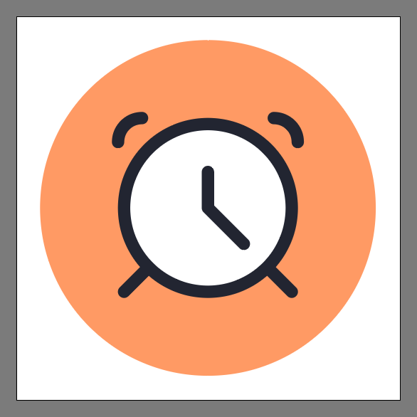
Final Image: Clock Icon

Step 1
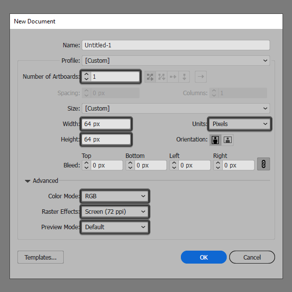
As with every new project, we’re going to kick things off by setting up a New Document, by heading over to File > New (or by using the Control-N keyboard shortcut), which we will then adjust as follows:
- Number of Artboards: 1
- Width: 64 px
- Height: 64 px
- Units: Pixels
And from the Advanced tab:
- Color Mode: RGB
- Raster Effects: Screen (72ppi)
- Preview Mode: Default
Quick tip: most of the indicated settings can be triggered automatically if you set the document’s Profile to Web, the only one that you’ll have to manually adjust being the Artboard’s Size (Width x Height).
Step 2
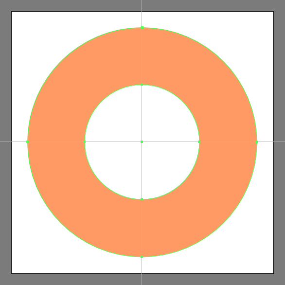
As soon as we’ve finished setting up our project file, we can start working on the actual alarm clock icon. Create the main shape for the background using a 56 x 56 px circle, which we will color using #ff9b64 and then center align to the underlying Artboard using the Align panel’s Horizontal and Vertical Align Center options.

Step 3
Add the main shape for the clock’s body using a 28 x 28 px circle, which we will color using #ffffff and then center align to the larger background.
Step 4
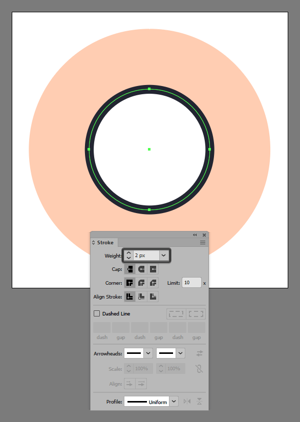
Give the shape an outline using the Stroke method, by creating a copy (Control-C) of it. Paste in front (Control-F) and then adjust by first changing its color to #1c202d. Then flip its Fill with its Stroke using the Shift-X keyboard shortcut, making sure to set its Weight to 2 px from within the Stroke panel. Once you’re done, select and group the two shapes together using the Control-G keyboard shortcut.
Step 5
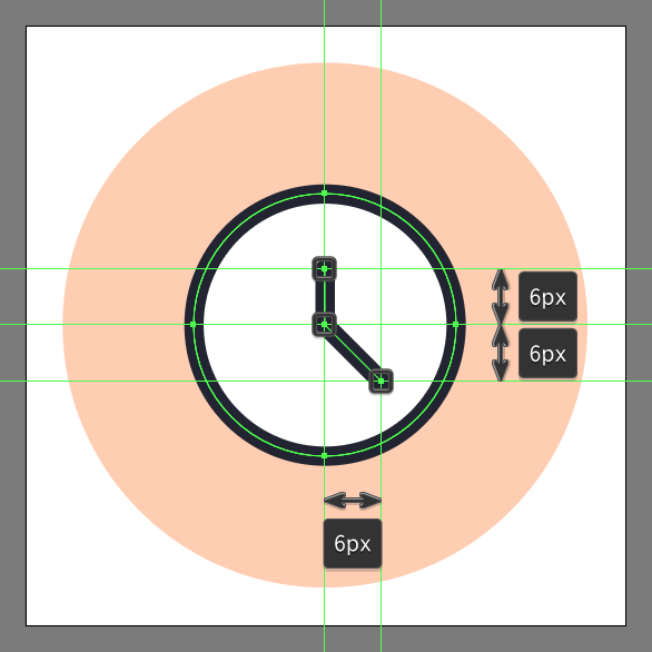
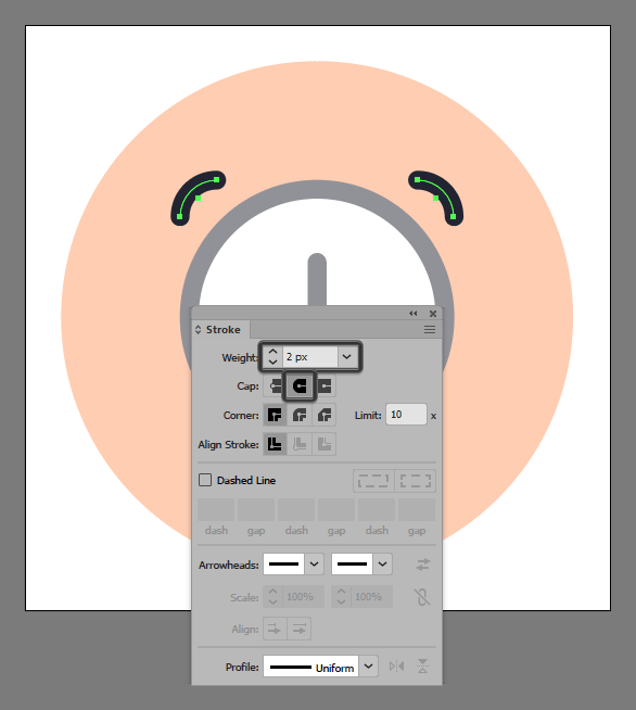
Grab the Pen Tool (P), and using a 2 px thick Stroke (#1c202d) with a Round Cap and Join, draw the alarm clock icon’s hands following the reference image as your main guide. Take your time, and once you’re done, move on to the next step.
Step 6
Create the main shapes for the two bells using two 8 x 8 px circles with a 2 px thick Stroke (#1c202d), which we will position as seen in the reference image.
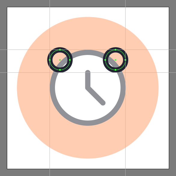
Step 7
Adjust the two shapes that we’ve just created, by selecting both their bottom and inner facing anchor points using the Direct Selection Tool (A). Remove them by pressing Delete, making sure to set the resulting strokes’ Cap to Round.
Step 8
Finish off the alarm clock icon by drawing the two feet using a 2 px thick Stroke (#1c202d) with a Round Cap. Position in relation with the larger body as seen in the reference image. Don’t forget to select and group (Control-G) all of the clock’s composing shapes, doing the same for the entire alarm clock icon afterwards.
Great Job!
I hope you had fun working on the project and most importantly managed to learn something new and useful during the process. If you have any questions feel free to post them within the comments section. I’ll get back to you as soon as I can!
Author: Andrei Ștefan
Just another coffee addict / pixel grinder, creating colorful projects one pixel at a time.


