
In today’s tutorial, we’re going to take a quick look behind the process of creating a keyboard app icon, and see how we can take some simple shapes and turn them into a finished usable product. So, assuming you already have the software running, let’s jump straight into it!
Tutorial Details: Keyboard App Icon
- Program: Adobe Illustrator CS6 – CC 2020
- Difficulty: Beginner
- Topics Covered: Design Theory, Compositional Construction, Shape Alignment, Grid Positioning
- Estimated Completion Time: 20 Minutes
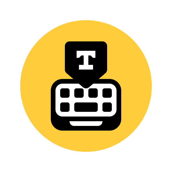
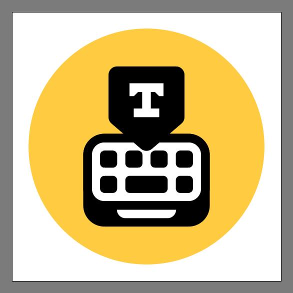
Final Image: Keyboard App Icon
Step 1
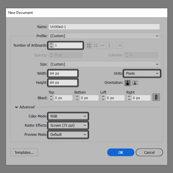
As with every new project, we’re going to kick things off by setting up a New Document, by heading over to File > New (or by using the Control-N keyboard shortcut), which we will then adjust as follows:
- Number of Artboards: 1
- Width: 64 px
- Height: 64 px
- Units: Pixels
And from the Advanced tab:
- Color Mode: RGB
- Raster Effects: Screen (72ppi)
- Preview Mode: Default
Quick tip: most of the indicated settings can be triggered automatically if you set the document’s Profile to Web, the only one that you’ll have to manually adjust being the Artboard’s Size (Width x Height).
Step 2
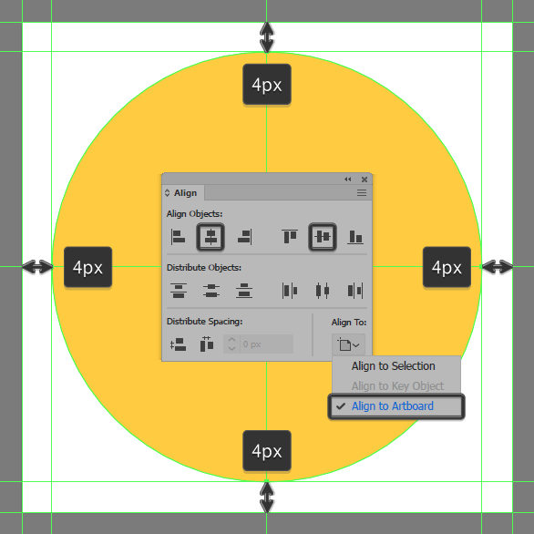
As soon as we’ve finished setting up our project file, we can start working on the actual icon, and we will do so by creating the main shape for the background using a 56 x 56 px circle, which we will color using #ffcc3e and then center align to the underlying Artboard using the Align panel’s Horizontal and Vertical AlignCenter options.
Step 3
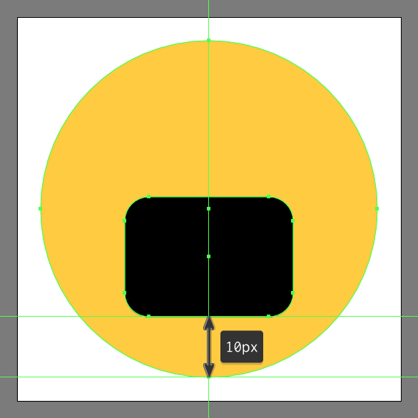
Create the main shape for the keyboard’s body using a 48 x 20 px rounded rectangle with a 4 px Corner Radius, which we will color using #000000 and then horizontally align to the underlying background, making sure to position it at a distance of 10 px from its bottom anchor point.
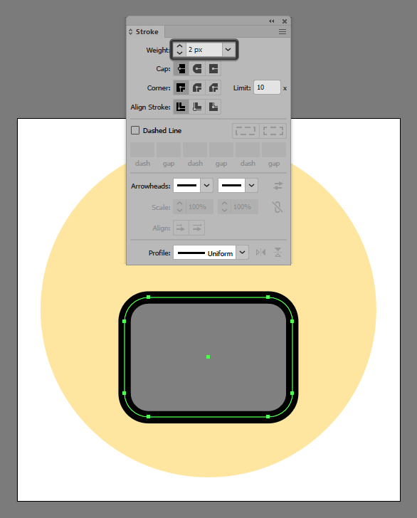
Step 4
Give the shape that we’ve just created an outline using the Stroke method, by creating a copy of it (Control-C), which we will paste in front (Control-F) and then adjust by flipping its Fill with its Stroke using the Shift-X keyboard shortcut, making sure to set its Weight to 2 px from within the Stroke panel. Once you’re done, select and group the two shapes together using the Control-G keyboard shortcut.
Step 5
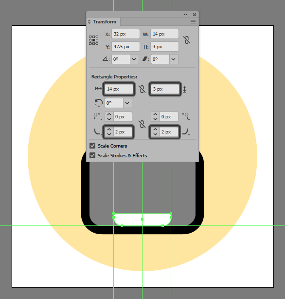
Add the little insertion using a 14 x 3 px rectangle (#ffffff), which we will adjust by opening up the Transform panel and then setting the Radius of its bottom corners to 2 px, making sure to position the resulting shape as seen in the reference image.
Step 6
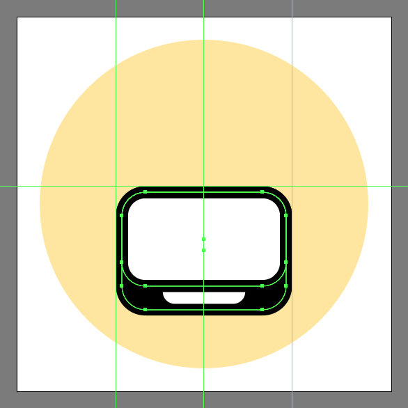
Create the front section of the keyboard using a 28 x 16 px rounded rectangle (#ffffff) with a 4 px Corner Radius and a 2 px thick outline (#000000), which we will group (Control-G) and then align to the larger section’s top edge.
Step 7
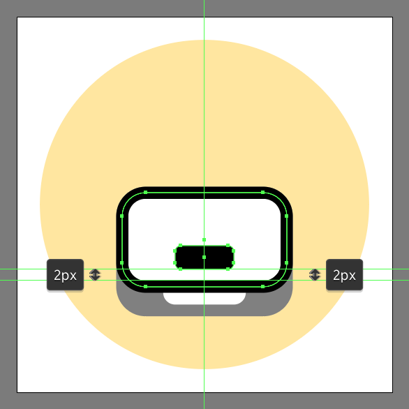
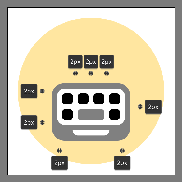
Add the space bar using a 10 x 4 px rounded rectangle with a 1 px Corner Radius, which we will color using #000000 and then position as seen in the reference image.
Step 8
Create the remaining keys using six 4 x 4 px rounded rectangles (#000000) with a 1 px Corner Radius, which we will distance at 2 px from one another both horizontally and vertically. Take your time, and once you’re done make sure you select and group (Control-G) all of them together, doing the same for the entire keyboard afterwards.
Step 9
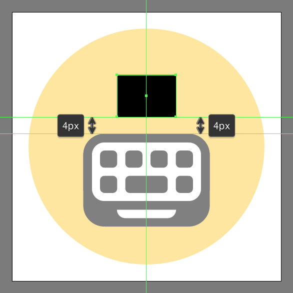
Add the main shape for the small indicator using a 14 x 10 px rectangle, which we will color using #000000, and then position as seen in the reference image.
Step 10
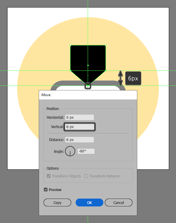
Adjust the shape that we’ve just created by adding a new anchor point to the center of its bottom edge using the Add Anchor Point Tool (+), which we will then select using the Direct Selection Tool (A) and push towards the bottom by a distance of 6 px (Enter > Horizontal > 6 px).
Step 11
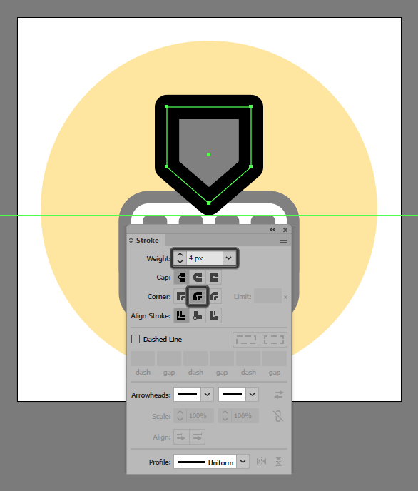
Give the resulting shape a 2 px thick outline (#000000) with a Round Join using the Stroke method, making sure to select and group (Control-G) the two together afterwards before moving on to the next step.
Step 12
Create the main shapes for the type symbol using a 6 x 2 px rectangle (#ffffff) for the foot section, followed by a 2 x 4 px one (#ffffff) for its stem, and finally an 8 x 2 px rectangle (#ffffff) for its arms, which we will position as seen in the reference image.
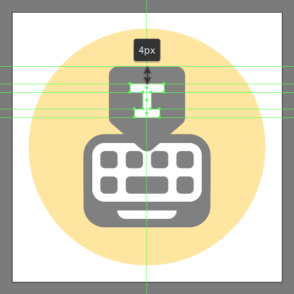
Step 13
Finish off the symbol and with it the project itself, by adding the upper serif segments, using two 2 x 1 px rectangles (#ffffff) which we will adjust by individually selecting their inner bottom anchor points using the Direct Selection Tool (A), and then pushing them to the inside by a distance of 1 px using the directional arrow keys. As always, once you’re done, don’t forget to select and group (Control-G) all of the symbols composing shapes, doing the same for the indicator and then the entire icon afterwards.
Awesome Job!
As always, I hope you had fun working on the project and most importantly managed to learn something new and useful during the process. That being said, if you have any questions feel free to post them within the comments section and I’ll get back to you as soon as I can!
Author: Andrei Ștefan
Just another coffee addict / pixel grinder, creating colorful projects one pixel at a time.


Thank you a lot for giving everyone an exceptionally remarkable opportunity to discover important secrets from this blog. It is always so fantastic and stuffed with amusement for me personally and my office acquaintances to visit your web site a minimum of three times every week to find out the newest stuff you have. Not to mention, I’m actually fascinated with the incredible secrets served by you. Some two facts in this post are completely the best I’ve ever had.