
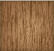
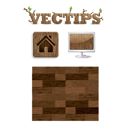
Last up for Vectip’s Texture Week is wood grain. The steps for this technique are very similar to the previous Brushed Metal Texture tutorial. It uses the same Graphic Pen effect but stretched a little more. It also uses the Warp Tool and Twirl Tool. Also like the other texture tutorials, this technique is easy and applicable in logos, icons, interfaces or pretty much anything.
Notes
This tutorial was created with Illustrator CS3.
Keyboard shortcuts are displayed in orange. ⌘ is displayed for the Command key (mac), with the Ctrl key being the Windows equivalent (not displayed).
Rectangles
Create a 5 inch by 5 inch rectangle with the Rectangle Tool (m). An easy way to draw an exact rectangle is to click on the artboard with the Rectangle Tool (m) to bring up the Rectangle dialog to enter dimensions. Fill the rectangle with a light brown and take off the stroke.
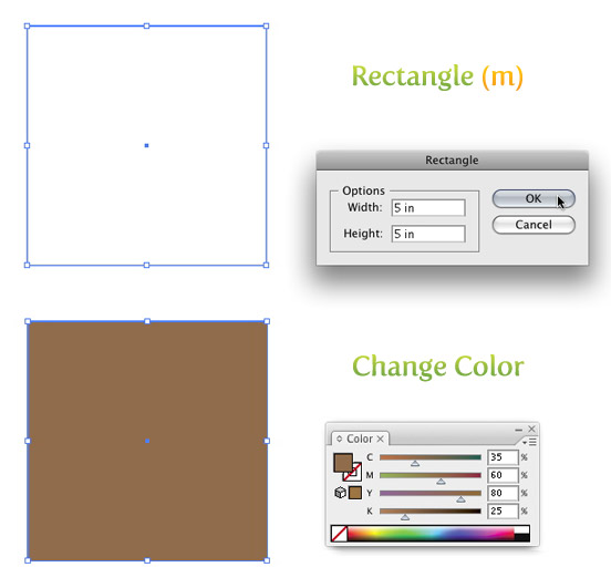
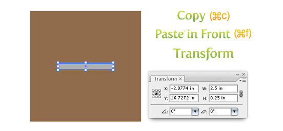
Next Copy (⌘c) the rectangle and Paste In Front (⌘f). With the copied rectangle selected, change the dimensions for the width to 2.5 inches and the height to .25 inches in the Transform Panel and fill the rectangle with a 40% black.
Texture
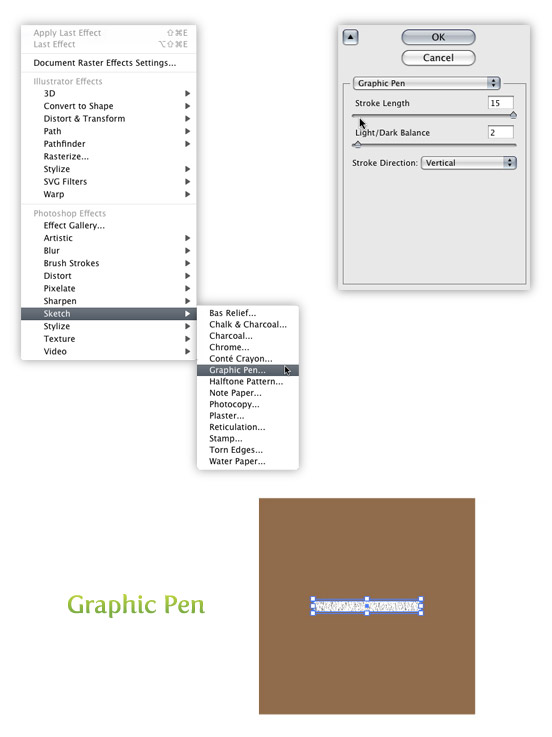
Select the smaller rectangle and go Effect > Sketch > Graphic Pen. When the Graphic Pen Effect dialog comes up, change the following settings.
- Stroke Length = 15
- Light/Dark Balance = 2
- Stroke Direction = Vertical
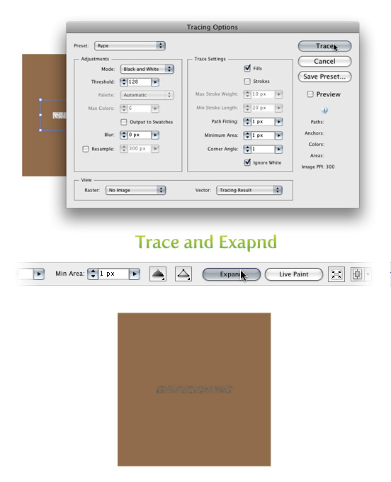
Trace and Expand
With the texture selected go Object > Expand Appearance. With the texture still selected, the Control Panel defaults to the Live Trace options. Click the arrow beside the Live Trace Button and select Tracing Options. Or you can go Object > Live Trace > Tracing Options. You don’t have to change all the options, just the ones below.
- Mode: Black and White
- Path Fitting: 1px
- Minimum Area: 1px
- Corner Angle: 1
- Ignore White: Check this box
I like to save a preset in the Tracing Options. It makes it easy to recall these setting. If you have read previous tutorials, you will see I use these setting all the time for tracing. Next, press the Expand button on your tool bar.
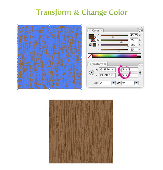
Transform and Color
With the texture selected, change the width to 5 inches and the height to 5 inches from the Transform Panel. Next, change the color of the texture to a darker brown than the first rectangle.
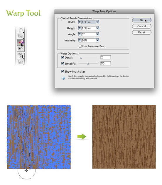
Warp Tool
Double click on the Warp Tool (shift r) in the Tools Panel to bring up the Warp Tools Options dialog. They are probably on the default settings, but if they are not, press the reset button on the right of the dialog. Once the settings are back to default, change the Intensity to 10% and click OK.
Select just the texture and click and drag with the Warp Tool (shift r). I like to go up and down and slightly back and forth. You can do as much or as little as you want.
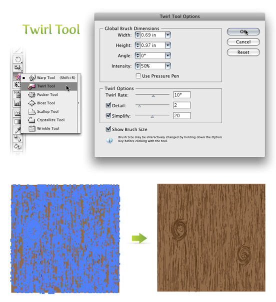
Twirl Tool
Click and hold down on the Warp Tool (shift r) in the Tools Panel to bring up the other transform tools. Pick the second tool in the list called the Twirl Tool. With this tool you can add some knots to your wood texture if you want. Double click on the Twirl Tool in the Tools Panel to bring up the Twirl Tool Options dialog. Below are the settings I change.
- Width =.69 (50pts)
- Height =.97 (70pts)
- Twirl Rate =10°
- Simplify = 20
With the texture selected, click and hold on the texture until you are happy with the knot. The Twirl Rate is slow so it is easy to see when you need to let go.
Experiment
You can experiment quite a bit with this technique. You can change the dimensions of the Warp Tool and Twirl Tool to create different wood grain texture and shapes of knots.
Below are some example uses of this texture.
This post was also republished on vecteezy.com


Pretty section of content. I just stumbled upon your weblog and in accession capital to claim that I get
Nice post. I learn something new and challenging on sites I stumbleupon every day. It will always be useful to read through content from other writers and practice a little something from other web sites.
Major thankies for the article. Thanks Again. Fantastic.
thanks for sharing
it’s nice
It’s amazing
Great tutorial
Nice one!!
Thank you soooo much 🙂
Awesome Tut! Thank you very much!
Hi,
I found it very interesting and useful to create amazing effects with this tool.
Thanks for sharing.
Thanks
Mandeep
You can choose Adobe Flash web designer yourself so as to get the best results.
Before you begin to do any of your work in Photoshop, you’ll need to setup how it will handle
the color of your images. Find out about action files, align,
anchor points, alpha channels, and more. Adobe also has an online forum for its products, including
Photoshop. There is an easy-to-use and self-explanatory organize panel to the right, where Albums,
Smart Albums and more can be created. Despite some limitations, Adobe Photoshop Elements 9 is a good overall value for the cost.
Kindly consult the product website or a vendor for latest
prices. As a public relations or marketing practitioner, you will probably never have to design
a billboard using 3D effects and lighting tools. Photo editing IS JUST expensive software, but
that doesn’t mean you will be scavenging for a download free of photoshop.
Does this scene or scenes work well for the rising action.
Great Tutorial, Thnaks
I appreciate you sharing this blog post.Much thanks again. Cool.
Very nice tutorial 🙂
Hey just wanted to give you a quick heads up. The text in your post seem to be running off the screen in Internet explorer. I’m not sure if this is a formatting issue or something to do with browser compatibility but I figured I’d post to let you know. The design and style look great though! Hope you get the issue solved soon. Cheers
Amazingly clever! I’ve always wanted to know how to do this illustrator and this is seamless!
hi, thanks for the tutorial, but i have a problem with this step
Transform and Color
With the texture selected, change the width to 5 inches and the height to 5 inches from the Transform Panel. Next, change the color of the texture to a darker brown than the first rectangle.
when i try to change the colour to darker brown,it doesn’t work. is it because when in the tracing option, the mode is black and white? idk why i cant change the colour except with black-white color mode, does anyone know what i did wrong? thank you in advance.
Hi!
Do you have a similar tutorial for CS6 instead? Because it looks different from what you have so I cant follow the tutorial.
I’m still trying to figure it out because I’m not getting the same result. However, the tracing options now have their own window. So basically go to “Window->Image Trace” in Illustrator CS6.
The graphic pen effect however is not working for me. I do not get anything close to the result he gets and when I increase the size it completely loses the wood effect I’m trying to achieve.
Must revise this tutorial for CS6.
In any case, thank you very much for at least giving me an idea.
Fiddled with the settings in the Window->Image Trace box in CS6. What I did to get the closest equivalent was this:
Threshold: 128
(Click to expand ‘Advanced’ settings)
Paths: 100%
Corners: 100%
Noise: 1px
Snap Curves to Lines: Uncheck
Ignore White: Check
Hope this helps.
Hi dude,, your work so awesome and has a good taste.. is it work for the other program, such as photoshop and in Design..?? THanx
Thanks, just used this technique!
Thanks alot !!! Your life saver.
I have Illustrator CS6 and I can’t to the tracing part no matter what. I have tried anything. If anyone know anything please tell me. Help… :/
Nice 😀
Thanks for this Tutorial! =)
Aaaahh I have been looking for a tutorial like this for ages! Thanks!
Wow!this tutorial was really helpful for me! thanks.
You just saved me $20, as I would have had to buy a wood texture online to match the quality of the one I just made using your tutorial. Thank you.
Thanks for the tutorial…this was really easy to follow and it came out great. I’m wondering how you applied this to your text sample. I tried a few different ways but am not happy with the results and your sample looks exactly like what I’m trying to accomplish…
Thank you so much for this helpful philanthropic post 🙂
I’m a novice, so I’d like to ask a very silly question: after we create the wooden pattern, how do we fill our drawings with it? (for instance, the vectips writing you posted in the end). Thanks in advance!
Can you apply this to a beveled 3d object? I don’t know if I’m just missing a step but it’s giving me issues.
I feel ignorant… my graphic pen function seems to be disabled when I select the smaller rectangle to implement the third step. Any ideas why?! (I am inexperienced in Illustrator have never used this feature before) Thanks for any tips!!! I am anxious to follow through with this tutorial!
thanks for your generosity
this is very over-the-top and silly. you can simply use the tool to create the texture(in black and white), then copy a brown layer on top of said layer and reduce its transparency. This method would also leave more leverage with tone.
certainly like your web site but you have to check the spelling on several of your posts. A number of them are rife with spelling issues and I find it very bothersome to tell the reality on the other hand I will certainly come again again.
Loved this! Very simple ro follow. Did you just play around with the colors and opacity of th browns to achieve the wood floor? I really like that.
Great informative tutorial!
This is just awesome!!! totally loved it…. easy to go 🙂
Thank you, i have finished this texture it’s beautiful, but i have a question, i now i want apply this texture to another object how i can do it?…how i can save it as a texture?
I really appreciate this tutorial. I needed to vectorize a comp I originally did in Photoshop. The wood grain image I used in PS did not like to be tamed by Illustrator’s tracing options. This tutorial provided a nice, consistent, realistic texture without over- or under-exposed areas. Thanks!
Very Nice!!! Loved this Tutorial! Great looking Wood Texture! Mine came out great, enjoyed this Tutorial. Thanks for sharing.
How did you found this idea. How many hour do you spend to learn about design graphic
Thank you
Great tutorial!
Thanks for sharing your experience!
I think, I got it! 😀
j0hnb0y,
you might be selecting the bordered rectungle – it can be seen at the borrom of your toolbox. You should have a colour for the center of your rectungle and no colour for the border.
Derek,
1st time I tried, I got the wrong texture lines as I used the shown above settings for the sketch filter. Than I tryed to imitate the shown effect using my own settings. And one more thing – this texture looks much better when scaled to more little object at the end. If it doesn’t help, please show some screens to us.
this didnt work at all for me. i tried multiple times trying different thing and following it step by step and it would not work. I am pretty good with illustrator so i dont know what is wrong.
I have tried this tut at least 5 times and I still get a very black line at the top and bottom of the rectangle….I have followed the tut word for word but still cant get the same effect that you do
Please help
very frustrated novice to Illustrator 🙂
“Trace” and “Expand”. That is amazing!
Thanks for this tuto ! Congratulations ! From France
cool! how did u make the icon with the house cutout?
I always woundered the same thing. maybe someone on here can answer the question.
Great informative tutorial! I tried it but your end graphics looks a lot better than mine. I need to practice more I guess
How did you do the one with the home engraved in the square and the bevel look? It’s awesome!
Really nice tutorial 🙂 Really like the end result. Thanks for sharing your knowledge.
As I know about Adobe Illustrator a little bit and also I have been used it for some designing. The effects and drawing of Illustrator is more clear than the Adobe Photoshop, since it is a vector graphic software.
Oat Roller
very well information you write it very clean. I am very lucky to get this information from you.
Nice work, great tutorial. Hopefully be able to put this to good use
Hi!
How can I save the texture, so I can use in other works?
Tks
Thanks for this post–I really like it!!
I finished the tutorial. However, now what ? How do i get this wood looking picture in my text ?
Anyone got a tutorial for that ?
VEry nice and simple!!!! thanx
. You just need to buy another Kindle.
Bah I cannot get this to work, and i’d love to do it as I have some plans for a texture like this. The part i’m getting messed up on is when I apply the graphics pen effect it never comes out the same or similar as yours. Maybe it’s because i’m not doing it right but my options are the same. Also maybe i’m not familiar with the terms enough but what’s a 40% black? No matter how I do it my lines are always more sparse and chunky (as in i’ll have like 7 large lines instead of how you have many skinny lines)
I just can’t seem to get the graphics pen tool to work for me. Also I’d love to get my hands on the source files anyway but i’d doubt that’d happen 😛
You will have to play a pit with the tools . Mine didn’t come out the same either. i had to change them a bit!
40% black is the plack color with opacity of 40%. I have it 0n 50% , works better for me!
I have the exact same issue. I’m wondering if it’s different versions of Illustrator? Doesn’t really make sense but that’s all I can think of. I don’t get near as many lines and no matter what settings I change I can’t get anywhere close. Quite frustrating but it’s an awesome tutorial.
Thanks for this post – I really like it!!
Hi.I find that this tutorial is great. but i’m a having a little problem. The problem is when i try to fill the texture with dark brown, it wont turn to dark brown. instead it will only turn into black or grey. could you help me. thx 🙂
Hi There,
This same thing happened to me too.
Have the object selected and on the control panel on the left hand side you will see a colour box. Mine was filled with grey and all I did was choose a colour from the box and it changed it for me.
I hope this helps
Hi just what i was looking for. As commented above though, I have done this tut over and and over again down to the T but the grain looks nothing like yours.
Thx so much for the technique!! It looks real!
this technique is easy and applicable in logos, icons, interfaces or pretty much anything.
Very good post.
You did a good job.
how do i create a stone tiles then?
Thanks so much! This was very helpful!
Thanks for the great work.I really like it
Thanks for this post – I really like it!!
Wonderful tutorial, i really liked it..
Thanks for posting it..
😀
This is a fantastic tutorial! Thanks for sharing 🙂
Thanks for this post – I really like it!!
I looked at the western font tutorial, but i’m not sure exactly which part of it is the technique used to make the embossed house button in this tutorial. It would be really great if you made a quick tutorial on how you achieved this effect because there don’t seem to be any. thanks!
Hi, great tutorial, but I have problem. How can I save this texture? I would like using this one like a textures in graphic styles. Similar like I see on your show under tutorial. Sorry for my English, I hope, you will understand me.
excelent thanks
Hey I really like this site – thanks a lot for letting me know about to make this. I’ve been looking for this vector for a long time!
thank for give good tutorial ……………………….——>
Very good!!
Thanks dude, it’s really what i needed.
Just what is need. Thanks for that.
is = i
Very good tutorial. It really helped me. Thanks for posting!
I’m having some problems with just one step.. On the tracing options my AI CS2 on my PC doesn’t have the Ignore White check box.. Is there a work around for this? I’m coming up with strange results on my texture.
You can go ahead and trace and expand like in the tutorial, then use the Magic Wand to select all the white shapes and delete them. Let me know if that helps.
nice work. this site really helps me a lot
That was really simple and helpful
i learnt, i think i di the same so………
it was just amazing, n amazed later
I have been looking for an easy guide on how to create a wood grain texture Will any of these methods work in photoshop?
Hi,
How do you make 3d effect on object like the house icon ?
Many thanks
I used a technique I wrote about in the How to Create a Smokin’ Western Type Treatment in Illustrator. Let me know if that helps
Ok
Actually I apologize, as you already answered the same question some months ago.
That will help. However, the house seems to have much more shadow effect.
Moreover did you use the same effect on the icon outline ?
Many thanx
This is AWESOME!
I was able to get really great results by using the circlewarp tool in a variety of different sizes for a variation of knots in the wood.
Looks PRO.
Finding decent wood textures is ALWAYS a pain, and now I can create my own anytime.
Love it, thank you!
Very impressive and useful tutorial. Thank you very much. I followed you instructions and it worked like a charm. I learned quite a bit and like screwing around with the settings. I am making a brochure for a horse farm and can now give it that “barn” look with a little wood grain.
Awesome tutorial and easy to do! I never thought about creating something like that in illustrator. Thanks for the technique.
Easy to follow and many thanks for sharing your knowledge. However, I tried the after expansion (CS2) the texture turned black, so I had to texturize again, expand, ungroup.
Curious about what effects you used to create the little house icon…..?
I am pretty interested as well on more details about the little house icon realization.
Thanks.
How did you create the cut out of the house in the wood grain texture example. Was this done in Illustrator. Can this effect be used for text.
It is called Susa
Thanks for your reply and the link to the Susa font. How did you create the example with the house carved into the wood?
I just wrote a tut for Vectortuts with a similar effect. Let me know if that helps!
How to Create a Smokin’ Western Type Treatment in Illustrator
Thanks a million. That’s exactly what I’m trying to achieve. You are a charm. You should create a link in the Related Posts section on this tutorial to the Smokin’ Western tutorial. Thanks again. Great job!!!!
great tutorial!
u got one with how to make water texture :-)!
keep up the cool work!
Nice effects, and you make it sound ridiculously easy!
Thumbs up!
great! just great. Ill be checking this website more often.
I love you, man! Thanks a lot for this tutorial. I’ve been dying to make a wood texture for my artwork.
Awsome, your a life saver!
This is a great tutorial. Once the texture is created how are you using it in type and other shapes. Are you using a mask? I’ve tried that but it says there are too many elements and then ultimately doesn’t work.
Do you have a tutorial on how you did the icons on that you used the texture to make?
I am trying to figure out how you did the indented look of the house and also the shading on the edges of that one too. Also trying to figure out how you did the shading on the letters too…
Please let me know if you have a tutorial on that, or where to find one, or maybe create one … 🙂
ps. thanks for your very helpful tutorials.
Wow, great work. Thanks a million for this.
Hi Rype,
I’m trying to make this but I have a problem. My texture effects are disabled, i have the rectangle selected, but can’t get texture available. don’t understand why. I’ve AI CS2 and have tried to make it work but I can’t. What can I do?
Help me please.
Thanks!
Hey Kati,
It might be the Document Color Mode Settings. Try going File > Document Color Mode > RGB Color. Let me know if that works.
that worked – changing to RGB
thanks! great tutorial
very good. thanks
Great work !!!
great tutorial!
Hello,
I just wondered how you made the example on the bottom of the page with the house that looks “burned” or inset into the wood-grain. I have been trying w/ little success. Thanks
Scott, Did you ever figure this out, I am wondering the same thing?
I just wrote a tut for Vectortuts with a similar effect. Let me know if that helps!
How to Create a Smokin’ Western Type Treatment in Illustrator
Wow, just learn it this great technique. U really tech great stuff
Hi! Great Work!!! Very helpfull Tutorial
I would be very interessted to know how you did the second one in the final exemple!??
that icone with a house inside? Can you help me?
nice one!!!
thanks
love your tutorials! but i have a problem applying the texture. cause the graphic pen effect won’t apply. it can’t be choosen (sorry,i don’t know the correct words for this).thanx before!!
Love it!!!
me too!!!!
interesting tutorial, need to try this at some point. thanks for sharing
Oh god. If i was a chick id find u and kiss u allover… since im not: Thanks mate, you obviously own!
I am very grateful, cheers! <3
The reason some of you are running into problems I’m guessing is because your original illustrator needs to be 300dpi. I noticed when mine was coming into live trace after applying the effect it said it was only 72dpi so I created a new document and made sure it was 300 dpi. Hope this helps.
Thanks for help Devin! I had the same problem as Ard described. Now, after setting 300dpi, is result perfect.
Great tutorial! Thanks Rype!
hall0oooo thanks for ur tutorial for vector…..
good work….
Ard,
Some people have been running into a problem when they forget to expand and trace the Graphic Pen Texture before they scale it.
This tutorial is awesome!
But, I’ve a little problem: my wood texture look very different from yours. The outcome of the graphic pen effect is totally different from yours. Your result has a lot of stripes (sorry, I don’t know the right word for it in english), but mine does have just a few broader stripes.
I’ve no idea what I did wrong, because I followed everything you told to do.
I hope you can help me out. Thanks in advance!
hi i have problem i cant get result like you. i use graphis pen Expand Appearance trace and expand but my texture look very diffrent i do everything like you pls help
sry dor english thx
Thanks for the great tutorial. I referenced this page in my recent post on the same topic. I got a couple of useful comments about using the wood grain effect to create a sort of wood flooring background. You can check them out at iphonelemurs.com/blog.
ok, so i’m amazed at how easy this was to follow along with… i’ve seen other tutorials for wood grains, and none of them hold a candle to what you have here. thanks so much for making these tutorials, and keep up the fantastic work! 🙂
I love how you use filtered effects and then Live Trace. I’ve seen you do this kind of technique before, but I still haven’t applied it to my work. I have to experiment more with that kind of technique. It’s a good workflow you demonstrate with great results. Thanks.
Oxid,
There is no quick way to create a tile from the texture, but it can be done. It is painstaking process. I will put a tut soon with some tips, and tricks for seamless tiles. In the meantime check Veerle’s on the subject.
http://veerle.duoh.com/blog/comments/creating_seamless_patterns_in_illustrator/
Hello,
first of all I’d like to say a thank you for sharing your knowledge, very great site and perfectly designed in every pixel.
Just one question remained after reading this tutorial: Is it possible with Illustrator to make the created texture ’tile-ready’ because this way nothing guarantee that the created texture part will fit together with itself.
I’ve checked and it does not, the texture’s top and bottom borders do not match (neither the left and right borders but these can’t be observed).
I somehow get a very different result at the graphic pen step. This gives me a very strange effect when I resize it back to 5 by 5 inch. I’m not sure what I’m doing wrong.
Woow very usefull ! thanx
This is so GREAT! It’s the most realistic vector wood grain effect that I’ve ever stumbled upon.
iStockdiary also has a great post on realistic curtains that make a great texture.
http://www.istockdiary.com/illustrator/illustrator-tutorial-realistic-curtain/
Another good texture tutorial from Rype. The wood seems to have a rougher grain. Here is another different method on creating a smooth wood texture.
http://www.istockdiary.com/illustrator/illustrator-tutorial-wood-grain/
Andrej
Yup, it is compatible. When you trace the effect, it is nothing but basic paths.
Is this effect compatible with eps 8.0? I would need it for stock.
I just stumbled upon your blog through Smashing Magazine, and I’m a fan already!
This is a great tip, and something I have struggled to achieve in the past. You rock!
Another great tutorial!
PRETTY COOL.
thanks for the tip! <3
I’m glad everyone likes the post! Brad, I’m glad you ventured into the site, but also glad you use the RSS.
When I first saw this tut I thought, “Why would I want to do that?” But having an editable woodgrain in vector format opens a lot of possibilities. Thanks for the great work.
Also, I usually read your posts in a RSS Reader, and am always pleasantly surprised when I venture to your actual site. Beautiful layout and coherence to your identity.
You are the illustrator GOD.
Whaou! Textures with Illustrator! That’s definitely interesting.
I just discovered this site and I really love its design and its content. Great job, and thanks for sharing your experience. 😉
its amazing on how you use the illustrator tools to make this kind of effects!
the logo looks very nice!
thanks again 😉
This was awesome! Thanks for sharing!
it is really awesome!
i like it so so so much!♥♥
It’s amazing how illustrator amazes me every day we these simple step by step tutorials!