
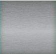
The second texture up for Vectips Texture Week is brushed metal. Like the previous Water Texture Tutorial, this brushed metal technique also utilizes Illustrator’s Effects. Again this tutorial is pretty simplistic when you break it down, and easy to replicate numerous times. You can use the brushed metal texture in almost anything, but I find myself using it in icons, logos, and interfaces quite a bit.
Notes
This tutorial was created with Illustrator CS3.
Keyboard shortcuts are displayed in orange. ⌘ is displayed for the Command key (mac), with the Ctrl key being the Windows equivalent (not displayed).
Rectangle
Create a 5 inch by 5 inch rectangle with the Rectangle Tool (m). An easy way to draw an exact rectangle is to click on the artboard with the Rectangle Tool (m) to bring up the Rectangle dialog to enter dimensions.

Gradient
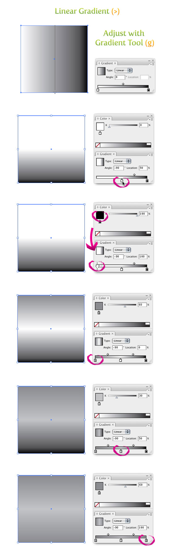
Next comes the gradient. Create a Linear Gradient (>) from the Gradient Panel and take off the stroke. Adjust the gradient with the Gradient Tool (g) by clicking and dragging from the top of the rectangle to the bottom. In the Gradient Panel grab the left swatch and drag it to the middle of the Gradient Slider. Next, select the black swatch on the Gradient Slider. If you look in the Color Panel, you will see it is now black. Click on the large black thumbnail and drag it into the Gradient Panel on the left side of the Gradient Slider. If you did it correctly, you should have a black swatch on the left, a white swatch in the middle, and another black swatch on the right in the Gradient Slider. Select the first black swatch and change it to a 60% black, select the white swatch and change it to a 30% black, and change the last black swatch to a 60% black.
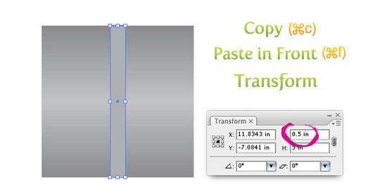
Next Copy (⌘c) the rectangle and Paste In Front (⌘f). With the copied rectangle selected, change the dimensions in the Transform Panel to .5 inches wide and fill the rectangle with a 40% black.
Texture
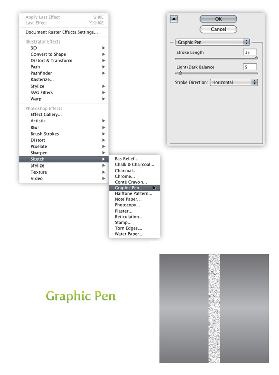
Select the narrower rectangle and go Effect > Sketch > Graphic Pen. When the Graphic Pen Effect dialog comes up change the following settings.
- Stroke Length = 15
- Light/Dark Balance = 5
- Stroke Direction = Horizontal
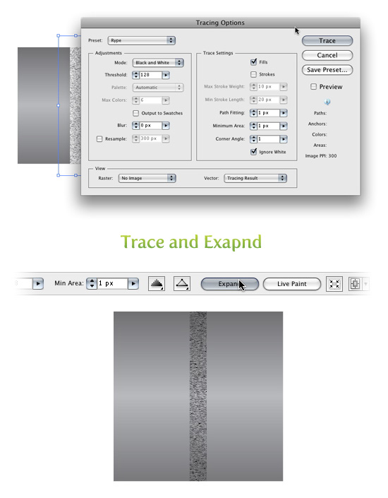
Trace and Expand
With the texture selected go Object > Expand Appearance. With the new image selected, the Control Panel defaults to the Live Trace options. Click the arrow beside the Live Trace Button and select Tracing Options. Or you can go Object > Live Trace > Tracing Options. You don’t have to change all the options, just the ones below.
- Mode: Black and White
- Path Fitting: 1px
- Minimum Area: 1px
- Corner Angle: 1
- Ignore White: Check this box
I like to save a preset in the Tracing Options. It makes it easy to recall these setting. If you have read previous tutorials, you will see I use these setting all the time for tracing. Next, press the Expand button on your tool bar.
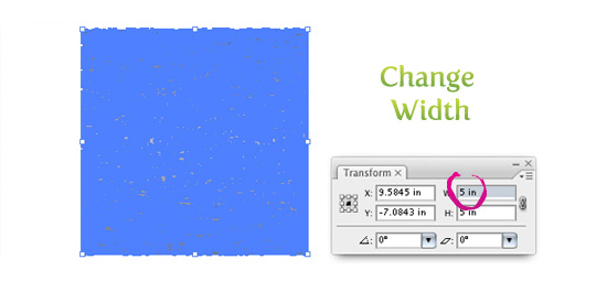
Transform Texture
With the texture selected, change the width to 5 inches from the Transform Panel.
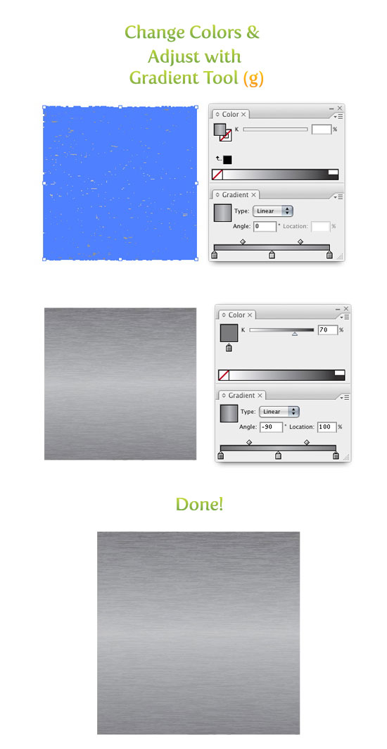
Color Texture
With the texture selected, create a Linear Gradient (>) from the Gradient Panel and take off the stroke. Illustrator will remember the last gradient used, so you should have the same gradient fill from the first rectangle. If not, repeat the steps for the gradient from the first rectangle or use the Eyedropper Tool (i) and sample the first rectangle. Once the texture is the same gradient, select the first 60% black and change it to a 70% black, then change the 30% black to 35% black, and then change the last 60% black to a 70% black. With the Gradient Tool (g) click and drag from the top of the texture to the bottom to adjust the gradient. Done!
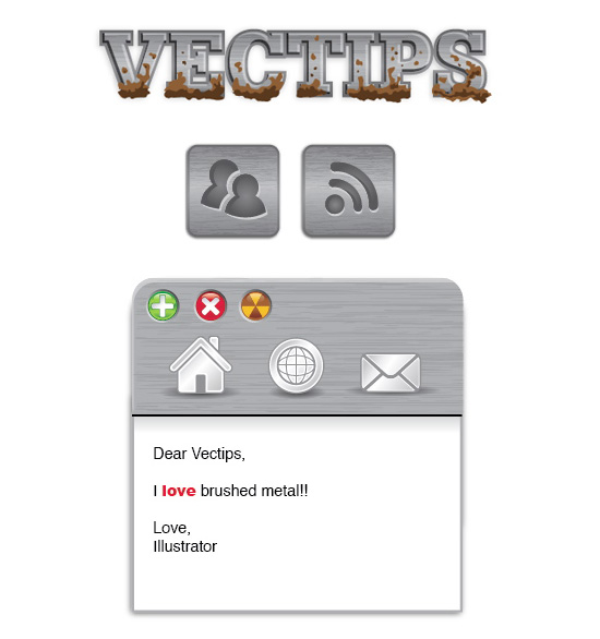
Experiment
This brushed metal texture is great to incorporate into logos, icons, interfaces, and much more. Look below for some examples


This is a wonderful tutorial and I really like the detail! I was halfway through it when I found out there was no Live Trace Options in Adobe Illustrator CC. It would be super cool if an updated version of this tutorial was made 🙂
Great blog you have here.. It’s difficult to find good quality writing like yours these days.
I seriously appreciate individuals like you! Take care!!
Hi, I’m new to Illustrator and I love your tutorials. I’m able to create the texture perfectly, but I’m not able to modify it or apply it to new shapes of any kind. Maybe I’m just being dumb, but could you please explain how to do this? If I change the shape of the rectangle, the brush strokes don’t change with it, and I can’t change the shape of brush strokes in any way.
I used to be recommended this web site by way of my cousin. I am not sure whether this submit is written by way of him as no one else know such unique about my trouble. You’re incredible! Thank you!
I need to to thank you for this very good read!! I certainly loved every bit of it.
I have got you saved as a favorite to look at new things you post…
Wow that was unusual. I just wrote an very long comment but after
I clicked submit my comment didn’t appear. Grrrr… well I’m not writing
all that over again. Regardless, just wanted to say
wonderful blog!
Could you place the same tutorial just for illustrator cs6? and windows? 😀
Woah this weblog is excellent i love reading your posts. Keep up the great paintings! You understand, a lot of people are searching around for this info, you could help them greatly.
This doesn’t work so well in CS6.
Are you ever going to update this?
Hey, I kinda need some help, I’m using Illustrator CS4 and I got some kind of noise. I did the brush but when I apply some white lines appear, they don’t really exist on the file, if I export to PDF or JPEG it is still there, altho its stuck in a region of the archive and I can get away of it just by placing my object somewhere else, I wonder if you have any idea of what is going on, I’m linking some screenshots so you can have a better idea of what is going on
http://i.imgur.com/NfTcVHv.png
http://i.imgur.com/2YJ2qDB.png
http://i.imgur.com/S9Sn0fY.png
thank you,
Att. Yam
I am using CS6 and I don’t have the live tracing options… hummm
After choosing live trace (b&w) which comes up automatically you can make a few changes. The panel is really different compared to the previous versions so all the options aren’t available.
Any chance you could update this for CS6? Seem to be missing a simple step in the Trace and Expand -> Transform section.
Awesome tutorial… I’m trying to put together some graphics for a website I’m designing and your site has proven immensely useful in this endeavor. Thanks again for posting these!
I never can get to seem this right. I believe I’ve followed the steps right but at the end the result always looks different from the tutorial.
Great Illustrator Tutorial, you can easily tweak some of the settings and you’ll add some more custom flavor needed for any printing needs.
Orange County Designers
To manage the gradient in the texture is better to ungroup it and next Objet/composed path. This way you can apply a gradient to all texture.
Sorry for my english.
Thanks for your tutorial.
how do you get this texture on text like you have in the sample. I tried a clipping mask, but it didn’t work. Says its too complex.
Awesome tutorial, but I’m having trouble with the masking-into-outlined-text part. When I mask it, everything goes blank.i can see the lines and vectors, but there’s no fill… does that make sense?
Has anyone got this to work in text yet?
This is a great tutorial, thanks dude!
Muy buen tutorial…
This was great! It really came out handy for a project I was working on. Wouldn’t have thought to have done in Illustrator.
You Rock!
Thank you.
As usual – pure awesomeness. I hope you make enough off this site to make a living, so we can continue to learn from your work. 🙂
Ansel
good, but how can you make the brush metal texture turn in a angle. like circular on a circle. Understand?
I have used warping effects (Effects >Warp) and Envelope Distortions to manipulate the texture.
Is there a way to make a Graphic Style with this texture? Using what I learned in the tutorials about letterpress and metallic text, for example, I tried to create everything in the same Appearance. However, when I Expand Appearance on the rectangle that has the Graphic Pen style added to it, the whole thing, well, goes to hell 😀
Now, I’m a n00b to the Appearance panel, so perhaps I’m doing it wrong. Also, I hope I didn’t collapse the blogosphere by referencing future tutorials!
After playing with this a bit, there’s one hint I might add.
Instead of adding the gradient to the texture, which can be a pain if you are playing with a lot of color combinations, make the texture RGB Black and use Multiply 5 to 10% for the entire texture.
This is essentially what you are doing by adding that gradient to the texture and increasing the black levels, but it makes testing other color combos a lot easier.
much easier !
and also – when I try to make a gradient fill to the whole texture selected, its applying to every single tiny texture separately, not to a group as desired.
I know this tutorial’s been out for a while, but I found the same issue some have put up about the effect not looking the same. It’s during Effect > Sketch > Graphic Pen.
I actually had to play around and found that the numbers are turned around. For me, Stroke Length = 15 and Light/Dark Balance = 5 did not work. What I had to do was Stroke Length = 5 and Light/Dark Balance = 15 and I got the final results like the example you showed.
Just thought I’d put it out there and see if it works for those who’s having the issue I did. I’m using CS3.
Great tutorial – thanks!
I’m a novice at using illustrator, but I am guessing that you forgot to mention that before you change the effect to graphic pen, you must make sure that there is no gradient in the object. I got it wrong the 1st time, then I changed the gradient to just black and it worked in the end.
Am I right?
You did it really easy to understand, thanks!
Thanks man, i subscibed, and that is the first time! Your tutorial is very helpfull.
to bad that when you try to help these people that ask u a question u get nothing in reply. anyways, keep up the good work!
about that issue, i’ve created new document and changed ppi from 72 to 300 now it looks like in tutorial.
Darijus is correct, new document > raster effects 300 ppi makes the texture look right.
If you use a lower raster setting your scratches will be too thick and it will not look as good.
I got to the last part, and it looks exactly like it should, all blue. But when I finally try to select the gradient tool, and click and drag in the form, with the rectangle selected, nothing happens! I hit Enter, and still nothing.
I’m in CS3, mac.
Any suggestions?
thanks!
Same exact issue?! as dzeni and others. I’m sure there something missed in the tutorial. Thanks in any case.
Great! Your guides are eye catching, easy and helpful! Continue like that 🙂
I just want ask you a question.. I m still a learner so I would like to know how can create a text with this texture. You replied above to a similiar question :
“You can create the texture like in the tutorial and then mask it out with outlined text.”
Ahem..How can i do it?
Thank you in advance
Nice tuts bro :).How to add the texture that we create to text ?
You can create the texture like in the tutorial and then mask it out with outlined text.
Great tutorial!
Would you please explain how will I “mask it out with outlined text” ?
Thanks!
Same exact issue as dzeni. Looks like gray oak or some other short-grain wood, not brushed metal. My suspicion is it is in the graphic pen setting. Any hints on making the “brush” effect more subtle?
I tried to follow this tut and mine looked pretty horrible. The problem is that when I set the graphic pen as instructed, the distance between the horizontal lines is too big and the lines themselves are too thick in places. This means that when I expand and trace, I end up with a much more coarse effect. I cannot find a way of making the graphic look anything like yours. Mine is more “pitted / scratched” and its not very pretty 🙁 I’m using CS3 and have all the options mentioned in the tut. Its just not working quite right.
Brilliant! Thanks dude!
@ Kim
At what point in the tutorial does it start getting messed up?
I followed this exactly but mine looks no way as good… why might this be?
So there is no way to make an art brush with a gradient that follows the stroke path?
There must be because there are such brushes included with Illustrator, such as the “watercolor stroke”!
I’ll be damned if I can find a tutorial on how to make one (that actually works). I keep getting the error “The selected artwork contains an element that cannot be used in an art brush”.
hello
I try to make your tuto – > this in CS3?, me is I have CS2
an i have two remarks/questions
1) when I expand appearance in the tracing options I don’t have ” ignore white” – > as I make break up and then expand i have white framework tou around and as, I have want to change the size from 0,5 to 5 I, it is smaller than the gradient … I do not know if I am clear
2) in the tracing option , image PPi i have 72 ppi in stade of 300 ..;
i hope it’s clear what i say i’m french…
could you help me????? tahnks
cool tut 🙂 thx…
it helped me a lot ! 🙂
Kyryacos,
You have to take of the gradeint fill to use it as a brush. You can’t use gradients in brushes. Let me know if that helps.
How do i add it to brush ? It won’t let me “The selected artwork contains an element that cannot be used in brush”,…any tips?
When you double click on the blend tool, set the align option to “align to path” not to page.
Rhapsody,
What version of Illustrator are you working on? Maybe if you try to change the Document Color Mode to RGB. Sometimes that helps with CS2. Just go File > Document Color Mode > RGB. Let me know if that helps.
Hi all, Im stuck @ “Effect > Sketch > Graphic Pen” part. I’m unable to select the option no matter what i did. I tried rasterizing, toggling the gradient/colors, etc, but to no avail. It seems most of the effects are not selectable.
Can anyone help me on this? Is there anything i have missed out?
THank you!
Mario,asegurate de que no estas intentado Filtro>Sketch (Filter>Sketch) sino que estas usando Efecto>Stekch (Effect>Sketch)
No se que pasa, me sucede lo de ESAU, al momento de tratar de poner: select > Sketch > Graphic Pen, en Sketch, no tengo activada ninguna opcion…. Que tengo que hacer como activo las opciones?????
<3<3<3<3<3<3<3<3<3<3<3
<3 <3
<3 t h a n k y o u ! ! ! <3
<3 <3
<3<3<3<3<3<3<3<3<3<3<3
Love this sie, great tutorials.
Thanks!
Good tut. although mine looked like complete crap even though I followed your instructions exactly.
No pude.. I can`t
al momento de tratar de poner: seleect > Sketch > Graphic Pen
dont let me do this.
Great Blog!!!
This things are awesome dude. How to do the emboss on the icon? I never know how, i tried few techniques but not as looking good as yours, except I can do it in photoshop. Man love your tutz!
Awesome again !
Awesome tutorial! I’ve always used Photoshop for this as well. A vector version is AWESOME! ^_^
Thanks!
Thanks!
Great TUTORIAL!….I’ve discovered this blog today and I’m very glad i founded it.
I’d like to know how to do the effect like the RSS Feed Icon in the Example.
Thanks a lot…
wooooooow!! another greate tip, easy and fast
I love this blog!! Fantastic tips. This is even better than Bittbox!!!
Great texture! I love your blog for those “I should have thought of that” tips.
i know this in photoshop, but never tryed in illustrator either! thanks for the tip!
nice
Nice TUT! I would never have thought about doing this in illustrator. Your blog is very insightful.