
Creating grainy textures are great for retro illustrations, typography, and logos. Alternatively, you can incorporate these effects into compelling new styles. You can always scan in similar textures and Live Trace them in Illustrator, but you can pretty easily create this type of effect all inside Illustrator!
Final Image
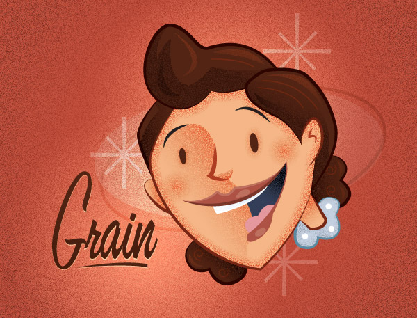
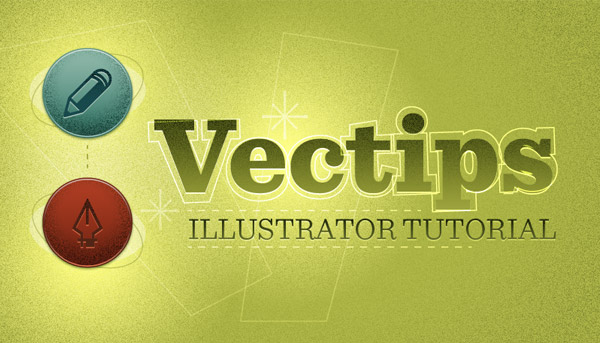
Here is a sample image of what these techniques can do. Further down in the tutorial, I give a quick breakdown of the process.
Tutorial Details
- Program: Adobe Illustrator CS5 (You should be able to create this tutorial in CS4 and CS3 but some of the tutorial images might look different.)
- Difficulty: Beginner / Intermediate
- Topics Covered: Grain Effect, Gradient, Gradient Meshes, Blends
- Estimated Completion Time: 15-20 minutes
Grainy Textures
In the following sections I’ll show you how to create these grainy textures from a couple of different elements within Illustrator. Basically you can create these textures from any element that contains a graded value of color (like a gradient). I’m sure some of you have already figured out this technique by creating some of the past Vectips texture tutorials or on your own, but for those of you that haven’t, you should have fun.
Gradients
Basic
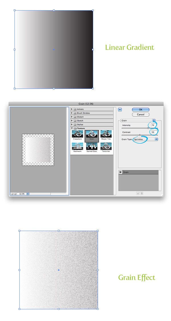
First up is gradients. Gradient are good for creating grainy textures that don’t require any complex contours to the texture. To start, create a simple linear gradient with the default white and black color stops in a rectangle. With the gradient selected, go Effect > Texture > Grain. In the Grain Effects dialog, change the Intensity to 74 (you can experiment with this number to get the grain you desire), Contrast 50, and Grain Type to Sprinkles. That’s really all! The real magic comes when you apply color and blending modes to the texture.
Color
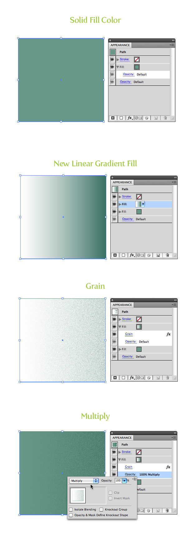
You can change the color stops in your gradient, but I like to place an object or new fill below the grain effect and set the grain’s blending mode to Multiply because of the white space the Grain effect creates. Let’s take a look at doing this with the Appearance panel.
Take your same rectangle and fill it with a solid color. From the pop-up menu of the Appearance panel, select New Fill. Select the top copy and fill it with a linear gradient. Change the first color stop to white and the second to a darker color than your original. With the gradient fill still selected, apply your Grain effect and set the Blending Mode to Multiply from the Opacity item under the gradient fill.
Gradient Mesh
Basic
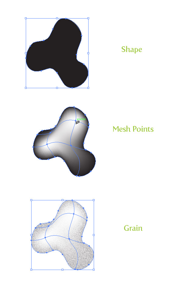
Gradient Meshes are great for creating more complex shapes with grainy textures. To start, draw an abstract shape with a tool of your choosing and fill it with black. You can either go Object > Create Gradient Mesh and set a specific numbers of points or use the Mesh tool (U) to click on your artwork to add mesh point. I’m using the Mesh tool (U), so deselect the artwork, select white from my swatches, and with the Mesh tool (U) click on the artwork to add points. Now, apply the grain effect like before.
Color
Like with the Gradient technique, meshes work great with a color underneath and the grain’s blending mode to Multiply. Start the original shape a solid color and Copy (Command + C) and Paste in Front (F). Change the fill of the copy to a darker color of the original shape, apply the white mesh points, apply grain, and set to Multiply.

Blend
Basic
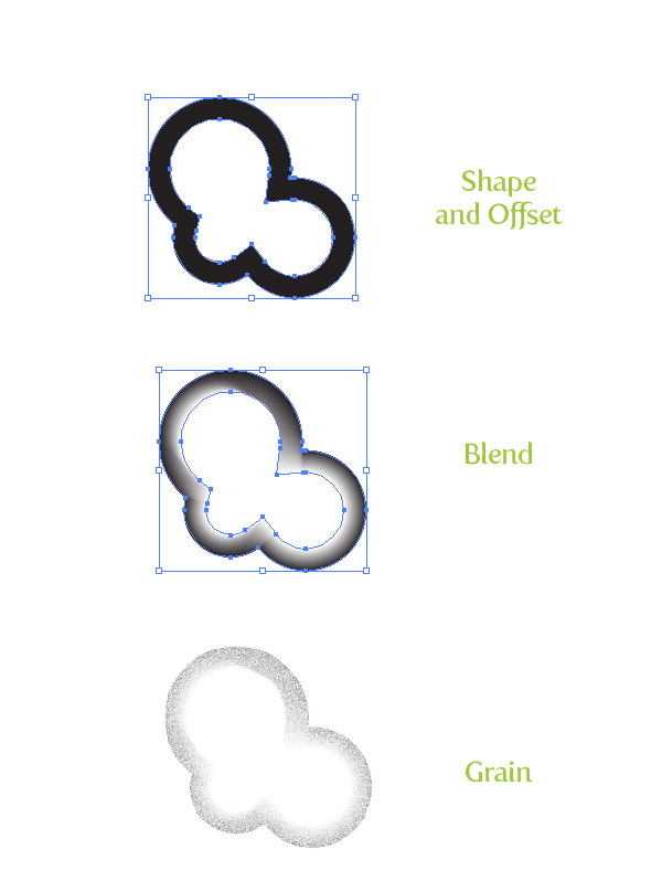
Blends tend to work great for either simple grainy textures or complex ones. It really just comes down to how you work and which is more comfortable, but the principle is pretty much the same. For the example, created a shape, go Object > Path > Offset, fill the offset with white, select both copies, and go Object >Blend > Make. Finally, apply your grain effect.
Color
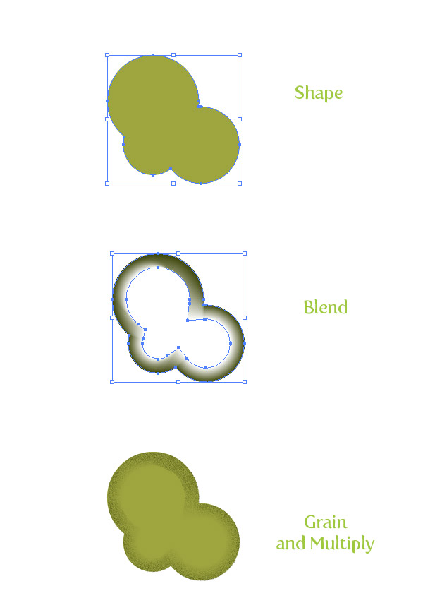
Like both the Gradient and Gradient Mesh, it’s good to have an underlying color. Also like gradient meshes, you will need a copy of the original shape above the color with a darker color, grain, and blending mode set to Multiply.
Quick Tutorial
Here is a quick tutorial utilizing some of the techniques. I won’t go into much depth, it’s just to get an idea of how to use these techniques in an illustration.
First, I created a sketch, scanned it, and traced it with the Pen tool (P). Next, I filled the trace with color, and added stroked paths set with one of Illustrator new Stroke Profiles (Width Profile 1). To add more depth with the grain textures, I started with the linear gradients in the skin and hair. I used a blend for the outline grain texture face shape and used a gradient mesh for the collar of the character’s shirt. For the background I used a big radial gradient grain texture. I also used a radial gradient with the first color stop white, the second white with 0 Opacity, grain, and set the Blending Mode to Overlay.

Experiment
This is a great technique to experiment with! Experiment with different colors, shapes, blending modes, and layering of textures. Try these techniques on graphical elements other than illustrations. They work great on text, logos, UI elements, and more! You can even incorporate these effects with some of the other texture techniques I have written about.


I like the valuable info you provide in your articles. I’ll bookmark your blog and check again here frequently. I am quite sure I’ll learn plenty of new stuff right here! Good luck for the next!
Hopefully it will be like that, but anything can happen in football.
Thanks for sharing detailed description in how to apply the texture with examples.
nice tutorila and tips
thanks
This was such an “AHA!” moment for me! Thanks for sharing the technique! 😀
I love the plug-ins you have mentioned in your post. Most of the Youngsters use many of these software’s for printing as well as editing , even I also prefer many of them. Thanks for the wonderful information , I will be waiting for your next post
Hi There,
Can you please let me know why when I apply the grain effect to my gradient, instead of utilising the colours i have already chosen the grain appears as black and white?
I have the same problem :(. Did you find a solution ?
Nice tutorial, I’m always looking for tips on using tools better! My issue is that in Adobe CC doing the basic blend like you created isn’t working as far as the blending effect. Both shapes end up there, one inside the other, with solid edges. I’m not sure what I’m doing wrong. If anyone knows or has a better explanation of that step I’d love to know 🙂
Hi,
Great article, thank you! But however I try to implement the grain effect (on a mesh or in a ordinary shape) I always get a strange shape (partial copy of the original shape) below my shape with the grain fx-effect. I’m using Illustrator CS6. Anyone else experiencing this?
Whenever I apply grain to my complete background, let’s say 400×300 px and save the file via export>save as jpeg, I get a white border around the whole image. If I save via save for web, the image is confined to the document size but quality is decreased even at 300dpi. Please do reply me.
Thanks in advance!
Great tut and very applicable to lots of uses.
I had a little trouble applying just the right grain “look” to the cheeks and the edges of the face only. I found a workaround but don’t know if this is what you do –
For the cheeks, I made 2 round shapes on a new layer slightly darker than the skin tone. Then I applied Effect>Blur>Gaussian Blur. To this blur I then applied the radial graidient, then the Effect>Grain, and then the blending mode Multiply. Adding the Gaussian blur step resulted in the more smudgy, blush-looking cheeks like in your picture.
For the face edge grain, I traced the face on a new layer, and did an Object>Path>Offset Path. I made the center fill the same color as the face tone, then made the outside fill a slightly darker color. I did an Object>Blend>Make, then applied an Effect>Grain, and then the blending mode Multiply. This applied a grain not just to the edges but all over the face. The fix was to use the direct selection tool to select only the inner offset and change the transparency of this shape only to zero.
I’m still a newb and learning. Great tutorials like this one encourage me to play around and learn more -thanks!
Hello!
When I apply the grain texture to my object, the edges of my object do not end up clean like yours… But really nasty. Would you be able to know what I’m doing wrong?
PLEASE! I appreciate your time!
What an excellent tutorial!
The steps are very clear!
I am looking for a long time to find this effect!
Thank you very much!
Nice walk through, love your work, keep ’em coming
Ι couldn’t refrain from commenting. Exceptionally well written!
This look ok in print?
Thank you very much. It’s very useful!
Your tutorial inspired me a lot.
Great tutorial, thanks a lot!!
Very good job. I want to know how to learn to handle the part where he mentions the trace in Illustrator CS5. thanks
Muy buen trabajo. Quiero saber como aprender a manejar la parte donde menciona el trace en ilustrator CS5. Gracias
nice tuts, its very different & effective
you are a life saver…. the technique is absolutely fabulous, and much easier than I would have ever dreamt of.
Thank you!
really great and easy tricks ! thanks !
I am now in love with you. This was awesome. I feel empowered. Thank you. That is all.
These tutorials are awesome!
Your tutorials ROCK! you open a world of possibilities 🙂
Hi,
Great tutorial! I have some difficulties though … I tried to apply this effect to a drawn logo, but the edges get all fuzzy. When I try doing the same with, for example, a rectangle, the edges stay sharp.
Also, I can’t seem to apply the gradient mesh on every part of my design. I get a little warning sign on the cursor when hovering above the selected part.
Any ideas on what I might be doing wrong?
Thanks!
This Rocks!!!
cool tut
Thank you! Well done…I love this tut!
Create Grainy Texture
fine this is very good tutorials nice!
I will just take only the grain effect.
No idea about cartoon drawing.
Thank you very much.
I’ve encountered the same problem as Tim (using CS5). Any suggestions?
Yeah, I tried this and the grain didn’t come out as fine as your tut shows. It was more blotchy than anything and I played around with the settings but nothing produced the same effect as yours. (Using CS4)
Any recommendations?
This is a shame that I found it right now…thank for this usefull tutoriallll, love it..
You’re my hero!!!! I didn’t know how to do this in Illustrator and opted to use Corel Painter’s airbrush to achieve the effect!! Thanks a lot!!
I’m a newbie to Illustrator so I found it difficult to follow. It would be great to show all the steps instead of missing some. Nice finish product however.
nice tutorial although I find it hard to apply the exact same grainy texture as you get. On my screen the grain effect isn’t as smooth as yours. grain dots are big and even by playing with the scale in the grain dialogue box I couldn’t get something satifying. Any advice?
i was wondering is there any way to turn the grainy effect into normal vector objects? I was thinking to “expand” it but it ended up giving me a a flat format which i can’t do any modification to it..
English is not my native language, i hope i do make my questions clear..=)
Nice tut also featured on my website
🙂
Great technique! Thanks for sharing.
Besides the grainy effect which is awesome by the way, I am more gravitated towards the illustration of the lady. It looks fantastic and it fits with the overall look perfectly. The color scheme is spot-on as it brings out the best of the character design. Truth be told, your character design was the main inspiration for my logo design and I had the designing team over at http://www.mascotdesigncorner.com to whip a mascot design having a similar overall design aesthetic to yours. It came out fantastic and I have to thank you for the inspiration. Your site rocks, btw. And your design skills are beyond commendable.
I’ve been looking all over for this! Thanks so much!
Thank you for this tutorial, Its very clear.
Thank you for this tut. I have been trying to figure vectored noise and grain for awhile now. I hadn’t even thought about going about it this way. I had previously tried using pre-made vectors and pulled patterns from PS and tried to import them into AI.
Great tutorial. I’m also really curious what font you used for the example photo at the top?
great texturing tuts Rype sir!
Hi again, uhm how did you managed to do those kinds of strokes, you know it gets thinner in some part,thanks
AWE……….’wait for it’…………SOOOME!!!!!!!!!
Great Tutorial, Thanks
thank you
This is great tutorial! Very clear and easy to follow. I’ve been looking for this techniques for ages and then randomly stumbled on this tutorial 🙂 yay. Thanks a lot again!
Very nice. Keep up the good work
Great tutorial. Great tips! Final result as a great looking! Congrats and thanks for sharing!
I always stare at the Starbucks art work on the signage and cups for the winter 2010 season. It’s grainy and vector looking. Do you think this is a good way to get that look? Is there anything else we can add to mimic this effect Starbucks is doing? PS-I found this site through dribbble.com, glad I could find this…thanks for all the tips!
Yeah, I think you can take these techniques and apply them to similar look. I would suggest just experiment a play around until you get something similar.
Great Tut! I always forget to use grain or textures in illustrator… will stay in ai instead of jumping back and forth to photoshop. thanks!
so much inspiring assignment you did in this illustration with ideas. thanks for sharing
nice technique! thanks, Rype!
This is art!
Great tutorial!
Adding texture is one of the things that frustrated me before, because I would have to go through photoshop and thus lose some of the flexibility of working in Illustrator. I think I’ll use this feature a lot!
I am very “grainful” for sharing the techniques, Rype.. great work, keep it up…
Having fun with these grainy textures : http://d.pr/LnPM
Yesterday i was searching for a tutorial about this EVERYWHERE!!! you read my mind 😛 Thanks
Very cool technique. All these texture tutorials in Illustrator are great. Thanks for sharing
Great tut. Ryan! I’ll have to try this out when I’m not working on shirts; I’m not exactly sure how you could halftone these effectively.
Nice technique. Rype, I think you need to use this for the beard in your avatar!
Good idea! He needs an update soon.
Hi Ryan. All your recent texture tuts are awesome! Thanks, and keep ’em coming…
Thanks for these nice tips !
Love the blend tip, perfect for complex shape.
By the way, one problem I have with the noise filter :
You cannot resize the noise, not a problem if you make illustration (you can resize it), but a problem for web design (usually you stay at 100% to be pixel precise).
As I create some effects for buttons to apply for layouts, the grain effect is too large and not detailled.
Any ideas of workaround ?
Thanks,
What are your Document Raster Effect Setting at? Try setting them at 300 ppi. I don’t seem to have any trouble with this setting creating pixel precise graphics. If it set at 72 ppi the raster effect don’t export and render well. To tell you the truth, I’m not really sure why.
Also, if you apply the grain to a 10 x 10 px rectangle, then scale it up, it will scale the effect as well, making it look pixelated. In your General Preferences you can switch Illustrator on/off to “Scale Strokes and Effects”
It works !
This is great and you’re my hero of the day 😉
I tought I knew Illustrator as I use it for years, but every time I’m reading your tutorials I’m learning something new.
Thanks !
This is wonderful! So perfect for retro looks. I would love to see more mesh-related and coloring tutorials as well. 🙂
Wondering if you have done a detailed tutorial on tracing and coloring so perfectly 😛 I get lost in mid way.