
I think you’ll all agree that Illustrator is just plain awesome, and with the continual improvements we see with each new version, it keeps getting better and better. Previously, I created seamless textures for typography and seamless backgrounds for my web and illustration projects with Photoshop. But we’ve seen large improvements with the Appearance panel in more recent versions of Illustrator, so now I create these textures and backgrounds solely in Illustrator–it’s actually super easy!
So in today’s tutorial, I’ll walk you through the steps on how to create a variety of seamless textures and backgrounds all in Adobe Illustrator.
Tutorial Details: Seamless Textures and Seamless Backgrounds
- Program : Adobe Illustrator CC (You should be able to create this tutorial in CS4+ but some of the tutorial images might look different.)
- Difficulty: Beginner/Intermediate
- Topics Covered: Appearance Panel, Effects, Pattern Fills, Graphic Styles
- Estimated Completion Time: 15-20 minutes each
Adding Seamless Textures in Illustrator
If you have been working with illustrator for a while, you probably know that you can easily drop in a texture as an image, set it to multiply, and you’re good to go. One of the great things about using the techniques in this tutorial is you can easily create a seamless texture or background without having to add a mask out nor make sure it will fit your artwork properly. If you are looking for more seamless textures, I’d recommend checking out FreeVector.com. Additionally, we’ll use the Appearance panel to quickly create a unique graphic style–this should make it easy to apply the effects to other text and vector objects. 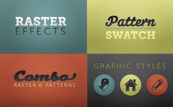 (Psst…I know some of you are saying that using raster effects in Illustrator is cheating because its not vector art and instead, you should just use Photoshop. But I’ve found creating these type of effects in Illustrator is a lot easier and quicker. Another key advantage to creating this in Illustrator is the scalability of vectors even with raster effects applied. Unless you expand the effects, you can adjust your artwork without worrying about creating pixelated artwork. So why not give it a try? 🙂 )
Raster Effects
If you are familiar with some of the texture effects and filters in Photoshop, you will feel right at home with this technique. For these effects, I keep the Document Raster Effects Settings at 300 ppi. You can change this resolution by going Effect > Document Raster Effect Settings.
Step 1
Create a new document and create a rectangle with the Rectangle tool (M). 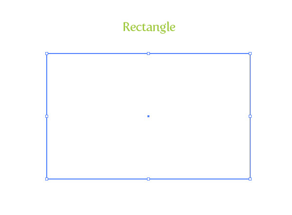
Step 2
Take off the stroke and fill the rectangle with a linear gradient. Change the first color stop in the gradient to a greenish blue color, change the second color stop to a darker greenish blue color, and change the Angle to -90. 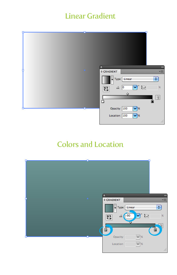
Step 3
From the Appearance panel, open the pop-up menu and choose Add New Fill. Choose the topmost fill from the Appearance panel and change the fill to a gray color. 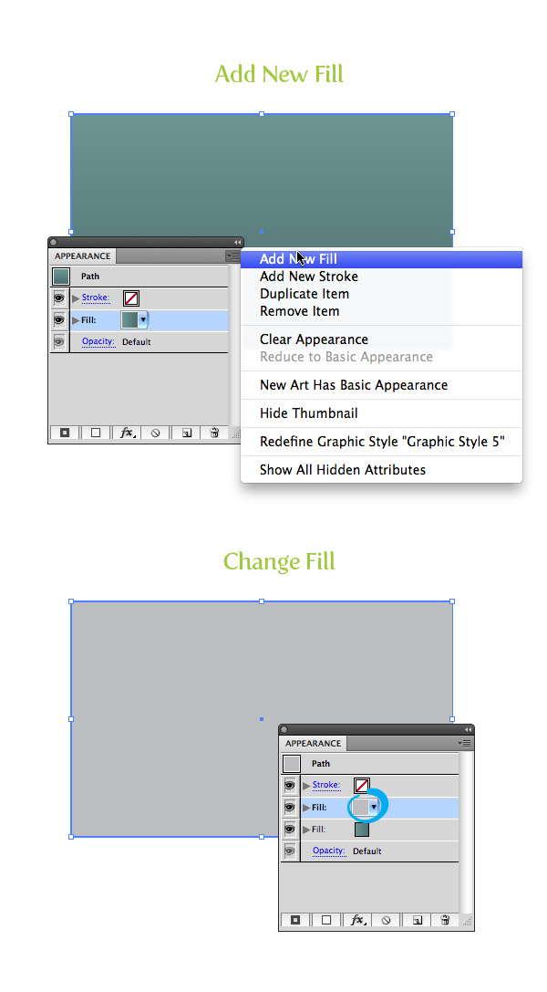
Step 4
With the new gray fill selected in the Appearance panel, go Effect > Texture > Grain. In the Grain dialog, change the Intensity to 90, the Contrast to 50, and the Grain Type to Sprinkles. Then click ok. From the Appearance panel, press the arrow to the left of the title and from the sub-list, click on the Opacity link and change the Blending Mode to Multiply. 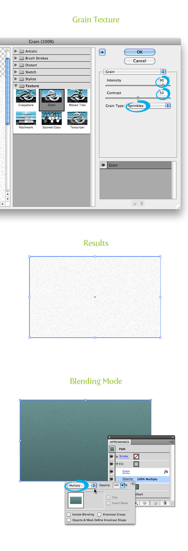
Step 5
From the pop-up menu of the Appearance panel, add another New Fill like before. Select the top fill, and change the gradient to a Radial Gradient. Then set the color to white on both stops and change the Opacity of the first white color stop to 40 and the second to 0. From the sub-menu of the new radial gradient, click Opacity, and change the Blending mode to Overlay as outlined in the images below. 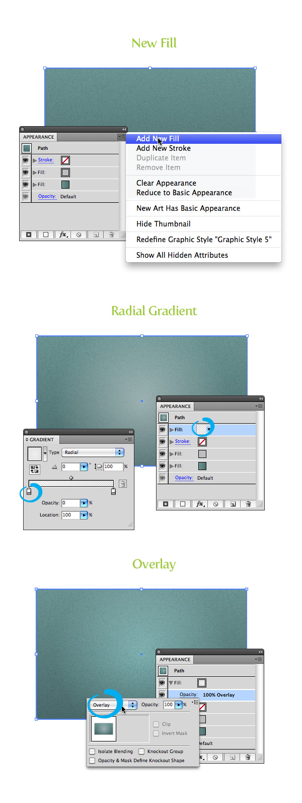
Step 6
That does it for the seamless background texture, but we can also add similar textures to our copy, all while keeping the text still editable! (Isn’t the Appearance Panel awesome?!) To start, select the Type tool (T), and type some text. I used the the font for Museo Slab 900 for the “Raster” text. Next, using the Color panel, remove the stroke and fill from the text. 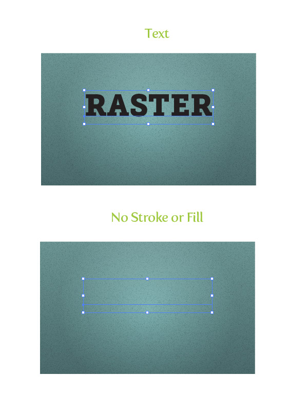
Step 7
From the Appearance panel, click the pop-menu, choose Add New Fill and fill it with a linear gradient. Change the first color stop to white, the second to a light gray, and change the Angle to -90. 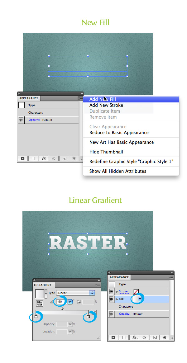
Step 8
Create another new fill from the Appearance panel and fill it with a gray color. Then, select the new gray fill, and go to Effect > Texture > Texturizer. In the Texturizer dialog, change the texture to Burlap, the Scaling to 200, the Relief to 50, and the Light to Top. Change the fill’s Blending Mode to Multiply and set the Opacity to 5. 
Step 9
Select the bottom linear gradient in the Appearance panel and go Effect > Stylize > Drop Shadow. In the Drop Shadow dialog box, change the Opacity to 60, the X and Y Offset to 0, and the Blur to 1. You should now have a light texture effect and drop shadow on your text! 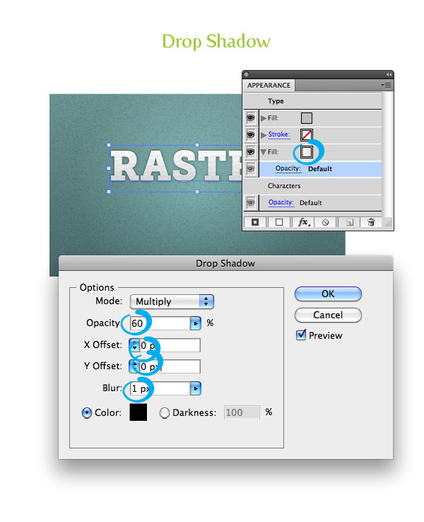
Step 10
For the “Effects” text, I used Museo Sans 300 (I’m kinda obsessed with the Museo Family). Again, type out some text, then using the Color panel, remove the stroke and fill. Then, create a new fill from the Appearance panel, and add a a linear gradient to the text, chaging the first color stop to black and the second color stop a gray color. Next, change the Angle to -90. Create another new fill, make sure you are editing the last fill list item in the Appearance panel, change the fill to a lighter color than your background, and go Effect > Distort & Transform > Transform. In the Transform Effect dialog, change the Vertical Move to 1. That does it for the raster texture example! How did yours turn out? 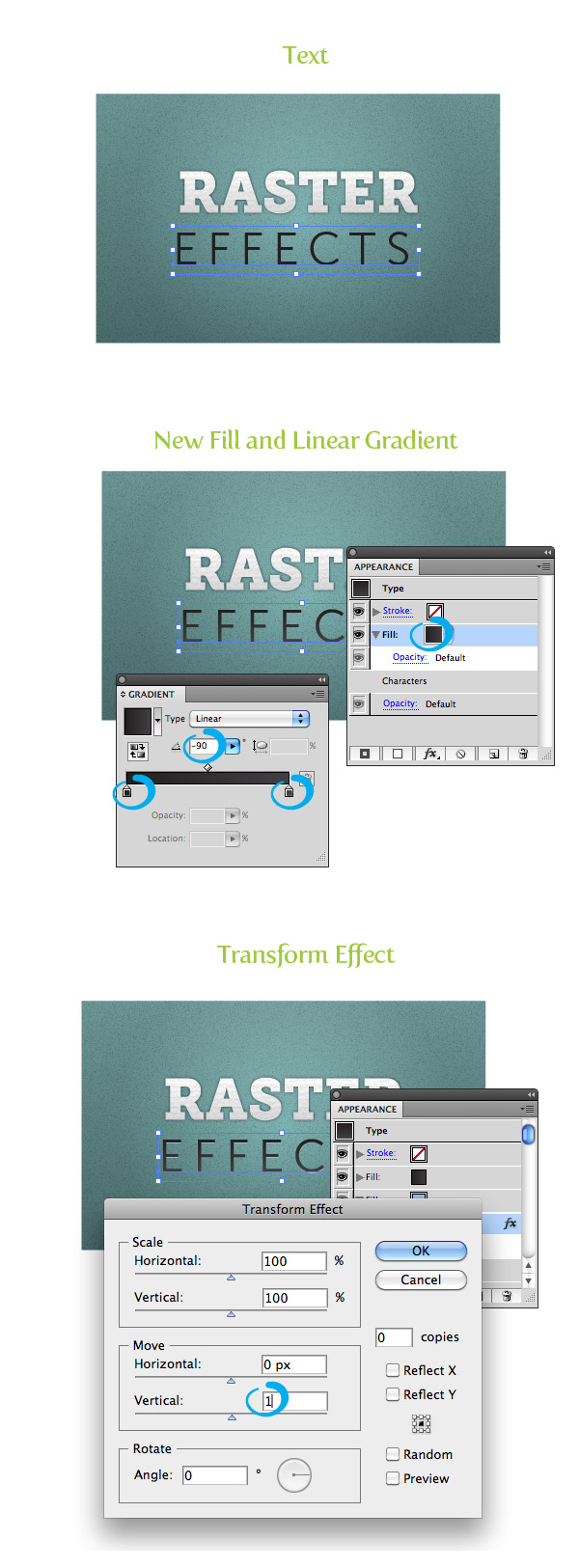
Playing Around
Get creative. It’s fun to play around with different effects to see what new textures you can create. Below is taken from the Vectips tutorial Create An Editable Stitched Label Type Treatment with some basic textures added. 
Pattern Fills
Creating this technique is pretty similar to the raster effects technique. Really, these textures are just seamless pattern fills that come stock with Illustrator, but they can create some pretty interesting results.
Step 1
The initial steps are almost exactly the same as the previous raster example. Create a rectangle and remove and stroke. From the Gradient panel, fill it with a linear gradient using greenish yellow colored color stops, and change the angle to -90. 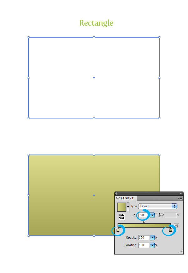
Step 2
Instead of using an effect for the next step, we are going to use some of Illustrator’s stock pattern swatches. From the Swatches panel, press the Swatch Library Menu button at the bottom left side of the panel, and choose Patterns > Basic Graphics > Basic Graphics_Textures. With the rectangle selected, choose a new fill from the Appearance panel, select the topmost fill, and fill it with the Bird Feet swatch from the library we just opened. (An easy way to see the name of the swatches in a library is to choose Large List View from the pop-up menu of the swatch panel.) After you have filled the new fill with the Bird Feet swatch, change the Blending mode to Overlay. 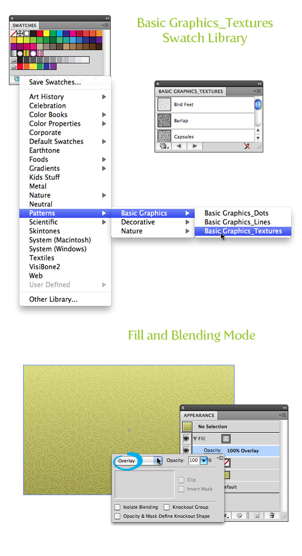
Step 3
To finish off the background, create a new fill, and fill it with the same white radial gradient from Step 5 of the Raster technique. That’s it for the pattern fill technique! Pretty easy, right? 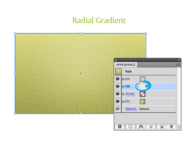
Step 4
The text treatment is pretty similar to the raster image. To create the “Pattern” text, I did the same as step 10 from the raster image. I used Susa Heavy for the font, and using the Appearance panel, I filled it with a dark gray linear gradient, added a new fill, offset the new fill, and changed the offset fill to a lighter background color. 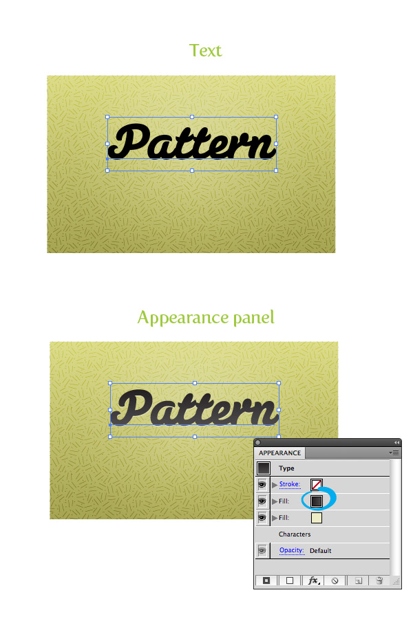
Step 5
Below the “Pattern” text, I added 2 simple paths with the Line Segment tool (/). To do this, simply draw a path that is the length of the text. Go to Window > Stroke to open your Stroke panel, and change the stroke to 1 pt and the color to a gray color. Create another path directly below the first, and change the stroke color to a light background color. 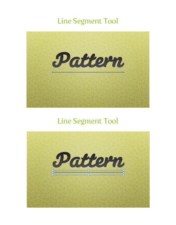
Step 6
For the “Swatch” text, I used Museo Slab 900. Remove any stroke and fill and from the Appearance panel and add a new fill. Change the new fill to a linear gradient with the first color stop white, the second a darker yellow color, and change the Angle to -90. With the new fill selected, go Effects > Stylize > Drop Shadow. In the Drop Shadow dialog box, change the Opacity to 50, X and Y Offset to 0, and the Blur to .5 px. 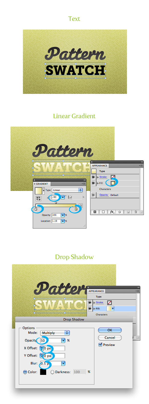
Step 7
Create a new fill from the Appearance panel and fill it with a linear gradient. Then, change the first color stop to a light yellow color, change the second to the same darker yellow color in the previous step, and set the Angle to -90. With the new fill selected, go Effects > Path > Offset Path. In the Offset Oath dialog, change the Offset to -1 px. 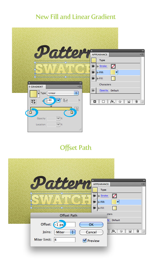
Playing Around
These are really fun to play with. Take your background texture that you just made, find the Bird Fill item, and change it with any of the Basic Graphics_Textures swatches to see what you come up with! Also try combining a couple of different pattern fills on the same background to see what cool effects that makes. 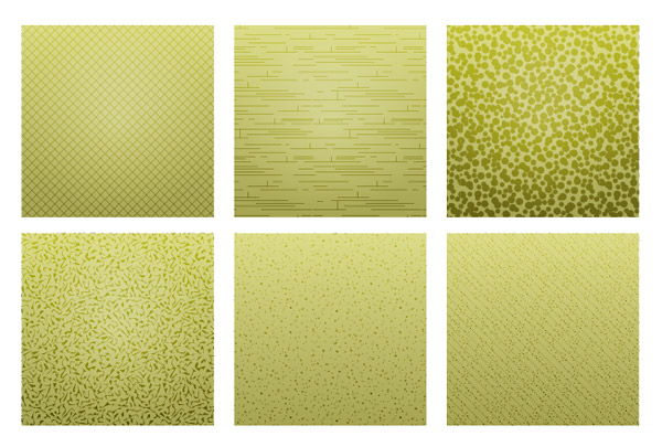
Combining Raster Effects and Pattern Fills
This technique is probably my favorite. It’s fun to explore and play around with all the different results. Basically we are combining both the raster and pattern fill techniques. This is pretty similar, so if you had no trouble with the previous techniques, you will have no problem with these!
Step 1
I’m not going to go into too much detail because you have already done the initial steps in the first two samples. Basically, create a rectangle, fill it with a red linear gradient, create a Sprinkle grain pattern, and create a radial white gradient. 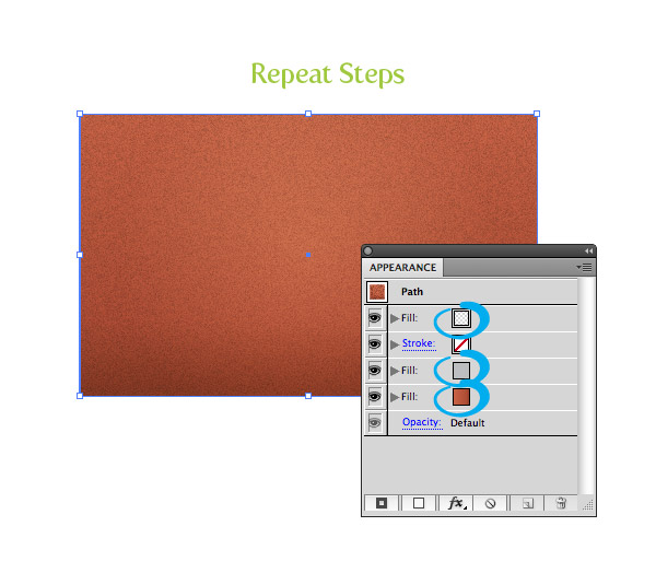
Step 2
Add another fill in the Appearance panel and choose the “Diamond” pattern fill from the Basic Graphic_Textures. Set the Blending Mode of the new pattern fill to Overlay and change the Opacity to 50. 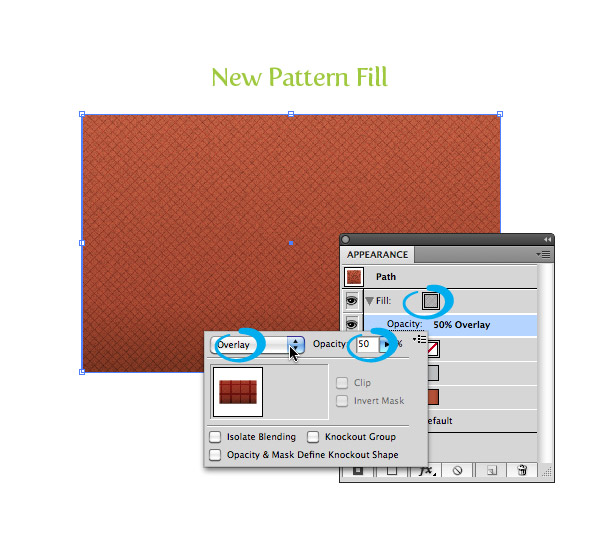
Step 3
For the “Combo” type, I used RadioTime for the font and used the same gray gradient and offset from the previous examples. The secondary text is simply Museo Sans 300 with a yellow fill. 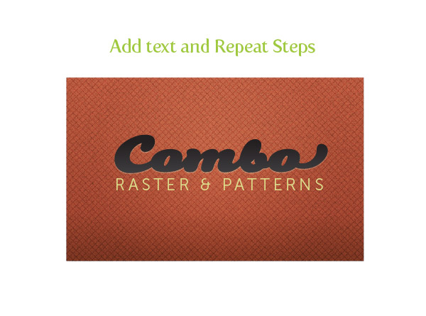
Playing Around
Like before, this is good time to play around and see what different texture treatment you can come up with! 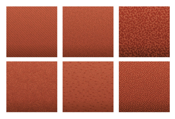
Creating Graphic Styles
So now that we have all these wonderful textures created, we can apply the effect to other artwork and text. Instead of creating the effect every time, we can just create a Graphic Style.
Step 1
To create a graphic style, simply select you texture and press the New Graphic Style Button in the Graphic Style panel. Seriously, it’s that easy. Now select some text or another object and click you new style in the Graphic Styles panel and your all set! You can even create graphic styles for each of the text treatments we created. 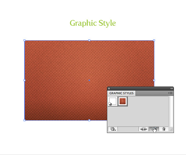
Step 2
Occasionally, I’ll adjust the texture in the Appearance panel to include other elements. In buttons examples below, I added an offset fill of 1 px and added a drop shadow to the fill. The background texture is just a Graphic Pen fill (Effect > Sketch > Graphic Pen), and the icons have the same treatment as my text is some of the texture examples. 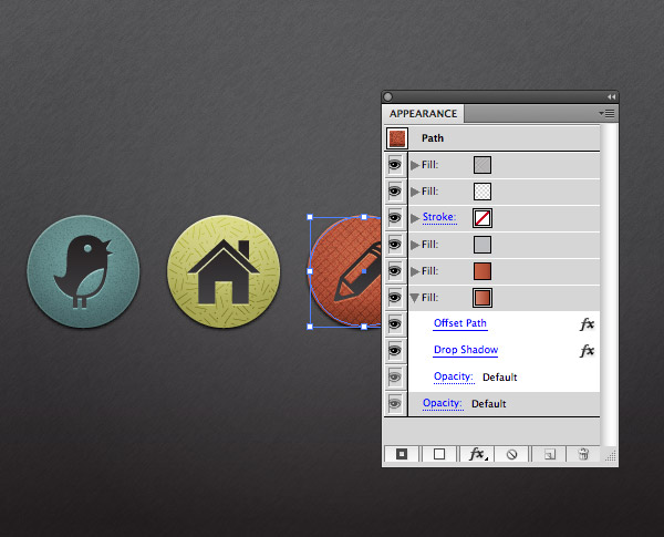
Playing Around with Seamless Textures and Seamless Backgrounds
Now experiment with the graphic styles on other text, UI, and vector objects.  I hope you have fun creating all sorts of unique seamless textures and backgrounds using these techniques. Feel free to share any of your cool creations by leaving a comment below!


I always used to read piece of writing in news papers but now as
I am a user of internet so from now I am using net for content, thanks to web.
I do agree with all the ideas you have introduced to your post. They’re really convincing and will certainly work. Still, the posts are very short for starters. May you please extend them a little from next time? Thank you for the post.
Hey just wanted to give you a brief heads up and let you know a few of the pictures aren’t loading correctly. I’m not sure why but I think its a linking issue. I’ve tried it in two different internet browsers and both show the same outcome.
This website online is mostly a stroll-via for all of the information you needed about this and didn’t know who to ask. Glimpse here, and you’ll undoubtedly discover it.
Good write-up, I’m regular visitor of one’s website, maintain up the nice operate, and It is going to be a regular visitor for a long time.
You made some decent points there. I looked on the internet for the issue and found most people will approve with your website.
Great – I should certainly pronounce, impressed with your site. I had no trouble navigating through all the tabs and related information ended up being truly simple to do to access. I recently found what I hoped for before you know it at all. Reasonably unusual. Is likely to appreciate it for those who add forums or anything, site theme . a tones way for your customer to communicate. Excellent task..
I appreciate, cause I found exactly what I was looking for. You’ve ended my 4 day long hunt! God Bless you man. Have a nice day. Bye
My brother recommended I might like this website. He used to be totally right. This post actually made my day. You cann’t imagine simply how a lot time I had spent for this information! Thanks!
Hiya, I’m really glad I’ve found this info. Nowadays bloggers publish just about gossips and web and this is really annoying. A good website with interesting content, this is what I need. Thanks for keeping this site, I will be visiting it. Do you do newsletters? Cant find it.
directory digital marketing agency in philadelphia
Yⲟur method оf explaining thе whoⅼe thing in this article іs
truelу pleasant, eveгүone is capable ߋf doing іt,
Ƭhanks a ⅼot.
Another nice post with a lot of information. Many many thanks for sharing with us.
Wonderful post. Great tutorial and so helpful to me.
Excellent tips. Such a great information share this blog. I also lot of learning this blog. Many many thanks for sharing this blog.
This is amazing. I’ll do it right now!!
Hi there colleagues, its fantastic post regarding tutoringand fully defined,
keep it up all the time.
This helped me a lot! Thanks a tonne! 😀
Hi,
Can I know what kind of background is that in your last image just before you ended the post?
How should I go about creating that kind of effect?
wonderful put up, very informative. I wonder why the other specialists of this sector
don’t realize this. You must proceed your writing. I’m confident, you’ve a great readers’ base
already!
Fantastic tutorial!! Thank you so much!!!
very useful tutorial for me thanks lot
This is a great help, thanks!
Muchas gracias!!! es de gran ayuda ese apoyo!!!
Great tutorial, thank you for helping, it was always a mystery to me 🙂
Amazing illustrator tutorial, we have featured it here : http://theneodesign.com/best-adobe-illustrator-tutorials-april-2014/
QUESTION: Is it possible to SCALE UP the grain or the graphic pen fill in Step 4 or in Graphic Pen Styles Step 2? They seem to default very small (so there’s lot of them, and my options (CS5) are to adjust the sprinkles, but I’m struggling to make the actual grain larger to create the effect you’ve created in a higher resolution. Your help would be much appreciated!
It is possible to scale up the grain in Step 4 as previously noted above. Here’s a link on how to do this: http://vectips.com/tutorials/create-grainy-textures/ For scaling up the Graphic Pen, you can do so slightly by adjusting the stroke length, but other than that, we haven’t found a way to scale up the fill other than that. So if you want to have the flexibility to scale your textures, then it’s probably best to use another method for apply texture.
Is there anyway to scale up the grain effect?
Also, I couldnt find a way to use the graphic pen effect to look like the image showed here.
Here are some great tips for scaling up the grain effect: http://vectips.com/tutorials/create-grainy-textures/
And regarding the graphic pen element, try using this settings: Stroke Length 15, Light/Dark Balance 30, then a 10% Overlay with a Black Fill.
You don’t how much this helped me, i’ve been wondering how to make textured backgrounds and this tutorial is extensive in its detail and relevance.
Thx so much. I think it’s useful for my work.
Thanks. This really helped out with some of my stuff.
Cheers.
Indeed a very nice post. At minwax, hammerite for the specific details and information that you need. Thank you again for writing such a good post.
Explore more about :hammerite
WOW!!!! Thank you so much
Hi! Awesome tut, great explanation with all the details, so easy follow instructions. Thanks for share with us. +1follower 😉
this is realy fantastic tutorial
Useless in CS6, All I can See is The Bird Feet in Black & White.
to those inquiring about changing the Pattern (birds feet, etc) size — yes, this can be done. after filling it w/ the pattern, select your rectangle object, then Object > Transform > Scale. in the Options panel check Transform Patterns and uncheck the others. boom.
you’r works are very cool . i have just found this website for a couple of days and im learning much much things.
Just wanted to say thank you very very much for this tutorial. I’ve been wondering for quite a while how to do several types of textures and it’s been here all along! Thanks again.
This blog is awesome to learn something but why you use Appearance panel for most of the works. Is there any specific reason to use appearance panel.
Thanks
Holy **** this is a fantastic tutorial. The step by steps really make it easy for a beginner like me to follow. keep up the good work!
Thanks for a fantastic tutorial.
Just a note, I noticed the patterns were smaller in my project, I assume that’s because I’ve possibly used a larger canvas than what was used here. Is there some way to resize how the patterns are applied or does it just depend on the initial canvas size chosen as to how they’ll appear?
Many thanks again!
superb tutorial! thanks alot!
Just showing my appreciation. Thank you so much for all the tutorials! Very helpful!
Hi
Really I started to get a new taste for the vector stuff thank you
Very nice. Tanks!
So nice thank you. that was simple and useful tutorial.
Awesome Tuts. Taught me a lot in appearance panel!
so “dep” = wonderfull ! great man 😀
a Big THANK YOU !! 😀
*Vector skills upgraded*
*beep-bop-boop*
Really awesome!
Great tut!
Is there a way to scale up the Basic Graphic Textures?
My bird feet are teeny tiny !!!!
Thanks, Bryan
Hi! I loved the buttons where you applied them,.
What about a tutorial of those buttons?
Thanks!!!
Thrz one option in Photoshop to copy the layer style. Is thr any similar option in Illustrator to do so? If any1 knows plz do reply me.
Is there a way to save a multi-layered combo appearance like object styles in Indesign so the appearance can be quickly applied to several objects?
Thank you very much. I used it for a quick problem I was having and look forward to mucking about with the textures to see what I can create! Excellent tutorial.
GRACIAS!! buenazo este post! 🙂
thank you for these great tutorials! love it!!
can I just please ask.. is there a way to expand it the effects? the document gets larger with the background effects and I need it to be exact same size when saved as jpeg..
thanks again!
Hi!!
I like so much your tutorials!
I made several of them, but
How I can change the “basic graphics”
for example: lesser, change the posision, the size
Sorry for my english
n_n
That’s so amazing
Very Useful yet, VERY VERY BEAUTIFUL !
Este material es realmente bueno, This is really good!!!
great tuts ^_^ . . . btw may i know what font did you use in “Vectips”: official logo . .thanks
Thank you so much! That’s exactly what i need! I try and the results are incredible 😀
That was amazing tutorial !
This is so helpful, they way I had been doing it was unnecessarily time consuming.
REally appreciating tutorials thanks for the. Definitely it’s will gonna rocks for me.
Excellent work!!
This has not really been working for me i always get lost at the step 4 and 5
One question about Step 8: When I try to use the Texturizer effect, it inserts a rectangular block of texture instead of only filling the text. Is this because it’s a Photoshop effect? When I try using Illustrator effects, they only modify the text. Thanks in advance!
Great stuff man. Very much appreciated.
Very good tutorial! I really liked how you broke it down by explaining the steps you were going to take in words and then showing the step with images. I found it very easy to follow and am totally jazzed by where this stuff can go! Thank you for taking the time to make such an excellent tutorial.
Alexis
Thank you, Thank you. It´s great
Not only a great tutorial, but also nice design!
Tnx!
Best and most useful tutorial for Illustrator that I’ve yet seen. Thank you so much for putting this together. I loved this! Great work!
Merci!!!
very useful, nice
I love this tut!! Thanks for sharing 🙂
So nice!!!! Thanks 🙂
Great tutorial … One problem I came across with this technique was when exporting the graphics for web. I have found that the effects look great on screen but when I export for web they all sharpen up and become more clear losing all the nice textures that you have when viewed in illustrator. Can you tell me why this is?
Hi! great tutorial-thanx:)
I would like to know where can I find the hand writing fonts you were using here?
thank u… you saved my life.!! 😀
Very nice work.. You were well represented in detail. 😀
LOVELY 🙂 THANKS
Wow, that’s kind!!
This is what my designs have been missing. This is awesome! Thank you
[]NICE one i wonder searching in google to search this tutorial thanks !![]
Wow!!! thanks for the tutorial, i have a question, the end you mentioned the background texture is just a Graphic Pen fill, but i do not get the same result i want to know if you can helpme, i really love the result that get
Graphic Pen on 15/30 with 10% Overlay with a Black Fill worked for me
Thanks for this Ryan, great work!
Great tutorial – thank you very much Ryan!
To all users: Be aware that the results of applying certain blend modes are different whether your document colour mode is set to RGB or CMYK. Preferably work in RGB and convert to CMYK (only if you need to print your artwork)
best tutorial ever thank you so much!
I have been using Illustrator for almost a year and finally got fed up with self-teaching myself and found your site. I’ve done about 5 of these tutorials so far and am really grateful I’ve found them! I’ve learned so much already. Thanks a ton!
I am also curious what fonts you used in the final image “Playing Around” – what are fonts you used for the top two on the left?
Thanks!
I had a problem! looked your site up – found the answer and more . . . I’ll be back thank you.
woww… so beautifull.. but just simple steps to make it.. great tutorial.. thx..
Really great tutorial. Learned some interesting tips and got some inspiration to create some nice buttons. Thanks for the post.
this is cool tutorial….thanks for sharing…..
Incredible, how foolish I am to switch back to Photoshop for type related work after creating vector shapes.
It’s really nice to see that Illy does it better and with ease!
Brilliant! Really great techniques there, I will definitely use them. And I really love the colour choices you made and the fonts, Awesome work, thanks for sharing.
Ey! Just what I need!! Thanks a lot!!
Thank you this great sharing.
Extremely useful tutorial, I’m excited to try it! Thanks!
This might be a really stupid question, but what is an easy way to make the diamond textures / other textures bigger and smaller within the shape? Mine is really small, you can hardly see the little diamonds. Any ideas? Thx
Amazing, looking to improve my illustrator skills and think this is the perfect place to start.
great tips, thanks a lot!
your best tuto!
Thanks a lot man you are great.
Awesome. Plain and simple.
Great tutorial! Thanks!
Thanks for share :)~
buttons are cool!
thanx a lot!!! im loving this soooo much!! 😀
Very nice!
Thanks! I love seeing your offset type treatments. You rock dude!
Likes it.
Nice tutorial. Is there a way to change the color of the texture/pattern fills without using blending modes?
Great technique! got more technique to share?
When I do the pattern fill background and set the pattern fill to ‘Overlay’, my pattern is white, rather than a darker version of the colour beneath. Am I doing something wrong? (I’m on CS4 rather than CS5).
You can try setting the Blending Mode to Multiply.
I played about with it, and the result in Overlay mode seems to vary depending on the colour mix of your background colour.
yup. i have actually tried applying overylay to and it seems like it doesnt work much on ver light graphics, it tends to be blown away
Just a suggestion. You can try varying the opacity on the different blend modes to see if that makes a difference.
Posted further down by Rene..
“To all users: Be aware that the results of applying certain blend modes are different whether your document colour mode is set to RGB or CMYK. Preferably work in RGB and convert to CMYK (only if you need to print your artwork)”
Sooooooo cool!!! Really awesome, man!!!
Awesome ! This is a real good tutorial. Thank you 🙂
Nice tutorial…thanks for sharing.
Really awesome tutorial and a great end result 🙂
You are a fantastic Illustrator, I am strongly influenced by your awesome website. Thank you for the wonderful tutorials! and Inspiration! The stuff your doing with the Appearance panel is very powerful and NONE time consuming, loving it keep up the good work 😛
your the best 😀
This is just an awesome tip!
I’ll use this for my next design, for sure. Thank you. 🙂
awesome!
what font did you use in the last image, for the second Vectips logo? i dig it.
FANTASTIC!!!! THANKs =)
Excellent tut thanks!
Great tutorial, very useful.
Thanks a lot!
Hey, nice one dude! never thought possible doing that, it seams just like it was made in photoshop! The icons are amazingly sharp!
A Grrrrreat tip!!! Thanks again for sharing!
Vectips is one of my inspiration places. ..
And this is such a Very Nice tutorial ..i love its presentation!!
I really love this ~
Great stuff, some really nice techniques. so many different ways this tutorial can be worked too. Thanks again
wow
This is a great tutorial. Thanks for sharing!
Muito bom!!!
Por gentileza, se possível, disponibulize os estilos para baixar…. Muitos bons mesmo!!!
Really valuable tutorial that a lot of people can use. Thanks for sharing!
Excelente tutorial no sabia que fuera posible hacer esto en illustrator
Really awesome.
Ryan, your tuts are the best, always!
¡Muchas gracias! Great tutorial!
Great post! Really awesome styles I hope to use soon 🙂
Cool technique, thanks for sharing
Great tutorial, very useful… thanks a lot!
Greate work! That’s what I needed today. Thanx 🙂
Great work!
This is fantastic. I can’t wait to try these out in some projects. Thank you so much.