
A popular typography trend in web design and print design is letterpress styled text. This text styling is easy to do in Photoshop, but in Illustrator, it is super simple to create letterpress styled text while keeping the text editable. Utilizing the Appearance panel and Graphic Styles, you can quickly and consistently apply this style to any editable text and other vector objects.
Final Image: Letterpress Styled Text
Below is the final letterpress styled text treatment we will be working towards.

Tutorial Details: Letterpress Styled Text
- Program: Adobe Illustrator CS4
- Difficulty: Beginner
- Estimated Completion Time: 5-10 minutes
Step 1: Letterpress Styled Text
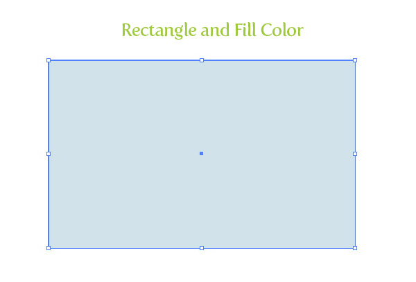
Create a rectangle with the Rectangle tool (M) and fill it with a color of your choosing. I filled mine with a light blue color. I like having a background color on which the text can be placed to really see the highlights of the letterpress text. Still, you can create this tutorial on a white background.
Step 2
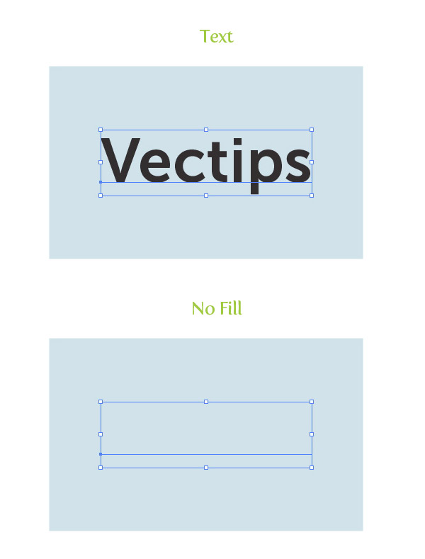
Type out some text with the Text tool (T) and chose a font. I am using the awesome Museo Sans 700 font. With the text still selected, take off any fill or stroke.
Step 3
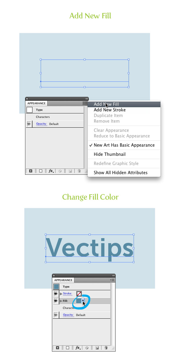
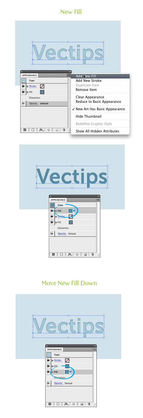
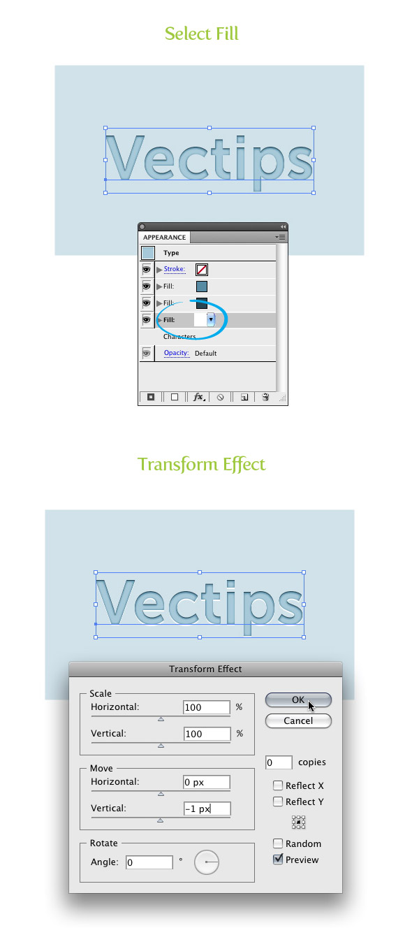
From the pop-up menu of the Appearance panel, choose New Fill. Next, press the swatch thumbnail in the Appearance panel of the new fill and change the color to a darker shade of your background color.
Step 4
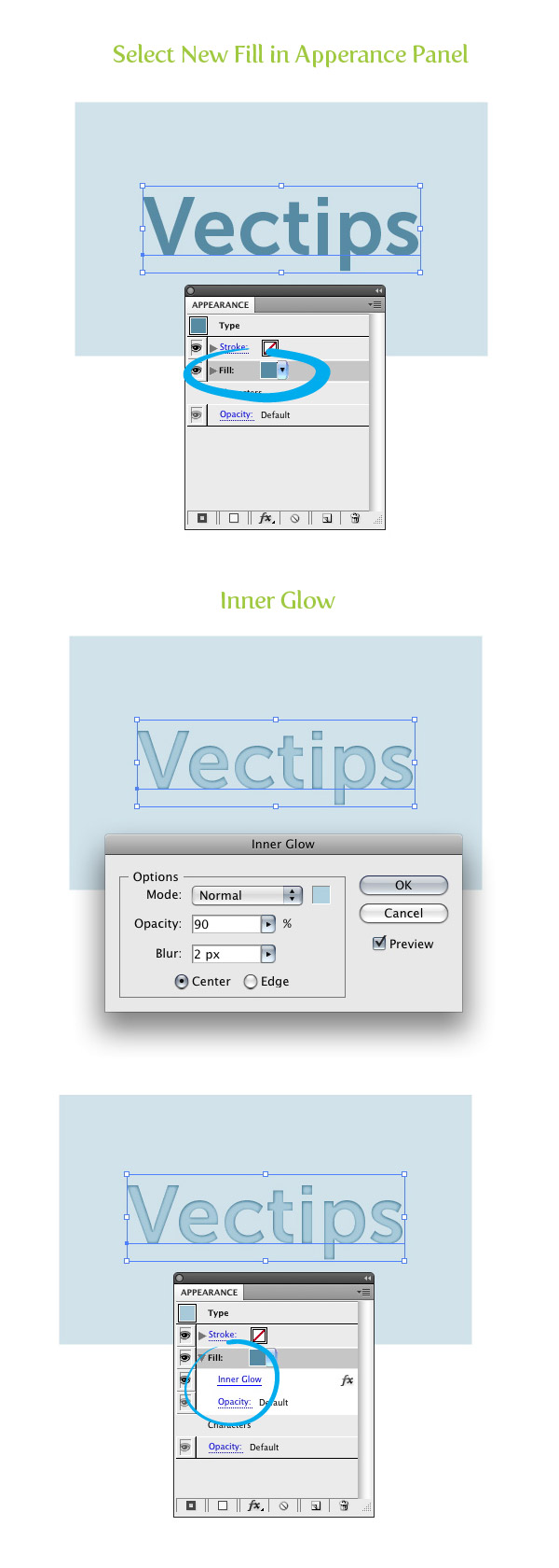
With the new fill selected in the Appearance panel, go Effect > Stylize > Inner Glow. In the Inner Glow dialog, change the Mode to Normal, the fill color (the swatch thumbnail to the direct right of the Mode drop-down menu) to a color slightly darker than your background color, the Opacity to 90 and the Blur to 2 px. You might have to play around with the Blur value depending on how big your text is. Now when you press the drop-down arrow of the new fill in the Appearance panel you can see the Inner Glow effect listed under it.
Step 5
With the text still selected create a new fill from the Appearance panel like you did before. After you created the new fill it will look like the Inner Glow effect you applied was lost, but it wasn’t. In the Appearance panel we have to be aware of hierarchy. When we created the latest new fill it was placed on top of the first fill. Rearrange the fills by dragging the newest fill below the first one in the Appearance panel.
Step 6
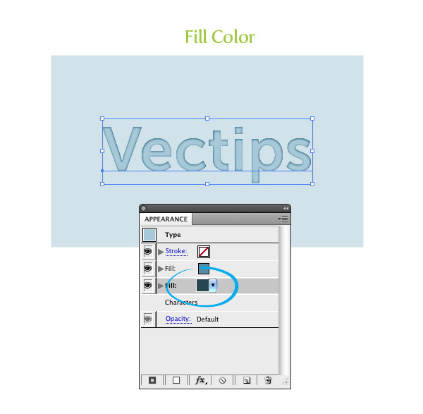
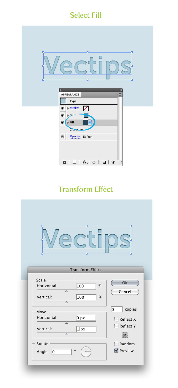
Select the latest new fill in the Apperance panel and change the fill to a darker color than your original text fill color. You won’t be able to see any change because the new fill is behind the first one.
Step 7
With the latest new fill selected, go Effect > Distort & Transform > Transform. In the Transform Effect dialog, change the Vertical Move to 1 px. This might need to be increase depending on the size of your text.
Step 8
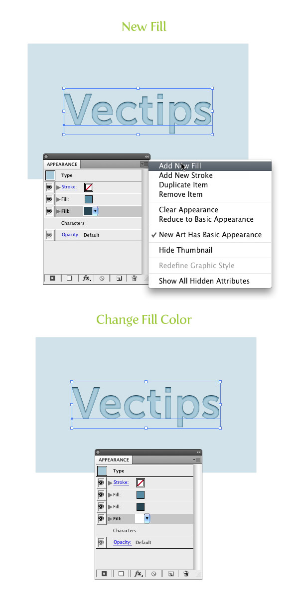
Create a new fill from the Appearance panel like before and fill it with white. Place the new fill below all the other fills.
Step 9
With the white fill selected in the Apperance panel, go Effect > Distort & Transform > Transform. In the Transform Effect dialog, change the Vertical Move to -1 px. Again, this might need to be increased depending on the size of your text.
Step 10
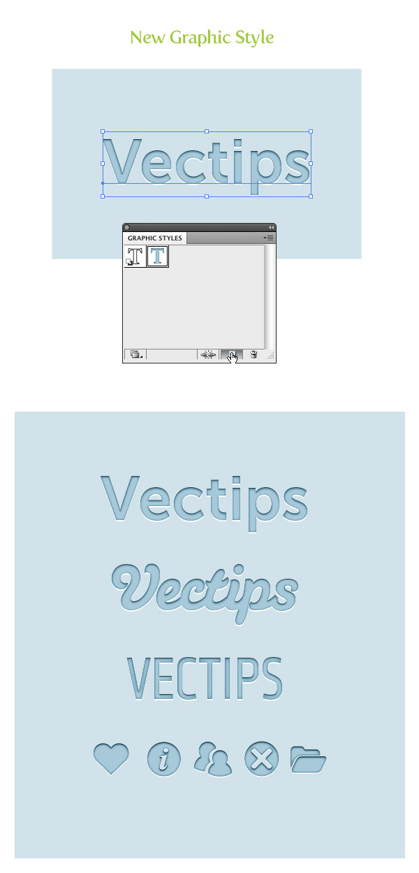
All done! That was pretty easy. Moreover, your text is still editable! To make this letterpress styled text technique more useful, we can create a Graphic Style. Select the text and press the New Graphic Style button in the Graphic Style panel. Now you can apply to Graphic Style to other fonts and even to other shapes and objects. Simply select some text or other vector paths and click the thumbnail of the graphic Style you just created.


Normally I do not learn post on blogs, but I wish to say that this write-up very forced me to take a look at and do it! Your writing style has been surprised me. Thank you, very great post.
This is really interesting, You are a very skilled blogger. I’ve joined your rss feed and look forward to seeking more of your excellent post. Also, I have shared your website in my social networks!
You could certainly see your skills in the work you write. The world hopes for more passionate writers like you who are not afraid to say how they believe. Always follow your heart.
Wow, marvelous blog layout! How long have you been blogging for? you made blogging look easy. The overall look of your website is excellent, as well as the content!
You made several nice points there. I did a search on the subject matter and found the majority of people will consent with your blog.
Hello there. This content is great You have a consistent visitor here.
WONDERFUL Post.thanks for share..more wait .. …
Youre so cool! I dont suppose Ive learn something like this before. So nice to seek out any individual with some unique ideas on this subject. realy thank you for starting this up. this website is something that’s wanted on the internet, someone with slightly originality. helpful job for bringing one thing new to the web!
I just want to say I am just very new to blogging and honestly savored you’re web site. Likely I’m planning to bookmark your blog . You really have awesome article content. Thanks a bunch for sharing with us your webpage.
Good write-up, I’m normal visitor of one’s site, maintain up the nice operate, and It’s going to be a regular visitor for a long time.
Magnificent goods from you, man. I’ve have in mind your stuff previous to and you are just extremely magnificent. I actually like what you have got right here, really like what you are stating and the best way wherein you are saying it. You’re making it entertaining and you still care for to stay it sensible. I can’t wait to learn much more from you. That is really a terrific website.
My coder is trying to persuade me to move to .net from PHP. I have always disliked the idea because of the expenses. But he’s tryiong none the less. I’ve been using WordPress on a variety of websites for about a year and am nervous about switching to another platform. I have heard fantastic things about blogengine.net. Is there a way I can import all my wordpress content into it? Any help would be greatly appreciated!
Very great post. I just stumbled upon your weblog and wanted to say that I have really enjoyed browsing your blog posts. After all I’ll be subscribing to your rss feed and I hope you write again soon!
wonderful points altogether, you just gained a brand new reader. What would you suggest in regards to your post that you made a few days ago? Any positive?
fantastic points altogether, you just gained a brand new reader. What could you recommend about your submit that you just made a few days ago? Any positive?
What’s Happening i am new to this, I stumbled upon this I have found It absolutely helpful and it has helped me out loads. I hope to contribute & assist other users like its helped me. Good job.
Very good article. Really looking forward to read more. Really Great.
Best view i have ever seen !
nice job!
Letterpress text effect becomes a huge trend in web design nowadays. This type of text used in headers, headlines, and even interfaces. It is a well-explained tutorial with the best example. It looks really awesome with your new project.
Thank a lot for this tutorial. Will come back for more
Great tutorial and a nice simple effect which looks good. This will be good for me to learn use for new project. Thanks for sharing.Thanks for your good guiding information.
Very useful thank u
If you wanted to create this effect on a WHITE background how would you do this? I selected a 5% fill for the first fill, and a 30% fill for the second, but what do you do about creating the highlight where you’d normally use a white fill for the 3rd? I want it to look like a blind letterpress on white paper.
Thank you, awesome tutorial, keeping it as editable text saves a lot of time i think.
This is fake Inner Shadow.
If you try it yourself, you can easily notice that the Inner Glow part of the effect is still evenly distributed, instead of being moved slightly down. Just because you add a small dark and glow effect to the top and bottom, doesn’t hide that the inner glow transition is still not moved.
Thanks for your tutorial, but it doesn’t remake the lack of a true Inner Shadow effect in Illustrator (which btw is absolutely embarrassing, since even CSS got a true Inner Shadow effect, and Illustrator CC claims to output CSS.
The Sketch App or similar software currently being developed, will eventually kill Illustrator I think.
Illustrator is simply too slow and old, and their developers don’t care about the community or trends whatsoever.
It’s dying software… 🙁
Cheer up, mate. It might never happen!
Exactly what I needed! The best tutorial for embossed text, thank you!
Great tutorial, just helped me out with the logo I had to design for a website. Saved me a lot of time trying to work out how to do it!
I experimented with the settings and ended up turning the glow effect off which produces a more sharper version as another option people might like to try.
Just another one of your awesome tutorials. Wonderfully presented. A++. Would view again.
Brilliant! =D
I keep having a problem at step 7 (With the latest new fill selected, go Effect > Distort & Transform > Transform. In the Transform Effect dialog, change the Vertical Move to 1 px. This might need to be increase depending on the size of your text.) I end up with a hard-edged drop shadow of the letter “outside” instead of a soft inner glow shadow. Ugh.
Note: I am working with an object as opposed to editable type, it is my logo. Doesn’t seem like this would be a problem.
Can you help?
Thanks!
Thank you so much. 🙂
Incredible.
Very helpful guidance, knowledge which is very useful.Greetings from Indonesia
Thanks
this was a great tutorial & super quick even for a beginner like me!
This is very simple but very effective and nice, thank you for sharing it 🙂
Thanks for this, it was really helpful!
Thank you! Just what I needed to know. Great tutorial.
This procedure was driving me nuts when I could not get the same effect. I finally realized that it was because the transform is explained in the wrong order.
The dark transform should be moved in the -ve vertical and the white transform should be moved in the +ve. Just look carefully at the images as the transform is applied and you will see it’s the opposite of the explanation.
i found the same problem and solution. despite having a lot of experience in illustrator and following each step to the “T” (including eyedropping the same colors he used) i still could never get it to look quite like what he created…
Thanks Fred, I too was unable to replicate the desired transform effect until I I discovered that the the transform is in reverse order..
See comment by Fred for details… This is crucial. Attention to detail is a must especially as people are relying on these sort of tutes.
As for the white transform layer..I found mine didn’t match until I made it 50% opacity screen.. looks much more inset with this setting for the text i’m using. Thanks
Wow great tutorial, I love this effects.
Kind Regards
This is a great tutorial.
I was struggling with 3D effects before I found this.
Thanks
Is it necessary to put backgrounds? I tried to create letterpress but its not appearing fine as you shown in this tutorial
For those that are having problems with this not looking correct when they follow the steps, I think I figured out why. I was having problems with it and it kept looking embossed rather than depressed. Simply make the white layer transform -1px and the dark layer 1px (oposite of what is shown in this tut). You can get to those values by clicking the expand arrow to the left of each layer and then clicking on the Transform effect.
Also, it should be noted, that I liked using a drop shadow set to a light version of the start color on Normal layer style and a 1px Y offset and a 1px blur. I liked this effect better than the white layer with 1px transform offset.
Thankyou thankyou thankyou!
Ouucchh i already remember the steps, but i have the problem with color, mine doesnt look like shadow inside. its more look like embossed..
🙁
mind if yougive me trick about colors
I’ve find how to do this for a long time !! Thank you so much !!! 🙂
Great tutorial. The best part is that it can be done on illustrator rather than photoshop.
Hi, I can’t seem to get colours correct to give me the best effect. What are the blues you use, web safe would be helpful.
Thank you very much!!!!!
Thank you. This will come in handy and as a good practice technique.
Don’t work with little letters (10 – 20 pt)
Thanks for the tuts.
I’m using CS5 and I’m not able to get the same result.
I have try several times with no luck.
I think the difficulty level should not be Beginner…
You should provide color you use for each step and also give a little more details, this will help newbies.
For example: ‘With the text still selected, take off any fill or stroke’ maybe give more detail how to do it…
I don’t give it up and will try to find out why it is not working.
I love this tutorial, and I’ve finally found a project to use it on. I am using red text on a white background, so I changed some of Rype’s steps above to suit that. I’m using CS5.
1. Transformed the darkest colour (2nd fill) by -3px
2. Because my background is white, instead of using a white fill for the last step (3rd fill), I used a very light grey and transformed it +3px. I also horizontally transformed it +2px.
Thanks for a great tute.
hey thanks for the tutorial. Easy to follow, and understand.
I am amazed by your tutorials, they are very easy to follow.
Keep going with your good work!!
I like your website
Has anyone made this into an action yet?
Thanks for this tutorial! It was very useful when I needed to do some quick icon illustrations for a blog post. You can check out my result here: http://wp.me/p1ERmb-5b
I did have to do a bit of changing of the tutorial (as other comments mentioned in CS5 it’s not exactly the same!) But I think it turned out pretty good.
I love this effect. I cannot seem to re-create it though.
CS5
I end up with an embossed effect every time. The darker and white transform effects do not go INSIDE the letters or object for me. They move above and below the letters.
Also, the initial inner glow effect only seems to work when I change the color to lighter than the original color – not darker as you suggest.
I’ve tried this in multiple ways and cannot figure out where I’m going wrong. Wanna do this so badly!
Hey all. Like Jonas, I wanted to be able to do this so badly, but was unable to recreate the effect. I tried many times, but it looked embossed… I don’t like failure. I read all comments, but no solution. I did pick up a couple things and finally figured it out!!! So I have to share, b/c newbies like me, were having similar problems, and the experts were just like ‘i have no idea what people are having a problem with?’
Here goes:
1.your first colour, is background – lets say very light blue
2.your second colour (first ‘new fill’ you apply to text) lets say medium blue
3 your inner glow fx should be set to ‘edge’ and your colour should be DARKER then your first fill (medium blue), then based on text size play with the blur. This step creates the depth inside the text area. I kept adding a lighter colour b/c I overlooked the way he explained and glow, made me think lighter for some reason 😉
4. your second new fill (darker blue) and -1px or more transform (the color is actually outside the text, but it helps with the illusion of depth when you only use just a slight negative vertical move
5. your last new fill (white or very light blue – must be lighter than your background) at 1px or more has the same effect as the previous step, but on the other edge of the text. it too is actually outside the original text area, but if subtle enough, it lightens the bottom edge of the text.
Too much transform of the last two fills, makes it look embossed. But the key to this whole comment is the inner glow is darker then the first fill and set to edge. Trust me, you’ll see.
I’m using CS5
Hi Brad,
thank you so much for this feedback. I had the same problem. My text looked embossed. With your advices it worked for me. Great work! 🙂
I think the most of us have had the problem because of this little error by the transform settings. The darker one needs to have “-” value and the lighter one (white) needs to have “+” value. In the tutorial its the other way around.
Awesome thank you this worked like a charm!
Very nice tutorial thanks for the advanced..
I know this is an old post but I’m hoping somebody can help me out… I got AI 5.1 and I just don’t see Inner Glow Effects… All I see is Effect–> Stylize –> Glowing Edges.. Did I miss something? Please help.. Thanks
To be honest, in Photoshop it’s much easier to do. Also, who said in that in Photoshop it’s not editable? Thats a myth. Ofc you can edit after styling in Photoshop, I’ve done it plenty of times.
I inverted the 1 and -1 in the last two fills using CS5 because it looked embossed and not engraved. Afterwards, it looked more the same.
<3
I take it back….. FINALLY I did it xD
tHE EFFECT IS GREAT!!! i LOVE BUT i CANT DOI IT 🙁 I DONT KNOW WHY I GOT THE FONT TRIPPLE NOT IN AN UNIQUE WORD… WHEN I USE THE TRANSFORM EFFECT IT GET RUINED….SOMEBODY KNOWS WHY??
this tutorial doesnt even yield the same result, i tried this like a zillion times already and im on illustrator cs5. under inner glow if i check ” centre” then i get almost similar results otherwise its just way different.
Nice tutorial, could someone tell me where can i find the same tutorial but for photoshop please? Thanks 🙂
Rattling nice style and design and wonderful written content , absolutely nothing else we require : D.
Great tutorial, even though—as explained before—letterpress isn’t an accurate description (which is what I was looking for). There’s a lot of great techniques in here, that, even though I don’t need them right now, I will come back to this later! Thanks for posting!
But this doesn’t even look like letterpress…
Hey, great tutorial! There is a little question though, when you apply the inner glow in the early stages of the tutorial, it appears to be angled, as if the glow is not appearing equally across the whole typeface, thus creating a realistic shaded effect. When I apply the inner glow, it isn’t angled like yours. Is there a way you can control which angle the inner glow appears?
Tea
Nice tutorial. Thank you. However i cannot make this effect. Because of colors. Can you give color codes? or hint how to select appropriate colors?
Thanks for sharing!
I found it difficult to choose the correct colors.
What I’ve done: the same effect in Photoshop, and pick the colors from there.
Final result looks stunning!
i <3 you
Good tutorial. I’d like to add that if you would like to change the color of the effect quickly because you need to apply it on a different background, I found it easier to select your text & background and use the recolor artwork tool (use the 1 color preset) rather than change all colors individually.
i think it is missing some steps in Step 4, when the inner glow is applied, the next images shown next has a drop shadow effect already, if its inner glow only, it should be centered. I dont quite understand the part that made that drop shadow effect inside the letters, i wish i could because its a really great tutorial, thanks anywayz
I am having the same problem as a few others. I get zero effect when I get to the Inner Glow step. I have tried it several times with different fonts in various sizes and different colors. I tried it in CS4 and CS5 to no avail. I am pretty disapointed because I love the look. I am not a newbie, I know the difference between the Illustrator vs. Photoshop effects so I am not sure what is going wrong.
Very cool tutorial. You exposed me to a whole new approach to creating things like this. Much more efficient way of working!
thanks for the tutorial it was really helpful.
take care.
Thank you very much for tutorial, it was very helpful!!! 🙂
Exactly what I was looking for – and very well laid out. Thank you!!
nice work! i now have a “letterpress” graphic style! 🙂
Really great tut! I was really scratching my head trying to figure out how to do this in Illustrator. It bugs me that Illustrator doesn’t have the same array of easy-to-use effects as Photoshop. Guess it’s because it’s all vector in Illustrator…
Anywhooo, thanx again for a great tut!
Very n1 & helpful tutorial. I did it a few times to get a good result. U have to be very careful with the color shades. If the colors too different it wouldn’t work out.
I also played a little bit with the opacity of the two fills below the text. For me 80% for the first and 50% for the white works excellent 🙂
This effect doesn’t seem to work at all on text sizes smaller that 48px. Makes this effect pretty much useless on buttons.
By the way, you can accomplish steps 5 thru 10 much easier by adding two drop shadows (yes, you can add multiple instances of the effect) to the original fill. One shadow goes up uses a dark color with multiply mode selected, while the other shadow goes down using a lighter color and screen mode. Much easier than creating new fills and moving them around.
Just realized that this effect is probably meant to be used on large text. Smaller text, as in buttons, looks great by just leaving off the inner glow. Do everything else and you get the great letterpress you in this tute.
Fantastic tutorial!
Please tell me how to create styles by myself how long i can use tutorials?:)
very useful tut..thanks!
I cant seem to get this to work as a graphic style. Once i create the graphic style and try to apply it to other elements (text, for example) it only changes the color of the text to one of the colors used in the tut. no other effects are added. Is there a step missing from saving the graphic style? What am I missing? (I am using CS4)
your text should be clear (no stroke or fill) for the style to work on it 🙂
Thank you this great sharing.
I am glowing inside about this tutorial. Viva La web. Took a while to figure it but now I’m really exploring graphical sytles because of this. Thank you.
WOOOOW lotsa’ comments. But yes. Amazing. Now I know how to use the whole “New Fill” thing, and graphic styles!
Sorry but I can’t figure out how to make this work. I’m Using CS5 and all the dialogues look identical to CS4. Where I seem to be going wrong is when I try to transform the dark inner glow to make it offset all it does is drop the entire type down one point. How do I get only the glow within the type to lower while keeping the actual type in the correct spot.
Hi,
I just can’t seem to get the effect right. Could you help me find out why?
It starts at Step 4. I can’t get the inner glow effect.
Maybe the chosen font is too thin: Acid (http://26plus-zeichen.de/fonts/acid-type/)
Thanks and congratulations on the tutorial.
Clarissa
I’d also like to know what size font you used. The vertical move definitely needs to be adjusted depending on the font size and though I keep playing with it, it doesn’t seem to be quite as smoothly done as yours, especially when I try applying the graphic style I created to other fonts.
Would you say that this works best if you stick to a particular color value range? For example, the second fill should be x shades darker than the first fill?
BTW, I followed step-by-step in CS2 and was able to create this effect (and I’m still somewhat of a beginner). So my advice to others working in different versions is simply to look carefully around the workspace. You won’t get the drop down menu for the colors but you can manually change the color value of the second fill based on the original color values.
Great tutorial..! Thanks a lot..!
Sick tutorial, i read it on your iPhone app.
after i finished the tut, i dragged the Graphic style on a vector logo (all stroke, no fill) and it worked perfectly, not just that, but it looked awesome!!!
thanks for the tut, im going to keep watching your tuts.
My Inner Glow doesn’t seem to be working. What size font are you working at?
Thanks a lot, very simple and nice, I loved your tutorials explain every detail and I love it XD
Heya, i tried several times following the tut every single wordd, but everytime it looks more like the text is outdentented rather than indented, any ideas?
What version of Illustrator are you using?
Rype, this happen becouse values in vertical displacement must change to positive where you put in negative value and put negative where you’ve put positive. I’m sorry my English.
Cheers
I don’t know why I don’t get the same kind of effect!! 🙁 But it is a nice tutorial, thank you very mucho!
I don’t know if I will get to explain you correctly because my English is so bad but I’m seeing than other people like you has the same problem and the solution is really simple.
If you follow the tutorial your final effect is not the same. Just change where you put -1 put 1, and where you put 1, change to -1.
Now in Spanish.
Y ahora en español que ese very mucho suena raro jeje. Simplemente cambia los valores de los pasos en los para la sombra y luz, intercambiándolos sacarás el efecto que ha hecho el autor. Donde ha puesto 1 en el desplazamiento vertical, pon -1, y al revés en el otro caso, donde puso -1 pon 1.
Simple.
Saludos
Wow very effective effect thanks for the great tutorial , cool output!
Amazing tutorial. Just what I was looking for. Thanks!
Nice tips
thanks for the share
thanks again
I’m getting the same problem to. I get a greyed out effect. Anyone got any ideas?
Make sure you are selecting your text before you try and add a new fill
“Add new fill” is greyed out when I try to select it. What is the problem?
thank you man
Thanks for the great tutorial-but I’m having trouble. Why is it that when I try to add a new fill or even go to illustrator effects for inner glow (or any other similar option) that all these options are greyed out?
Wow, I’m going to try that technique for sure. Is there a way you can do something similar in Fireworks? Anyone got a good URL for it?
it is more easy on photoshop, nice tuts. thanks
Hi, thanks for this tutorial, its great. I have CS2 and it works fine. I had to start from the beginning a few times because some things didn’t work for some reason (i.e inner glow) but the result is fine. Is there any way to ‘smooth out’ the inner glow effect as it looks pixilated and I’m not sure how this will show when printed.
To Image Grafics:
In step 2 the line and stroke are set to none. So in step 3, highlight the text and click on the little button with the arrow on the top right of the appearance box. Then select the first option and the text colour will change to black. Then change the text colour to a shade darker than your background box (if you are using one). I don’t have the arrow next to the colour to change it, so went to my colour palate and changed it manually.
hello
is this made in cs3 or cs4
cause am trying on cs3 and i dont get the results of step 3.
i get stuck there.
please help.
if you’re using cs4
can you help me how to use it on cs3.
thank you its a great tut.
thank you, great now i can make my own letterpress based on your tutorial 🙂
This is the greatest Illustrator tut I’ve seen in a long while. I feel like such a took – I didn’t realize you could apply two fills. This has opened so many new doors for me. Thanks much!
Million thanks! Already used for my portfolio website!
Beautiful type tutorial, this letterpress effect looks very elegant. Thanks!
Nice,
thanks a lot!
I didn’t have a dropbox either from my fill, but you can change the colour manually each time.
The possibility of making this into a graphic style is great!
i love this technique !! but not as easy as Photoshop 🙁
This tutorial is great! Thanks for making it. What are the three fonts used in step 10?
very nice style, thanks for the tut..
Excellent Tutorial! Adding this site to my RSS Feeds now.
that’s cool, simple and easy but amazing.. thanks 😉
I’m not sure I made it right. The corner of letter is like this http://auv.fileave.com/press.pdf
Any suggestion? Thanks
Ryan
thanks a bunch!
i’m a newbie n really liked what i see here…its neat!
Why is this not offered as a downloadable style?
I can’t offer it as a download because of my contract I have with iStock. I know it sounds stupid, but I can’t offer any download I have created.
Clearly presented … many thanks. I’ve used this in Photoshop, but the pointers for doing so in Illustrator are much appreciated.
Very nicely done! I’ve seen this done in PS but not AI. Thanks!
used to create such an effect in photoshop before. though it’s possible to achieve a similar effect, the required time was much longer. this new method will help me to save a lot of time.
thanks man.
keep up the good work…
Awesome tutorial… But i cant get the final step! I don’t know what i am doing wrong please help!
The Transform effect or Graphic Style?
The graphic style
The graphic style.. It doesn’t create a typography graphic style
That’s cool, but I don’t have a little drop down box in the Fills of my Appearance palette. You must be using a newer version of Illustrator.
一直都在寻找这种效果的方法!
Great!
Thank you!
wow. great technique.. popular on the web.
seen lotsa photoshop tuts on this.
This is a fab tutorial!
What is the icon set that you used in the last image??
It is one I sell on iStock Web Icons (Reflections 2).
Amazing !!!! Thank you so much for sharing it ! 🙂
Pretty, but not letterpress. Letterpress has always regarded overimpression as poor-quality printing because it ruins the other side of the sheet. The ideal is called a ‘kiss’. It can be only barely felt, and only barely seen.
Maybe you could call it ‘sunken’ or ’embossed’ text instead?
I realize it is not true “Letterpress”, after all it is digital artwork. I’ve seen it described as such, and although it is not the technical term, I think it is a fair way of describing the effect even though it is not directly describing the printing technique. It is pressed letters, right?
Still, it might just create unneeded confusion. Some might get confused when talking about the “look” of Letterpress in digital art compared to the printing effect. So you might be right, changing it to “sunken” or “embossed” might be better. Really, I just like the Letterpress name better.
For some great Letterpress printing inspiration, check out Adventures in Letterpress.
I tried! but my effect wasn’t that awesome though. ):
As an absolute beginner to Illustrator, I’d like to say that this tutorial was very easy to follow. I have experience in Photoshop but I found Illustrator weird and confusing, and this tutorial did introduce me to some new techniques. Certainly very different to how it’s done in Photoshop anyway.
Thanks.
Hi…
Many thanks for this tutorial and all the others actually.
Very good explainations as compared with many tuto makers who simply don’t bother to give half the path through it. “dropping hint IN”
Ej:
http://designreviver.com/tutorials/icon-design-tutorial-designing-a-new-icon-in-illustrator/
“dropping hint OUT”
What s more, the design of your page is great (I mean it and I ll copy paste it to make my own … just kiding)
One thing about this tutorial. In CS3 at least, when you start giving glowing effects, people may get wrong if instead of using Illustrator effects, they use Photoshop ones (I did it … I m a beginner).
Best regards
Absolutely gourgeous!!!
You have such a nice touch! Thank you very much
Out of curiosity what are the fonts you used in the last image?
Museo Sans, Susa, and Klavika Condensed
Hey man! what a great tutorial!!, this is the first tutorial that I follow from you, Thanks is really helpful.
AWESOME TUTORIAL! I have been dieing to find a letterpress look in Illustrator and you have done it. I can’t wait to use this on a project. Great job!
Lovely effect, never knew what it was called until I saw this tutorial.
Fab tut!
thanks for ai tutorial letterpress – i tried to create one by following your tutorial, but I still couldn’t create letterpress — all white, dark and original colors are piled up using stylize>transform.
I don’t know where I went wrong 🙁 I am newbie at Illustrator
Are you using CS4? What step did it start getting messed up?
Hi Rype, I got the same problem,it messed up at step 7.
Hi Josephine
You have to select Illustrator Effects instead of Photoshop Effects (both in Illustrator panel)
Brilliant use of the appearance palette and transform effect Ryan! Great Work!
I know I can try to see if I can, but I’ll ask anyway. Can I use this in Adobe Illustrator CS2? I still haven’t upgraded to CS4 unfortunately. 🙁
I’m not sure. I think you should be able to apply the effects to the text, but I don’t think the Appearance panel will look the same.
awesome awesome awesome , you are great !
Amazing tutorial, i like the final result….so simple.
i’ll be waiting for next tuts… 🙂
Great tutorial and a nice simple effect which looks good. This will be good for me to learn use for new project. Thanks for sharing.
Great tip, love the quality of the tutorials on this site always excellent.
Nice Tutorial. Thank you for posting it.
really amazing tutorial there ryan. 😉
great tutorial! i was wondering how to do this in AI..
Great Tutorial ! Will help me in a new projects !!!
Hi Ryan perfect tutorial love the result of text could you please tell me the name of the second font you used in the final preview image thanks
Thanks! The font is Susa.
Very good – this will help in future projects!
Brilliant! Just what I was after.
nice typo tut.
thanks!!
Finally a letterpress tut for Ai. Thank you.
Great effect. You do good work! 8)
Thanks for this tutorial
[IMG]http://img9.imageshack.us/img9/6231/captura518.th.png[/IMG]
Great technique, thanks for sharing!
More Than Love It!
so fresh and so clean clean
Ooh, this is terrific.
I use this effect in photoshop all the time.
Great to see it in illustrator.
Just as easy with pathfinder cutting or clipping masks.”CtrlC & CtrlF” is your friend.:)
Damien
Creative Director
freehandforest.com
Glad to see another tut from you on this site! 🙂 Please keep them coming.
your hot 😉
Your English is poor.
good,nice.
glad to see