It used to be a time consuming process to create a halftone pattern. First, I would open a picture in Photoshop, convert it to grayscale, apply a halftone pattern effect, open it up in illustrator, trace it, and if didn’t get messed up somewhere in the process, I would use the halftone pattern in Illustrator. In Illustrator CS3 it is quite a bit easier to create halftone patterns without leaving Illustrator.
Notes
This tutorial was created with Illustrator CS3.
I suggest having the Raster Effectsat 300 ppi. This will generate the best quality in the pattern. You can change this by going Effect > Document Raster Effects Settings and chose 300 ppi.
Halftone Patterns
I don’t want to ramble on here, but it is helpful to learn a little about halftone patterns before getting started. Basically, halftones simulate continuous tones with equally spaced dots of varying size. The eye blends these tiny dots into smooth tones. So anything created in Illustrator that contains continuous tone, can be simulated by a halftone. This includes gradients, blends, and gradient meshes. Moreover, you can apply halftone patterns to photos.
Color is also important to note when dealing with halftone patterns. In addition to smooth tones, the human eye blends a limited palette of colors to create numerous colors in a halftone. It kind of works like the color mixer. A halftone pattern mixes dots of Cyan and Yellow to create a green color, just like you mix Cyan and Yellow in your color mixer. If you use processed colors (like the green mixture of Cyan and Yellow) when creating your halftone pattern it might not convert to vector gracefully. I suggest initially using black or spot colors in your halftone pattern. After the halftone is converted to a vector you can change it to a process color (CMYK or RGB).
If any of this doesn’t make sense, just use black as the dark color and white as the light color in your gradients, blends and gradient meshes. After they are converted to vector, use any color you like.
Halftone Patterns from Gradients, Blends and Gradient Meshes
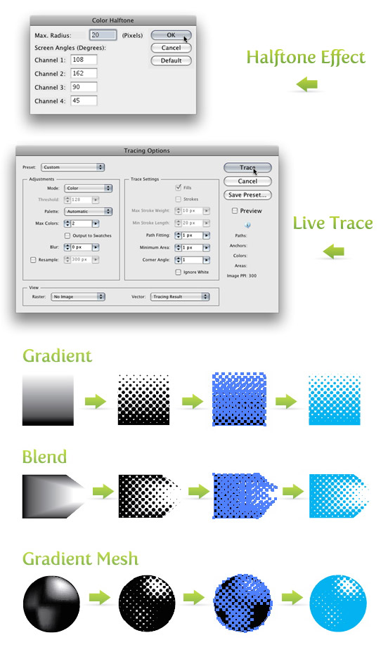
With your gradient, blend, or gradient mesh selected, go Effects > Pixelate > Color Halftone. Change the Max Radius to 20 and keep the rest of the settings the same. If the dots in the halftone patterns are too small or too big, you can change the Max Radius by double clicking the Color Halftone effect in the Appearance Panel.
Now you can trace the image to create vector art. Like the previous Grunge Text Tutorial, it is easier to work with the image once it is vector. Moreover, I am going to use the same settings in that tutorial.
First, expand the image by going Object > Expand Appearance. With the image selected, the Control Panel defaults to the Live Trace options. Click the Arrow Button beside the Live Trace button and select Tracing Options. If you wish, you can also go Object > Live Trace > Tracing Options. You don’t have to change all the options, just the ones below.
- Mode: Color (select if your object contains color, hopefully you are just using black and white)
- Max Colors: Dependent on how many colors you used,if any.
- Path Fitting: 1px
- Minimum Area: 1px
- Corner Angle: 1
- Ignore White: Check this box
It is not a bad idea to save a Preset in the Tracing Options. Saving a preset makes it easy to recall these setting. Press the Expand button on your Control Panel, and now you have vector art!
Halftones from Photos
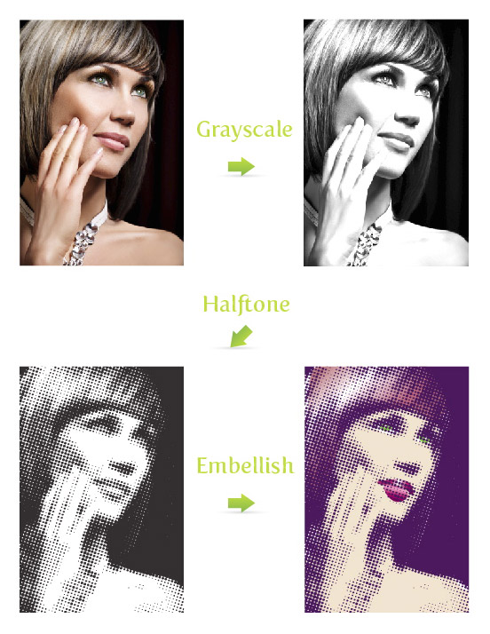
First, place a photo on the document by going File > Place and choose your photo. Once the photo is on the document, embedded it by pressing the Embed button on the Control Panel. Next, go Edit > Edit Colors > Convert to Grayscale. Now you can apply the same settings for the halftone pattern effect and vector tracing as before. Again, you can always go back and change the Max Radius if the dots are too small or too big. Now it is really easy to spice up the halftone pattern with color!
Halftone Swatches
If you want some more halftone options, check out the halftone swatches available in Illustrator. In my opinion these are not as versatile as the previous techniques, but they are worth exploring. To open these swatches, click on the pop-up menu in the Swatch Panel. Next, go Open Swatch Library > Patterns > Basic Graphics > Basic Graphics_Dots. The last five swatches in the set are the halftone swatches.

Experiment
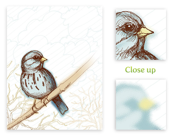
Don’t stop there! Try playing around with the halftone pattern settings or use the halftone pattern effect on color photos and other vector objects. Below is an example of how I integrated these techniques into one of my illustrations.
Update
There are many of you wondering if you can create these halftone effects with perfect circles in the halftone pattern. Unfortunately, with the techniques above, the circles in the patterns will never be perfect. However, there is an awesome Illustrator plug-in that can help in creating perfect halftone patterns called Phantasm CS. You might have already heard of this plug-in and if you have, you know about it’s unparalleled color adjustment tools. Now, Phantasm CS has added an amazing halftone tool! Phantasm CS now makes it super easy to create a perfect halftone effect. Moreover, you have total control over the halftone pattern. I advise any Illustrator user to buy the plug-in just for the color adjustment tools, but with the added benefit of the halftone tools, you would be crazy not to get this plug-in. I also suggest checking out the Phantasm CS Halftone tool demonstration video and learn about how powerful this tool is!





Hello! I’m at work surfing around your blog from my new apple iphone!
Just wanted to say I love reading your blog and look forward to
all your posts! Keep up the superb work!
Great weblog here! Also your website lots up very fast! What web host are you the usage of? Can I get your associate hyperlink to your host? I want my web site loaded up as quickly as yours lol
I really like looking through an article that will make people think.
Also, thank you for permitting me to comment!
I really wanted to send a quick word to be able to say thanks to you for some of the remarkable facts you are placing here. My extended internet investigation has at the end of the day been recognized with high-quality information to exchange with my family. I ‘d state that that we site visitors actually are definitely lucky to exist in a great community with many lovely professionals with helpful opinions. I feel really happy to have encountered the web page and look forward to many more fun moments reading here. Thank you once more for everything.
Thank you!! This helps setting up halftones for sill screening!
Nice tutorial! By the way, there’s also a new tool called HalftonePro which can create vector halftone with any shape and is much easier to use than Phantasm.
Great! Thanks!! 🙂
Thanks for the tutorial!!! So useful! :)))
As you mentioned the built-in Illustrator swatches are not exactly mind-blowing. These are similar, but much more organic looking: http://www.halftone.us/downloads/halftone-illustrator-pattern-fill-swatches/
Thanks for great tutorial! I hate doing halftones in Illustrator so I was looking for useful tutorial. You did explain the process of creating vector halftones very well. Thanks again! vectorize images
TQ for great tutorial
Muy claro, me ayudo mucho !!
How did you add color after you changed the picture to half tone
It’s in reality a great and useful piece of information. I am glad that you shared this helpful information with us. Please stay us up to date like this. Thanks for sharing.
Hello, i feel that i noticed you visited my website thus i came to return the choose?.I am attempting to find issues to improve my site!I suppose its adequate to make use of some of your ideas!!
Great tut!
This post is in Italian… http://goo.gl/qPxBI …but it worths a look if you want to find some other ways for making vector halftones.
Great explanation!
Grande explicação!
Thanks!
Obrigada!
Hey, I tried this tutorial several times but I don’t know why when I change the setting in tracing options I can’t change preset to custom. It’s not selectable. I can only select default and stuff.
Thank you EVER SO MUCH for that tutorial! =D
I’ve been looking for a technique to simulate a bit of spray paint fading from black to the base color and using your tutorial with the pointilize instead of halftone option did the trick!
However, I never would have gotten that far without your tutorial as a basis.
Thanks again!
Hello guys, can u help me? why my color halftones always error like this…
http://img507.imageshack.us/img507/7262/screenshot20120817at110.png
or
http://imageshack.us/photo/my-images/507/screenshot20120817at110.png/
I’m use adobe illustrator cs 3 in mac…. thank you so much…
So *that’s* how you do it! Thanks!
Great tutorial thanks. You can also set the threshold to “1” to round the edges more when tracing.
I did Pixelate->color halftone and my dots come out colored and not black and white. Is there a missing step here? Please let me know! Thanks! I’m using illustrator CS4
Thanks a lot. I am happy to find this web.
If you’re on a Mac and you want to make custom vector halftones you should check out Vectoraster: http://www.lostminds.com/content/show_product.php?id=vectoraster4
Wow, this really help a lot.. Thanks!
Or could you do this with the Phantasm CS maybe?
Yeah, and it’s a lot easier.
I downloaded the trial version but it doesn’t seem to compare to the film I’ve outputted in the past… the dot size and frequency doesn’t seem to be true. Are there any tips you could suggest?
is it possible to print the design out WITH the halftone pattern without the use of a RIP for your printer? I am a screen printer and have had issue after issue with RIP programs and this would just be perfect without having to purchase another $350 RIP program.
thanks
MAESTRO!
Really usefull!
thanks!
Great work man
Much thank yous
Liberate
I look for too long, I found it here.
thank you
thanx you….
Thank you this great sharing.
I was just finding out this effect thanks for sharing
Useful – thanks!
Cool!
_______
Creation of logomarca, logotipo, logo and brand design | criar logotipo
thanks for tutorial
Wow, thanks for the great tutorial. I’m trying to get creative with screen printed t-shirt designs, and this will really help.
PS – love what you did with your bird illustration!
you’re a genuis!!! I’ve expended a lot of time trying with dotted blends to simulate a halftone pattern but this is awesome!!
Excellent tut. No “for dummies” humor, or fluff. Just a straightforward solution. You have a new follower. 🙂
great, thanks for the tips.. illustrator is harder to pick up, but im really trying to master it for screenprinting!!
I needed to recreate a design to put on a t-shirt. thanx a million!!
Best description for this technique ever. Thanks!
Great post, I like it. I hardly ever use halftones but I’m going to try.
The Update is awesome, Phantasm rocks! Thanks for introducing me to it!
thanks
its very useful
hi, Great tuto, thanks for it!
was wondering maybe you know how to make the same effect with
type.(instead of dots)
???
im tring to figure this out
long time,,,
please let me know!
thanks.
It is actually really easy to do with the Phantasm CS plugin. With the plugin, it gives you the option to use an ellipse, square, lines, symbol, or type for the halftone. I would suggest taking a look at it!
As for creating it without the plugin, I’m not sure how to do it without manually placing each letter.
thanks!!!
Thank you for posting that tip – I recently got into t-shirt designing and this helps when it comes to my penchant for wanting to shade things but have color restrictions…lol.
This is an excellent tutorial! However, I am new to illustrator and I’m trying to figure out why my color halftones are never the same color as the original colors. They always turn into a multi-colored mixture. Please help! Thanks.
Hi,
Great tutorial!
Is there a way you could explain to me how you did the embellished effect with muted colors on “halftones from photo” description.
please let me know,
thanks!
Is it possible to create a halftone simply with lowering the transparency in a vector? I am trying to create a ‘faded’ look for a t shirt. Did this once before, not sure how. Please direct me.
An excellent article – I’ve seen this finish in numerous graphic novels where an obvious photo has been shaded in this way for black/white printing. Very good article and will use it myself considerably. Now to merge outlining poster edge/colour dodge with this technique for the ultimate toon effect!
thanks…. 🙂
Great tuto, thanks for it 🙂
And i liked your website, +Fav 🙂
wow Man that a def tutor ! thanks:(|)
My good sir, my head is much to small to contain this lesson. Some bleeding may occur.
please write details
Very good plug-in, thanks for sharing
My problem with this is that the expanded half tone dots are never perfectly round! is it just me….?
I have the same problem. The dots aren’t round.
Hi, nice tutorial! Why is it that my halftone always has RGB and CMYK in it? See example:
http://dev.webavant.com/halftone.jpg
I also am curious how this person achieved the warping of the halftone:
http://s3.amazonaws.com/wootdesigncontestentries/tgentry/She_Breathes_Fire-sz2dmg-s.jpg
same here!
Thanks I’m very new to illustrator this is one of the first things I wanted to learn and this was straight forward and accurate. Thanks again.
It`s very useful the halftone techinque, thanks for this post.
I’ve been into halftone patterns for about 6 months now, this tutorial is a great help – thank you!
graciasss!!! me ayudo muchisisisismo!!! ( >_< ) love !!!
the power of design is in your blood! great
Hey Ryan,
Thanks for the great post! I’ve been trying to learn how to do this forever! rock on
I’m having the same problem as Jonah Block. I love the tip. I’m just wondering if there’s a way to make the circles all round. Without going through the whole Halftone.
I didn’t understand this? If you don’t have much expirience with ‘Illustrator’ it’s very hard to know what all the words mean, or where to find them.
wow,its great tips for me, thanx……………………………………
when I try your method I end up with imperfect circles like this http://img407.imageshack.us/img407/5585/sloppyhalfotnecopyoy2.gif resulting in a sloppy halftone, are there anyways around this besides tracing each individual circle? I’d rather not be dependant on stock art for halftones
Nevermind my last question, I figured it out. I had to select the layer then go to fill under the appearance window and then change the color there. What I was trying to do was use the fill box in the tool menu which for some reason didn’t work. Anyway, I got it.
I follow the tutorial for halftones from gradients precisely as written and when I go to change the color of the halftone to anything but black I get a gray. If anyone can help me figure out what I’m doing wrong, I would greatly appreciate it. Thanks.
Wow!!! I am so thankful! I was going crazy trying to do this by myself! And after reading this tip, it was so easy!… thanks a lot for this precious information.
Gracias!
Regards from El Salvador
P.S. And the best part is that i was able to copy and paste in freehand, since it was a vector composition.
Todd,
No, I am exclusive to iStock. I went exclusive early on before many of the other stock photo and vector sites came around, but I have been having a good experience with iStock. Have you? Where else do you contribute?
Awesome tutorial! By the way, do you sell your stock illustrations on any site other than iStock? I’m a full timer in the microstock industry myself. I dabble in vectors, photos, a little of everything. http://www.istockphoto.com/thesupe87
GREAT tip! looks well good when done. thanks Also i agree i like the site looks very fresh and clean!
cheers
Excelente, uno de los mejores tips que he visto.
Erick Ragas
Awesome…thanks, I also have been searching for this technique. Your’s is the best, esp… for vector art which is what I wanted to create. Thanks again for sharing.
I’ve been hunting down tutorials on halftone effects in illustrator and I have to admit this is the simplest I’ve found so far. I want to experiment with these techniques for t-shirt designs, I am still a little lost when it comes to spot color separation, but this will help me get a lot further where I need to be!
John,
• First a drew the element I wanted, and kept the color black (bird body shape)
• Then I blurred it in Illustrator (Gaussian Blur in the Effects)
• Then I drew a rectangle that encompassed the whole blur, fill with white, send behind the blur, and group the blur and white rectangle.
• Next, I follow the Halftone tut for creating the halftone.
• Expand and change color!
Let me know if that helps!
thanks. great stuff. can you expound on how you did the coloring on the bird in the “experiment” section? Did you do the color in photoshop or Illustrator? I love how it blends together with the color halftone.
this is gold!!!! i’ve been trying to figure this out for years.
thank you!!!!!!!!!!!!!!
The main difference Fireworks and something like illustrator, is that fireworks is specially designed to deal with web graphics, it has many of the tools needed and the workflow fits web graphics well. For example, in illustrator you have layers, you can make any layers you want and assign items to it. In Fireworks, theres no layers, everything you do is a separate object automatically, and can be organized in folders. Sorta different than layers. Fireworks has native tools for vector and raster drawing. The same can be achieved with the combo of Photoshop and Illustrator, but those 2 applications together can do SO MUCH MORE tnan just web graphics. Granted Fireworks canm be used for more than web graphics too, i use them all interchangeably depending on the project.
Great Finds Harley!
This is a fantastic tutorial, many thanks for laying it out so well.
I saw a tutorial by a guy who does something very similar to this, then actually traces it, with help from the BLEND tool, to have a perfect vector halftone (made up of perfect circles). It’s only realistic for straight, square halftones…not fancy photos or anything:
http://illustrationinfo.com/?p=46
I came across another tutorial that shows how to make a perfect circular vector halftone, without any raster stuff ever entering the equation:
http://www.vectorials.com/tutorials/Circular-Vector-Halftone-Pattern-81869.html
Both of these tutorials are a lot of extra work compared to the tutorial here on this page, and are only worth it if you REALLY need to have your halftone dots made up out of perfect vector circles. Good for a logo or something where the dots might be very clear and visible.
Hope this helps somebody.
Rock on, vector warriors.
Very nice! I knew there was an easy way, but I couldn’t figure it out. This REALLY helped!
great tuto ;]
V. GD!! THX!
GREAT! thx a lot for this tutorial!
This is awesome, thanks for the heads up!
Thank you! Halftone-tastic!!!
wooow…it’s great.
i like it!
hey! i’ve been using your tricks.. they’re pretty good.. thaks for sharing.. but i couldn’t use this one with the photo .. i don’t have the option to embed :S
Good, I’m glad that worked.
Thanks for the reply. Unfortunately, I got the same result with 100% black. What did work was setting all of the screen angle channels to zero.
With the gradient selected, select the black swatch in the Gradient Panel. Now look at the Color Panel to see the mixture. You only want a 100% Black and 0% for C,Y,M. Now try the effect.
Let me know if that works!
I tried this tutorial in an effort to convert a gradient to halftone for screen printing. The result I got was a multi-colored halftone effect. I’m sure this had to do with the fact that the original gradient was from black to white in CMYK mode. How do I create a gradient with the correct black and white to make this work?
This is a great little trick. Thanks. very useful and simple
Wow, nice tips here 🙂 And also nice site we have here 🙂
very nice!
thats it, bro
genius tutorial and nice blog you got here mate.
Great tip, thanks
Thanks Debra! I’m afraid that Live Trace isn’t available until CS2. Tracing images in flash is another option. That is what I used to use before the Live Trace in Illustrator.
I love your tutorials- very helpful and enlightening! However, I’m curious to know if CS1 has, and if so where it is, the live trace option. I can;t seem to find it anywhere.
I only gone done some ART with this awesome tutorial! ^_^
This is great, The method I used before wasn’t as clean. Didn’t know we could do this without photoshop, thanks!
Excellent tutorial. Thanks!
Thx a lot.
(very good illustration)
great…thanks for sharing
This looks good. I have a method for creating half-tones, I originally posted this on an Illustrator Techniques forum but many would not have seen it.
If I may I would like to share it here;
1. Create your shape, fill with White, no stroke.
2. Object>Transform>Scale(50%)>Copy.
3. Fill smaller shape with Black, no stroke.
4. Select both your shapes.
5. Object>Blend>Make (Smooth Colour)
6. Effect>Pixelate>Colour Halftone… (Max Radius: 8; Angles: 90)
Try using different colors or irregular shapes.
This worked perfectly for me! Thank you so much!!
You can bring your gradients, gradient blends, meshes and photos into Photoshop and apply the halftone effects there. Then, bring it back into Illustrator and trace. See if that works. That is the nice thing about CS3, you can do it all in Illustrator.
An easy way to make them all perfect circles (or squares if needed) is to select all of the dots via the Appearance Panel (be sure to double click on “Contents” so they are all selected individually instead of as a group). Then go to Effects>Convert to Shape>Ellipse and adjust your settings in there to the desired effect. Expand Appearance and voila!!!
Amazing tip, thanks!!!
Hey Shawn,
Thanks for this Tips to have perfect circles. 🙂 and that is very much important to retain the shape in the end right.
very nice tip about changing to squares i was looking for it, thanks
Awesome post. We are getting CS3 finally at work shortly, so I will be putting this to good use.
Can you achieve anything similar to this with just CS?
I have to say, really never used it that much. I’m not sure why I didn’t. What is the main difference between Fireworks and other programs like Illustrator and Photoshop?
Great little blog you have going here glad i found and book marked. Just a quick question does anyone still use Fireworks i have the newest version and find it so hard to leave it to learn Illustrator
man, fireworks, is not for illustrator work, is for create webpages… is an awesome software I use all the time, but illustrator is for other purpose don’t get confuse…
i LOVE this effect. ive never really played with halftones, but now im going to. thanks. im really liking this blog.
Well…For screen printing A POST SCRIPT PRINTER MAKES YOUR HALFTONES FROM GRADIENTS already. you set the tone values in your print set up