

For a while, it seemed liked every client wanted grungy graphics. This might sound familiar, “I like it, but can we grunge it up more”. Don’t get me wrong, having some grunge can create a great deal of depth to a design or illustration, but there can be to much of a good thing. This is the technique I use because it is quick and consistent, making it easy to scum up any design or illustration.
Notes
This tutorial was created with Illustrator CS3. You should be alright if you have Illustrator CS2.
I suggest having the Raster Effects at 300 dpi. This will generate the best quality in the effect. You can change this by going Effect > Document Raster Effects Settings and chose 300 dpi.
Adding Grunge
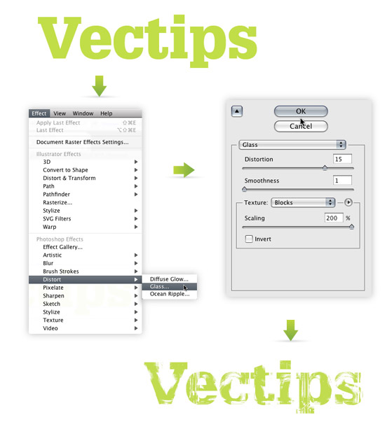
With your text selected, go Effect > Distort > Glass. In the options, use the following settings.
- Distortion: 15
- Smoothness: 1
- Texture: Blocks
- Scaling: 200%
That’s it! You can still edit the text without loosing the effect. You can change the font, color, kerning, or whatever! Moreover, you can edit the Effect by selecting Glass in the Appearance panel.
Tracing Image
If you want to incorporate the text with other elements, it is a good idea to trace the image as a vector. Currently, if you place the text over an element that isn’t white, you will see white in the text instead negative space.
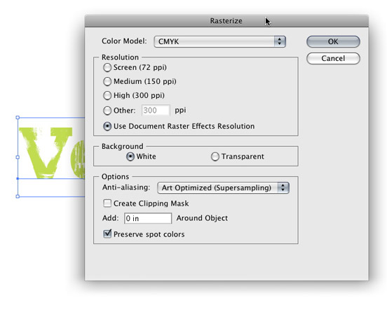
First you will have to rasterize the image. Right now, the text is essentially vector art masking out a raster image. Both need to be rasterized before converting to vector. With the grunge text selected, go Object > Rasterize. Keep all the options the same, except change the Resolution to Use Document Raster Effects Resolution.
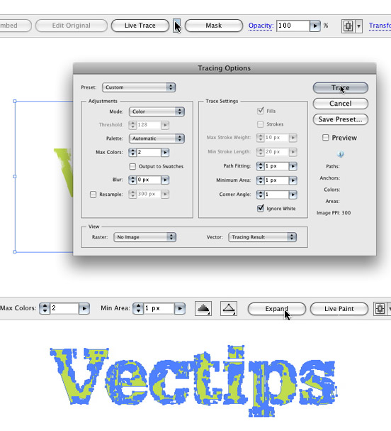
With the new image selected, the Control Panel defaults to the Live Trace options. Click the arrow beside the Live Trace Button and select Tracing Options. Or you can go Object > Live Trace > Tracing Options. You don’t have to change all the options, just the ones below.
- Mode: Color (if you text is color)
- Max Colors: 2 (if you text is color)
- Path Fitting: 1px
- Minimum Area: 1px
- Corner Angle: 1
- Ignore White: Check this box
It is not a bad idea to save a preset in the Tracing Options. It makes it easy to recall these setting.
Press the Expand button on your tool bar, and now you have vector art!
Experiment
Try this technique on objects other that type to get more grunge effects. You can even create your own texture and load it in the Glass effect where you previously chosen Blocks, pretty cool!


Appreciate your any other amazing article. The spot else could any one obtain that type of info in this the best solution regarding composing? I own a demonstration in a month’s time, and I am around the find such information source.
Woah this blog is wonderful i love studying your articles. Stay up the great paintings! You realize, many individuals are searching around for this information, you could help them greatly.
I’m extremely impressed with your writing skills as well as with the layout on your blog. Is this a paid theme or did you customize it yourself? Anyway keep up the excellent quality writing, it is rare to see a nice blog like this one these days.
Thanks for the positive feedback! The layout is indeed customized. We look forward to providing you with continued Vector tutorials.
awesome n cool, n nice tips, thx 🙂
this is really cool stuff..thank you for sharing such a useful post
Thanks a lot for this great technique…
In the end, what background did you use to fit the word on?
you’re my illustrator hero… keep posting bro..
nice tutorial there however, let say we wanna import the file to illustrator, how should we save the file as esp for shirt printing process? Pantone?
Wow ! Nice effect .I’m loving it .
cool thx
is simple and looks cool.
nice work 🙂
hugs
Veryy good
greatt post…very interesting
kisses
Question,
How’d you get the final result? Did you brush over it and then do a compound path or something? I’m new to this, but would love to figure out how to be a better illustrator.
Thanks!
I used the same grunge technique and applied to a couple rectangle objects. Then I played around with the Blending Modes (Multiply, Overlay, Etc) from the Transparency panel.
Thanks for the tutorial, it’s great.
great tutorial~!!…but how do you get the background effect like grungy…you did show how to add grungy effect on the text but what about the background.thanks~~^^
great idea………:)
Thank you for Idea
wow, really great. I often use grungy text by using PS3. New technique. thanks
it is too nice an informative site and intrusting
it is toonice an informative site and intrusting
You are my new Illustrator hero 😀
Yes Rype, please….the experiment part.
Righttt, same.
sorry, wrong email 😛
Wow… I duno Illustrator also can make grunge 😛 Thanks dude 🙂
Sure. I’m in a similar situation, so I guess suggestions are welcome;)
Thanks Simon! I probably will add something similar. The blog is relatively new so I am still ironing out the kinks. Thanks Again!
Hey
I’ve been looking for something similar for a while, now I stumbled upon it. Here, why don’t you add something like popular posts to the sidebar, makes it a lot easier to scan.
p.s. and stumbled
Thanks Jim 🙂
Jim,
Nice! Thanks for finding that!
CS2 Mystery Solved!
After poking around, I realized that some of the effects ONLY work when the document is in RGB format. If the document is in CMYK, some of the filters, etc. will not function. This seems to be true of Photoshop as well (as I tried to import everything in there and had the same results). I guess this is one of the improvements of CS3 over CS2.
So, if you are using CS2, in order to do this tutorial, make sure that the document is set to RGB first!
Rasterizing didn’t work for me…
Alicia,
I am still looking but, haven’t had much luck. I don’t have a copy of Illustrator CS2. Did rasterzing the text first not work?
I’m having the same problem as Chrystal, It’s not working on CS2.
Have you find anything that could help us.
I’m not sure Chrystal. Maybe if you rasterize the text before you apply the Glass Effect, it might work. Let me know.
Chrystal- I had the same problem but I realised the file I created was in cmyk not rgb. Created new file rgb mode and bingo the effects>Distort>Glass can now be selected.
I couldn’t get this tutorial to work :(. I’m using Illustrator CS2 on Windows, but when I select the text and go to Effects>Distort, Glass (and everything else in that menu) is grayed out and can’t be selected. Any tips on why that is?
Thanks! 😀
Good tutorial. Its clear and easy to follow. Your site has a clean design. I write a lot of Illustrator tutorials too. Thx.
nice tutorial;
great tutorial, thanks
Hey this looks great, one suggestion is, instead of rasterizing then tracing, just select the text after you apply the filter, and click on Expand Apperance. This should give you the same results as rasterizing then tracing.
Enjoyed it! Thanks
useful! Update more!
Great site! Great tutorial! Great!
Great set of tutorials. You’ve got something going on here. Keep it up.
Very nice, thx
Muito Bom.!
Cool it is! Just found out about your blog from CSS Mania and I’m subscribing. Keep the good work buddy!
Ah and cool logo, I felt like resizing it hehe 🙂
nice tutorial..
Is there a way too to do it in Photoshop? Including a short explanation of the experiment part of this tutorial. Really like the effect, please contact me in my mail about this. Thanks!
It’s Glyhpa
VERY cool! Btw, what font is that you’re using?
Great blog, great tutorial. 😉 Thanks a lot!