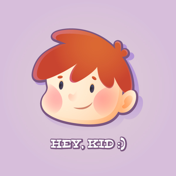
 In this tutorial we’ll do some freehand drawing to create a cute child icon. We’ll be using a lot of gradients to make the icon look interesting and vivid. You can use a drawing tablet if you want, but even with a mouse you’ll be totally fine working with smoothing functions of Adobe Illustrator. Let’s get started!
Tutorial Details
- Program: Adobe Illustrator CS6 – CC
- Difficulty: Intermediate
- Topics Covered: Pencil Tool, Stroke Panel, Shape Builder Tool, Gradient Tool, Pathfinder panel, Transparency panel
- Estimated Completion Time: 20 minutes
Final Image: Cute Child Icon
Step 1
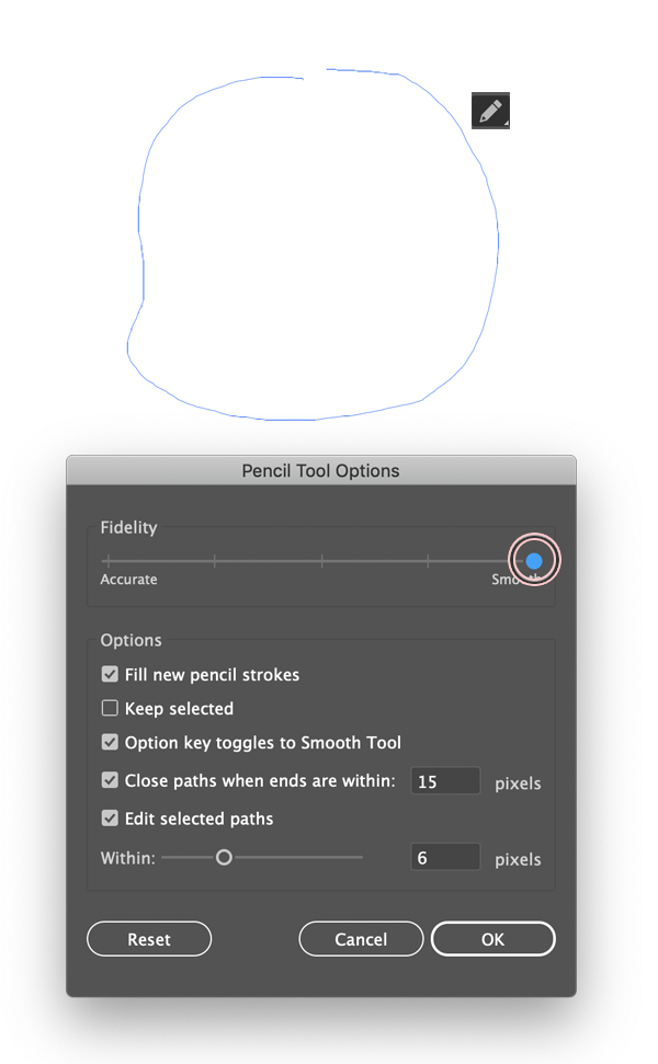
Let’s find the Pencil Tool (N) icon in the Tools panel and double-click it to open up the settings. Set the Fidelity to Smooth and check the Fill new pencil strokes box, as shown in the screenshot below.
Draw a rounded shape with a small bump on the left side for the cheek. This will be the head of the cute child icon. Once your pencil gets close to the starting point of the line, the path will close automatically.
Step 2
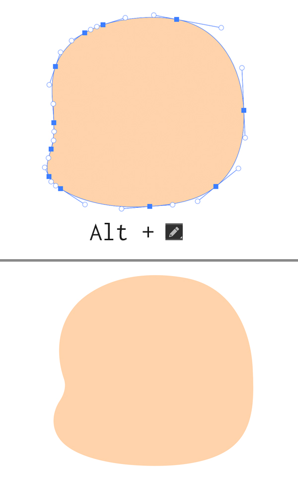
Fill the shape with any skin color that you want and make the shape smoother by using the Pencil Tool (N) while holding down Alt. Stroke along the edges, reducing the number of points.
Step 3
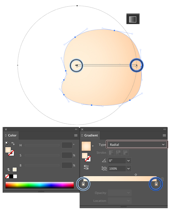
Let’s use a gradient to make the shape more dimensional. Open the Gradient panel (Window > Gradient) and apply skin colors to the gradient slider, making one of the tips slightly lighter. Set the Type of the gradient to Radial.
Take the Gradient Tool (G) and drag it from the left side of the face to the right, as shown below.
Step 4
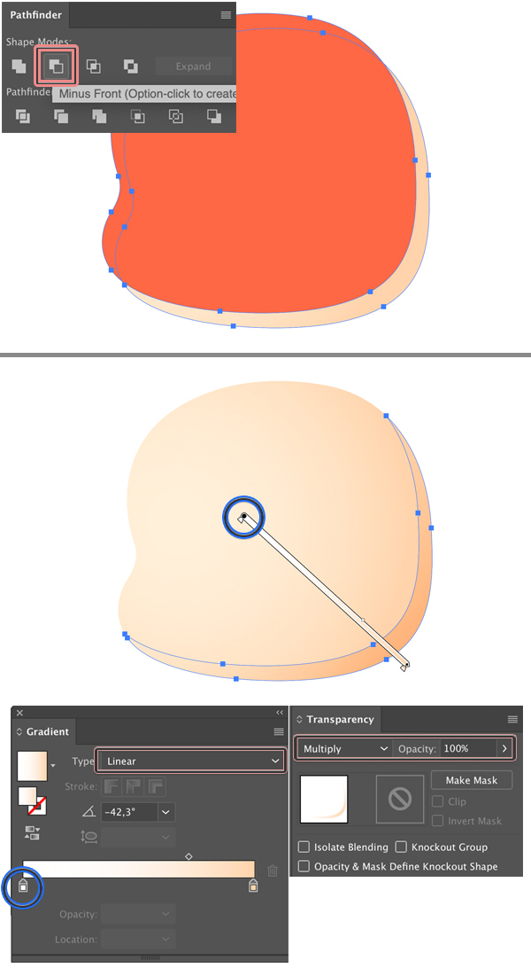
Let’s add a subtle shadow. Copy the shape and Paste in Front twice (Control-C > Control-F > Control-F).
Select the top shape and move it up and to the left a bit (I’ve filled it with red color to make it more visible in the image below).
Select the shape that you moved and the one beneath it and apply the Minus Front function in the Pathfinder panel.
Now let’s apply a gradient from white to beige to the new shape. Set the Blending Mode to Multiply in the Transparency panel (Window > Transparency). White color becomes transparent when using the Multiply mode, creating a nice smooth transition between the shapes.
Step 5
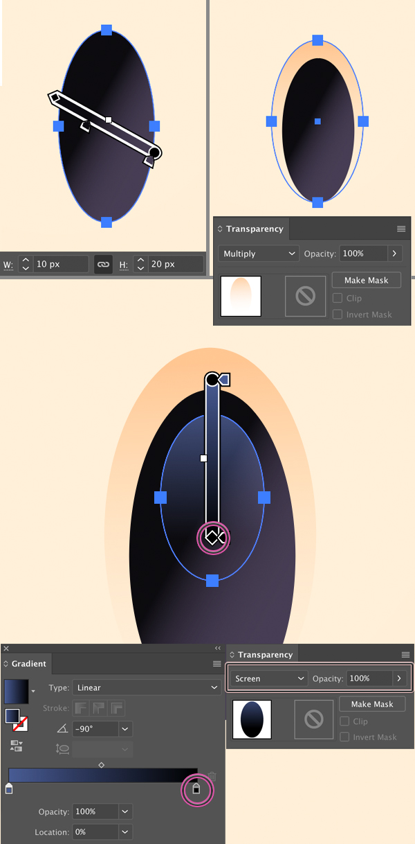
Now we’ll create an eye. Take the Ellipse Tool (L) and make a 10 x 20 px shape (the size actually depends on the head shape that you’ve create earlier, so you can resize the eye accordingly to make it fit).
Apply a dark linear gradient to give it more depth and Copy-Paste the shape in Back (Control-C > Control-B). Make the bottom shape slightly larger and apply a gradient in the Multiply mode, creating a shadow, the same way as we did in the previous step.
Finally, place a smaller circle on top of the eye, creating a highlight. Apply a gradient from blue to black in the Screen mode. When using this mode, the black color becomes transparent.
Step 6
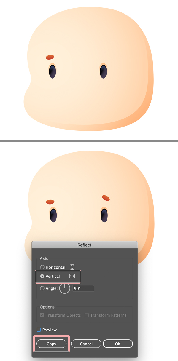
Create a small oval for the eyebrow and use the Reflect Tool (O) to flip it to the opposite side. You can double-click the icon of the tool to open its settings, set the Axis to Vertical and click Copy.
Don’t make the brows perfectly symmetrical, keep them slightly different to create an interesting facial expression.
Step 7
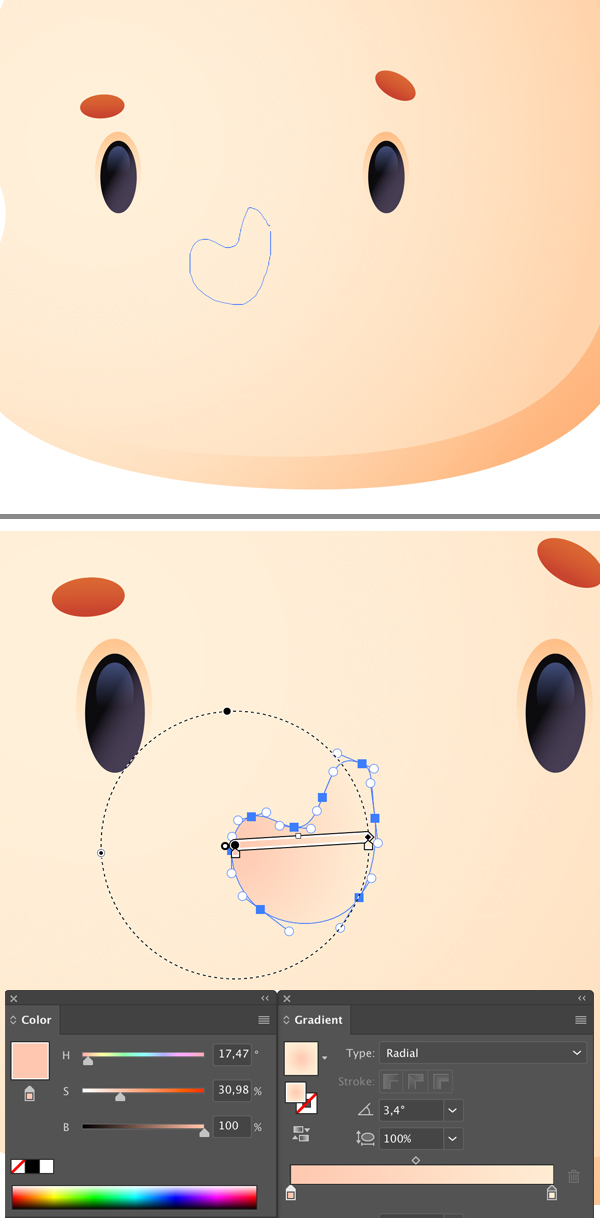
Switch to the Pencil Tool (N) and draw an upside-down comma shape for the nose. Fill it with a Radial Gradient, making the tip of the nose slightly red.
Step 8
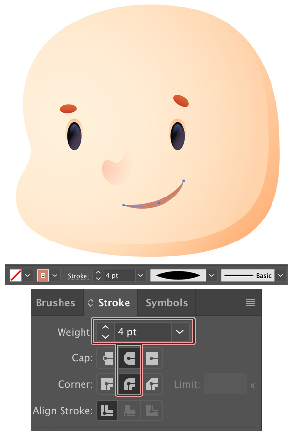
Keep using the Pencil Tool (N) and draw an arched lines for the mouth. Set the Fill color to None and the Stroke to brown. Set the Stroke Weight to 4 pt either in the control panel on top or in the Stroke panel. Set the Variable Width Profile to Width Profile 1, making the tips pointed.
Step 9
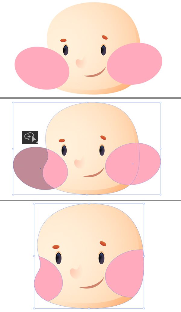
Now let’s add a subtle blush on the cheeks. Place two ovals on top of the cheeks, as shown below.
Select both ovals and the head shape. Take the Shape Builder Tool (Shift-M), hold down Alt and click the parts of the ovals outside the head to delete them.
Step 10
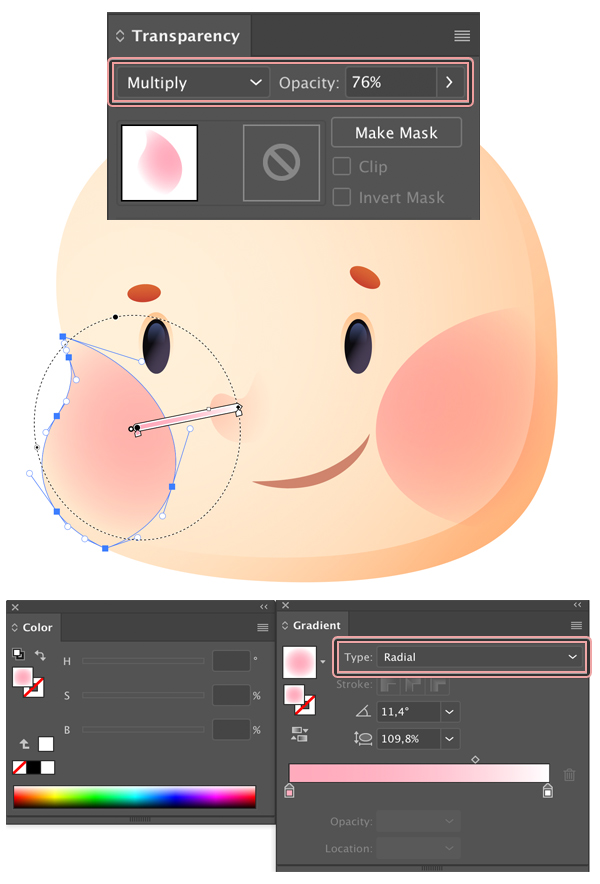
Apply a subtle Radial Gradient from pink to white and set it to Multiply mode.
Step 11
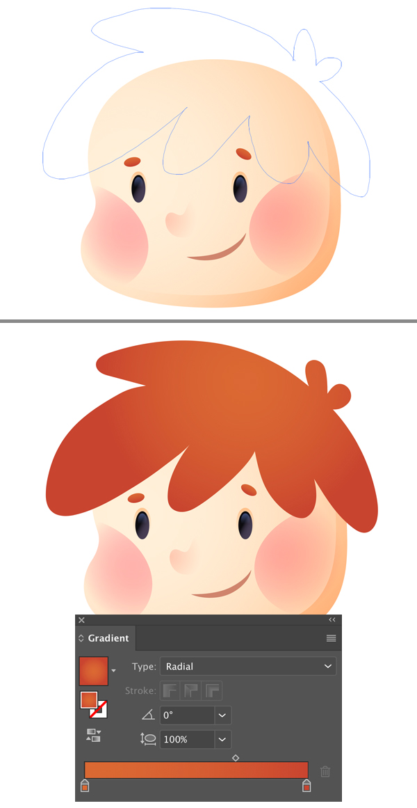
Now let’s draw the hair. Take the Pencil Tool (N) and create a rounded blobby shape. Fill it with a radial gradient of any hair color of your choice, making the top part slightly lighter. This trick is always helpful and adds some volume to the shape.
Step 12
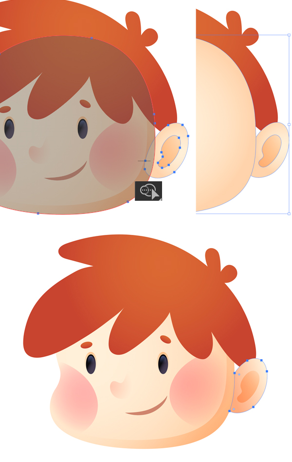
Don’t forget to add an ear! You can use either the Ellipse Tool (L) or draw it by hand using the Pencil Tool (N), making it look more stylized. Fill the inner shape with a darker gradient in Multiply mode, depicting a cavity.
Step 13
Let’s attach the ear to the head so that it doesn’t look like a separate shape. You can duplicate (Control-C >Control-F) the head shape in case if you’re afraid to destroy it somehow.
Select the head shape and the ear shape and take the Shape Builder Tool (Shift-M).
Click and drag a line across the overlapping part of the shapes. When you see both shapes become grey and merged, release the mouse key to apply the action. At this point, the head shape will jump on top. Select it and press Shift-Control-[ to Send to Back.
There we have it! As you can see, now the edge of the ear shape repeats the shape of the edge of the head. You can play with the colors of the gradient to find a perfect match.
Step 14
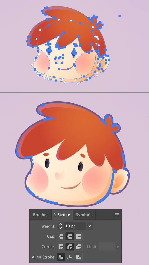
We’re almost there! Let’s add an outline around the head to separate the cute child icon from the background.
First of all, Group (Control-G) all the elements of the head.
Copy the group and Paste in Back (Control-C > Control-B).
Keeping the copy selected, use the Unite function in the Pathfinder panel to merge all the elements of the group into one single shape.
Now we can apply a Stroke to the created silhouette and increase its Width to create a thick outline around the cute child icon.
Hey-hey! Our Cute Child Icon is Finished!
Great work guys! Now you can create a set of different cute child icons, adding diversity to your project and creating some cute children designs.
I hope you’ve enjoyed this tutorial and learned something new.
Have fun!
Author: Yulia Sokolova
2D/3D artist and tutorial instructor, focusing on character creation, icons, lettering design, and illustrations.




I tried this several years ago and had a terrible time with getting all of it to be straight. I eventually made some shorter, some longer and used that layout.
Wonderfully explained, Thanks