

After reading Lensco’s comment “Cool tip, all we need now are gradients on strokes. Pretty please, Adobe?” on the previous tutorial Quick Tutorial: Adding Gradients to Text, I decided to write a quick tutorial about how I create gradient strokes. This super simple technique use the Appearance panel and effects to create editable gradient strokes in Illustrator.
The Problem
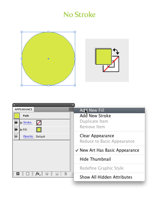
In Illustrator, you can’t apply a gradient to strokes the way you normally apply gradients to other objects. You can create a stroke on an object, go Object > Path > Outline Stroke, and then fill the stroke with a gradient, but you won’t be able to change the stroke weight later on. Moreover, you can’t use the Outline Stroke method on type while keeping the text still editable. With the following technique, you will be able to add gradient strokes to objects and text while keeping them still editable!
Adding Gradient Strokes to Objects
First let’s go over the steps for adding a gradient stroke to objects. I will go over adding gradient strokes to text following these steps because of the added extra steps when working with text.
Step 1
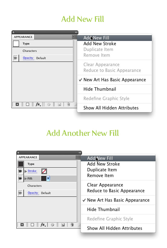
Select your object with the Selection tool, in my case an ellipse, and make sure it has no stroke applied. With the object selected, open the Appearance panel menu (top left menu button) in the Appearance panel and choose New Fill. Now you should see two fills in the Appearance panel.
Step 2
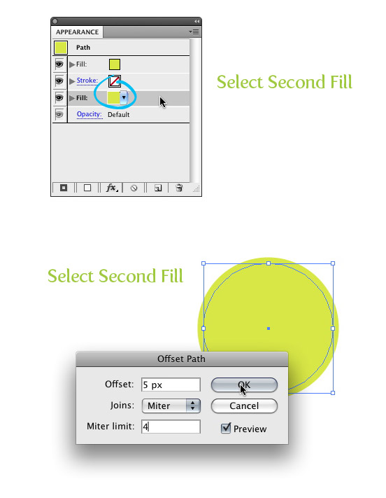
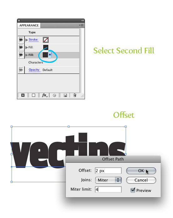
Select the last fill in the Appearance panel and go Effect > Path > Offset Path and enter the size you want your stroke. You can use px, pts, or whatever you normally use for your stroke weight.
Step 3
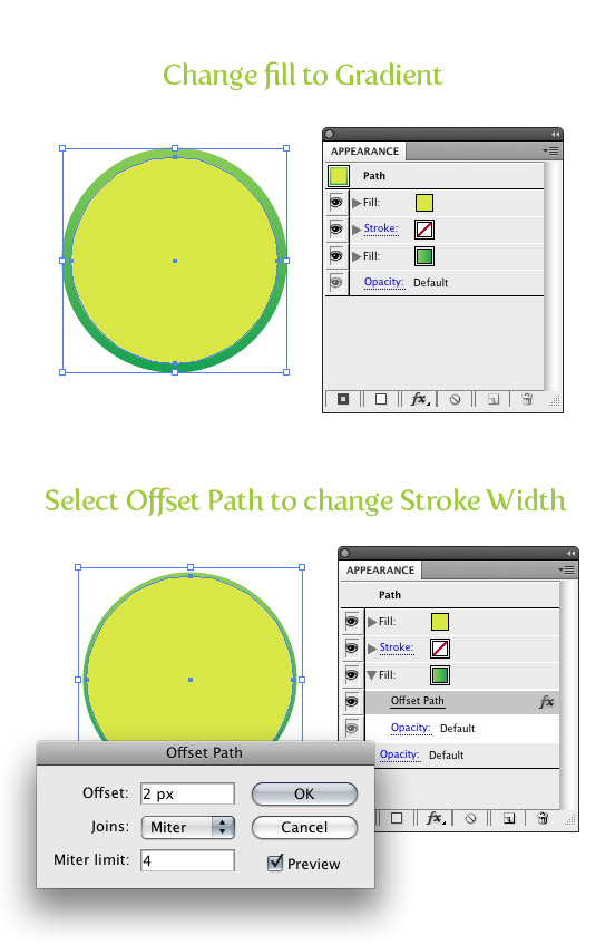
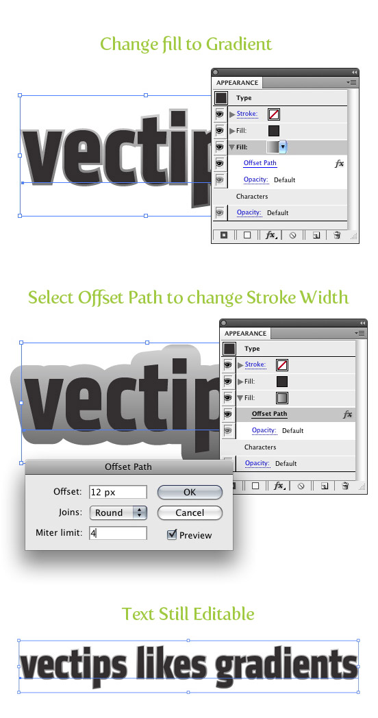
Now you can change the offset fill to a gradient and your done! The great part about using this technique is you can go to your Appearance panel, select the Offset, and change the Offset just like changing the stroke weight!
Adding Gradient Strokes to Text
Creating gradient strokes for text while keeping the text still editable, is similar to the steps above, but with a couple extra steps.
Step 1
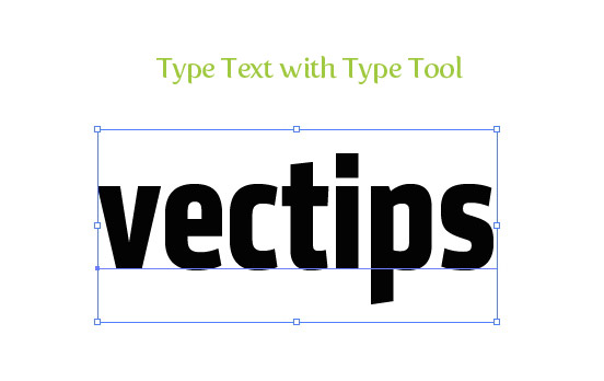
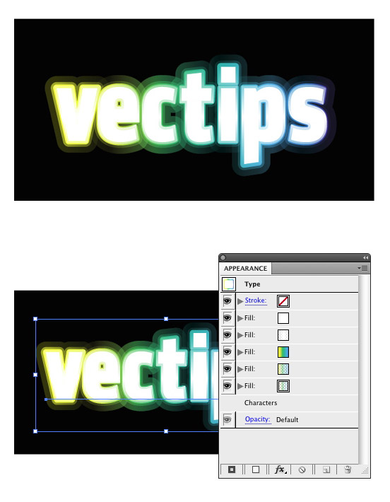
Create some text with the Type tool, with the font of your choosing. I am using my favorite font of the moment, Klavika Bold Condensed, just like in the previous tutorial Quick Tutorial: Adding Gradients to Text.
Step 2
Set the fill and stroke of your text to none. If you don’t this, after you have applied new fills to the text in the following steps, you will sometimes see the original text color peeking out on the text edges.
Step 3
Select the text with the Selection tool, open the Appearance panel menu (top left menu button) in the Appearance panel and choose New Fill. Once you have added a new fill, do it one more time, so you have a total of two fills in the Appearance panel.
Step 4
Select the last fill in the Appearance panel and go Effect > Path > Offset Path and enter the size you want your stroke. You can use px, pts, or whatever you normally use for your stroke weight.
Step 5
Now you can change the offset fill to a gradient and your done! Just like in the previous steps, you can change the stroke width (really not a stroke but an offset) as desired and you can also still edit the text!
Experiment
I hope this quick tutorial makes some of you want to look into the Appearance panel more! It is quickly becoming my favorite panel because of the speed and flexibility it creates when working with Illustrator. I suggest everyone play around with the Appearance panel to see what they come up with! Below is an example type treatment with multiple transparent gradient strokes.


Very basic steps.
Tutorial doesn’t cover how to create the advertised image at all. It simply shows you how to create some fill layers and outline paths.
The image that should be advertised on top of the tutorial is the text with one simple grey offset path.
Great post! Have nice day ! 🙂 vbtie
wow, to the author, this is really amazing. It’s wonderfully done.
Thank you for sharing. Just in time for my project
Your tutorial was incredibly helpful, but how did you get the transparent strokes from the very last picture?
Thanks this was just what I was looking for to recreate a logo effect!
my teacher just showed me this website and geeked out and took over my computer. this site is pretty darn cool though.
Very helpful, thanks…
You explain the steps on how it can be created, but not the steps on how you created YOUR logo, with the transparent gradient.
Thanks!!!! This is handy!! 🙂
Yeah, this is good except when you want a transparent fill with just the stroke as the gradient (like a picture frame. The only way I’ve found to do this so far is the outline stroke technique. Please do let me know if there is a workaround for this!!
Seriously dude! Amazing, thanks
Nice Tutorial. I have a issue when i resize the object. The offset path mentioned(Effect > Path > Offset) is not resizing relativly. I guess we should use (Object > Path > Offset) and Group the new object ;ayer created with the base.
Wow, This one things has been my biggest pet peeve with learning illustrator. This tut was amazing, simple, and easy to understand. Thank you So much!!!
Thanks for your tut. Good job
Wow! I didn’t realise you could do this kind of effect in Illustrator. Will be very useful for my work. Thanks!
superb…
wow!! I love this tutotial, thanks!!
Rely nice tutorial – can you post the .ai file? for http://vectips.com/wp-content/uploads/2009/02/stkgrd_10.jpg
I keep trying to match your fill gradients but fail
Thanks
Excellent tute. I’m about to go try this right now.
Thanks your great helpful tip.
Great tutorial!
One problem I’m having is that I want a black background to bring out the colour. I’ve tried creating a rectangle in he layer behind and also tried creating a fill and converting to shape. What happens then is that all the gradients disappear and I’m left with the white fill of the text.
Any suggestions?
very nice ..thank u a lot!
hay 🙂 Great tut love it..although ive only got cs3/windows and that make this tut really confusing :S do anybody know the same tut but for cs3 instead? that would be really helpful 😀
Thanks man, your tip got me through the day today!
thanks 😀
very nice and cool
hello Rype, could we make transparent gradient on CS3? I do not find the opacity options like it has on CS4, thanks
Hi, nice tut!
Could you tell me the name of the font you used here http://vectips.com/wp-content/uploads/2009/02/stkgrd_05.jpg ? thank you 🙂
It is Klavakia Condensed
thank you again!!
Fantastic thanks for the tip
Greate tutoial, thanks for sharing
I wonder how I could do this in Flash…
Thanks for this one, learned a few new things. Keep up the excellent work.
Is this working in CS3 too? …or only in CS4…? Cause I just can’t do this kind of “glowing” opacity. It becomes “gray” when it has low opacity. What should I do?
this, very thank you..
Your site full professional and very beautiful…
Merci beaucoup for your very helpful tuts and for sharing your knowledge.
Great. I love the way you write your tutorials, they are easy to follow. Keep it up my friend.
Thanks to this, I was able to make this:
http://quakeulf2.deviantart.com/art/Visit-the-colonthree-blog-135674178
Great tutorial! :3
This is beautiful. :’3
Ah, very helpful. Making friends with the Appearance panel right now!
oh yeah. useful useful useful
10x
Thanks for all these great tutorials – I learned a lot about Illustrator from these than from any other tutorials !! I hope you could post more !!
Very lovely effect
Mystery work!
Thank you.
nice tuts.
you can also use this tool to make double stokes
Hello,
I would appreciate even more, if You could share your secrets how you create multiple transparent gradient strokes as shown in your experiment. Tried but didn´t manage. Any chance…?
Thank you.
that helped! finally, i’m kinda new in working with CS4 and there is one more question remaining( i know it’s getting annoying isn’t it?) i also had problems with this when making the tut about your reflections, the question is , i now grouped the dots and want to select the top highlighted shape of the body, but if i want to select that, i select the dots instead of the highlighted shape. Is there an trick to select underlaying objects who are overlapped by other objects?
You can go Select > Next Object Below, that might work.
dear rype,
on the website of tutsplus you gave an tut about text effects, you give an tutorial about making text in an green leave content. You also draw an ladybug in this tutorial, however when i try to intersect the dots with the original ellipse i get the message that cs4 can’t intersect the dots with the original ellipse because they ain’t overlapping paths. How can i fix this?
This caught me off guard when I started using the new CS4. Try holding the Option/Alt key when Intersecting. This will make the Pathfinder not automatically expand when you Intersect. Let me know if that helps.
if I hold down the alt/option key my dots dissapear. but should i copy an paste in front the original ellipse form as in the red ellipse, or does this also include the shiny effect? i tried several different time but it ain’t working, help!
Just copy and paste the original ellipse, make sure all the dots are Grouped together before you Intersect them while holding down the Option / ALT key. Let me know if that works any better
good tutorial !
thanks~
Excellent post!
thanks again!
@ JSand4325
I used Fertigo
http://www.josbuivenga.demon.nl/fertigo.html
Could you tell me the name of the font you used to label the instructions in your screenshots?
i.e. the font used for “Select Second Fill”
Thanks!
alright, I think the problem is that I’m working in CS3, better get CS4, thanks for
the help!
@Bateman
I applied the transparency to the Color Stops in the gradient (the gradient swatches) from the Gradient panel. You will need CS4 for transparencies in gradients.
Below is a link to an image with the Gradient panel open to see what it looks like.
http://vectips.com/wp-content/uploads/2009/03/gradnt_strk.jpg
ok, and than you use the transparency panel for each added fill? if i do that, they change to grey, and yours look like transparent.and you can see the offset path trough the order offset for eact letter. how did you fixed that?
make sure your document colour settings are set to RGB, not CMYK.
@ Bateman
I actually just changed the offest for each individual fill in the Appearance panel. If you look at the Apperance panel in the example, I have a couple of other fills. These other fills I just set a larger offset than the previous one.
Let me know if that helps!
@ Danny
Yeah, I think it is because you are using CS2. In the example, I changed the opacity in the gradients not the opacity of the overall text.
Hi Ryan,
Nice tut,
i am having the same problem as Bars, maybe it’s the version of illustrator that i’m using (CS2)? but i can’t seem to gain control of gradient transparency/ opacity
I wonder how you fixed your effects in your example, it seems like that you have an different ofsett path for every individual letter, how did you do this?
p.s. thanks for the tuturial, helped me a lot =)
@Bars,
Are you changing the opacity on the object or in the Color Stops on the gradient in the gradient panel?
On your example the outer stroke seems colorful and transparent at the same time. My problem is that it becomes (actually seems) gray when it has low opacity. 🙁
Where is the mistake?
Really nice look, thanks
thank you verry much for this tuts
Awesome! This can really help in my work! If I knew a few days ago that this was possible, could have saved much time!
Thank you very much! This is only one more reason to love your work: awesome and very usefull, and I love it!
Congratulations!…
wow thanks very much for this, amazing as always! ^_^
awesome tip once again! Oh how I love the appearance panel
awesome tip once again! Oh how I love the appearance panel
WOOT! It worked. All because I can’t read the instructions properly. Thanks for the patients and the time. Love the site.
@ Chris,
I see where the trouble is. When you apply the Offset instead of going Object > Path > Offset, Go Effect > Path > Offset.
Let me know if that works.
Hey, So I made a quick little screen cast of what I am doing in illustrator. I posted it on YT
here.
Lets hope that link worked.
@ Chris,
You shouldn’t be able to move the object independent of each other when using this technique, I wonder why this could be? Sounds like you are using the Appearance panel, and I am assuming you are applying the New Fill to just one object. The only thing I saw in your description that was different than the lesson is that you need to apply the gradient to the last fill in the Appearance panel.
The place were it might have gotten mixed up, is when you applied the offset effect.
Make sure you have the last fill in the Appearance panel selected when you apply the offset, otherwise the offset effect will create a new shape.
The real power of this techniques is being able to later adjust the offset, like being able to adjust a Stroke weight.
Let me know if that helps at all.
So, for me, following the steps above, created a copy of the shape. I then for the life of me could not figure out why – when I changed the fill to a gradient – I couldn’t see it. For me I ended up with a smaller top shape that had fill stroke fill (like in your example) where the fills where the same colour. I also had a larger (offset) shape below with fill shape fill (like in the example). I then had to select the top fill of the bottom shape then apply the gradient to get effect. I can also move both shapes independently of each other. So how is this any different then copying the shape and applying a gradient? Or am I not understanding something?
Simple and great tutorial. No doubt, I’ll be using this in the future. Thanks!
Really great tutorial
Wow, impressed with your quick solution! Until Adobe adds real gradients to strokes, this will do. Thanks.
Also, I need to upgrade to Illustrator CS4, if only for the new gradients tools and the appearance palette.
I’ve been looking for such a tuorial for quiet a while, so thanks a lot, Ryan.
Keep them coming…
Good tip always its so amazing
Very cool. Different from the way I currently do things, but this seems a bit more intuitive.
Ohh I wish I had thought this up on my own sooner, and saved a lot of time and effort!
Ryan this is AWESOME! I’ve always used Offset Path to create my stroked type, but 1) I didn’t know it could be an effect (I love Effects and the Appearances panel; I use that combo for rounded corners too!) 2) can’t edit a normal offset path like I used to do 🙂
and of course another little bonus is that it can be applied as graphic style.
This is really handy. Thanks for posting it!
”Your done“ is not English. It’s called “You’re done”
Whoops! Thanks for keeping me on my toes. I’m better at Illustrator than grammar.
What’s ‘called’ “You’re done” exactly? The phrase “You’re done”?
“What’s that phrase called? Ah yes, ‘You’re done’, that’s what it’s called.”
You’re an idiot. Next time, make sure you have even the feeblest grasp of English before you criticise others’ use of it.
And yes I know, my post if full of grammatical errors. I have no idea how it all works.
This is really the lest friendly or constructive response to someone who’s just put so much effort into a tutorial for you. Clearly, if you got to “your done” then you have some interest in what this tutorial is showing. It’s cool that you want to help the author to correct a grammar mistake but come on – at least make an effort to say one nice thing before you go all pompously and rudely critical. You’re lucky to have received a nice comment from the author on this (probably because you embarrassed him – well done). I would have told you to take a class on the art of critique.
well said