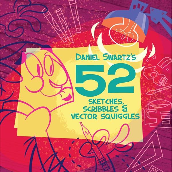
Illustrator Daniel Swartz created 52 illustration every Friday for the past year. He just finished up the last week and has create some great vector illustrations! Moreover, he has collected all his Illustration Fridays pieces into a book. Daniel has been kind enough the provide Vectips with some insights into the project, discount codes for the book, and one book for a lucky Vectips reader.
Interview
Why did you do Illustration Friday for a year?
I’ve always been envious of artists who take on self-initiated projects that require very regular output. I love watching their development and admire their dedication.
I reached a point where I felt that if I didn’t do an extended project like this now…it would never happen. It was scary in a weird way, I’d never done anything like this and was worried I wouldn’t be able to finish. Fortunately there were a lot of people that encouraged me throughout the year, and to be honest the positive peer-pressure of making it by Friday was huge incentive not to embarrass myself!
We’re responsible for our own growth. I am always investing in my craft and I reached a point where I felt it was best to start a project like this to take advantage of some recent growth and cement some new ideas I had been playing with…both conceptually and technically.
I think I’m most excited about the development in my color and value sense. I’m really into violet now, and my images are way easier to read – which I think you can see as the series progresses. Because I was turning around a piece every week it allowed me to quickly explore new directions and refine what I learned seven days before. As you go through the book I think you can see definite trends and movement as I figure out what is essentially my style. I also found a lot of ways to slim down my process but doesn’t reveal any shortcuts being taken.
I highly recommend doing a project like this on your own. If you want, you can participate in Illustration Friday at www.illustrationfriday.com. It’s free to be a part of and fantastic to see hundreds of other interpretations of the same word.
So why a book?
I’m in the midst of finishing my MFA in Illustration through the University of Hartford. It’s a great program, but like all schooling – it’s expensive. This is my third and final degree and I’ve racked up a fair amount of loans getting to this point.
I wanted to create a product that people would enjoy and could also help me pay back one of my loans before I graduate this summer. If I sell 1000 of the books I will meet my goal!
Creating a self-initiated project, like this book, allowed me to keep working at what I love (illustration) while also developing a product that hopefully will compensate my time.
If you were magically be turned into any Illustrator tool, what tool would it be and why?
I would probably be the Pathfinder. I love the idea of using different shapes and combining them or cutting them apart, or just keep their intersections…whatever. So many new shapes I never would have come up with can occur with that tool! I really enjoy finding new ways of combining positive,negative, and transparent shapes and Pathfinder (along with the Knife tool) have become my best friends.
What is your favorite Illustrator tip, trick, or technique?
Use the Recolor Artwork Dialogue. It’s fantastic for quickly experimenting with new color schemes. If you are anything like me, you find some colors that work and kinda stick with it…the Recolor Artwork tool helps me get out of my box.
Win A Copy of 52 Sketches, Scribbles & Vector Squiggles by Daniel Swartz
What you will win
- 1 winner will win a copy of 52 Sketches, Scribbles & Vector Squiggles by Daniel Swartz.
How to Win / Rules
- Leave a comment below telling us which piece from the Daniel Swartz Illustration Friday set you like the most.
- Contest begins December 27, 2010 and ends Thursday December 30, 2010. Winners will be announced December 31, 2010
- 1 winner will be chosen at random.
- Only comment once.
- Please leave a valid email address so we can contact you.
Book Discount Codes
From now until December 31st, get $10.00 off of any order over $29.95. That means you can buy the hardcover for about the price of the softcover!
- USD $ coupon: CHEER
- GBP £ coupon: CHEER1
- EUR € coupon: CHEER2
- CAD $ coupon: CHEER3
- AUD $ coupon: CHEER4



Ripple 🙂 but Savour is also my favorite. Awesome job Dan!!
I love the Savour one!
I liked the Nativity illustration. Great book Dan!
My favorite piece is definitely “Beneath” (#41). It’s such a creepy, morbid piece and yet with the way in which Swartz colors it (not too mention his geometric art style), there’s a lightheartedness to it. Makes me think of The Real Ghostbusters or Danny Phantom.
Week 9 I like the most!
Really, I can pick only one? Guess I’ll go with Week 24: Trail. Thanks for the chance to win a copy of the book!
“Burning.” I would love to have this poster-sized to hang on my wall. I tell everyone that the only reason I go camping is for the marshmallows. 🙂 Aside from the subject matter, the textures and colors used here perfectly convey the slightly crunchy outer shell of a toasted marshmallow. It was tough to choose just one favorite. Also loved “Equipment.” I remember my grandmother teaching me about “putting on the armor of God,” and this would have made the lesson much easier to remember. 🙂 Pick me to receive the free book!!
Fantastically fun work! It’s a draw between the bookend illustrations (#52: Mail and #1: Pioneer)
GO DAN! Been watching them all year! Great to see them all compiled so nicely. Great Job!
z
Week 20: Fearless
The stark contract of the Moby Dick image with just the small touch of red is perfect.
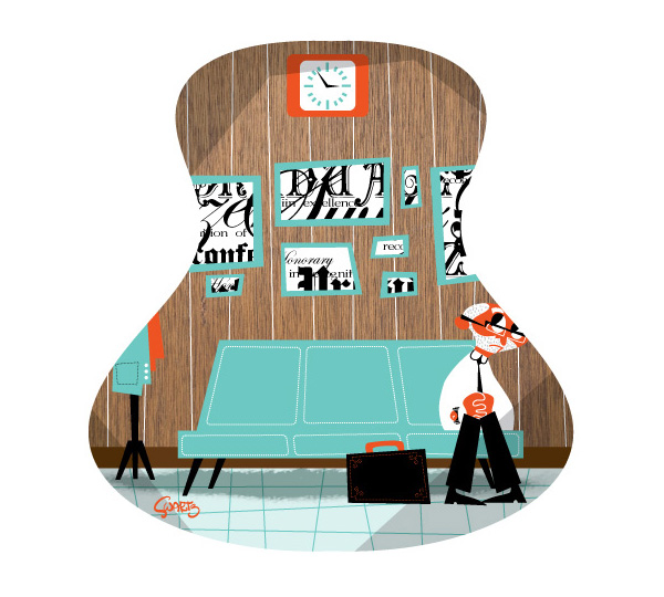
Week 22: Early
There’s nothing I don’t totally love about the piece.
The guitar shaped window forcing the composition.
The “acting” the character in the scene is downing.
Lastly on a technical standpoint the textures (like the rest of his work) make me drool!
Thanks for bringing him to our attention. He’s one of the few artists I’ve seen that art doing the kind of work in vectors that really sets itself part from the tool.
I really like Focused. It reminds me what it takes to accomplish all your goals in life.
Week 20: Moby Dick
Really simple but effective use of color to help emphasize the great design work used to create the Whale. Classic paperback novel of the 60s feel and I would buy it on the spot! Great work.
Week 8: Adrift
They are all SOOOO good!!! What an incredible talent and vision. Thank you so much for sharing. My favorite is Week 21 – Equipment. It is one of my favorite verses and having such a great illustration of it makes it more memorable. Good job!!
Trail. Reminds me of my trail running and the peacefulness.
Week 31 Double – The Jekyl to Hide, the ghastly depiction of Hide as a force vs a physical person. More true to the heart of the story. Now an hour gone pouring over the 52, going back for more.
I need to look at stuff like this to kick my own self in gear… I bought a book called “Drawing On The Right Side Of The Brain” (or something like that, it was the original supposedly better version before they updated it, in case you’re interested) and I got to the point where the start with the exercises and I just shut down because I haven’t drawn in so long. I was like, “Okay, great! I will get back to this as soon as I’m mentally prepared and focused!”
That was 2 weeks ago. Part of the problem for me is lack of ideas. Thank goodness for this Vector Inspiration website…
These illustrations are gorgeous!!! Wow. Okay, I think my
favorite is Week 22: Early (love that retro feel)
I just love the composition of “Week 31: Double”, the color palette its impressive too
I like week #14 Rescue.
Week 22- Early. It’s very easy to relate too.
My favorite is Week 34: Star Gazing. It has a wonderful use of colors and I really enjoy the theme.. Week 20: Fearless is a very very close second, there is nothing more brutal than moby dick. Great collection of work.
Hard to choose from this wonderfully diverse group, but I think week 12…Subterranean is at the top of my list! I love the color scheme and the concept. Now that I read the other responses, I see that I am not alone in this opinion.
Almost impossible to choose a favorite, but I finally decided on “Ahead”! This is like an illustration course in a book.
Without a doubt–#12 “Subterranean” touches my whimsical soul through animals and #47 “Burning” lights my fire for color and simplicity!! You are truly blessed to be able to reach people in a special way with your art! You are able to live AWESOMEness!!! Whaaaahooooooooo!
I LOVE the Jekyll and Hyde poster. The texture perfectly frames the main figure and offsets those ominous eyes. Awesome. Second favorite: the simple and dynamic Moby Dick!
I’m torn between also week 47: Burning (beautiful!) and week 31: Double (mainly because I love the pose and the simplicity of Dr. Jekyl)
I think that week 47, Burning, is the most beautiful – the colors are very well chosen and i like how it fades from yellow to purple.
I love how Daniel incorporates varies colours and simple shapes into a lively story on screen! Every single piece puts a smile on my face 🙂 I love every piece in the book, but if I have to choose one, that will be the week 49: Savour. Simple shapes, bright colours and creative narration, definitely an inspiration to me. Brilliant works!
I like the week 22: Early most. 🙂
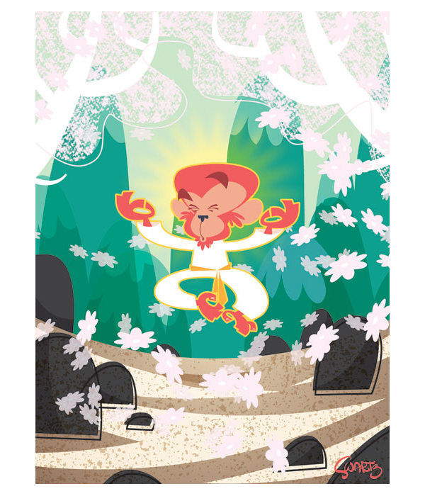
I like focused, It has a nice 3D feel to It, and the contrasting colors make the image pop out. There’s something about a floating monkey that just makes me happy ^^
I like Week 24: Trail
Week 30: Breakfast!
I like the “Artificial” most. Those colors, the background and everything is just great.
This is really hard, but I will have to say #6 Focused!
i like
Week 21: Equipment
good colours.
I like Week 21: Equipment. That’s great!
Week 8: Adrift
so atmospheric!
I like Week 31: Double yeeee:)!
I love the Week 6 “Focused” illustration the most (though it is hard to choose one favorite). What a great concept to do one illustration per week. Congratulations to you, Daniel. Very inspirational work!
‘Afterwards’ is the best, hands down. I also like the ‘Equipment’ – dig the style very much!
There are to many wonderful illustrations to choose from, but I believe “Pioneer” is my favorite.
Can’t…stop…looking…at the marshmallow. Beautiful color and I love the sparks. Congratulations on a fantastic book.
Week 46: Afterwards
Great use of composition and shapes!
Week 47: Burning
I love the energetic colors and attention to detail.
It’s a toss-up between Savour (the sushi one) and Star-gazing (the Pirate-ship). Gah! Making choices is haaaard!
I really liked Week 6: Focused.
Perspective!
I loved Focused.
Week 8: Adrift is just lovely.
I liked the Jekyl & Hyde one. Great use of color
My favorite is Week 47: Burning because of the use of color. The colors are very vibrant and makes the image more interesting than if it were illustrated with a more realistic color palette.
My favorite is probably week 12: Subterranean as well, it is very whimsical, but the use of outlines is very effective at illustrating all of the things the dog had buried in the yard. Also, by showing only the lower portion of the dog’s master, and using body language, we can easily read that he is perturbed at his canine companion’s behavior! Very cute, clever, and effective! Love it!
I really like the Subterranean illustration, so Week number 12.
Great contest, congrats!
My favorite piece within the book is definitely the Jekyl & Hyde composition. It love the colors and the shapes used, and I really enjoyed. Thanks for the great interview and giveaway!
I liked Subterranean. I thought it was funny, I have a dog that loves to dig. I never know what I will find. I loved the color scheme too, the dark brown on the bottom then the light colors on top to make it stand out. Really nice
Week 16: Linked