 Welcome back to another Illustrator based tutorial, in which we’re going to learn how to create a flat lock icon, using nothing more than a couple of basic geometric shapes.
So, assuming you already have the software up and running, let’s jump straight into it!
Tutorial Details: Lock Icon
- Program: Adobe Illustrator CS6 – CC 2019
- Difficulty: Beginner
- Topics Covered: Design Theory, Compositional Construction, Shape Alignment, Grid Positioning
- Estimated Completion Time: 15 Minutes
Final Image: Lock Icon

Step 1
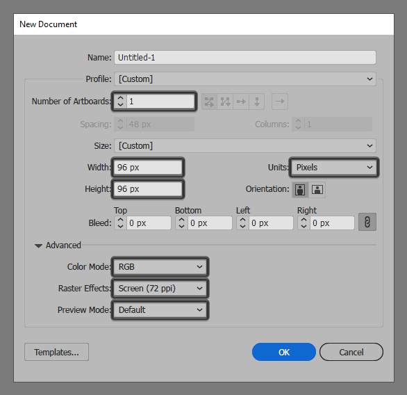
As with every new project, we’re going to kick things off by setting up a New Document, by heading over to File > New (or by using the Control-N keyboard shortcut), which we will then adjust as follows:
- Number of Artboards: 1
- Width: 96 px
- Height: 96 px
- Units: Pixels
And from the Advanced tab:
- Color Mode: RGB
- Raster Effects: Screen (72ppi)
- Preview Mode: Default
Quick tip: most of the indicated settings can be automatically triggered if you set the document’s Profile to Web, the only one that you’ll have to manually adjust being the Artboard’s Size (Width x Height).
Step 2
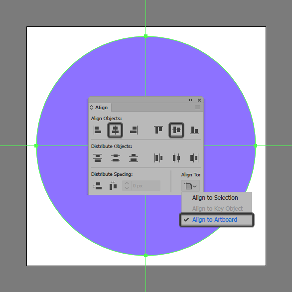
Once we’ve finished setting up our project file, we can start working on the actual icon by creating its background using an 88 x 88 px circle, which we will color using #8E73FF and then position to the center of the underlying Artboard using the Align panel’s Horizontal and Vertical Align Center options.
Step 3
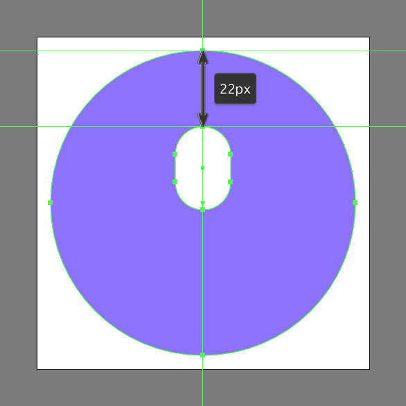
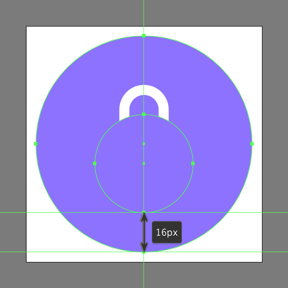
Add the shackle using a 16 x 24 px rounded rectangle with an 8 px Corner Radius, which we will center align to the background, positioning it at a distance of 22 px from its top anchor point.
Step 4
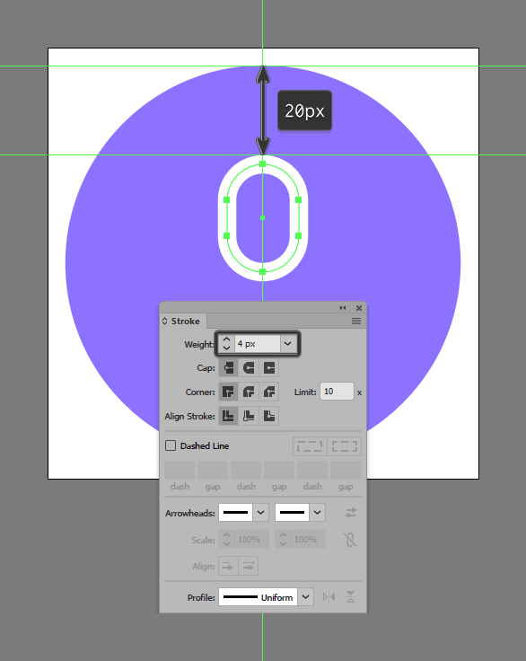
Turn the shape that we’ve just created into an outline by first flipping its Fill with its Stroke using the Shift-X keyboard shortcut, making sure to open up the Stroke panel afterwards and set its Weight to 4 px.
Step 5
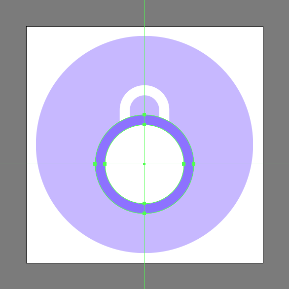
Create a 40 x 40 px circle, which we will color using #8E73FF and then position as seen in the reference image in order to use it as a separation surface.
Step 6
Add the lock’s main body using a smaller 32 x 32 px circle, which we will color using white (#FFFFFF) and then center align to the separation surface.
Step 7
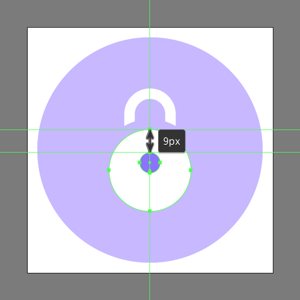
Create the head section of the keyhole using an 8 x 8 px circle, which we will color using #8E73FF and then position at a distance of 9 px from the larger body’s upper anchor point.
Step 8
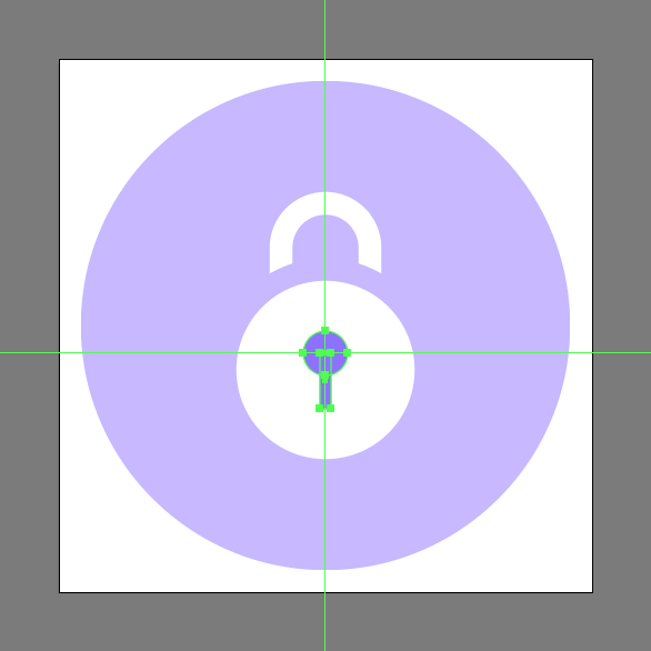
Add the hole’s lower body using a 2 x 10 px rectangle (#8E73FF) which we will position onto the lower half of the previous shape.
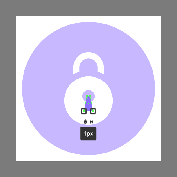
Step 9
Adjust the shape that we’ve just created by individually selecting each of its bottom anchor points using the Direct Selection Tool (A), and then horizontally pushing them to the outside by a distance of 2 px using the directional arrow keys. Once you’re done, make sure you select the resulting shape and the upper circle and group them together using the Control-G keyboard shortcut.
Step 10
Finish off the icon and with it the project itself, by giving the shapes that we’ve just grouped an outline using the Stroke method, by creating a copy (Control-C) of them, which we will paste in front (Control-F) and then adjust by first flipping their Fill with their Stroke (Shift-X) and then setting their Weight to 2 px and their Corner to Round Join. Take your time, and once you’re done make sure you select and group (Control-G) all of the keyhole’s composing shapes doing the same for the entire icon afterwards.
![]()
Great Job!
As always, I hope you had fun working on the project and most importantly managed to learn something new and useful during the process.
That being said, if you have any questions feel free to post them within the comments section and I’ll get back to you as soon as I can!


I truly appreciate this article. Really thank you! Really Great.
thanks, your explanation is amazing without video you show the whole process, how to create a lock icon very easily and your other graphics also quite good.