
In today’s tutorial, we’re going to take a look behind the process of creating a navigation icon, and see how we can take some simple shapes and turn them into a finished usable asset. So, assuming you already have Illustrator up and running let’s jump straight into it!
Tutorial Details: Navigation Icon
- Program: Adobe Illustrator CS6 – CC 2020
- Difficulty: Beginner
- Topics Covered: Design Theory, Compositional Construction, Shape Alignment, Grid Positioning
- Estimated Completion Time: 25 Minutes
Final Image: Navigation Icon

Step 1
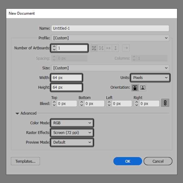
As with every new project, we’re going to kick things off by setting up a New Document, by heading over to File > New (or by using the Control-N keyboard shortcut), which we will then adjust as follows:
- Number of Artboards: 1
- Width: 64 px
- Height: 64 pxUnits: Pixels
And from the Advanced tab:
- Color Mode: RGB
- Raster Effects: Screen (72ppi)
- Preview Mode: Default
Quick tip: most of the indicated settings can be triggered automatically if you set the document’s Profile to Web, the only one that you’ll have to manually adjust being the Artboard’s Size (Width x Height).
Step 2
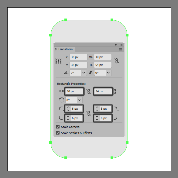
As soon as we’ve finished setting up our project file, we can start working on the actual icon, and we will do so by creating the main shape for the phone’s body using a 56 x 56 px rounded rectangle with a 6 px Corner Radius, which we will color using #E6E6E6 and then center align to the underlying Artboard.
Step 3
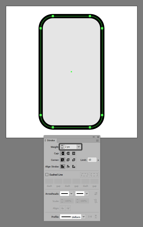
Give the shape an outline using the Stroke method, by creating a copy (Control-C) of it which we will paste in front (Control-F), and then adjust by first setting its color to #000000, and then flipping its Fill with its Stroke using the Shift-X keyboard shortcut. Set the resulting Stroke’s Weight to 2 px, making sure to select and group the two together using the Control-G keyboard shortcut.
Step 4
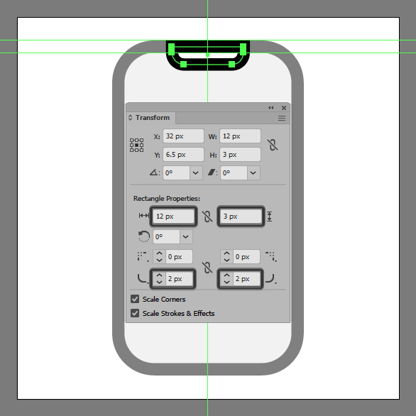
Add the notch cutout using a 12 x 3 px rectangle (#FFFFFF), which we will adjust by opening up the Transform panel, and then setting the Radius of its bottom corners to 2 px. Once you’re done, give the resulting shape a 2 px thick outline (#000000), grouping (Control-G) and then aligning the two to the larger body’s top edge.
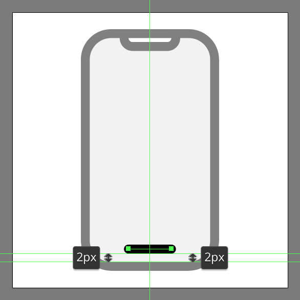
Step 5
Create the on-screen gesture button using a 10 px wide 2 px thick Stroke line (#000000) with a Round Cap, which we will position onto the lower section of the screen as seen in the reference image. Once you’re done, select and group (Control-G) all of the phone’s composing shapes together before moving on to the next step.
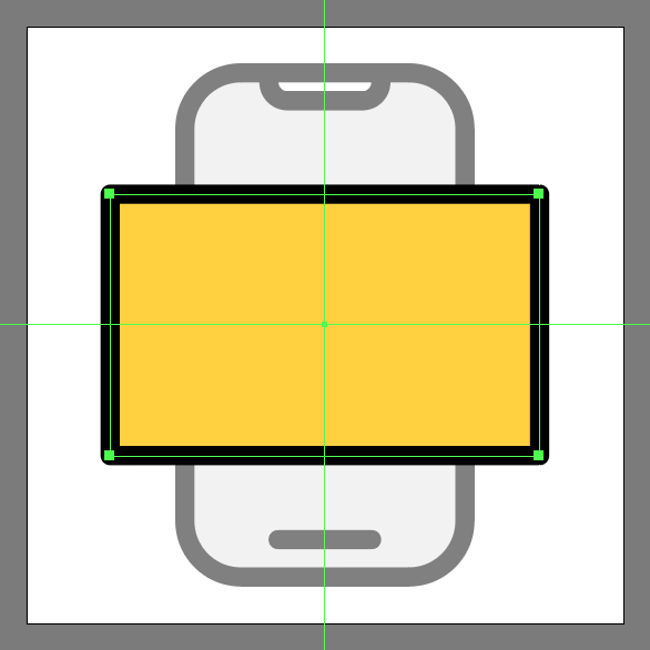
Step 6
Add the main shapes for the rotated screen using a 46 x 28 px rectangle (#FFD13E) with a 2 px thick outline (#000000) with a Round Join, which we will both position to the center of the phone.
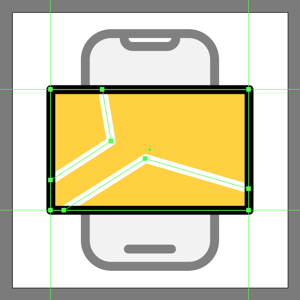
Step 7
Grab the Pen Tool (P), and using a 2 px StrokeWeight (#FFFFFF) quickly draw the little street lines using the reference image as your main guide, making sure to group (Control-G) and position them underneath the outline itself.
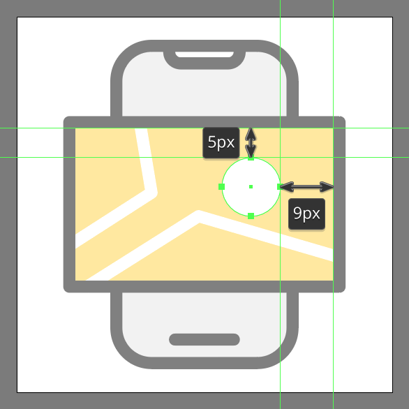
Step 8
Create the main shape for the location pin using a 10 x 10 px circle (#FFFFFF) which we will position onto the screen’s upper-right corner.
Step 9
Quickly adjust the shape that we’ve just created, by selecting its bottom anchor point using the Direct Selection Tool (A), and then pushing it to the bottom by a distance of 2 px making sure to drag its handles’ endpoints towards the inside a bit in order to shorten their curves.
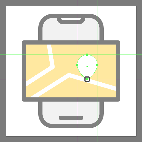
Step 10
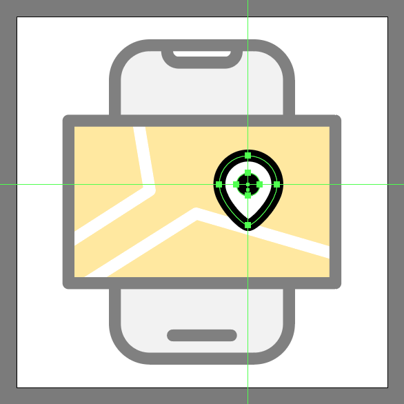
Give the resulting shape a 2 px thick outline (#000000), followed by a 4 x 4 px circular cutout (#000000), making sure to select and group (Control-G) all of them together, doing the same for the entire screen afterwards.
Step 11
Finish off the icon, and with it the project itself, by adding the hard shadow using a 30 x 4 px rectangle (#000000), which we will position below the screen section as seen in the reference image. As always, once you’re done don’t forget to select and group all of the icon’s composing shapes before finally hitting that save button.
Great Work!
As always, I hope you had fun working on the project and most importantly managed to learn something new and useful during the process.
That being said, if you have any questions feel free to post them within the comments section and I’ll get back to you as soon as I can!

Author: Andrei Ștefan
Just another coffee addict / pixel grinder, creating colorful projects one pixel at a time.


I am commenting to let you be aware of what a incredible encounter my child encountered browsing the blog. She picked up too many issues, including how it is like to possess an amazing teaching style to let the rest really easily know precisely several grueling topics. You truly did more than her expectations. Many thanks for displaying such essential, trusted, revealing and even cool guidance on your topic to Tanya.