
In today’s tutorial, we’re going to take a look behind the process of creating an OS error icon, and see how we can take some simple shapes and turn them into finished usable product. So, assuming you already have Illustrator up and running, let’s jump straight into it.
Tutorial Details: OS Error Icon
- Program: Adobe Illustrator CS6 – CC 2020
- Difficulty: Beginner
- Topics Covered: Design Theory, Compositional Construction, Shape Alignment
- Estimated Completion Time: 10 Minutes
Final Image: OS Error Icon

Step 1
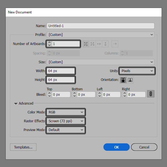
As with every new project, we’re going to kick things off by setting up a New Document, by heading over to File > New (or by using the Control-N keyboard shortcut), which we will then adjust as follows:
- Number of Artboards: 1
- Width: 64 px
- Height: 64 px
- Units: Pixels
And from the Advanced tab:
- Color Mode: RGB
- Raster Effects: Screen (72ppi)
- Preview Mode: Default
Quick tip: most of the indicated settings can be triggered automatically if you set the document’s Profile to Web, the only one that you’ll have to manually adjust being the Artboard’s Size (Width x Height).
Step 2
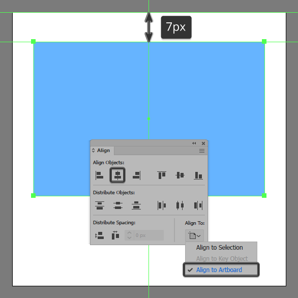
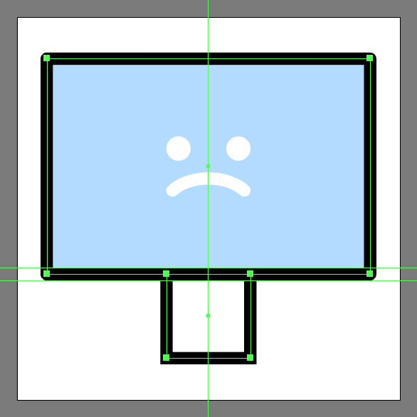
As soon as we’ve finished setting up our project file, we can start working on the actual icon, and we will do so by creating the main shape for the screen using a 54 x 36 px rectangle, which we will color using #66B6FF, and then positioning it at a distance of 7 px from the center of the Artboard’s top edge.
Step 3
Give the shape that we’ve just created an outline using the Stroke method, by creating a copy of it (Control-C), which we will paste in front (Control-F) and then adjust by first changing its color to #000000. Flip the copy’s Fill with its Stroke using the Shift-X keyboard shortcut, making sure to set its Weight to 2 px and its Corner to Round Join. Once you’re done, select and group the two shapes together using the Control-G keyboard shortcut.

Step 4
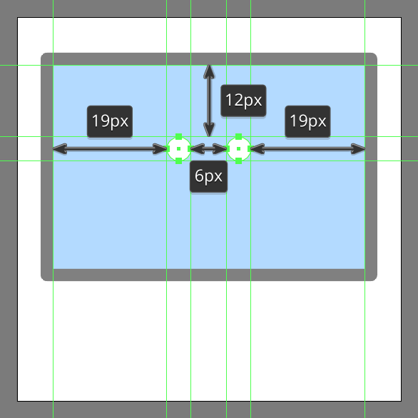
Start working on the little sad face by creating the eyes using two 4 x 4 px circles, which we will color using #FFFFFF, and then horizontally distance at 6 px from one another, grouping (Control-G) and then positioning them to the center of the screen, at a distance of 12 px from its top edge.
Step 5
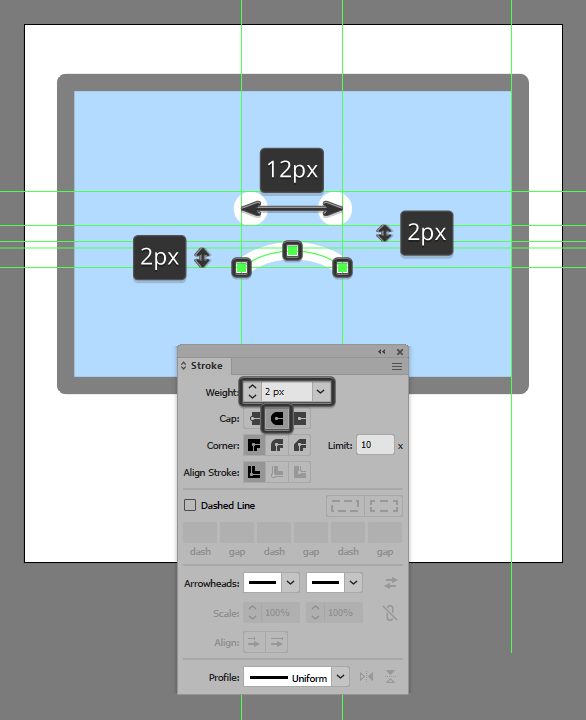
For the mouth, grab the Pen Tool (P) and use it to quickly draw a 12 px wide 2 px tall 2 px thick Stroke line with a Round Cap as seen in the reference image. Once you’re done, make sure you select and group (Control-G) all of the face’s composing shapes before moving on to the next step.
Step 6
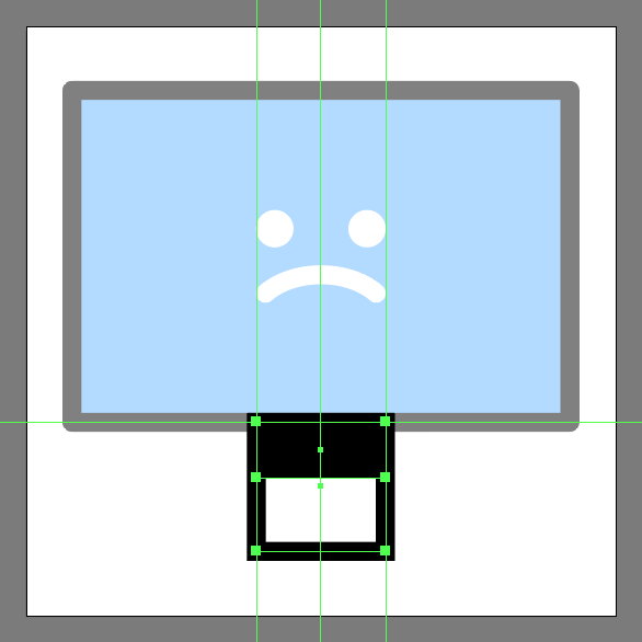
Create the main shape for the monitor stand using a 14 x 14 px square with a 2 px thick Stroke, which we will color using #000000 and then position below the screen, making sure the paths overlap as seen in the reference image.
Step 7
Add the hard shadow using a 14 x 6 px rectangle, which we will color using #000000 and then center align to the previous shape’s top edge.
Step 8
Finish off the stand and with it the icon itself, by adding the base using a 28 px wide 2 px thick Stroke line (#000000) which we will overlap with the bottom section of the previous shape. Take your time and once you’re done, select and group (Control-G) all of the current section’s composing shapes, doing the same for the entire icon afterwards.
Awesome Job!
As always, I hope you had fun working on the project and most importantly managed to learn something new and useful during the process.
That being said, if you have any questions feel free to post them within the comments section and I’ll get back to you as soon as I can!

Author: Andrei Ștefan
Just another coffee addict / pixel grinder, creating colorful projects one pixel at a time.


