
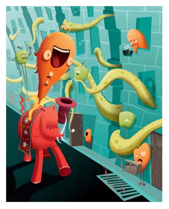
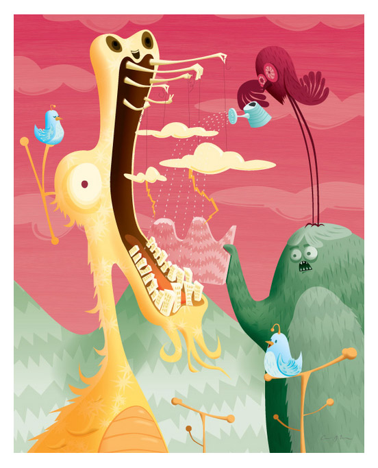
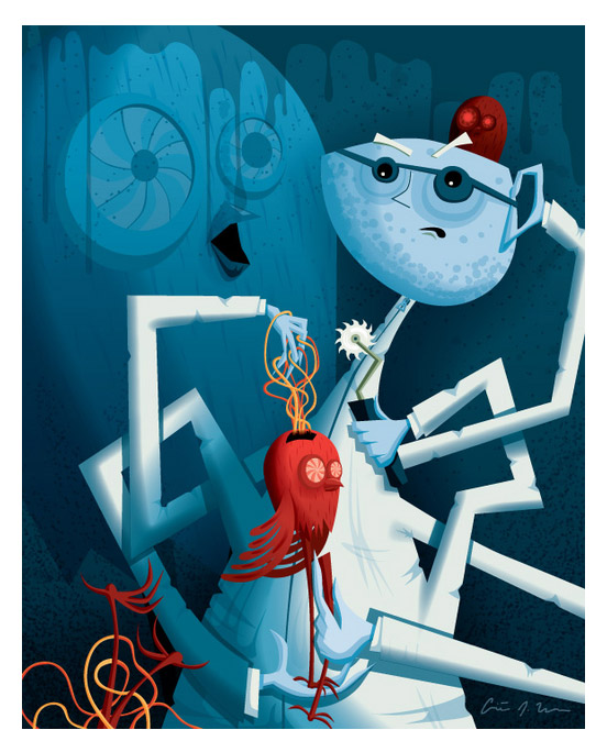
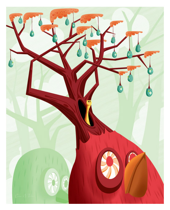
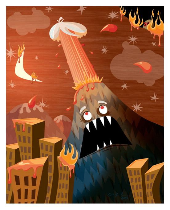
Chirs Leavens is an amazing vector artist who produces most of his art, from start to finish, in Illustrator CS3. This includes all the fantastic textures and tones in his illustrations. Chris’s art incorporates absurdity, anthropomorphism, and a healthy dose of humor. Chris was kind enough to provide Vectips with an interview with insights on his style, Illustrator, and the design and illustration industry!
About Chris Leavens
Born in Pennsylvania, Chris graduated from Penn State University with a degree in Film and Video. A few months after graduating, Chris moved west to Los Angeles to work on commercials, television, motion pictures, and his directorial debut, I Don’t Know Jack, a feature documentary about Jack Nance, star of David Lynch’s Eraserhead.
Chris decided to take a break from the film biz and began working as an illustrator, graphic designer, and web designer, focusing primarily on educational material for children. This “break” has more than outlived Chris’s Hollywood career and continues to this day.
Chris Leavens Around the Web
View Chris’s art, buy print, and more.
- Chris’s Portfolio: Check out some of Chris’s artwork.
- Uloosen: Chris’s blog.
- Imagekind: Buy print of Chris’s artwork.
- Flickr: Chris’s Flikr account.
Interview
Hey Chris, thanks for taking the time to provide Vectips with an Interview! To start, Could you tell us about your design and illustrating background and what made you become a designer and illustrator?
Thank you for taking the time to interview me!
I don’t come from a conventional artistic background. I didn’t go to art school and quite honestly, if you would have told me fifteen years ago that I’d be working as a designer and illustrator, I don’t think I would have believed you. Art has played a big role in my life, though. I was a consummate doodler throughout my entire educational career, but I never really took my artwork seriously. I guess I just didn’t think I was that good. Then, near the end of college, something strange happened. I took a few art classes and a Photoshop class as electives (I was at Penn State studying film and video) and when my teachers saw my bizarre doodles and sketches, they were impressed. Surprised the heck out me, for sure. I never thought my work would be considered “art,” but my professors literally gave me free reign to do whatever I wanted to do. It boosted my confidence and helped me to realize that my absurd, humorous tendencies were allowed in the world of art.
After college, I moved to Los Angeles to work in the film industry and almost immediately, my minimal Photoshop experience, artistic sensibilities, and computer skills opened doors for me. I worked as a video editor and quickly transitioned into motion graphics and graphic design. Without a doubt, my twisted take on things carried me farther than my technical skills in the beginning. If I could offer one piece of advice to folks looking to work as illustrators or designers, it’s to focus your attention on cultivating your sensibilities, your angle. Too many people spend too much time trying to hone technical skills. Those come with time and experimentation. If you’re inquisitive, you’ll want to see how far you can push the tools you’re using. Your art, your style, they’re driven by your sensibilities, not your technical knowledge.
On your site, you talk about how you used to work in the film industry. What made you break away from the film industry to focus on design and illustrating? How has working in the film industry influenced your designs and illustrations?
Honestly, I just burned out on the film industry. I worked on too many projects that I had little to no interest in. Also, people at the lower levels of the film industry have a bizarre contempt for their audience. It seemed a little too cynical and self-serving to me. I met a lot of great people, had a lot of great opportunities and experiences, but in the end, I don’t think it was for me.
My experience with motion graphics, graphic design, and animation helped me transition into design for print and web. I focused heavily on animation in college and the character-design aspects of that helped quite a bit when I started my current job which involves a lot of illustration for educational materials. I taught myself to use Illustrator as drawing tool for my last TV job, a TBS special called “War Games,” and that, without a doubt, has had a giant influence/impact on what I do.
What is your favorite and least favorite thing about the design and illustrating industry?
My favorite aspect of working in design and illustration is that you get paid to be creative. It’s also really nice to be able to use your job as an opportunity to experiment and hone your skills.
As for my least favorite aspect of working as a graphic designer and illustrator, that’s easy: you’re beholden to someone else’s vision. Before I started working full-time in design/illustration, I would draw and paint my own work quite a bit. Soon after I made the transition, working on other peoples’ projects and dreams became such a draw on my own creativity that I stopped creating my own personal work for nearly seven years. Seven years! Recently, aside from my full-time job, I’ve stopped taking on other peoples’ projects and bringing other peoples’ dreams to life so I could focus on my own artwork and my own aspirations. I’ve actually got to credit my wife, Adriana, for encouraging me to create my own work again. It’s amazing because I had all of this latent creative energy building up over the past seven years and when I started seriously creating my own artwork again about a year ago, it sort of exploded out of my head and I haven’t been able to stop since. It’s great because it’s led to gallery shows and moderately steady sales. People hang my art on their walls now, which is bizarre beyond belief.
Could you describe your typical workflow for an illustration?
I generally start by thinking through my ideas while running or hiking. I run three times a week and it helps me clear my head and focus on my bizarre ideas. Occasionally, I’ll sketch out some ideas with pencil and paper to better realize what I’m trying to create, but usually I go straight to Illustrator and start with the big, blank, white page. I try to have a rough sense of the colors I’m going to use and I draw outline shapes of the objects I intend to put in the frame. Using bright, bold colors, I lay out the composition, playing with placement until I get everything in the frame the way I like it. I use a lot of layers and label them clearly in order to make isolation and detail work easier. After the composition is complete, I add shading and details (faces, windows, items, accessories, etc.), tweak the colors and tone them down a little bit. The final element I add is the texture, mostly because it slows my computer down more than the other elements do. Sometimes the textures I create make my computer virtually unusable, but the end result’s always worthwhile.
Your illustrations contain wonderful textures. Do you create these in Illustrator? If so, do you have specific techniques for creating certain textures?
I create everything — start to finish — in Illustrator. I like retaining the scalability of the vectors and I like the challenge of creating all the elements with vectors and scalable effects.
For the most part, I use custom brushes to create my textures. When I create a brush, I use 100% black and set the mode to “tint.” This allows the brush to employ whatever color you choose for the stroke (as you know already). I feel like this is one of the most overlooked and under-used features in Illustrator. It’s really useful and powerful. I like to create art brushes and stretch the hell out of them — that’s usually how I texturize my skies. For fur, I use triangular art brushes, expand them, and add custom styles (usually gradients with the mode set to multiply) to help them blend into the main object. More recently, I’ve come back to using scatter brushes (something I used to do all the time) to create speckled, stipple-type textures. The great thing about using the scatter brushes is that you can set them up to control the density using a Wacom pad’s pressure sensitivity. I like to set the size, spacing, and scatter in such a way that it intensifies as the pen is pressed harder on the pad.
Why did you choose Illustrator and vector art as a medium?
I was creating a lot of illustrations for work using Illustrator and after a few years, I started to feel like my vector skills were out-pacing my traditional skills. I got to the point where Illustrator felt sort of like a musical instrument that I knew inside out. When I’m drawing and painting traditionally, my hand’s not always as steady as I’d like and I don’t have undo! Also, I love having the ability to work with and change colors at any time without hassle. Color’s really central to my approach, so keeping it mutable is really important to me. I’ve thought about using Photoshop as it’s a bit more akin to traditional drawing and painting, but I hate that it’s not scalable. The scalability and infinite, hassle-free changeability of vector art makes it an easy choice, in my opinion
What is your favorite Illustrator Tool and why?
This is going to sound boring, but it’s true: the pen tool. I use it all the time. I don’t draw much with the pencil or the brush tools. The pen tool lends itself to a clean, precise aesthetic that’s really appealing to me. I’m convinced that a lot of the modernist illustrators of the past, like Jim Flora, would have gone crazy for vector art because it works so well with their aesthetic, approach, and style.
Other tools/features that I use a lot and like quite a bit: select –> same (great for changing colors en masse), clipping masks (I use tons of these to isolate areas and to mask off shading objects), feathering (to soften my shading), and gradients.
I know you didn’t ask, but I’m also going to offer up the features that I rarely or never use as well. One is the gradient mesh. I really, really dislike the way gradient meshes are controlled and altered in Illustrator. They just don’t seem quick or intuitive. Yes, I’ve used gradient meshes and yes, I understand how they work, I just don’t like them and rarely use them. Another feature I practically never use is the Live Trace function. It has its place, but it doesn’t really work with what I do and I feel like a lot of people who work with Illustrator are cheating themselves by using Live Trace as a crutch. Draw with vectors! Set yourselves free!
What is your favorite Illustrator tip, trick, or technique?
I’d say my favorite technique would probably be creating shading using feathered, masked objects. It might seem simple, but I feel like it allows for a lot of flexibility and speed when shading an object. I usually create what I call shade objects on top of my primary objects, set the shade object’s mode to multiply, feather it, and then use a clipping mask to “chop” off the excess. If the shading isn’t intense enough, you can always step into the clipping mask and add more shade objects, layering them to intensify the shading. They’re easy to move, change, and manipulate.
Are you going to upgrade to CS4? Are you excited about any new features of CS4?
I’m definitely going to upgrade to CS4. I’m really excited about the changes to the gradient features — I’m absolutely certain they’ll speed up my workflow. Also, I like the idea of being able to use a blob brush to create my shade objects, especially since you can have them inherit styles from the styles palette. Also, the changes to the appearance palette seem like they’ll really help speed up workflow in a big way.
Since you used to work in the film industry, what film has influenced you artwork the most?
Honestly, I can’t think of a movie that influenced my artwork too much. Two recent movies that had great, inspiring visuals are “Hellboy 2” and “Speedracer” (totally underrated and misunderstood — very true to the whacked-out spirit of the original cartoon). The cartoon “Samurai Jack” had a huge impact on me and what I do. I like the sans-outline aesthetic and “Samurai Jack’s” use of it really inspired me. I think a lot of the appeal for me lies in the modern illustration influence the show drew on. I grew up looking at and reading those children’s books with that bold aesthetic and it’s super-appealing to me.
What aspects, if any, of your designs and illustrations reflects parts of your personality?
Certainly my absurd sense of humor (not so much reflected in this interview, but trust me, it’s a big, big part of who I am). I’m not really a pretentious or serious person, and I think that’s reflected in my work. I like watching people at art shows looking at my work. Most people get these big smiles on their faces and that’s exactly the reaction I’m looking for. Occasionally some snooty types pass by and sneer, which makes me even happier. One thing that can be somewhat annoying is the ever-present assumption that I use or need to use all varieties of illicit substances to create my artwork. Honest to God, I never touch the stuff. I rarely even drink and I never drink when I’m creating my work. I just have a crazy imagination that would probably make me into a crazy person if I didn’t have some sort of creative outlet.
What are you favorite online sources of inspiration?
I love flickr. It’s a great, supportive community and there are loads of terrific artists who post their work on flickr. I check it multiple times daily and keep in touch with other artists that way.
Other than that, I like to look at websites with my favorite artists’ work on them. I’ve been a fan of Tim Biskup for quite a while and I like to check out his site occasionally for inspiration. Recently, a flickr contact of mine turned me on to Nathan Jurevicius, a vector artist whose work is absolutely incredible. Definitely something anyone interested in vector art should check out.


Nice informative interview, thanks for sharing.
Chris creates really great illustrations!
By the way Chris, aren’t you going to share your awesome coloring style and write a couple of tutorials? 🙂
Great interview, very informative — thanks!
@Esben
The points and handles used to create the meshes seem to have less friction, for lack of a better term. When you’re using the pen tool, if you grab a handle to adjust a curve, the “twist” seems to travel at a fairly regulated pace, whereas I’ve noticed it seems to curve and almost flail at times when using the mesh. Also, I barely even think about selecting individual points when I’m using the pen tool, but they seem to be more difficult targets when using the mesh. I may not be using the proper words to express the difference, but there’s definitely a palpable — if minor — difference between the mechanics of the normal drawing points and the mesh points. It’s just enough to put me off from using it for most applications. Basically, for me, it would add unnecessary time to my process because I’m able to achieve what I want much faster using feathered objects and clipping masks. Might not be the purest or most elegant technique, but it’s very quick, easy to edit, and it produces a certain look that works well with my style. That said, I really respect you for what you’re able to do with the mesh.
@David
Thanks, man! Sad to hear that your teacher “fumbles” through what is most basic and necessary part of vector drawing. Hopefully you’ll get something from the class.
Brilliant work and interview. My university’s Illustrator class is being taught by a complete idiot, and it’s hard to justify shelling out money to watch the professor fumble through using the pen tool for the first time when there are experts like Chris out there. Well done and I look forward to experimenting with textures based on some of your tips.
@ Chris
Its a interesting technic which I look forward too trying to use! Just like Rype I bought a Wacom a few months ago and I haven’t completely got my head wrapped around it, when I use it in Illustrator – especially the settings.
Meshes takes all of one attention, no doubt about it! But Im somewhat puzzled with you saying that it doesn’t work like pen tool?
Thanks again to Rype for the interview and thanks to everyone for the kind words.
@Esben – I agree — textures are certainly the most difficult element of vector illustration. I’m not a big fan of the often overly-plastic looking drawings that often result from a vector approach, so I tend to limit harsh, bright highlights to items that need to look shiny and/or reflective. Also, I’ve found that keeping the textural elements simple helps a lot when you’re creating vector textures. For instance, when I create a speckled scatter-brush texture, I usually start with a simple, sloppy circle. I like to make the elements a bit imperfect to give them a more organic quality. So a sloppy circle, rotation set to randomly cover the whole range, subtly varying the scatter, spacing, and size, either at random or in association with the Wacom pen’s pressure, seems to work really well. For me and my approach, I try to keep copy-and-pasting and duplicated items to a minimum to give it more of a drawn-by-hand feel.
Also, I really didn’t mean to disparage the gradient mesh feature/tool. People do incredible work with it and I do use it on occasion, but it’s mainly the way the points and handles operate that keeps me away from it. I wish the mechanics of the mesh’s vector controls operated in a way more akin to the pen tool. I tend to break images down into objects and I like being able to layer those objects and move them freely, which is another reason meshes don’t work as well with my approach. I think they’re one of the best and most powerful features in Illustrator, they’re just not for me.
@Chris – A couple of weeks ago I was just about to write a email to you, asking for a description on how you made texture. Somehow I find textures the most difficult part to accomplish in vector.
Funny to read that you aren’t that happy about meshes, since its in one of my favorite tools and most easier to control than normal gradients.
Thanks for sharing your insight, your artwork is a huge inspiration
What a great interview Chris, thanks for sharing so much about your techniques and processes! Your work is so amazing!
Super interview. Very nice work as well. Thanks for sharing!
Awesome interview, and thanks for the tips!
Chris, you’re the man! Some day i’ll be just as good 😛
Your work is so much fun to look at! I can tell you have a blast creating your designs…I’m jealous! ^_^ I really enjoyed the article.
Great interview. I enjoyed listening to how you became an illustrator, Chris. Keep up your great work!