
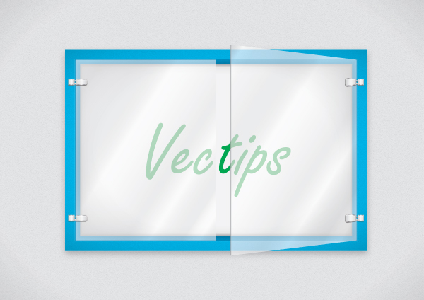
In this tutorial, you will learn how to create a See-Through Cabinet by applying a semi-realistic glass texture effect. You will learn how to add multiple fills and strokes in order to create shadows and highlights to your illustration, and you will also learn to use the Pathfinder Panel and the Transparency Panel. Let’s begin!
Tutorial Details
- Program: Adobe Illustrator CS6 – CC
- Difficulty: Beginner-Intermediate
- Topics Covered: Gradient Tool, Basic Tools and Effects, Transform techniques and the Appearance panel
- Estimated Completion Time: 1 hour
Final Image
This is the final image that we’ll be creating:
Step 1
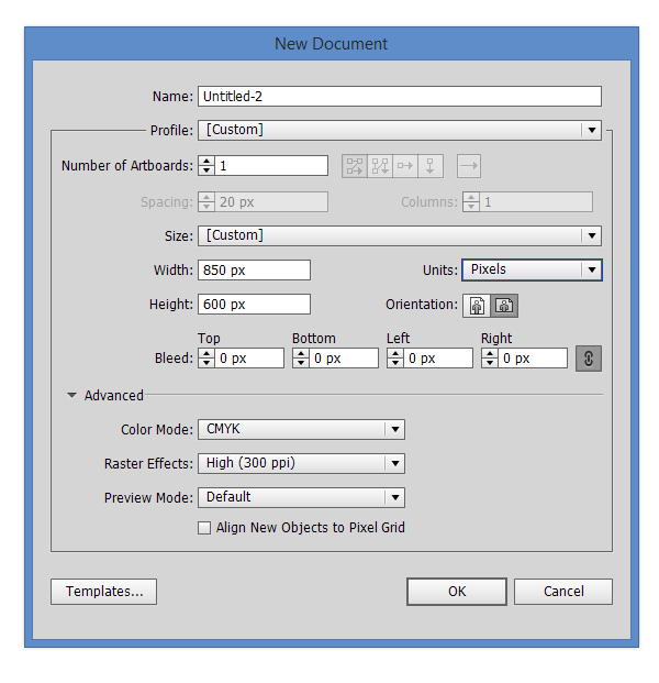
Open Adobe Illustrator and create a new document (Ctrl + N). Select CMYK Color Mode, 300 PPI Raster Effects and make sure that Align New Objects to Pixel Grid is unchecked.
Next, go to Edit > Preferences > General and set the Keyboard Increment to 1 pt.
Step 2
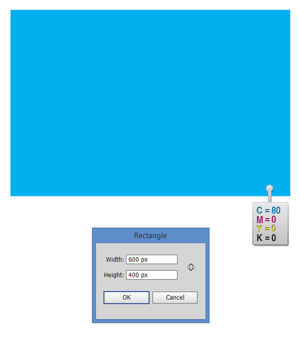
Pick the Rectangle Tool (M) and draw a 600 x 400px rectangle, then fill it with C=80 M=0 Y=0 K=0 and make sure that there is no stroke.
Step 3
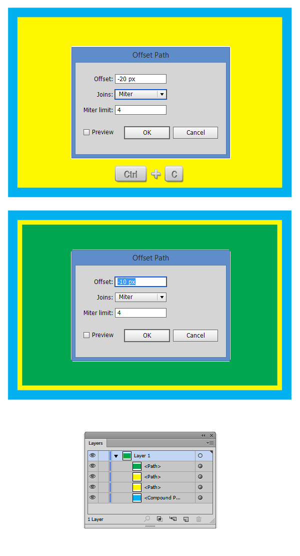
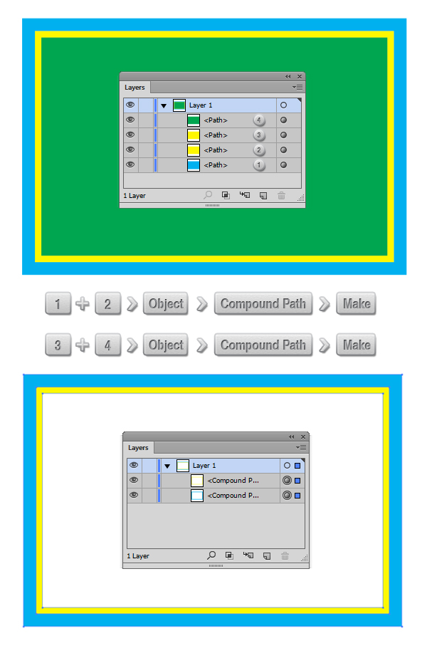
Select the rectangle we’ve previously created and go to Object > Path > Offset Path then enter a value of -20px. A new rectangle will be created. Make sure you select it and make a copy in front of it (Ctrl + C > Ctrl + F). Select the copy and go again to Object > Path > Offset Path and enter a value of -10px. Now if you look in the Appearance Panel (Window > Appearance Panel) you will have 4 rectangles.
Step 4
It’s time to create the frame of the cabinet. Select the rectangles tagged with (1) and (2) in the image below and go to Object > Compound Path > Make (Ctrl + 8). Now select rectangles tagged with (3) and (4) from the image below and again go to and go to Object > Compound Path > Make (Ctrl + 8).
Step 5
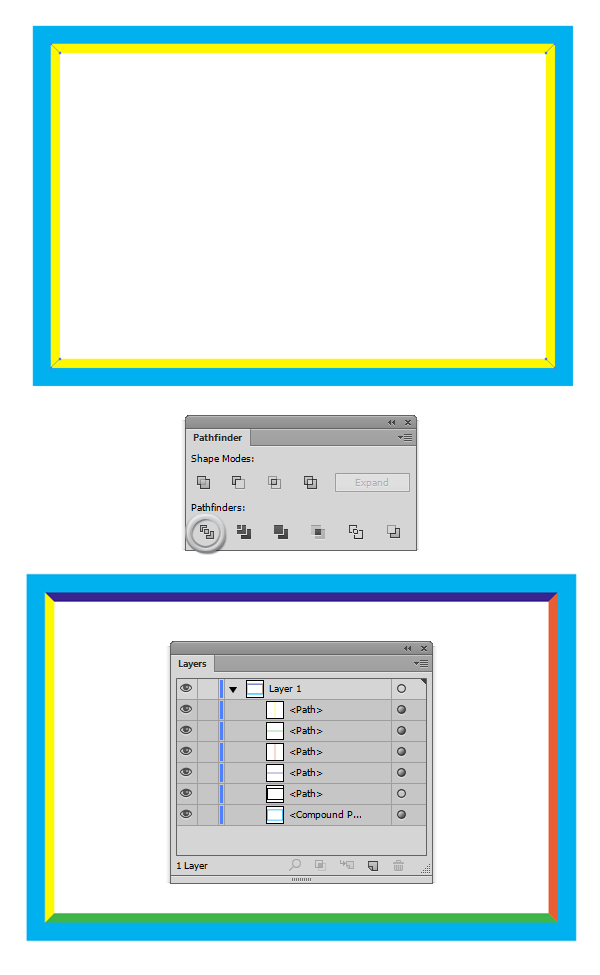
It’s time to divide the frame into four paths. Select the Line Tool (\) and draw four lines at the corners for the yellow compound path. Select the four lines you’ve created and the yellow compound path; then from the Pathfinder Panel select Divide. A group with five path will appear. Just select the group and Ungroup it (Ctrl + Shift + G).
Step 6
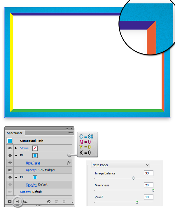
Select the cyan compound path and from the Appearance Panel. Add a new Fill (see the highlighted button from the image below) and fill it with C=80 M=0 Y=0 K=0. From the Transparency Panel (Window > Transparency Panel), reduce the opacity of that fill to 10% and set the Blending Mode to Multiply. With the second fill still selected, go to Effect > Sketch > Note Paper, and in the dialog box, enter the values you see below.
Step 7
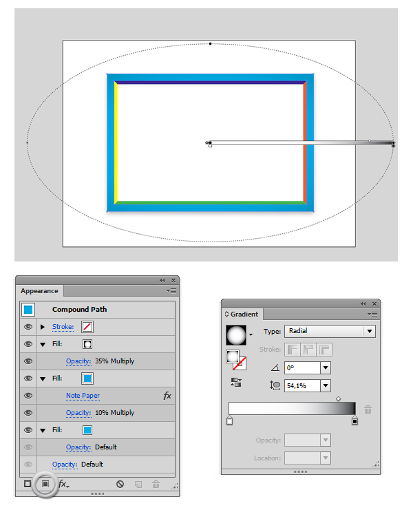
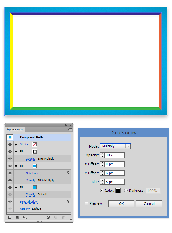
From the Appearance Panel add a third fill, this time a Black to White radial gradient fill (Window > Gradient Panel). With the last fill created from the Transparancy Panel, reduce it’s opacity to 35%, then set the Blending mode to Multiply.
Step 8
It’s time to add a drop shadow to the frame. Select the whole compund path, and go to Effect > Stylize > Drop Shadow; then enter the values you see in the image below.
Step 9
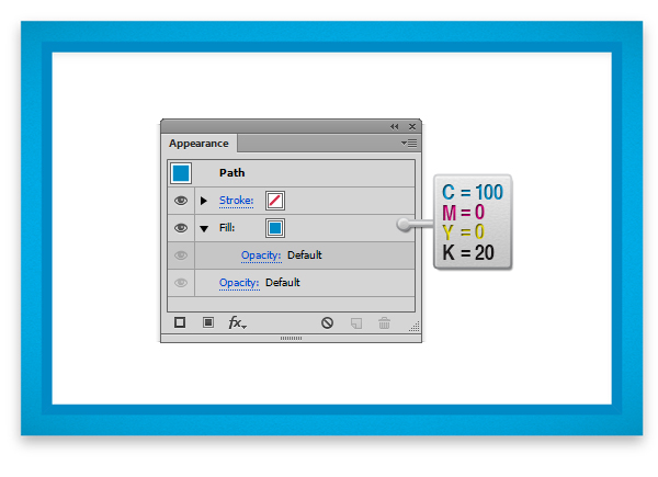
Now select the four shapes we’ve create in step 5, and fill them with C=100 M=0 Y=0 K=20.
Step 10
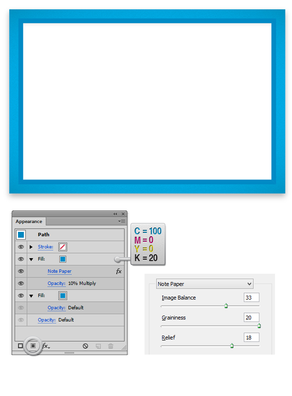
Select all four shapes, and add a new fill from the Appearance Panel (see the highlighted button from the image below). Then fill it with C=100 M=0 Y=0 K=20. From the Transparency Panel, reduce the opacity of that fill to 10% and set the Blending Mode to Multiply. With the second fill still selected, go to Effect > Sketch > Note Paper, and in the dialog box, enter the values you see below.
Step 11
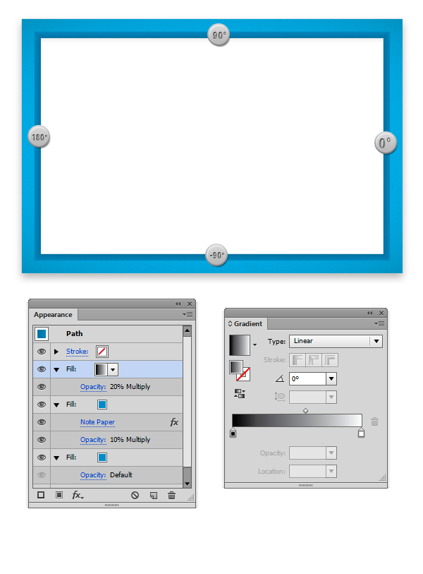
Add a gradient fill from the Gradient Panel, set the type to linear and the colors from Black to White. From the Transparency Panel, lower the opacity to 20%, and set the Blending Mode to Multiply. For each path, set the angle as you see in the image below as we need to have a darker cyan in the interior of the frame.
Step 12
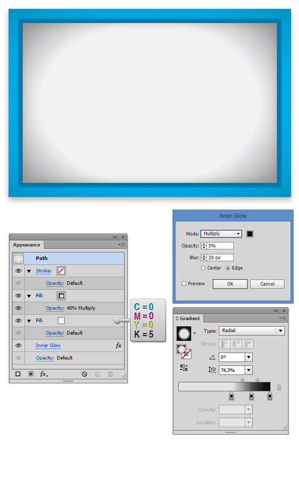
Select the background of the Cabinet (see step 5 when we divided the inner frame), and set the fill color to C=0 M=0 Y=0 K=5. Add a new fill, this time it needs to be a radial Gradient fill (you can find it in the swatches panel). From the Appearance Panel, select the gradient fill, and lower the opacity to 40%; then set the Blending Mode to Multiply. Select the whole path (not only the fill) and add an Inner Glow (Effect > Stylize > Inner Glow). Then in the dialog box, enter the same values as in the screenshot below.
Step 13
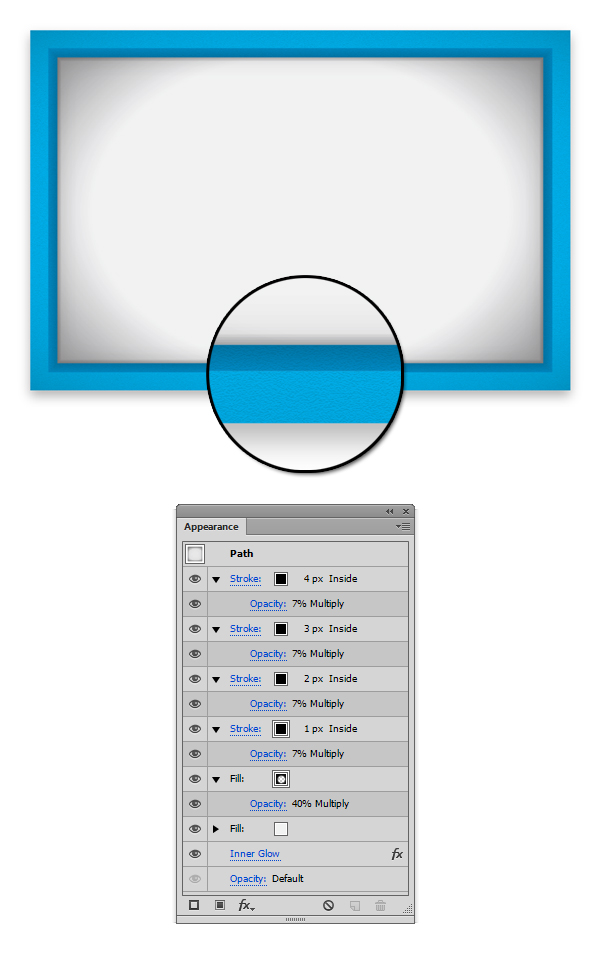
With the previous rectangle selected (from step 12), go to the Appearance Panel, and add four black strokes from 1px width to 4px width. For all of them, lower the opacity to 7%, and set the Blending mode to Multiply.
Step 14
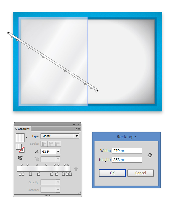
Now that we have the base for our design, let’s get to the fun part–creating the glass doors. Using the Rectangle Tool (M), create a 279 x 358px rectangle. Make sure that there is no stroke applied, and fill the shape with a linear gradient.
Step 15
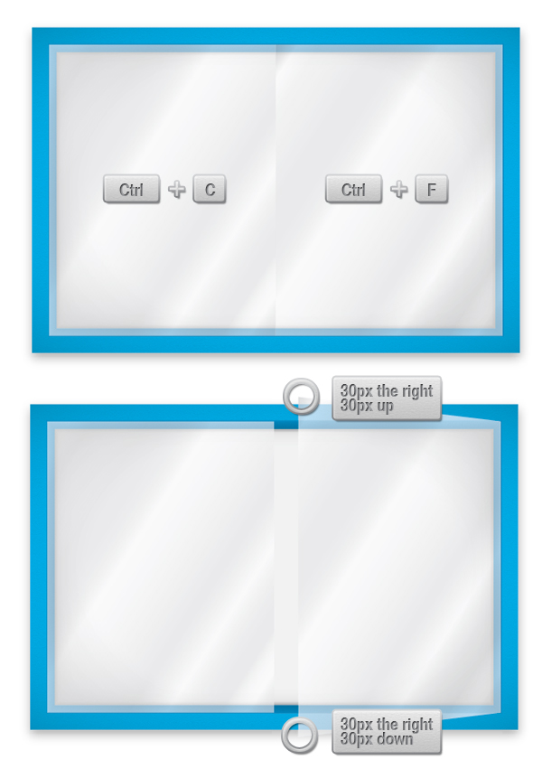
Copy then paste symmetrically (like in the image below) the door we’ve previously created. With the White Arrow Tool (A), select the anchor points highlighted in the image below, and move them 30px to the right, then 30px up or down depending on the point you have selected in order to “open” the left door.
Step 16
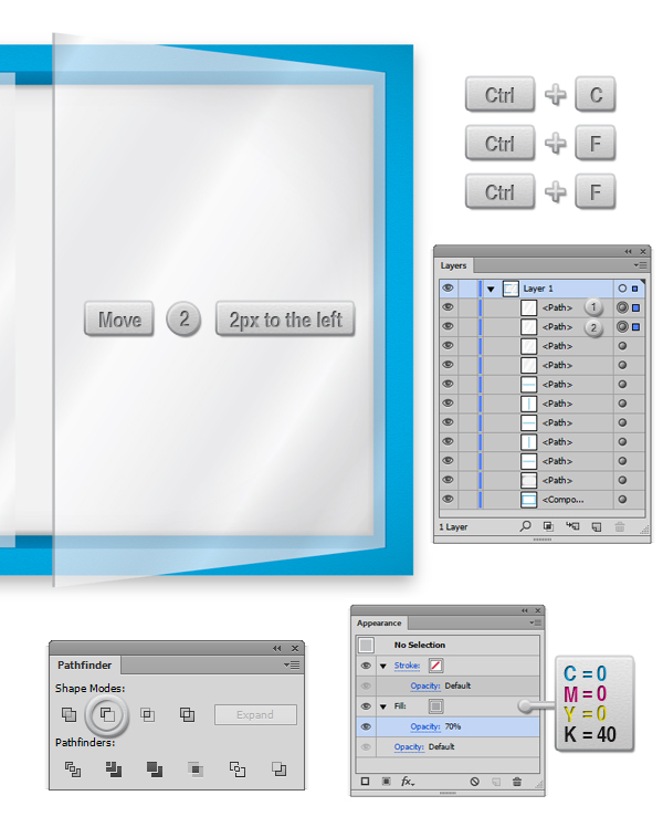
Now let’s create the edge of the right door. Copy and paste the shape twice (Ctrl + C > Ctrl + F > Ctrl + F). Move the first copy (1) 2px to the left; then select both copies and hit the Minus Front button from the Pathfinder Panel. Fill the resulting shape with C=0 M=0 Y=0 K=40. From the Transparency Panel, lower the opacity to 70%.
Step 17
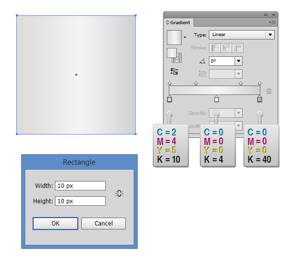
Using the Rectangle Tool (M), draw a 10 x 10px rectangle; then fill it with a three-color linear gradient.
Step 18
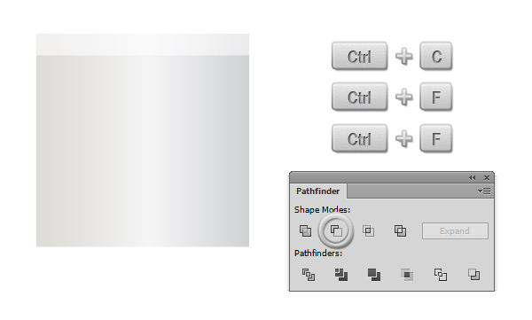
Make to two copies (Ctrl + C > Ctrl + F > Ctrl + F) of the shape we’ve previosuly created, then select the top shape and move it 1px down. Select both copies and hit the Minus Front button from the Pathfinder Panel. Fill the shape with white and lover the opacity from the Transparency Panel to 70%.
Step 19
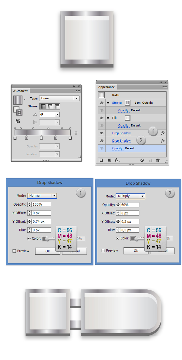
From the Appearance Panel, add a linear Gradient Stroke (available only in Illustrator versions 16 and up). After this, add two drop shadows (Effect > Stylize > Drop Shadow). When you add the second Drop Shadow, Illustrator will ask you if you really want to add a new one, say yes. Enter the values from the screenshot below. Now repeat the very same procedure for the rest of the shapes in order to create something similar to the final design you see below.
And we’re done!
Just make four copies of the shape we’ve previosly created, and arrange them as in the image below.
Author: Andrei Urse
My name is Andrei Urse. I’m a graphic designer from Romania. I love creating logos and complex vector art using Illustrator, but I also use Photoshop and InDesign on a daily basis. You can find all of my work on Behance.



It’s amazing for me to have a web site, which is helpful
in support of my knowledge. thanks admin
What blending mode do you use for the glass doors?
I’ve used “Normal” as Blending Mode. Only lowered the opacity to 70%.