I came across this trick randomly and decided to post about to get your opinion. It seems like a pretty cool little trick, but honestly, I haven’t found a great use for it. It is fun to play around with and great for experimenting, but can you see yourself using this trick for anything in particular?
Envelope Distortion
First, it might be helpful to give you a little background on Envelope Distortions. An envelope distortion is a vector shape that contains other artwork. The artwork contained within takes on the shape of vector. In Illustrator, you can create a Envelope distort three ways.
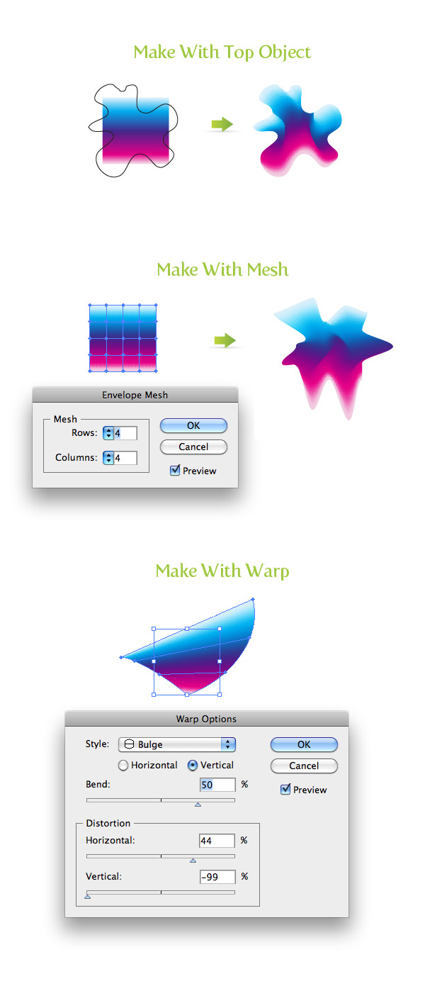
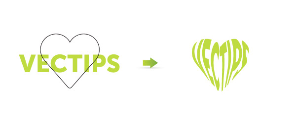
Make With Top Object
- In this method, the top most vector shape acts as the envelope for the artwork below.
- To apply this distort, select your top most vector shape, the artwork you want to distort, and go Object > Envelope Distort > Make with Top Object (Command Option C).
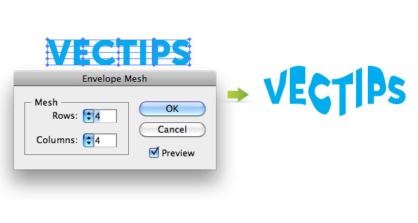
Make With Mesh
- In this method, Illustrator creates the shape for you with editable mesh point to control how the distortion affects the artwork.
- To apply this distort, select your artwork and go Object > Envelope Distort > Make with Mesh (Command Option M).
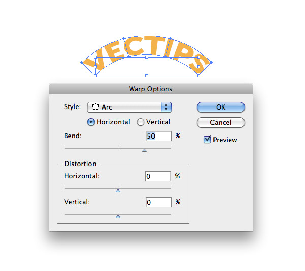
Make With Warp
- This method is similar to the Make With Mesh method but instead of starting off with a rectangle mesh, Illustrator gives you the option of choosing from several preset shapes.
- To apply this distort, select your artwork and go Object > Envelope Distort > Make with Warp (Command Option Shift W).
Distort Linear Gradient Option
With this setting, Illustrator will distort the linear gradient of the artwork being distorted.
Distort Linear Gradient Settings
To change this setting, go Object > Envelope Distort > Envelope Options. Check the Distort Linear Gradients check box.
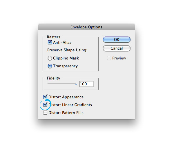
Playing Around With Distorted Linear Gradient in Envelope Distortions
After you change the settings, try playing around with it in the different methods of Envelope Distortions.
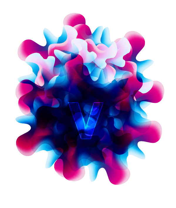
Like I said in the beginning of the post, I’m not sure how you can incorporate this into your work, but it is great to experiment with. In the image below I took to distort I made with the Make With Top Object, copied it a number of times, and changed between Overlay and Multiply blending modes. What can you come up with?



Thank you very much i find this very usefull when trying to do some realistic work. Instead of using a mesh in some complex objects ill try gradients and then distort them ;).
Very helpful tip, thank you kindly!! Makes some awesome effects to my illustrations thus far.
Hi, I’m also using for my job this tool. But I got problem when using it with group. For example if you see Nutrition facts on some packaging, but not only white and black. Can you try for me, outer box of Nut.facts is green colour, and the text of nut.facts black color but in small yellow box. Same for the rest, all each sentence in yellow box with black text.
B’cos when I’ve tried with env.distortion(using as arc effect), the text become broken or outside of the box, not same arc with the yellow box.
It will help me, if you can share with next tutorial about this problem.
Or maybe you can email me if you need the sample of my job.
Thank you before.
I liked the way of presentation.
It was really helpful,
Thanks
Awesome~ thanks… 😀
Interesting techniques! The same is also popular nowadays in logo design. Thanks for sharing 🙂
so cool!, thanks!!
nice!!! I will be using this to create flowers that have bunched petals… ie snapdragons. very useful 😀
I can do a photorealistic things in Ai,but I don’t know to do that 🙂 It’s very helpful and great 🙂
very interesting…. great
looks great!
thanks for this short tutorial,
we really need it!!!
I’m comeform China~!!This is some difficult ~!!
I actually just used this technique the other day on a poster. I made some stacked 3D blocks with text on them, but the text didn’t have any perspective to go with the blocks. So I found this technique, and skewed/distorted the text just a little so it looked like it was written down the blocks.
But I never thought of all these techniques, definitely going to use this some more.
thanks for sharing. i plan to use this soon.
5-6 years on AI and I’ve never come across these options. amazing result!
thank for tutorial
Sweet! I had seen the option before, but never explored what it does.
Thanks!
Never thought of this before. Thanks for the tip.
Nice little tips there, the distortion with a top object could come in very useful. thanks
Awesome ….. Illustrator God ¡¡¡¡
Hey man thank you for the information, in fact y found it very useful. I have to make a character wich is a vodoo chaman making some kind of sorcery. I was looking for some cool “magic glow” for the tip of his magic staff, and this works.
Great Tutorial. You really explored that well.
Wow! I’m working with AI for long years but most of these techniques were unknown even for me! Thanks for this short tutorial, this is definitely worth a try!
Hey – those look like neat techniques!! Cheers for the tip 🙂