Welcome back to another Illustrator based tutorial, in which we’re going to take a look behind the process of creating a simple anchor selection icon, using nothing more than a couple of basic geometric shapes and tools. So, assuming you already have the software running in the background, bring it up and let’s jump straight into it.
Tutorial Details: Anchor Selection Icon
- Program: Adobe Illustrator CS6 – CC 2020
- Difficulty: Beginner
- Topics Covered: Design Theory, Compositional Construction, Shape Alignment, Grid Positioning
- Estimated Completion Time: 20 Minutes
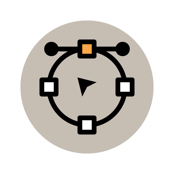
Final Image: Anchor Selection Icon
Step
1
As
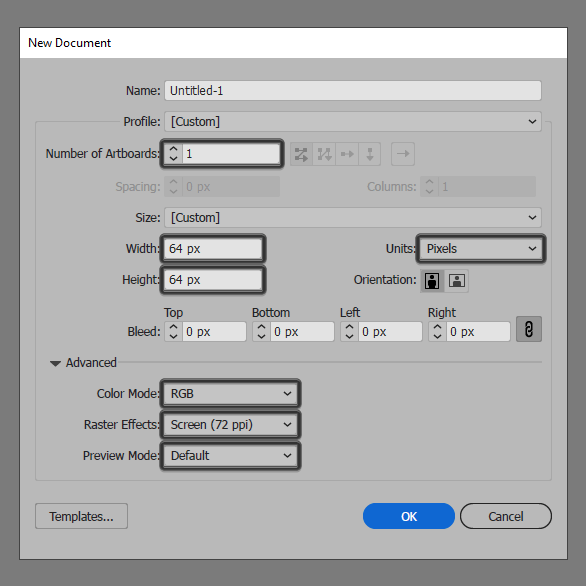
with every new project, we’re going to kick things off by setting up a New Document, by heading over to File > New (or by using the Control-N keyboard shortcut), which we
will then adjust as follows:
- Number of Artboards: 1
- Width: 64 px
- Height: 64 px
- Units: Pixels
And
from the Advanced tab:
- Color Mode: RGB
- Raster Effects: Screen (72ppi)
- Preview Mode: Default
Quick tip: most of the indicated settings can be triggered automatically if you set the document’s Profile to Web, the only one that you’ll have to manually adjust being the Artboard’s Size (Width x Height).
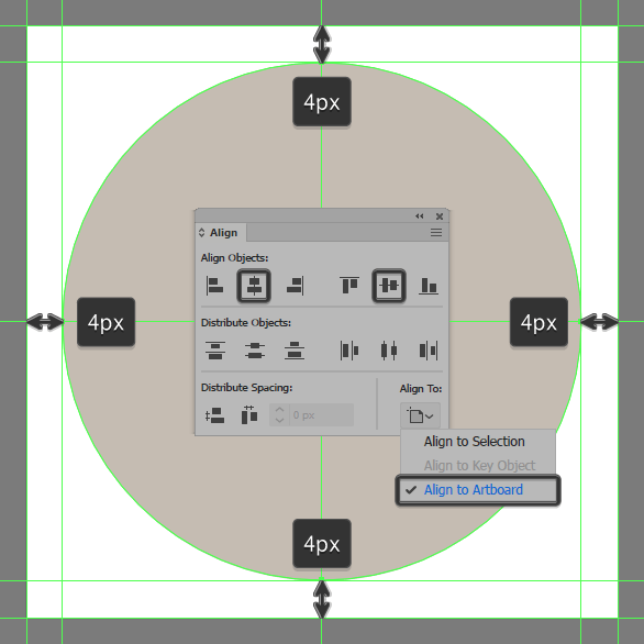
Step 2
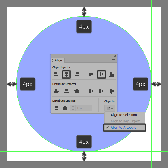
As soon as we’ve finished setting up our project file, we can start working on the actual icon, and we will do so by creating the main shape for the background using a 56 x 56 px circle, which we will color using #c6bdb3 and then center align to the underlying Artboard using the Align panel’s Horizontal and Vertical Align Center options.
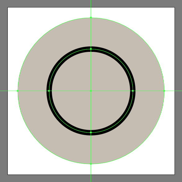
Step 3
Create the main shape for the vector path using a 32 x 32 px circle with a 2 px thick Stroke (#000000), which we will position to the center of the larger background.
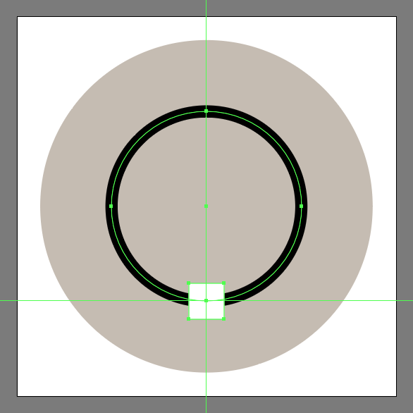
Step 4
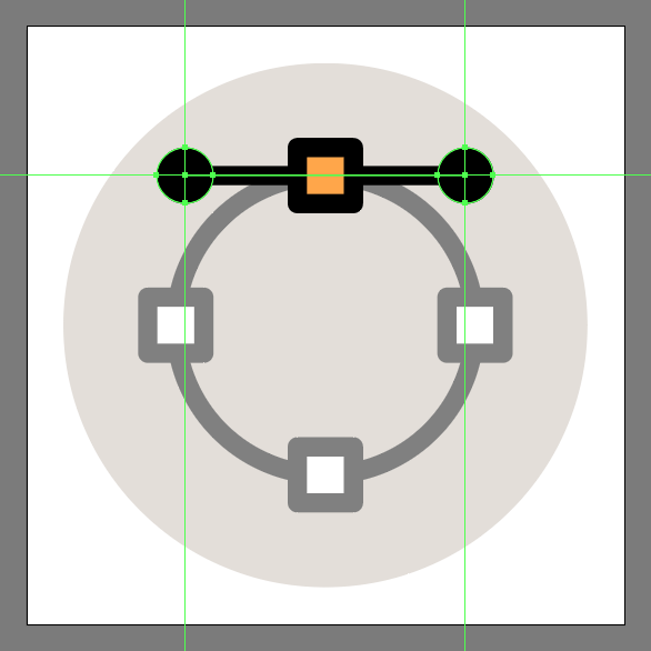
Create the main shape for the bottom illustrated anchor point using a 6 x 6 px square, which we will color using #ffffff, and then center align to the circle’s bottom anchor point.
Step 5
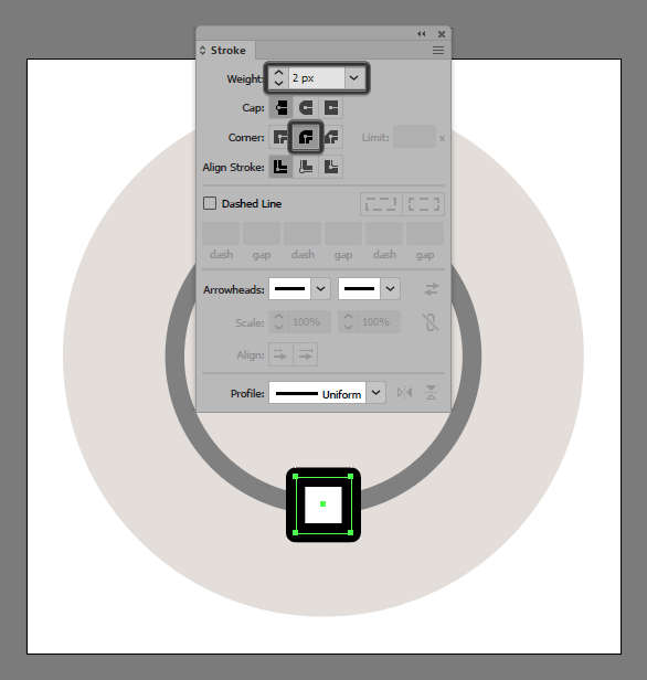
Give the shape an outline using the Stroke method, by creating a copy of it (Control-C), which we will paste in front (Control-F) and then adjust by first changing its color to #000000, and then flipping its Fill with its Stroke (Shift-X). Set the resulting Stroke’s Weight to 2 px and its Corner to Round Join, making sure to select and group the two shapes together using the Control-G keyboard shortcut, before moving on to the next step.
Step 6
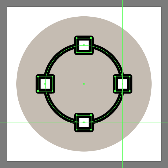
Add the remaining anchor points, using three copies (Control-C > Control-V) of the one that we’ve just finished working on, which we will then position as seen in the reference image.
Step 7
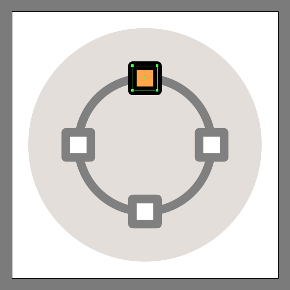
Adjust the top anchor point by selecting its fill shape using the Direct Selection Tool (A), and then changing its color to #ffa748.
Step 8
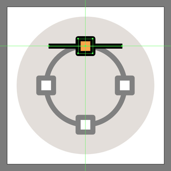
Quickly add the two handles using a 30 px wide 2 px thick Stroke line (#000000), which we will center align to the top anchor point, making sure to position it underneath afterwards by right clicking > Arrange > Send Backward.
Step 9
Create the end points using two 6 x 6 px circles, which we will color using #000000, and then position to the center of the horizontal Stroke line’s anchors. Once you’re done, make sure you select all of the shapes except for the background, and group them together using the Control-G keyboard shortcut.
Step 10
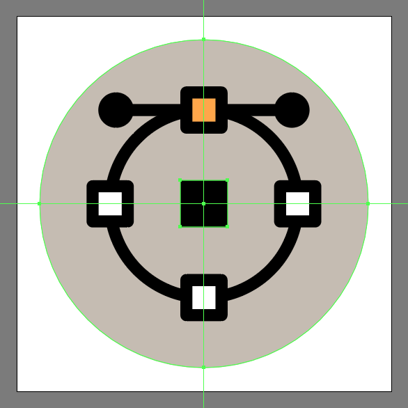
Create the main shape for the selection tool using an 8 x 8 px square, which we will color using #000000, and then position to the center of the background.
Step 11
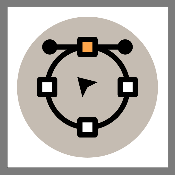
Finish off the icon and with it the project itself, by individually selecting and then adjusting the position of the square’s anchor points using the Direct Select Tool (A) following the reference image as your main guide. Take your time, and once you’re done, make sure you select and group (Control-G) all of the icon’s composing shapes together before finally hitting that save button.
Great Job!
As always, I hope you had fun working on the project and most importantly managed to learn something new and useful during the process. That being said, if you have any questions feel free to post them within the comments section and I’ll get back to you as soon as I can!
Just another coffee addict / pixel grinder, creating colorful projects one pixel at a time.


 ial we’re going to take a look at the process of creating a camera icon, using nothing more than the basic shapes and tools that we work with on a daily basis.
 In today’s tutorial, we’re going to explore the process of creating a simple mouse icon, using nothing more than the basic geometric shapes and tools found within Illustrator.