 In today’s tutorial, we’re going to take a close look behind the process of creating a small perfume icon, using nothing more than some basic geometric shapes and tools that Illustrator has to offer.
That being said, open up Illustrator and let’s get started!
Tutorial Details: Perfume Icon
- Program: Adobe Illustrator CS6 – CC
- Difficulty: Beginner
- Topics Covered: Design Theory, Compositional Construction, Shape Alignment, Grid Positioning
- Estimated Completion Time: 30 Minutes
Final Image: Perfume Icon

Step 1
As with every new project, start by first setting up a New Document by going over to File > New (or using the Control-N keyboard shortcut), which we will adjust as follows:
- Number of Artboards: 1
- Width: 128 px
- Height: 128 px
- Units: Pixels
And from the Advanced tab:
- Color Mode: RGB
- Raster Effects: Screen (72ppi)
- Preview Mode: Default
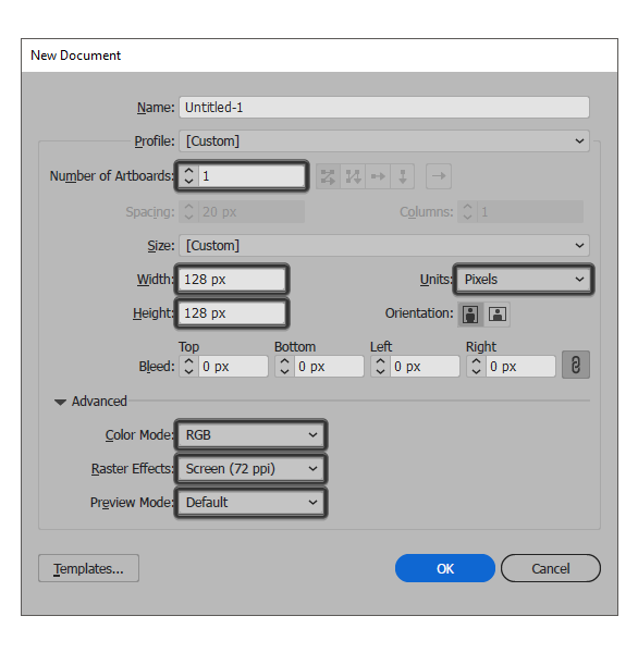
Quick tip: most of the indicated settings can be automatically triggered if you set the document’s Profile to Web, the only one that you’ll have to manually adjust being the Artboard’s Size (Width x Height).
Step 2
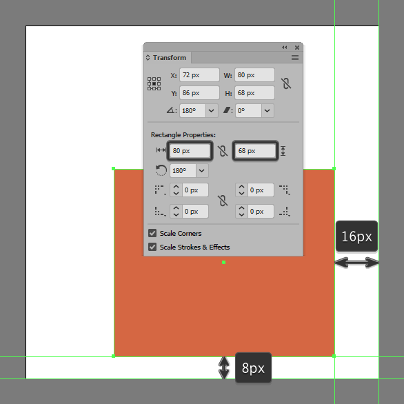
Once we’ve set up our project file, we can start working on the actual icon, and we will do so by creating the fill shape for its side section using an 80 x 68 px rectangle, which we will color using #D66741, and then position at a distance of 8 px from the Artboard’s bottom edge, and 16 px from its right edge.
Step 3
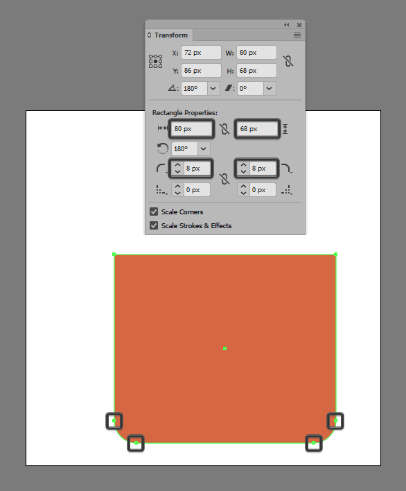
Adjust the shape that we’ve just created by setting the Radius of its bottom corners to 8 px from within the Transform panel’s Rectangle Properties.
Step 4
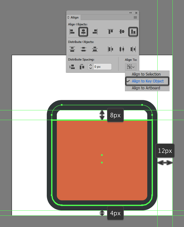
Create the outline for the perfume bottle’s side section using an 80 x 80 px rounded rectangle with an 8 px Corner Radius and an 8 px thick Stroke (#2C3435), which we will center align to the fill shape’s bottom edge. Once you’re done, select and group both shapes together using the Control-G keyboard shortcut, before moving on to the next step.
Step 5
Create the bottle’s front section, using a copy (Control-C) of the shapes that we’ve just grouped, which we will paste in front (Control-F), and then reposition by moving them to the left by a distance of 16 px using the Move tool (right click > Transform > Move > Horizontal > -16 px).
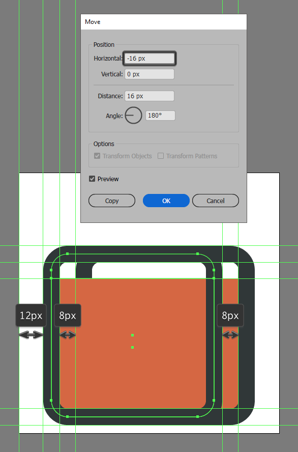
Step 6
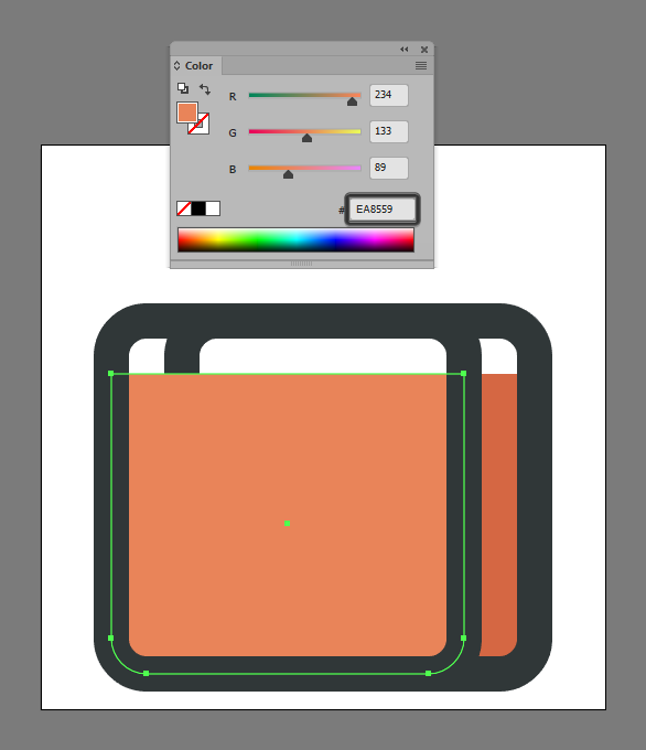
Select the front section’s fill shape using the Direct Selection Tool (A) and then adjust it by changing its color to #EA8559.
Step 7
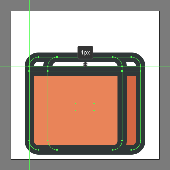
Add the top outline to the bottle’s liquid, using a 96 px wide 8 px thick Stroke line (#2C3435), which we will center align to its two composing sections.
Step 8
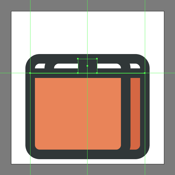
Add the small tube section using a 16 x 12 px rectangle (#2C3435), which we will center align to the previously created outline segment.
Step 9
Give the bottle a little swag by creating the Givenchy-inspired logo, using a 4 px thick Stroke with the color set to #2C3435. Take your time, and once you’re done group (Control-G) all its composing sections center aligning them to the fill section of the bottle’s front, doing the same for the entire bottle afterwards.
![]()
Step 10
Start working on the bottle’s pulverizer, by creating the side of its bottom section using a 12 x 12 px square (#889998), which we will position on top of the larger body, at a distance of 42 px from the Artboard’s right edge.
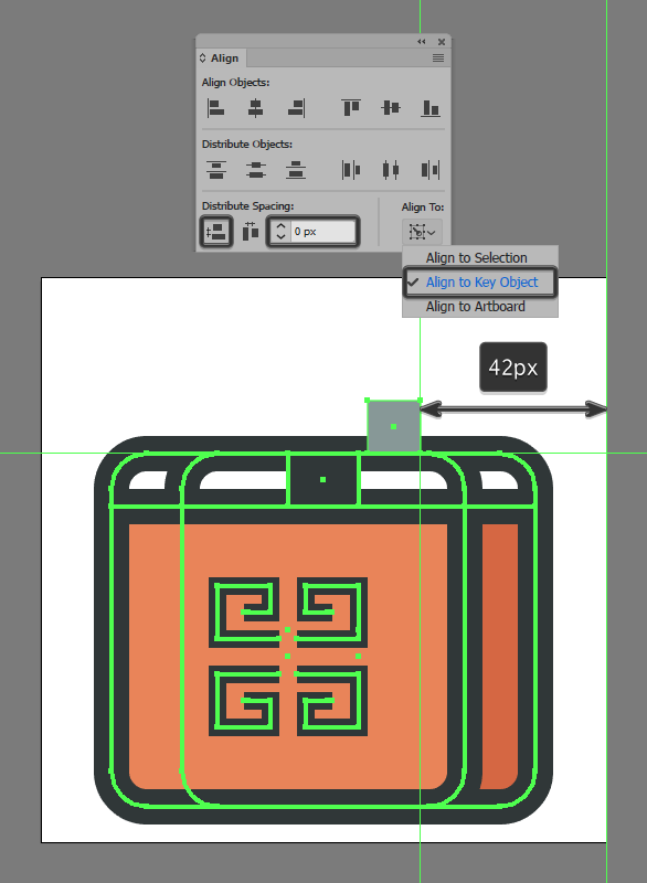
Step 11
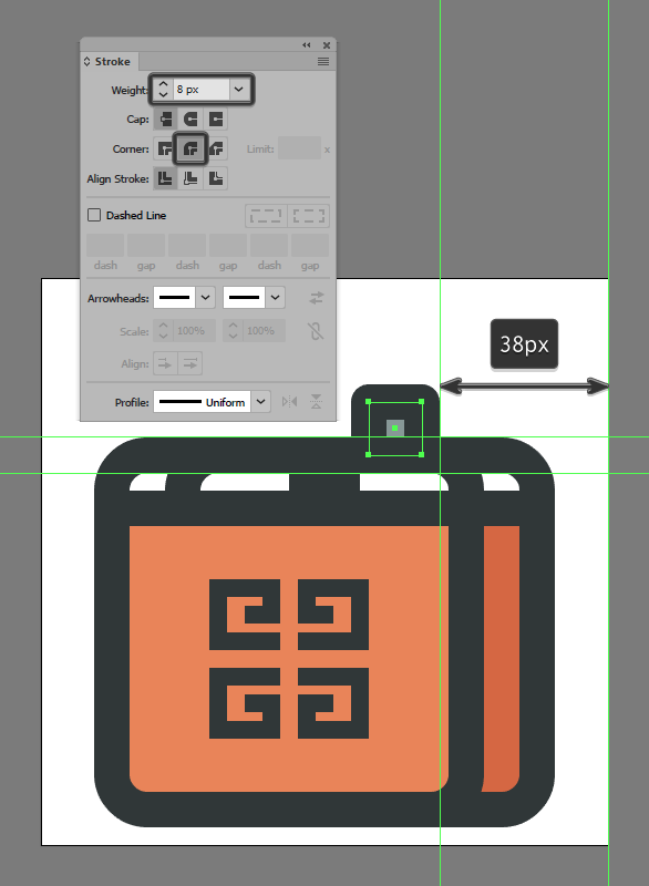
Give the shape that we’ve just created an outline using the Stroke method, by creating a copy of it (Control-C) which we will paste in front (Control-F) and then adjust by first changing its color to #2C3435, and then flipping its Fill with its Stroke (Shift-X) making sure to set its Weight to 8 px and its Corner to Round Join. Then, before moving on, select both shapes and group them together using the Control-G keyboard shortcut.
Step 12
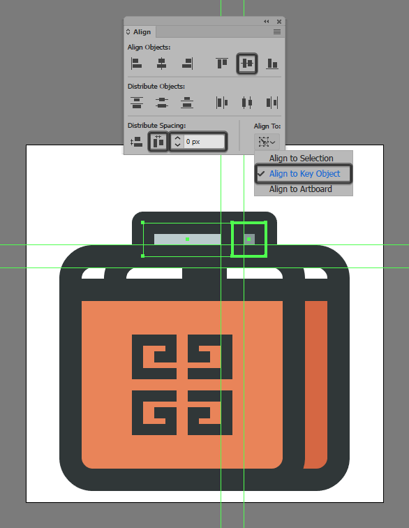
Create the front section using a 32 x 12 px rectangle (#BCCCCE) with an 8 px thick outline (#2C3435), which we will group (Control-G) and then position onto the left side of the side section. Once you’re done, select both sides and group (Control-G) those together as well.
Step 13
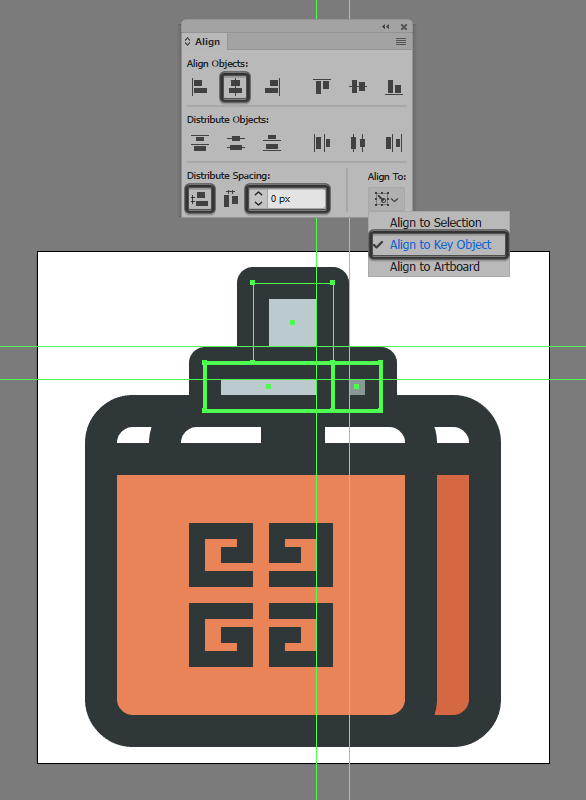
Create the spray cap using a 20 x 20 px square (#BCCCCE) with a 4 px thick outline (#2C3435), which we will group (Control-G) and then center align to the pulverizer’s previous sections.
Step 14
Finish off the cap and with it the icon itself by adding the nozzle using a 6 x 6 px circle (#2C3435), which we will left align to the larger fill section, positioning it at a distance of just 2 px from its top edge. Once you’re done, select and group (Control-G) all of the cap’s composing shapes together doing the same for the entire icon afterwards.
![]()
Great Work!
There you have it guys a simple approach on how to create your very own perfume icon using the most simple of shapes and tools that Illustrator has to offer. I hope you’ve manage to keep up with each and every step and most importantly learned something new and useful along the process.
Author: Andrei Ștefan
Just another coffee addict / pixel grinder, creating colorful projects one pixel at a time.


