What is design theory and how can you put it to work for you? I’ll cover the design principles that propel good design to great design. Superficial instruction, where you’re simply told what to do to get a specific result has its place, but you won’t find any of that here—only principles squarely aimed at applying design fundamentals to increase the effectiveness of your work. Take a look.
Design Principles: Now how, but why
The most powerful websites are a thoughtful blend of form and function. Over time you can begin to expertly employ the principles of design and weave together a powerful result. If you’re looking for a tutorial on flat design, this isn’t it. While I am using a flat design as the article’s muse, the topics I cover are foundational to design theory.
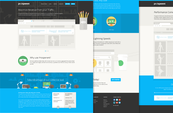
Here’s the design I’ll use:
Fundamentally speaking
While there are many subsets and concessions made depending upon which medium you work in, at its core, great web design embodies hierarchy, repetition, line, balance, contrast, scale, and much more. Given the depth of the topic, I can only cover a few principles, but those that I do cover will have you well on your way to infusing your design work with detail that will set your work apart from the pack.
Here are the design principles I’ll cover:
- Hierarchy
- Repetition
- Contrast
- Shape
- Color
- Texture
Let’s get started!
1. Hierarchy
As with most design principles, hierarchy can apply to any facet of design—color, type, shape etc., not just layout. For this article, I’m focusing on the layout of the website design as the lens through which we’ll address hierarchy.
In design, hierarchy is the foundation of successfully communicating a message. When hierarchy is used effectively viewers can quickly scan a page and immediately get an idea about what content is more important, and what’s less important. When hierarchy is off, a design feels uncomfortable, information may be ignored entirely, or the credibility of the site/product/person etc. may even be questioned.
Although there are exceptions to the rule, in western culture people tend to follow a top to bottom, left to right eye path as they take in information. Device and medium (screen versus printed paper for example) play a big role in how information is understood too.

Animation: In western culture people tend to follow a top to bottom, left to right eye path as they take in information.
Hierarchy in action
This website design uses both a 5 column and 6 column grid, depending upon the page and content. A robust grid offers several advantages. First, it allows the design elements to line up with one another with regularity. Second, it enables me to define less important content with one column, and more important content with more columns. Again, by employing multiple design principles within a specific area, like color or contrast, hierarchy can be further refined.
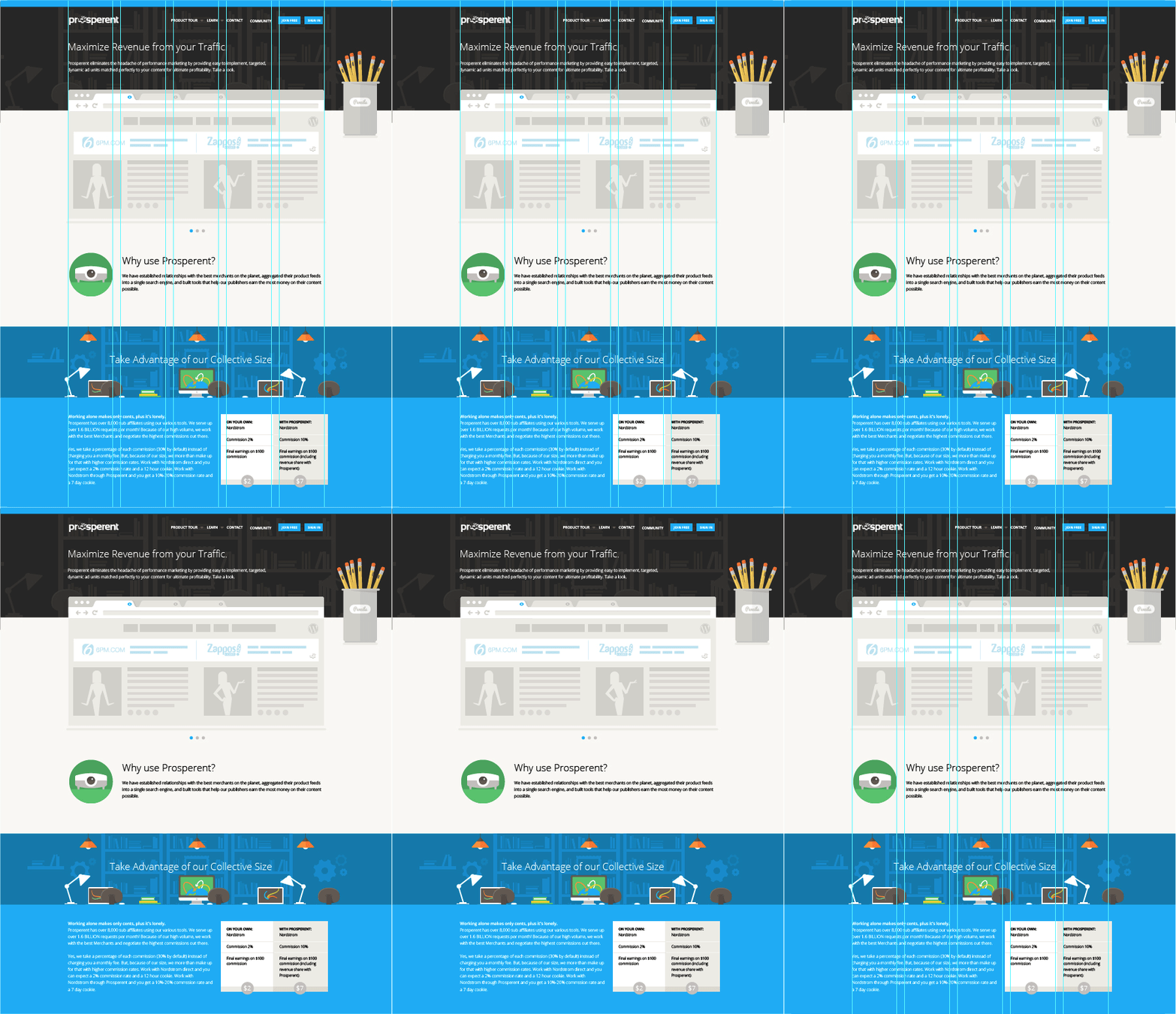
Animation: By adjusting the how many columns the content occupies I can call attention in any order, no matter where the content falls on the page.
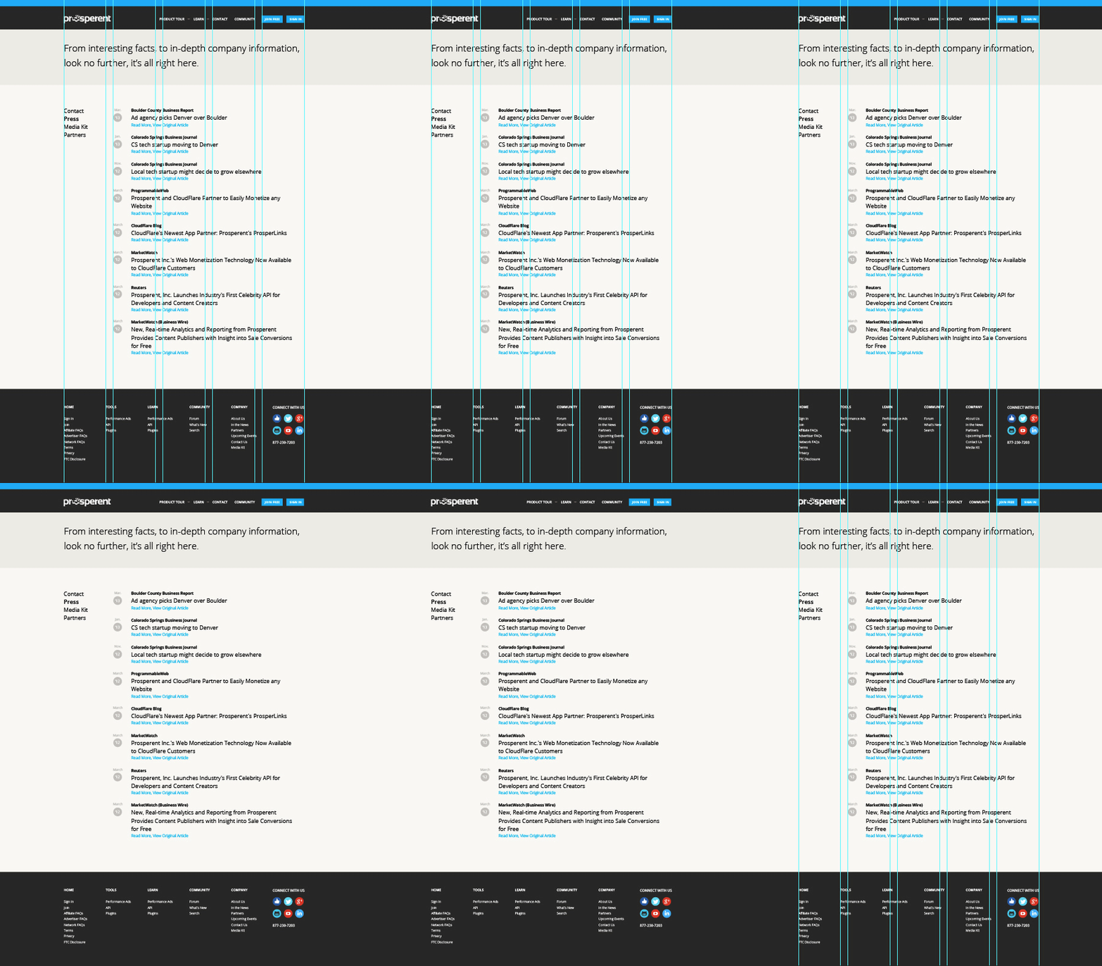
Animation: A viewer assesses the hierarchy of the content that’s visible at any given moment. Since this website design is very tall and cannot all be seen simultaneously, hierarchy is applied within individual sections too.
Animation
2. Repetition
Repetition is a classic when it comes to design principles. From color, to shape and size, repetition can involve repeating any variety of elements. Repetition adds a familiar and comfortable feeling to a design—although, when used in excess, a design tends to become unimaginative, and predictable.
Repetition in action
The horizontal colors are used to distinguish each section while still maintaining some sense of unity between them, which is important for overall cohesion.
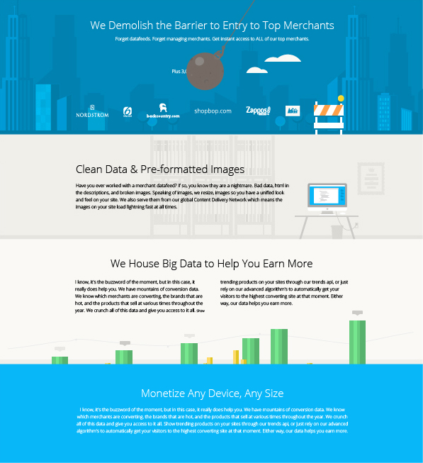
Individual elements can have multiple design principles applied to them. Below, repetition is applied within the horizontal shape by repeating bookcases and stacks of books.

These simplistic illustrations have very similar qualities, another form of repetition.

3. Contrast
Contrast is the marked difference between two or more elements. Contrast can be a difference in color warm vs. cool, a difference in style, flat vs. 3d, or even a difference in shape.
Contrast in action
To leverage contrast in this design, I added a generous use of circular shapes. These shapes provide a welcomed break in the somewhat formulaic use of horizontal stripes. Large circles offset by smaller circles add more variety and interest.


Contrast not only in shape, but color and text size too! The angular lines of the text when compared with the circular illustrations complement each other nicely.

4. Shape
Shape is one of the most ambiguous design principles. It’s a separate category but applies to all other design principles. In other words, anything that you create is a shape.
Shape in action
The page below incorporates an assortment of icons that all seem to work very well together. This isn’t by chance however. Aside from color (more on that next,) shape is fundamental in creating cohesive and interesting icons.
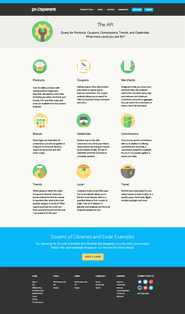
Upon closer inspection, you can see how the variety of shapes interact with one another. Straight lines paired with curves look great together.

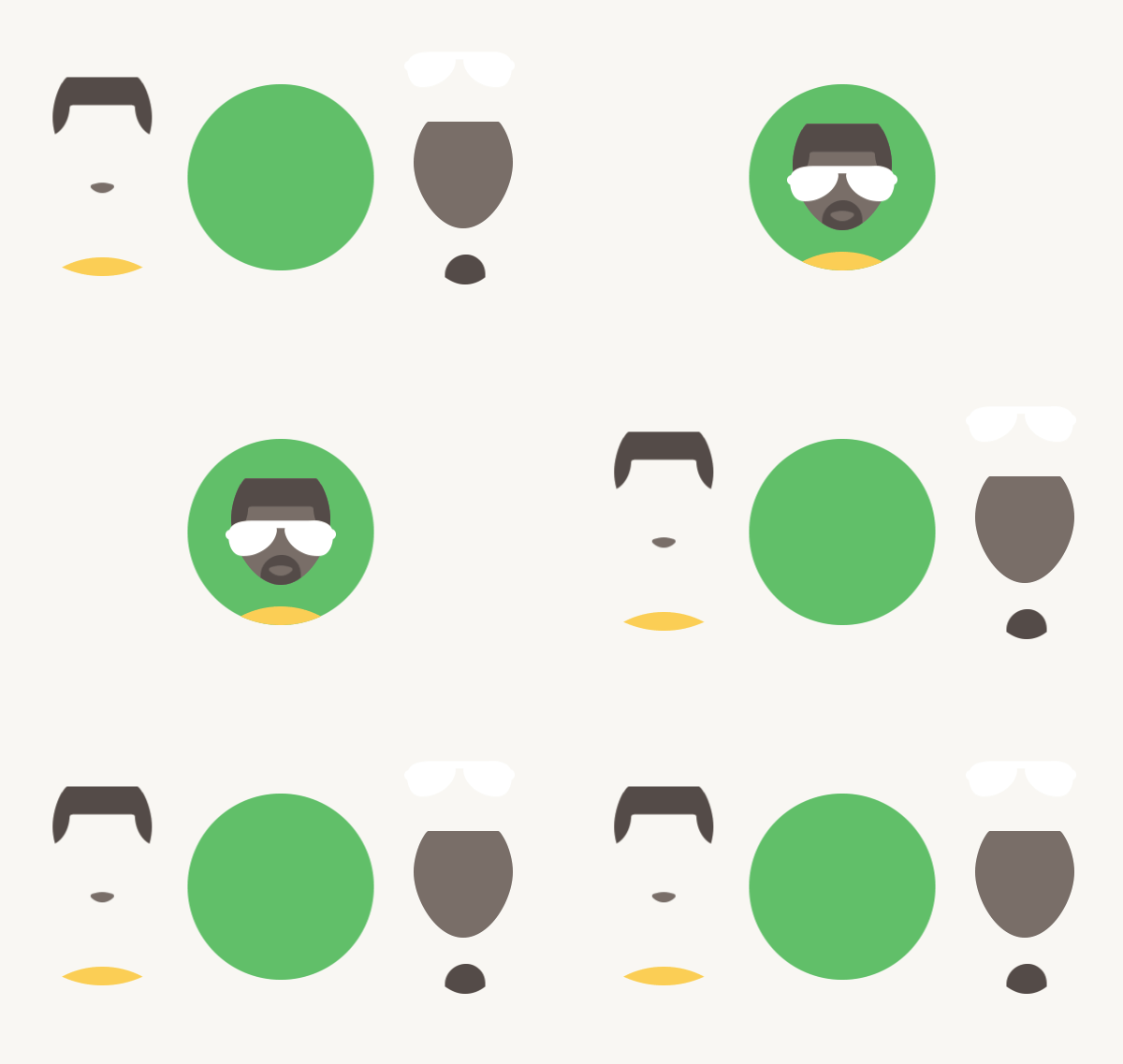
Animation: At the most fundamental level, creating a dynamic looking icon merely requires combining basic shapes in interesting ways.
5. Color
Color is one of those design principles that has different meanings depending upon your reference point. For example, brides in United States culture wear white to weddings while it’s not unusual for a bride in Asia to wear red. Or, for example, in the 19th century pink was considered masculine, as it reflected a watered down shade of red (the color of blood drawn during war) while blue was regarded as feminine. Having said this, it’s obvious why a good understanding and implementation of color theory will benefit your design.
From entertainment, to social media, to automotive, blue is one of the most widely used colors, no matter the industry. In color theory, blue can describe power, tranquility, and faith, to name a few things.
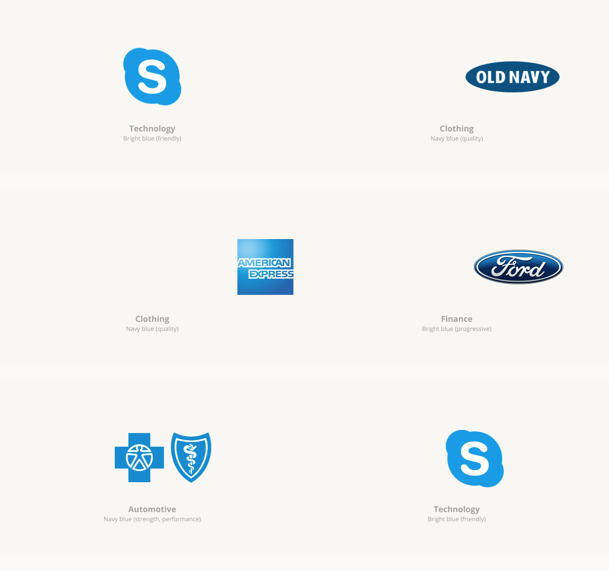
Animation: A variety of industries and companies use blue in varying degrees to suit their brand and message:
Color in action
When designing, the overall feeling that color evokes can be dramatically altered by changing the value (lightness) and chroma (saturation) of a color. Blue is one of the most versatile colors there is. In this design, I’m using blue as a primary color with green, tan, yellow, and orange in varying degrees as supporting, and accent colors. The accent colors further help define the feeling that I want to leave the viewer with.

Since my color palette is fairly limited, I used specific elements that matched my color scheme.

Simple but sporadic use of the green accent color weaves together isolated elements.

6. Texture
Texture is defined as the surface or feeling of an object. On screen, texture is simulated.
While it requires no introduction, flat design is all the rage. Although, make no mistake, flat design isn’t new. It’s simply a term that has been attributed to a look that’s popular right now. “Flat design” will continue long after the trend has passed.
Texture in action
In this design, texture, or the lack thereof, is instrumental in achieving a simplistic look. Since this design is for a progressive affiliate advertising company that needed a modern look, a flat design was employed.
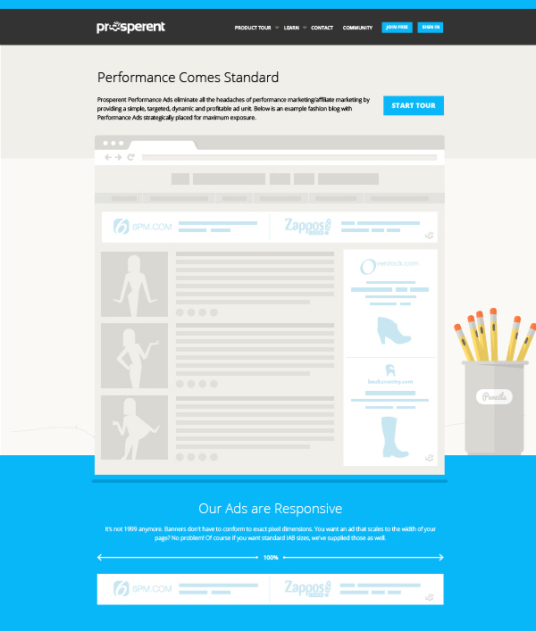
Common elements like pencils are devoid of heavy shading, giving them a light, and clean look.

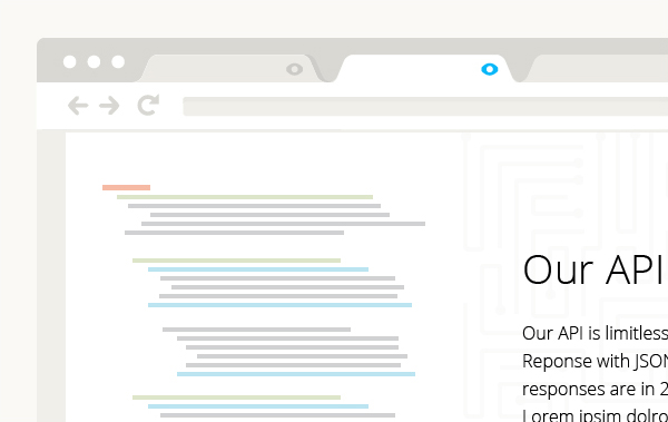
The browser window is distilled down to its simplest form, putting the focus more squarely on the content, and message.
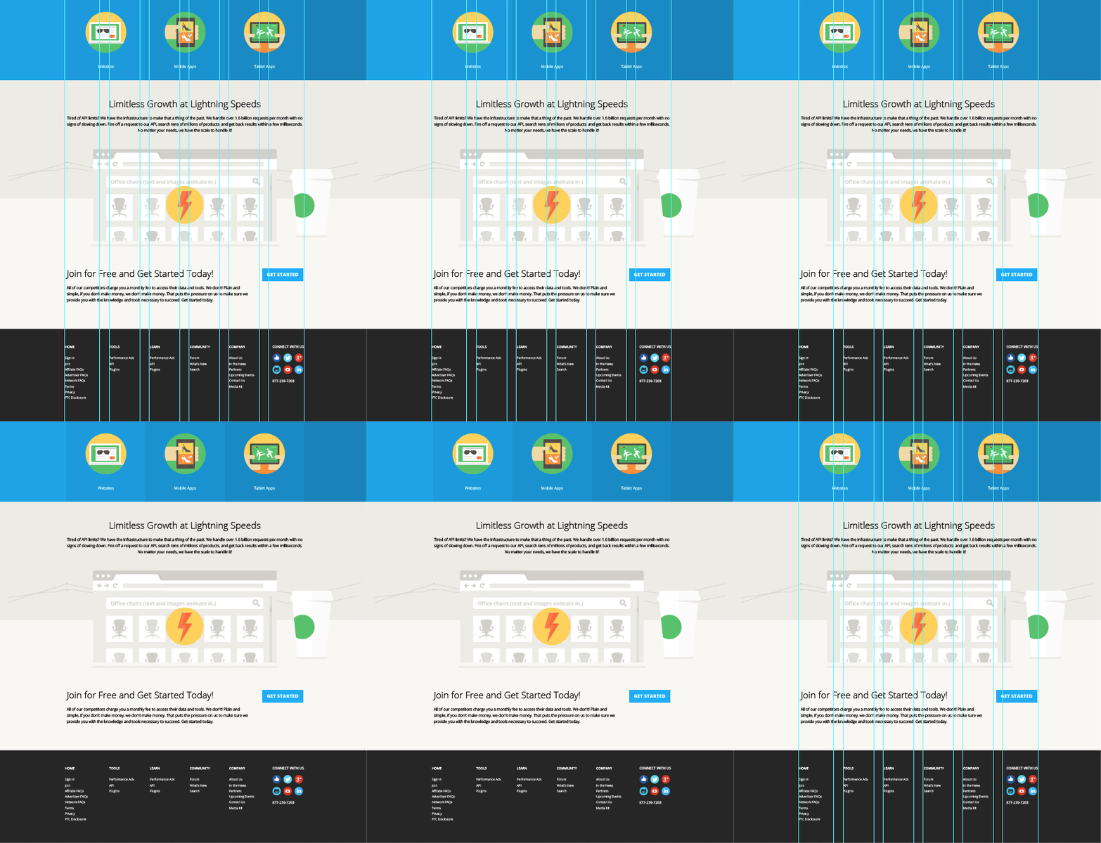
An office environment is illustrated in its most raw form, adding interest while not overpowering essential information.

See the design principles in action
Take a look at www.prosperent.com
7. Apply your skills
As with any design element, it’s important to have solid reasons why you include it. Design decisions should always be made based on appropriateness for a particular cause. Although, client mandate may also play a role. When you substantiate your decisions with reasoning greater than personal preference, they work to your advantage and become harder to refute.
The design principles I covered are excellent fundamentals to include in your work, but remember that good design is about marrying form and function. As your experience increases, you’ll learn when to follow the rules and when to break them.
Now, get designing!
Jonathan Patterson’s Social Profiles
![]() Follow him on Twitter: @Jon_Patterson
Follow him on Twitter: @Jon_Patterson
![]() Follow him on Dribbble: dribbble.com/jon_patterson
Follow him on Dribbble: dribbble.com/jon_patterson




Im thankful for the article.Much thanks again. Awesome.
Great tips…these definitely help me brainstorm for future design projects. Sometimes I look at designs I make and I ask myself…”So what was the purpose of this?”…with these tips you gave I can now have a better concept in mind before randomly creating a project.