

In today’s tutorial, you’ll learn how to create a complex gold text effect which includes a reflection, dropping shadows, and highlights. These all can be created with the help of the most powerful tool available in Adobe Illustrator–the Appearance panel. You learn how to create this graphic style and then apply it to editable text objects. Have fun learning our new vector tutorial!
Tutorial Details: Gold Text Effect
- Program: Adobe Illustrator CC
- Difficulty: Beginner – Intermediate
- Topics Covered: Appearance panel, Scatter brush, live effects
- Estimated Completion Time: 20 minutes
Final Image: Gold Text Effect

Step 1: Gold Text Effect
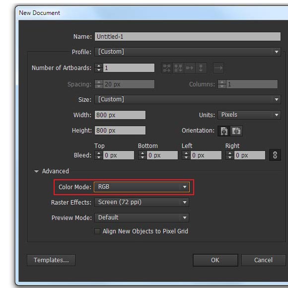
Start Adobe Illustrator, then go to the File > New…. to begin working on your gold text effect. In the opened dialog box choose the RGB color mode, the size of the artboard doesn’t matter since we’ll create a graphic style.
Step 2
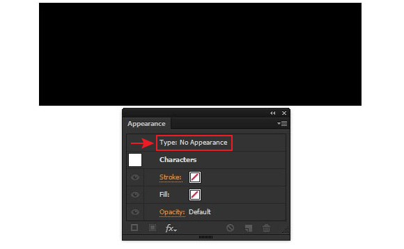
Take the Type Tool (T) and type any word in upper case. I used the Myriad Pro font and 180pt font size for such purposes.
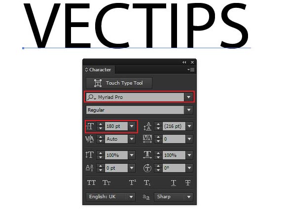
Select a word, then click twice on the Characters in the Appearance panel (Window > Appearance).
Select the Fill attribute in the panel, then delete it by clicking on the Trash icon.
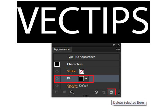
The letters disappeared, don’t worry–that’s the way it should be. Click twice on Type: No Appearance.
Step 3
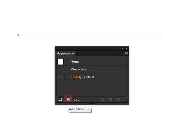
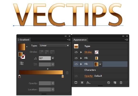
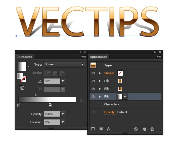
Click on Add New Fill button in the Appearance panel.
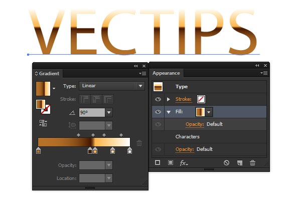
To the fill, apply a linear gradient using the Gradient palette consisting of five colors: white R=255 G=255 B=255, light-yellow R=252 G=220 B=161, yellow R=255 G=182 B=77, brown R=69 G=24 B=1 and light-brown R=181 G=113 B=40.
Step 4
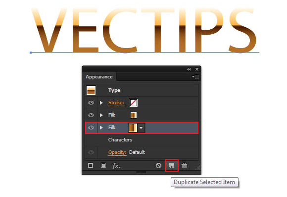
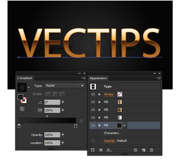
Click on Duplicate Selected Item button in the Appearance panel, then select the lower fill.
Note that while working in the Appearance panel, the object should remain selected. Go to the Effect > Path > Offset Path… and set 2px for the Offset value.
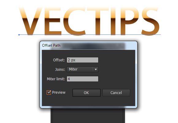
Replace the gradient of lower fill with a vertical gradient which consists of yellow R=255 G=182 B=77 and brown R=69 G=24 B=1.
Step 5
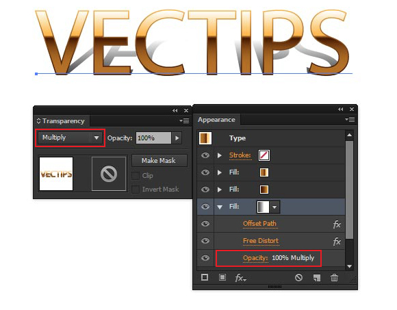
Click on the Duplicate Selected Item button in the Appearance panel, then select the lower fill.
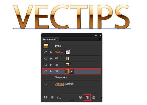
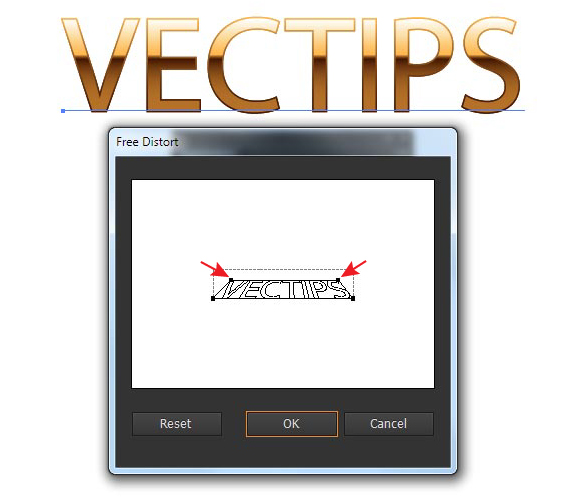
Go to the Effect > Distort & Transform > Free Distort…. Shift the upper vertices of the text bounding box down and to the center as it is indicated on the figure below, then click the OK button.
Replace the gradient of the lower fill with a vertical linear gradient from white to grey R=64 G=64 B=64.
Apply the Multiply blending mode to this fill. This can be done in the Transparency panel or directly in the Appearance panel. In this step, we’ve manually created a drop shadow effect from the text.
Step 6
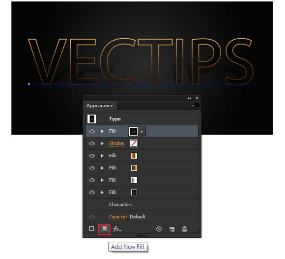
Click on the Add New Fill button in the Appearance panel.
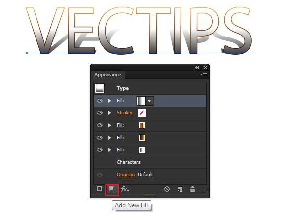
Move the new fill above all attributes.
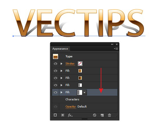
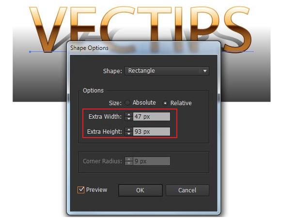
Keep the lower fill selected and go to the Object > Convert to Shape > Rectangle…. Set the Extra Width and Extra Height value in the opened dialog box.
Replace the gradient of the lower fill with a radial gradient from dark grey R=43 G=43 B=43 to black R=5 G=5 B=5.
There you have it! We’ve now created the background in this step.
Step 7
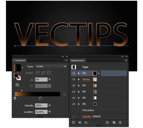
Click on the Add New Fill button in the Appearance panel.
Replace the gradient of the upper fill with a vertical linear gradient from brown R=181 G=113 B=40 to black R=0 G=0 B=0.
Now go to the Effect > Distort & Transform > Transform…. In the opened dialog box select Reflect Y option, and click on the lower white square in the reference point locator.
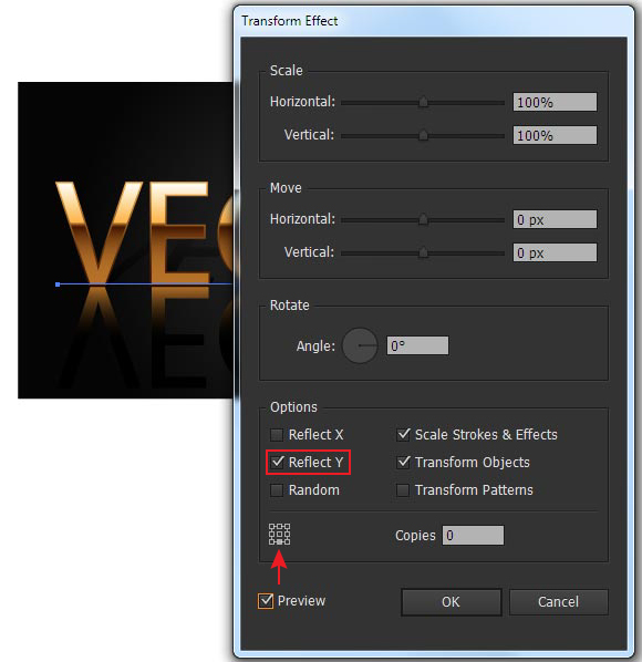
Apply the Screen blending mode to the fill and reduce the opacity to 35%
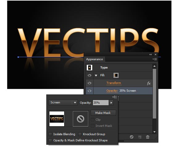
We’ve created a text reflection in this step.
Step 8
Choose grey R=153 G=153 B=153 for the stroke and set a 2px width in the Appearance panel.
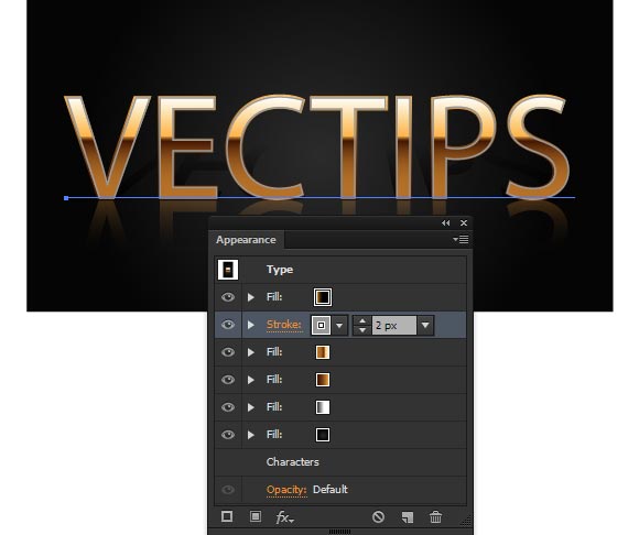
Apply the Multiply blending mode to the stroke.
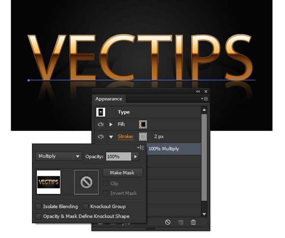
Thereby we’ve created a bevel on the edge of letters.
Step 9
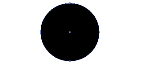
With the help of the Ellipse Tool (L), create a 20x20px circle with a black fill R=0 G=0 B=0 and no stroke.
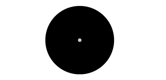
Now create a second circle – 1x1px with a light-grey stroke R=204 G=204 B=204. Centers of both circles should match.
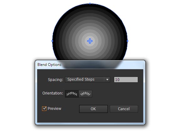
Select both circles. Then go to the Object > Blend > Make, and next to Object > Blend > Blend Options… and set 10 specified steps.
Step 10
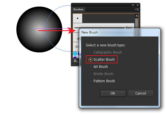
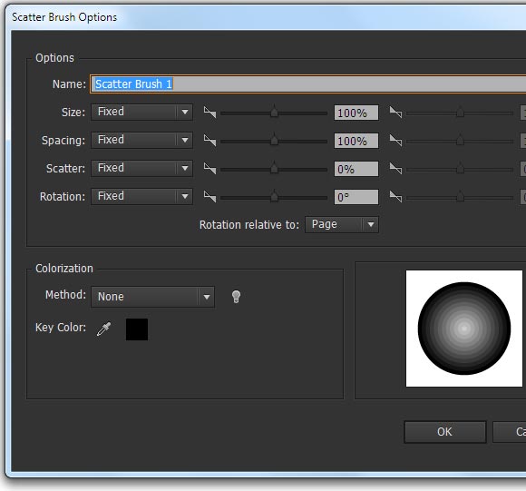
Drag the blend object into the Brushes panel (Window> Brushes). In the opened dialog box, select the Scatter Brush.
Save the brush without changing the default settings.
Step 11
Select the text, then click on the Add New Stroke button in the Appearance panel.
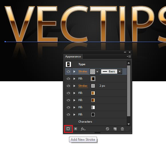
Apply a brush to the stroke which was created in previous step.
Click twice on the Scatter brush icon in the Brushes panel in order to get access to the parameters of the brush. Set 4000% for Spacing value, and click OK.
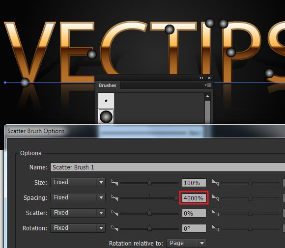
Click on the Apply to Stroke in the dialog box.
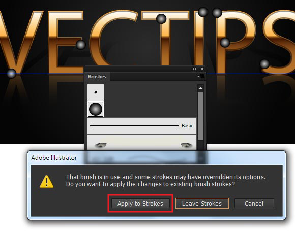
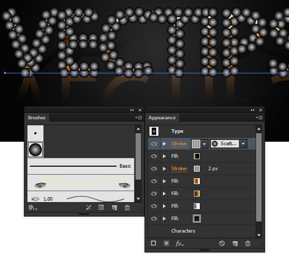
Set the Color Dodge blending mode for this stroke.
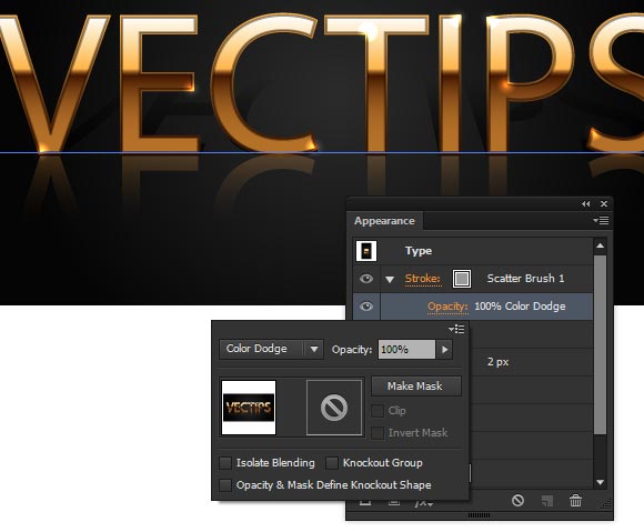
We’ve created highlights on our letters in this step.
Step 12
And finally, when the gold text effect is ready, we can save it as a graphic style. Open the Graphic Style panel (Window > Graphic Style), select the text, then choose the New Graphic Style in the fly-out menu of the panel.
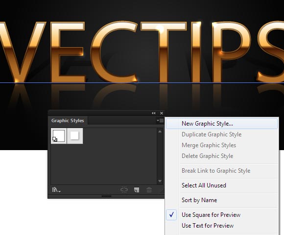
Now this graphic style can be applied to any editable text. All I have left to say to you is bye-bye!


Author: Iaroslav Lazunov
My name is Iaroslav Lazunov, I am a graphic designer from Ukraine. I am glad that I finally found the job in my life that I can share my knowledge and experiments with you in my tutorials. Follow me on Twitter or visit my blog Vectorboom.com


Thanks
Excellent article. This article is very helpful and effective for any designer. I like your website and appreciate your writing. Every day I will check your website and collected new information on your site. Thanks for sharing great information with us.
All are presentations very helpful, definitely help for us. Thanks for sharing great experience.
Very Nice work i like it
Great job! I have a problem. Adobe tells that selected composition contains an element that scatter brusch cannot be applied to. 🙁 Could you tell me, what am I doing wrong?
nice effect
Vectorize tutorial is hard to clarify but you share it very easily and it’s helping me most. Thanks.
Amazing text effect, It’s really looking awesome, Thank you so much.
amazing tutorial. thank you. Such clear good instructions!!
You should upload an illustrator file that can be used as a template, thanks
A great tutorial, especially one that can be saved as a layer style, is particularly efficient for future work
Thank you for this nice tutorial – it was very useful for me.
I have one comment though – I might be wrong, but it seems like you can’t just create brush from the blend object. You need to expand it first. I think this is an important step that’s worth mentioning in the tutorial to save people’s time and nerves :).
I cant do this with cs3 version right?
It’s a well presentation and will definitely help to learn the style of art.
Thanks, great… but I’m looking for some tutorials for example how to make potion etc. This kind of tutorials are missing here. For example one tutorial about making gold bars, hatchet this are really perfect tutorials.
Thanks for a great tutorial, Iaroslav!
Small typo!
As I pointed out to Stani, where it says:
“Now create a second circle – 1x1px with a light-grey STROKE R=204 G=204 B=204. Centers of both circles should match.”
It should actually be be a light grey FILL.
Great tutorial!! 😀
Didn’t know anything about illustrator, now I learned thing or two.
Yay! Thank you! This looks amazing! Can’t wait to try it out!
may i have its ai file???/
Great work! Thanks for the help!
~ Silly-Funny Books
This is an awesome tutorial THANK YOU. I did however struggled on Step 9. I just could not get the blend the same as yours. After 1 hours I figured it out. My process: I created a circle according to your specification 20px x 20 px, then i put a black fill (R=0 G=0 B=0 ) with NO stroke. Then I created a smaller circle 1px x 1px, i gave it a grey fill (R =204 G=204 B=204) and NO stroke. I grabbed the small circle with the selection tool and centered it on top of the bigger circle. Then, I clicked outside of the circle(s) (they should not be selected). Then i just clicked on the Blend Tool (left side on the tool bar, above the Sprayer Tool) i clicked on the small circle first and then on the bigger circle and got the matching blend on your tutorial.
That’s because of a small typo, where it says,
“Now create a second circle – 1x1px with a light-grey STROKE R=204 G=204 B=204. Centers of both circles should match.”
You actually need it to be a light grey FILL.
Great tutorial!! 😀
You’re a genius. An EDITABLE text gold effect. Genius. Genius. Genius. Thank you.
This tutorial was perfect, except the last step. When I set the stroke to colour dodge, the circles stay white and grey on top of my gold text. I have tried to fix it without success. Do you have any suggestions? Thank you!
Awesome work , I can confirm in CC you need to use Effect > Convert to Shape in Step6. Best thing to do is follow the steps exactly, then when your Happy you can play around with them to suit any project, for example if you need a far smaller font size than 180pt.
That’s was awesome tutorial. The steps couldn’t have been anymore clearer. Thank you.
it was awesome but kinda hard but i got it
Nice effect 🙂
But to convert to shape should it be Effect > Convert to Shape? I am using Illustrator CC could be the reason.