 We wanted to bring this awesome tutorial back up since it’s springtime again! Together we’ll create a vintage-style logo illustration from open-source fonts and stock images to fit on current design trends. Let’s dive right in to this hipster logo design!
Tutorial Details: Trendy Vintage Style Logo
- Program: Adobe Illustrator CS6 – CC
- Difficulty: Intermediate
- Topics Covered: Typography, Effects, Drawing Skills
- Estimated Completion Time: 25 Minutes
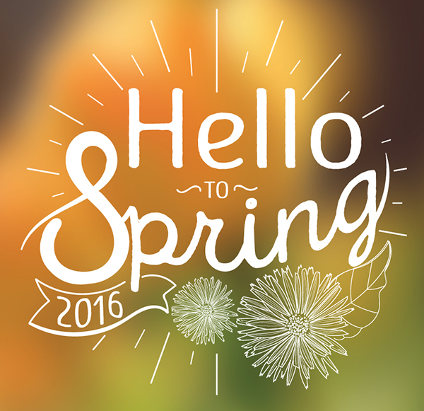
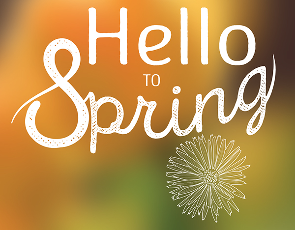
What We’ll Create
Step 1
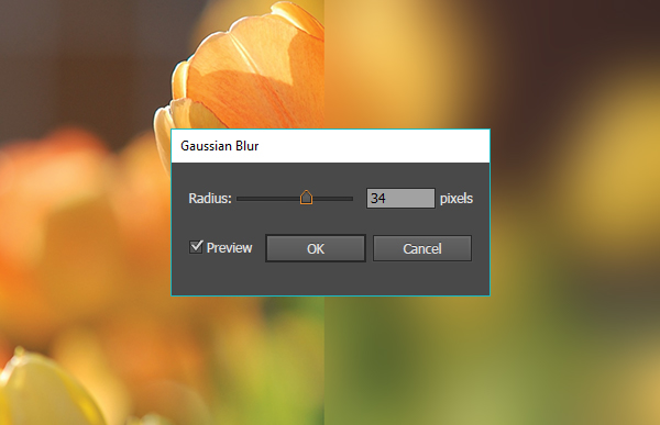
To start, import a stock photo into Adobe Illustrator. The tulip image below was downloaded from Unsplash. Under Effect > Blur > Gaussian Blur, apply a blur effect of 34 pixels or so. This will give you a bright and unobtrusive background for your design.
Step 2
With the Rectangle Tool, draw a square over your stock object. Select both and Create a Clipping Mask by hitting Control-7. Now you have a perfect space in which to create your logo design!

Step 3
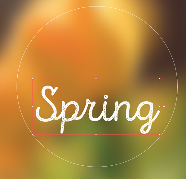
In order to help you define your logo’s space, draw a circle with the Ellipse Tool. We’ll delete this circle later, but for now it’ll give us a place in which to create our illustration’s composition.
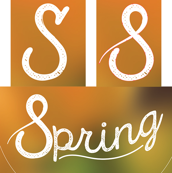
Using the Type Tool, write out your word of choice in the script font of your choice. I’ve used Intro Script R H2 Base.
Step 4
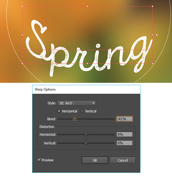
Select the word “Spring” and go to Effect > Warp > Arch to apply a Horizontal Bend of -41% or so. My goal is to match the bend of the circle.
Step 5
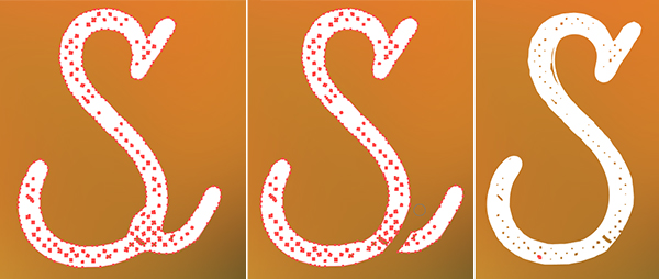
Go to Object and Expand Appearance so your warp effect is permanent. Then, Expand your type object. Ungroup and delete the S. We’ll be using a slightly different S for the final design.

Step 6
Once again, type out the letter S with the Intro Script R H2 Base font. Convert it to an outline. Lock your other objects in the Layers panel so you’re only working with the letter S. Using the Eraser Tool erase the connecting shape from the S to other letters as well as the serif on the top curve.
Step 7
Use the drawing tool of your choice (I’m using the Blob Brush Tool, but I also reccomend the Pen or Pencil Tool) to draw a new curve from the top of the S that swings downward. Use the Smooth Tool to help smooth out any rough edges in the path of your object.
Once satisfied with the changes you made to the S, place it with the rest of your word. You can also alter any of the other letters or even use a different script font for your S if you prefer.
Step 8
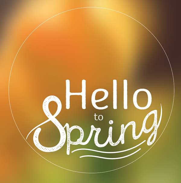
My other words, “Hello” and “to” are simpler. The sans-serif variation of the Intro Rust font was used so focus is kept on the theme of “spring”. Also note how much smaller each word is compared to “Spring” as well as its placement. You want it to be readable while still dynamic in placement.
Step 9
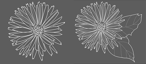
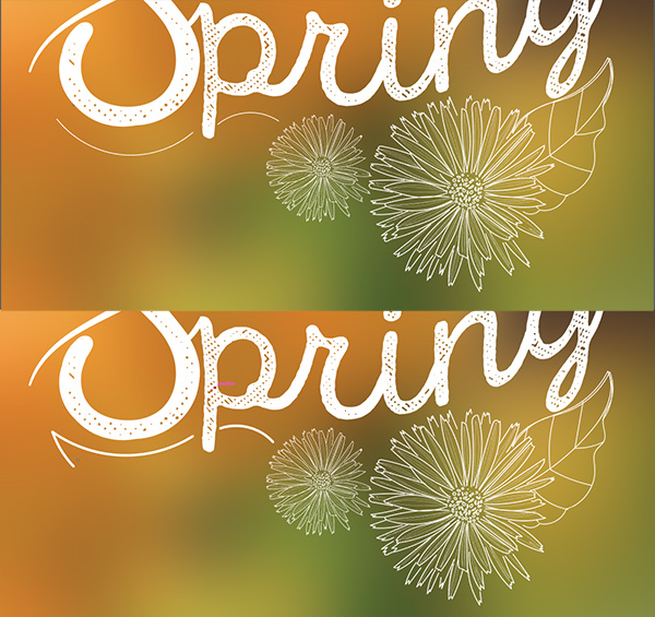
Let’s add some nature illustrations to our design! In order to speed this process up, use a stock photo (mine is a flower image from Unsplash) and trace its elements with the drawing tool of your choice.
I used the Paintbrush Tool to outline each petal of the flower. This allows me to change the path’s width in the Stroke panel or change the calligraphic brush used in case I want the style of the flower to change before expanding my paths.

Step 10
Fill in the details of the flower with smaller brushes and thinner strokes. Add other flowers or leaves in order to fill in the design, either drawing freehand or from another stock image. Once satisfied with your illustration, Expand the paths so you can easily Scale the illustration as needed.
Step 11
Place your nature illustration(s) at the bottom of the design. At this point I’ve deleted my circle that defined my compositional boundaries, but you may still wish to use it in order to gather illustrated elements along the bottom edge.
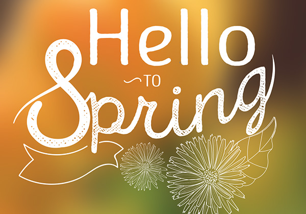
Step 12
Along with other flower shapes, I wanted to add a banner to the bottom. Using the drawing tool of your choice, draw two curving lines beneath the “S” and “P” of the word “Spring”. Notice how the line breaks at the letter “P”. Start drawing the banner’s tail and thicken the stroke’s line up a bit.
Step 13
Complete the banner. Notice how thick it is. This will allow us to write something inside of it. Also note how the bottom edge of the banner follows the contour of the top edge as well as how it flows into the curve of the flower placement.
I capitalized the word “TO” and have drawn a small curved line on either side of the word in order to fill in the space between “Hello” and “Spring” a bit more. The letter “G” curves upward more as well. All of this is in response to the circle we drew at the beginning of the tutorial.
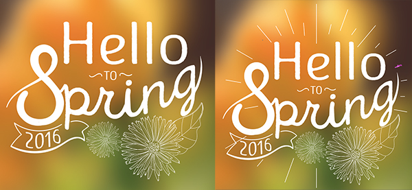
Step 14
Using the Type Tool write in the year in the banner. Warp the text with the Flag effect so it follows the contour of the banner (use the Preview option in order to make sure it fits) and then Expand the type and its Appearance.

Step 15
As a final touch, use the Line Segment Tool to draw short lines radiation outward from the center of the design. Try to delete or limit any overlapping lines and vary the length so every other line is long and every other line is short.
Conclusion
Finalize your design and Expand all stroked paths into objects. Group your design together when finished in order to keep your document organized. Consider more complex phrases, logos, and illustrations in this style. Now that you have the basic technique down, there’s no end to the vintage style pieces you can create!
Author: Mary Winkler
Mary works under the brand Acrylicana® and has illustrated and designed for companies like Disney, Jakks Pacific, Jada Toys, Envato, and more. Check out Acrylicana.com for artwork, tutorials, and more. Follow Acrylicana on Instagram, Facebook, and Twitter!


Very good post.Really looking forward to read more. Keep writing.