 Whether you’re making a logo from scratch or using digital assets in order to do so, here are five top tips for perfect geometric logo vector creation!
Tutorial Details: Perfect Geometric Logo Vector
- Program: Adobe Illustrator CS – CC
- Difficulty: Intermediate
- Topics Covered: Design Theory, Shape Building, Tools
- Estimated Completion Time: 15 Minutes
Final Image: Perfect Geometric Logo Vector
1. Build From Basic Shapes
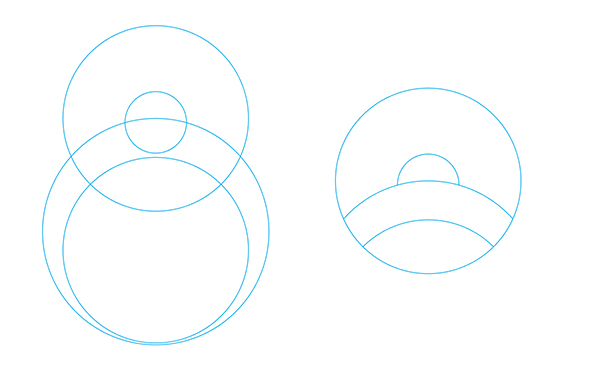
Building your logo design from basic shapes ensures the accuracy of your logo’s elements. Circles, squares, polygons, and more all build up an aesthetically pleasing and fantastically designed logo compared to something haphazardly sketched out. Notice how the beginnings of the logo design below is constructed simply from four overlapping circles. They’re all aligned to their vertical centers as well, creating a a design that flows well inside the circular boundary drawn around it.

2. Use Overlapping Elements
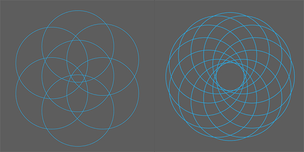
Often complex geometric logo vectors involve a lot of overlapping elements. Begin this simply by overlapping circles and other polygons. Consider the shapes that begin to form when you start overlapping lines or filled objects. Building logos in Adobe Illustrator makes this easy when you can rotate, align, and scale elements quickly and easily from the comfort of the Toolbar.

3. Rotate Shapes for Perfect Placement
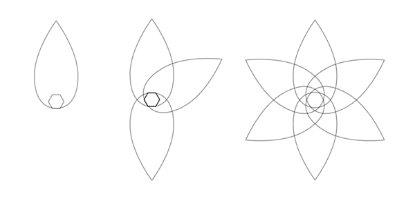
You can overlap elements all you want, but in order to save headaches, using tools like the Rotate Tool will help you place elements perfectly within your geometric logo vector design. Notice the leaf shape below. When overlapped with other leaf shapes it forms a small hexagon in the center. In order to make sure each object is placed perfectly, copies of the leaf were rotated 60° around the hexagon in order to create the fantastic and perfectly aligned final design.

4. Lineart and Grayscale Versions are Key!
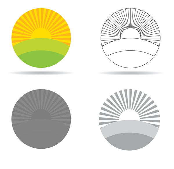
A fantastic colorful logo can be great, but logos aren’t always printed in full color. Often they need to be replicated with a single ink color or a limited color palette. In order to make sure your logo is print-ready for all occasions desaturate your image to see how it would play in grayscale. Notice the third image below: it’s unreadable! It may as well be a single gray circle! Create alternate versions of your logo: full color, gray scale, limited color, line work, and black and white. This way you can see how your work reads in a variety of contexts (including strange tangent lines) and if the impact of the logo is in the design or simply in the colors chosen.

5. Stock Assets Speed Up Design
Sometimes you have a very short deadline with a very small budget. When this happens, start off your geometric logo vector design with a licensed digital asset, such as the logos below. They will speed up your process and give you a starting point to base your logo design or technique after. Whether you’re in need of inspiration or elements in which to manipulate into a completed, unique mark, vector stock is literally an asset to the busy graphic designer and will help for when time is not on your side to meeting that deadline.
Author: Mary Winkler
Mary works under the brand Acrylicana® and has illustrated and designed for companies like Disney, Jakks Pacific, Jada Toys, Envato, and more. Check out Acrylicana.com for artwork, tutorials, and more. Follow Acrylicana on Instagram, Facebook, and Twitter!


its very helpful…
Good ideas and well explained, thank you for taking time to record and share!