 Let’s have some fun with simple shapes and gradients to create a beautiful weather app icon!
Tutorial Details: 6 Quick Steps to Creating a Fantastic Weather App Icon
- Program: Adobe Illustrator CS6 – CC
- Difficulty: Intermediate
- Topics Covered: Design Theory, Shape Building, Compositional Skills
- Estimated Completion Time: 20 Minutes
Final Image: Weather App Icon
![]()
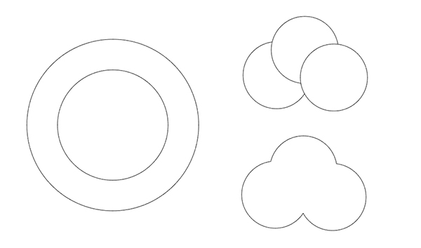
Step 1
Let’s start by building the basic icon. Using the Ellipse Tool (L) draw two circles, one inside the other. This will be the icon base.
For the clouds, Draw a small grouping of circles and Unite them in the Pathfinder panel.
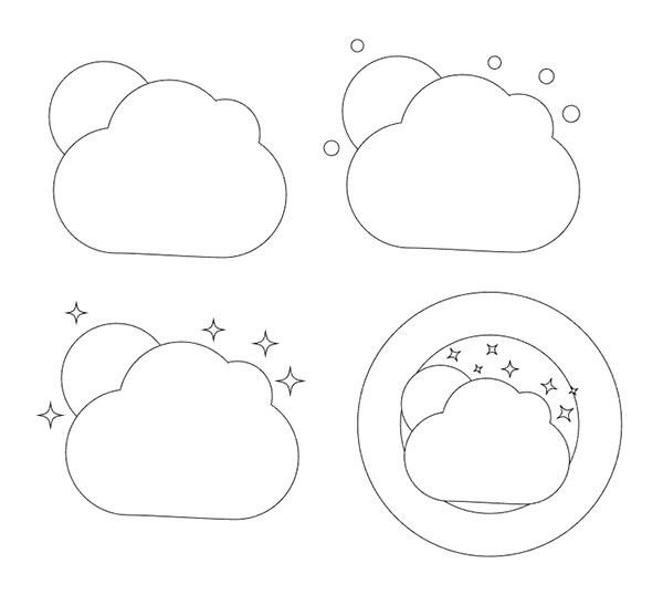
Step 2
Flatten out the bottom of the clouds (delete extraneous anchor points) and place a circle for a sun or moon behind them. Since this is a night scene, I’ll add some stars. Draw circles round the design, select them, and apply a Pucker effect (Effect > Distort & Transform > Pucker & Bloat) to create sparkly stars. Expand their appearance and place the design on top of the circles created earlier. This is our basic icon design.
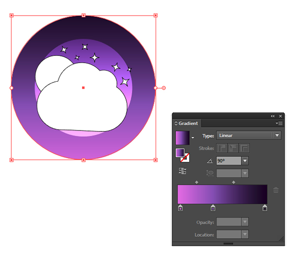
Step 3
Select the largest circle and apply a Linear Gradient going from dark purple to violet to fuchsia, or a similar colorway. Set the smaller circle’s fill color to white and Blending Mode to Screen or Overlay in the Transparency panel.
Step 4
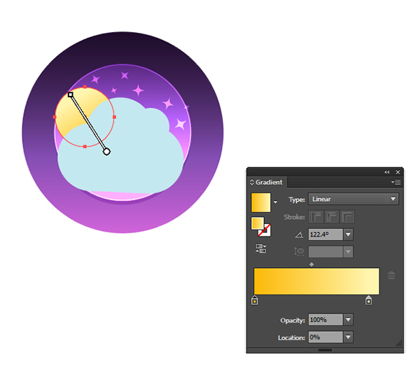
I outlined the smaller circles with a white stroke and set the fill colors of the sparkle stars to white with Blending Modes set to Overlay. Give the moon a Linear Gradient of yellow-orange to yellow and set the cloud’s fill color to light blue.
Step 5
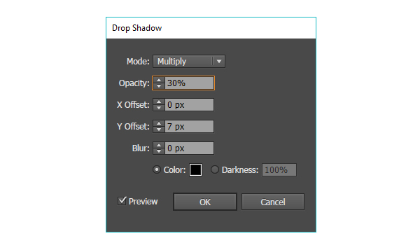
Apply the Drop Shadow seen below to the cloud and the smaller circle to add some dimension to the icon.
Step 6
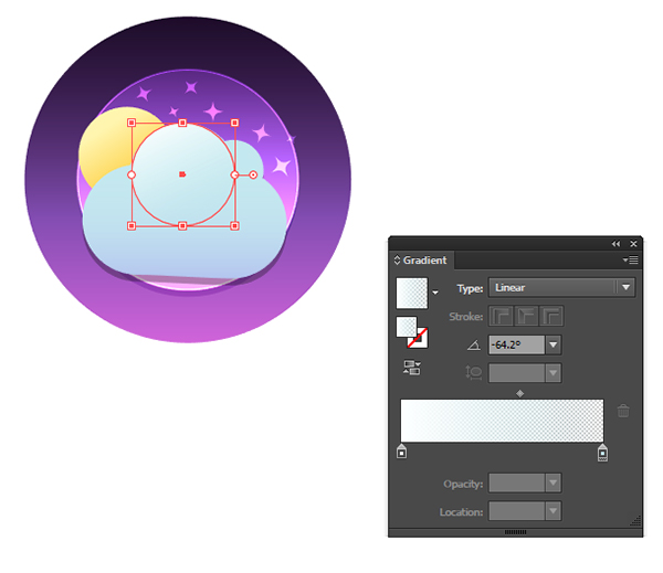
For a bit of dimension in the cloud, draw small circles on each curve of the cloud with a Linear Gradient going from opaque white to transparent blue.
Conclusion
Well done, you’re through! If you like, add a slight outer glow to the sparkly stars or a blend to the circles behind the icon to create a series of circles in different colors and add more texture to the design. What would other weather patterns look like? Share your completed weather app icons in the comment section below!
![]()
Author: Mary Winkler
Mary works under the brand Acrylicana® and has illustrated and designed for companies like Disney, Jakks Pacific, Jada Toys, Envato, and more. Check out Acrylicana.com for artwork, tutorials, and more. Follow Acrylicana on Instagram, Facebook, and Twitter!


Thanks so much for the blog.Much thanks again. Great.
I hope i can be a pro in design vector. This web help me to know very much tutorial. Thank you
Hi, thanks for the tutorial, but I can’t replicate some of the manipulations with the stars.
imgur.com/a/qMkO5
1) Even though I applied overlay blending to them, they all look kinda the same throughout.
2) Also outer glow doesn’t seem to be doing anything when I apply it.