
In this tutorial, we’ll go over how to create a storefront icon, simply by using rectangles, Illustrator Effects, and gradients. This icon is great for use in e-commerce sites, and the techniques in this tutorial can easily be applied to other icons, illustrations, and logos.
Final image: simple storefront icon
Ready to create a storefront icon for your own shop or design? Below is the final vector we will be illustrating.
Tutorial details: how to create a storefront icon
- Program: Adobe Illustrator CS4 – CC
- Difficulty: Beginner / Intermediate
- Topics Covered: Rectangle Tool, Gradients, Bulge Warp
- Estimated Completion Time: 30 min – 1 hour
Step 1
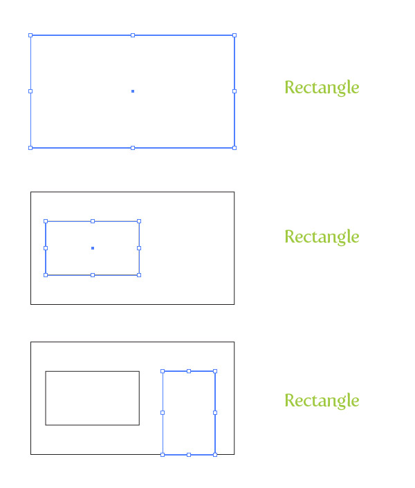
In order to create a storefront icon, first begin a new document and make a rectangle with the Rectangle tool (M). Keep this rectangle about half as long as it is tall. Within the rectangle, create two more rectangles. One will be the window and the second will be a door.
Step 2
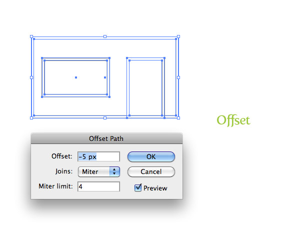
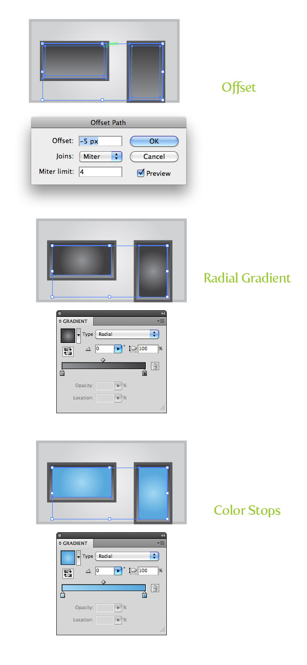
Select all the rectangles and go Object > Path > Offset. In the Offset dialog, change the Offset to -5 px. This value might be different depending on the the original size of your rectangles.
Step 3
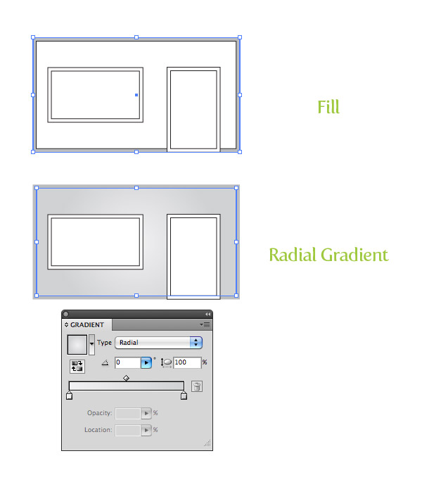
Select your main store shape and fill it with a gray color. Select the offset of the main store shape a fill it with a radial gradient from the Gradient panel. Change the first color stop in the radial gradient to a light gray and the second color stop to a gray slightly lighter than the main store shape color.
Step 4
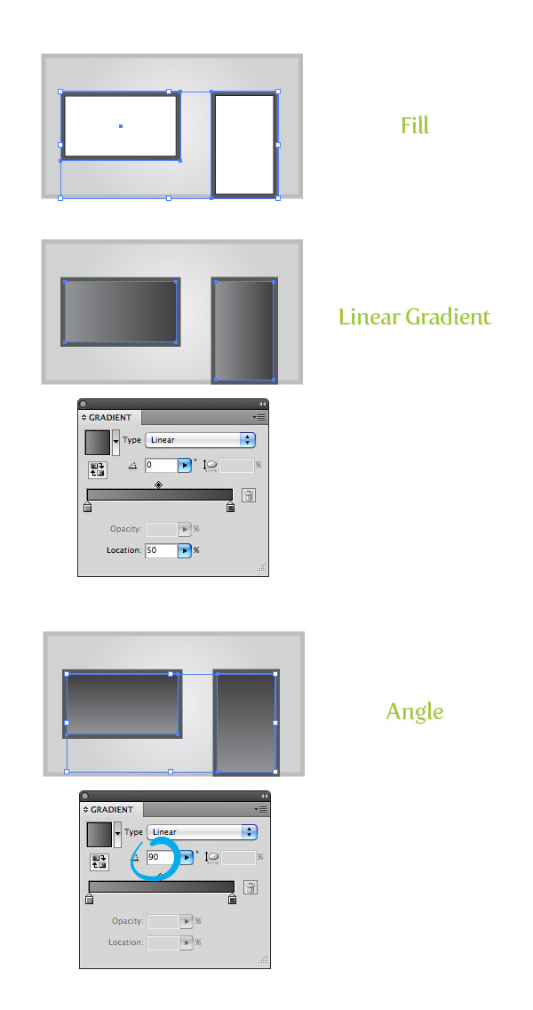
Select both the main window and door shapes as you create your storefront icon, and go ahead and fill them with a dark gray.
Next, select the offset window and door shapes and fill them with a linear gradient. Change the first swatch in the linear gradient to a gray lighter then the original window and door shapes and the second swatch a darker gray then the original window and door shapes.
Change the angle to 90 from the Gradient panel.
Step 5
Select both the window and door offsets and go Object > Path > Offset. In the Offset dialog, change the Offset to -5 px.
Change the fill of the new offset to a radial gradient with the first color stop a light cyan color and the second color stop to a darker cyan color.
Step 6
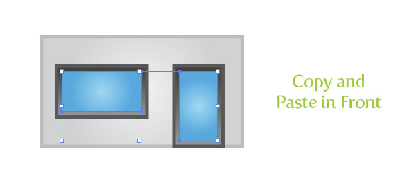
Select both the new offsets and Copy (Command + C) and Paste in Front (F).
Step 7
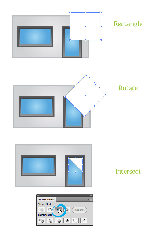
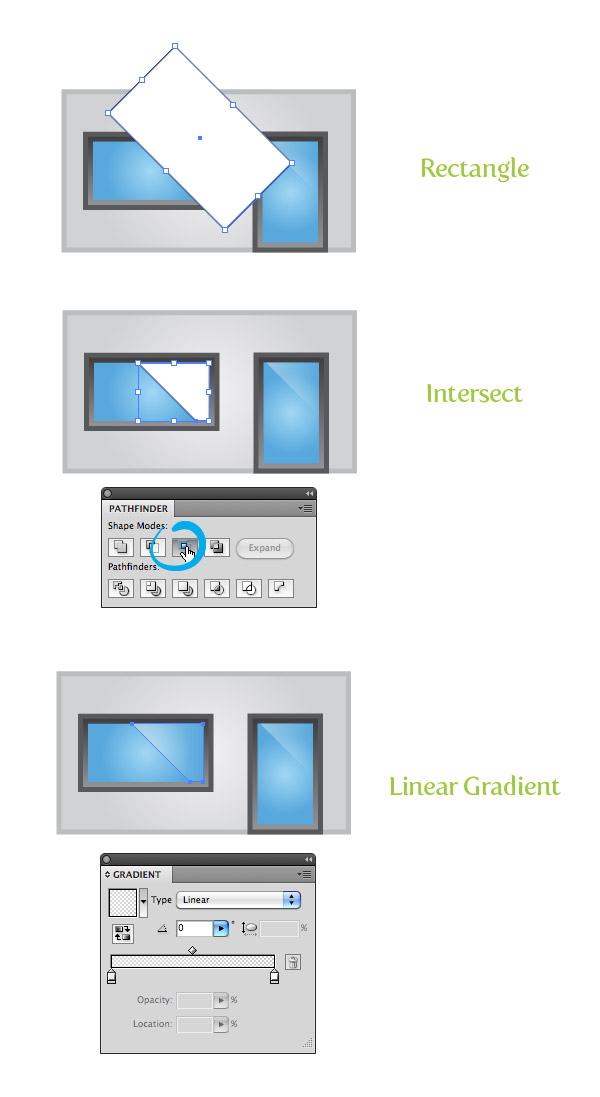
With the Rectangle tool (M), create a rectangle about one half the width of the door. With the Selection tool (V), hold the Shift key and rotate the rectangle 45 degrees.
Place the rotated rectangle over the top right side of the door. Select the cyan door copy and the rectangle and press the Intersect button from the Pathfinder panel.
Step 8
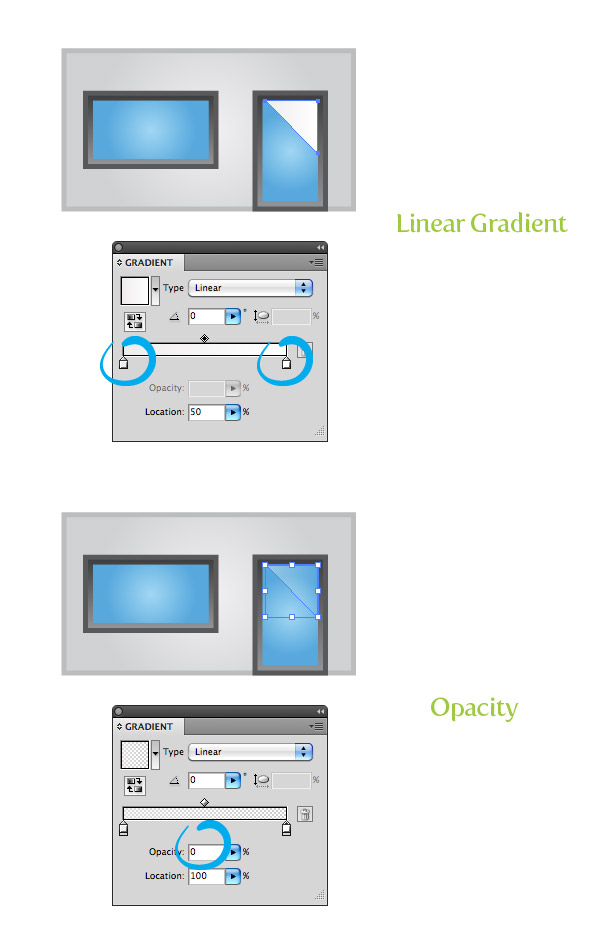
Fill the new intersected shape with a linear gradient and change both color stops to white.
Select the first white color stop and change the Opacity 45 and change the second white color stop’s opacity to 0 from the Gradient panel.
Step 9
Repeat steps 7 and 8 for the window.
Step 10
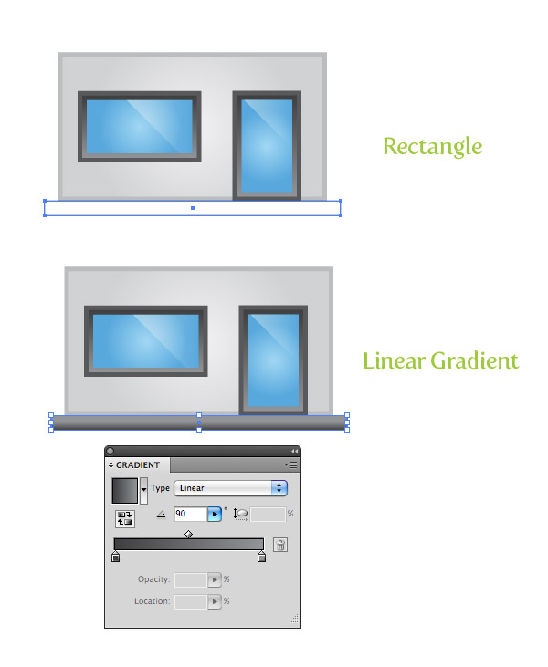
Create a thin rectangle slightly wider then the main store shape and place right below the main store shape. Fill the new rectangle with the same linear gradient as the first offset window and door shapes.
Adjust the gradient with the Gradient tool (G) from top to bottom so the lighter part of the gradient is at the top of the rectangle.
Step 11
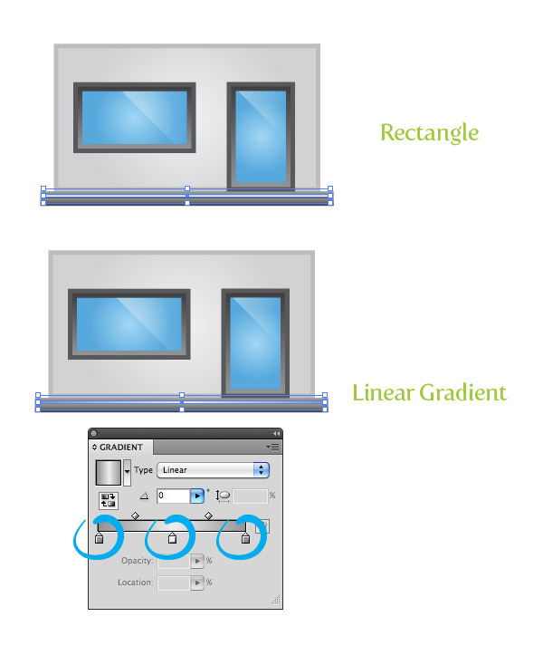
Create another rectangle about one fourth the height of the previous one you made, and place it inside the previous rectangle. Fill the new rectangle with a linear gradient.
For this gradient, we need to add another color stop. Simply click right below the center of the Gradient Slider in the Gradient panel.
Now that there are three color stops, fill the first with the same lighter gray as the previous rectangle, the second color stop white, and the third the same gray as the first color stop.
Step 12
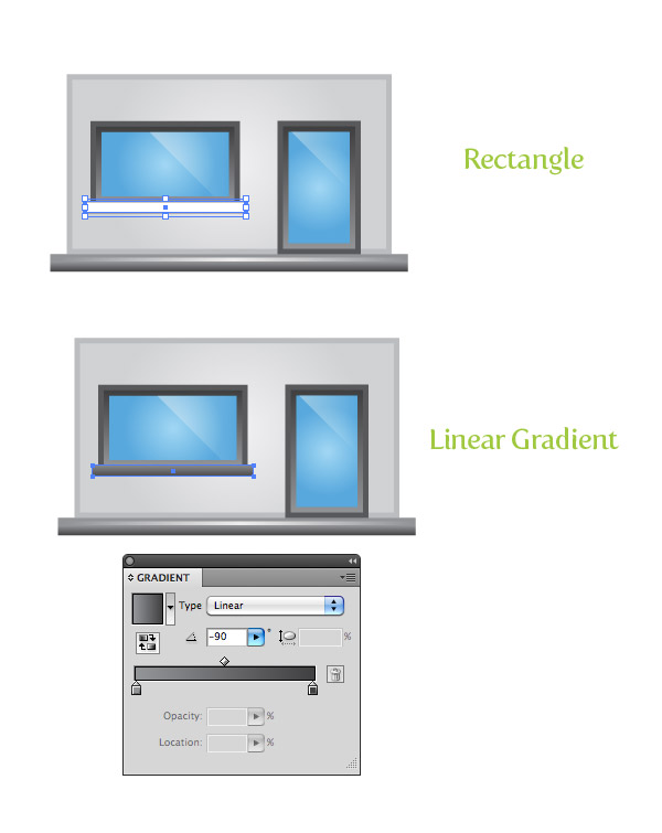
When you create a storefront icon, the trick is to add small, realistic touches. In this step, we’ll add a subtle window apron to make your illustration pop.
To add the apron, create another thin rectangle, fill it will the same gradient as the sidewalk, and place below it the window.
Step 13
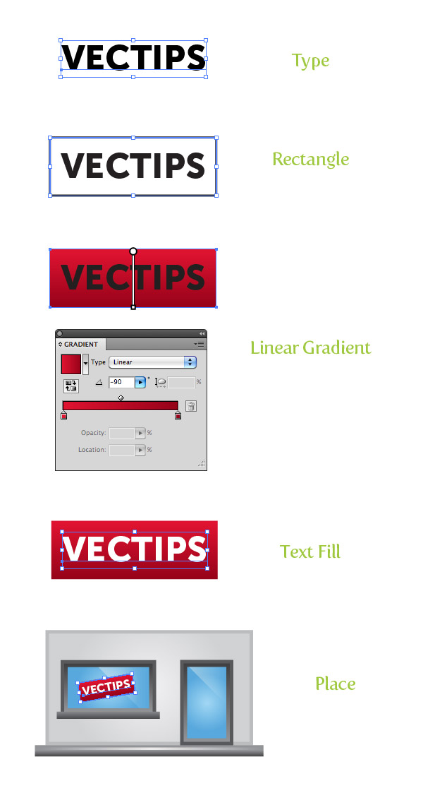
To add some life to our store vector, we can create a simple sign for the window. Start by typing out some text and change the font size to fit within the window.
Create a rectangle slightly bigger than your text and go Object > Arrange > Send Backward (Command + [ ). Fill the rectangle in with a linear gradient. Make the first color stop red and the second a dark red.
Adjust the gradient so the lighter part of it is at the top of the rectangle. Next, fill the text in with white.
To complete the sign, select the text and rectangle, slightly rotate it with the Selection tool (V), and place over the window.
Step 14
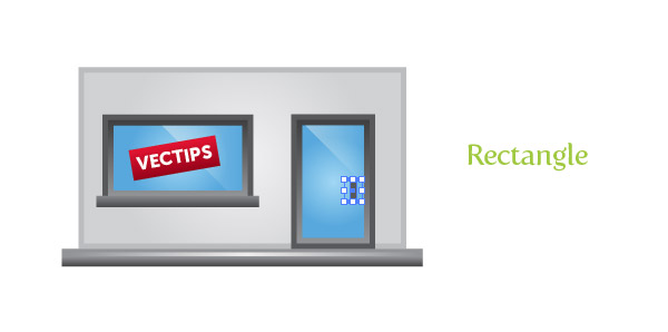
To add just a little more panache, create a small rectangle and fill it with a dark grate color for the door handle.
Step 15
Now on to the store awning (since we can’t create a storefront without a colorful awning!)
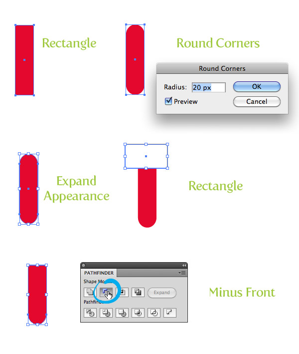
Make a rectangle that is a little taller than the main door shape, half the width of the door, and fill it with red. With the new rectangle selected, go Effect > Stylize > Round Corners.
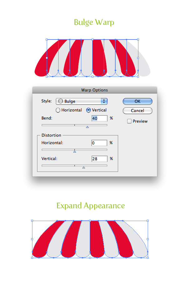
In the Round Corners dialog, change the Radius to 20 px. Like your offsets, this might be bigger or smaller depending on the size of your building. Next, go Object > Expand Appearance.
Create a rectangle to cutoff the top rounded corners of the rectangle, select both shapes, and press the Minus Front button from the Pathfinder panel.
Step 16
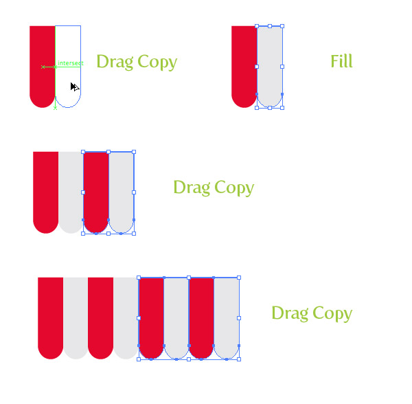
With the Selection tool (V) hold down the Shift key and the Alt / Option key (Shift constrains movements and Alt / Option copies) and drag a copy of the red shape to the right side of the original.
Change the fill of the the copy to a light gray. Select both shapes and drag out copies like you just did, making sure they line up with the right side of the gray shape.
Again, select all the shapes (you should have a total of four) and drag out a copy to the right of the last shapes. You should now have a total of eight shapes.
When dragging out the copies, I like to have Smart Guides enabled ( Command U). Having smart guide activated will snap objects together when editing the shapes, making it a lot easier. (For more info on Smart Guides, check my quick tip The Power of Smart Guides.)
Step 17
You’re over halfway to knowing how to create a storefront icon vector of your very own! Your next step is selecting all the awning shapes and group the objects (Object > Group).
Then go Effects > Warp > Bulge. In the Warp Options dialog, check Vertical, Change the bend to 40, Horizontal Distortion to 0, and the Vertical Distortion to 28. Next, go Object > Expand Appearance.
Step 18
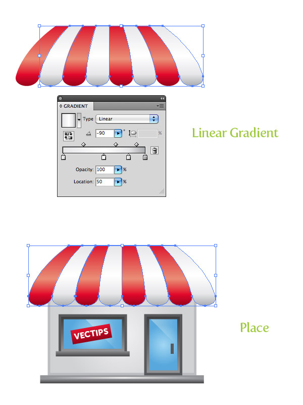
Select the red shapes and fill them with a linear gradient. Add two color stops to the gradient so you have a total of four.
Change the first color stop to red, the second to lighter red, the third to red, and the last on to a dark red. With the Gradient tool (G) adjust the gradient from top to bottom.
In the gradient panel, change the Location of the third color swatch to 80 and the location of the second color stop to 55.
Step 19
Select the gray shapes in the awning and repeat the previous steps, but change the first color stop to a light gray, the second to white, third to light gray, and the fourth to gray. Place all the awning shapes over the top of the store.
Step 20
Select the main store body shape, Copy (Command C ), and Paste in Front (Command + F). Select all the awning shapes, Copy (Command C ), and Paste in Back (Command + B).
With the shapes still selected, move them down slightly and Group (Command G) them together.
Select the copied awning shapes and the copied building shape, hold down the Alt / Option key, press the Intersect button from the Pathfinder panel, and then press the Expand button from the Pathfinder panel.
Fill the new shape with a linear gradient, with the first color stop being a light gray color and the second a darker gray color. Adjust the gradient with the Gradient tool (G), so the light part of the gradient is at the bottom.
Step 21
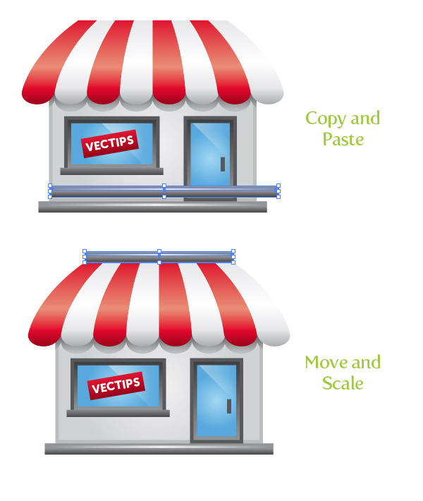
Select the bottom two long, thin rectangles, Copy (Command + C) and Paste (Command + V). Move the copies to the top of the awning and scale them horizontally, matching the top width of the awning shapes.
Step 22
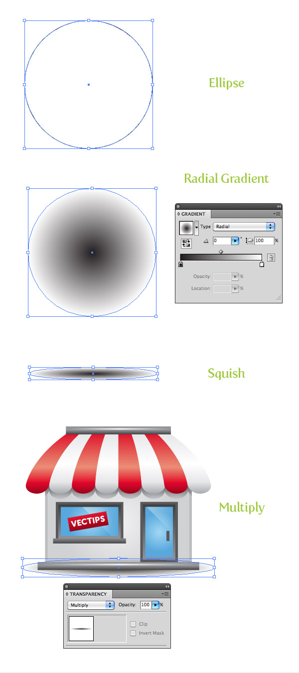
Create an ellipse a little wider than your main store shape with the Ellipse tool (L). Fill this with a radial gradient, change the first color stop to black, and then change the second to white.
Squish the ellipse with the Selection tool (V) to about an eighth of its original size, and place it behind and toward the bottom of the artwork. Set the Blending Mode of the ellipse to Multiply from the Transparency panel, and you are all done!
Take a deep breath, because you just learned to create a storefront icon.
Awesome job! You now know how to create a storefront icon.
Now that you’ve learned to create a storefront icon of your very own, you can use this vector illustration for banners, websites, and much more.





I quite like looking through an article that can make men and women think. Also, many thanks for allowing me to comment!
That is really attention-grabbing, You are an overly skilled blogger. I’ve joined your rss feed and look ahead to in search of extra of your excellent post. Additionally, I have shared your website in my social networks!
I used to be able to find good information from your blog posts.
Hello! I loved reading your site. I’ll return to view again sometime.
Hi there. This blog is terriffic You have a consistent visitor here. I love your stuff.
We absolutely love your blog and find most of your post’s to be exactly I’m looking for. can you offer guest writers to write content for you? I wouldn’t mind publishing a post or elaborating on a few of the subjects you write with regards to here. Again, awesome weblog!
I do not even know how I ended up here, but I thought this post was good. I do not know who you are but definitely you’re going to a famous blogger if you are not already 😉 Cheers!
Wonderful web site. Plenty of useful info here. I’m sending it to some buddies ans additionally sharing in delicious. And of course, thank you for your sweat!
Wow, marvelous blog layout! How long have you been blogging for? you made blogging look easy. The overall look of your web site is wonderful, as well as the content!
I just want to mention I am beginner to blogs and absolutely loved this blog. Probably I’m going to bookmark your blog . You really have awesome articles. Thanks a bunch for revealing your web-site.
There may be noticeably a bundle to know about this. I assume you made certain good points in options also.
I would like to thank you for the efforts you’ve put in writing this web site. I am hoping the same high-grade blog post from you in the upcoming as well. Actually your creative writing abilities has encouraged me to get my own web site now. Really the blogging is spreading its wings rapidly. Your write up is a great example of it.
I’m impressed, I need to say. Actually not often do I encounter a weblog that’s each educative and entertaining, and let me inform you, you might have hit the nail on the head. Your thought is outstanding; the problem is one thing that not enough people are speaking intelligently about. I am very comfortable that I stumbled across this in my seek for something referring to this.
Good website! I really love how it is easy on my eyes and the data are well written. I’m wondering how I could be notified whenever a new post has been made. I have subscribed to your RSS which must do the trick! Have a nice day!
Definitely, what a splendid blog and illuminating posts, I definitely will bookmark your blog.Best Regards!
Excellent post. I used to be checking constantly this weblog and I am impressed! Very useful information specially the closing part 🙂 I take care of such info much. I was looking for this particular information for a long time. Thanks and best of luck.
excellent issues altogether, you just gained a logo new reader. What may you suggest about your post that you just made a few days in the past? Any sure?
Heya i’m for the first time here. I found this board and I in finding It really helpful & it helped me out much. I am hoping to present something back and aid others such as you aided me.
Spot on with this write-up, I actually suppose this website wants far more consideration. I’ll in all probability be once more to read far more, thanks for that info.
Awesome tutorial! I can now try to make my own icon.
Great! Finally I’ve got a solution.
I will try follow all your processes to create one for one affiliate site.
Awesome!
Now I know how to create storefront using adobe photo shop. Great tips I must confess. Thanks
awesome article thanks sharing it!
Unless I am not getting it when i offset and try to fill the offset part it a. either doesn’t fill it or b. it fills the front layer. I’m doing exactly as you said on this tutorial did i miss a step between the offset and fill part?
very nice tutorial!!
thank u
Now stop making these so I wont have to do them in school, please.
I had to do this in school. To warp the red and grey pieces all together, you have to group them to get it done right. If not, it just makes distorted bubbles next to each other. After warping, you can ungroup them with no problem, but group them first.
Great design and Easy to Create
I am sure this article has touched all the internet users,
its really really pleasant post on building up new web site.
Here is my illustration of the store front. Thanks for the write-up.
http://img.photobucket.com/albums/v645/duceduc/themes/store-front-icon_zps31c55627.png
Awesome tutorials mate. Very simple and common sense used to create this storefront icon.
I like it!
♥♥♥
Hi, great tutorial , but on step 17 please underline or write with capital letters that the the elements should be in a group. I was stuck on this step for an hour 😀 its good that I read the comments and found my mistake :)Thank you though
beautiful and inspiring
hey that was awesome tutorial!
and I made exactly as you created 🙂
Thank you! Thanks For Sharing
let’s see I’ve made
http://www.facebook.com/photo.php?fbid=2980421718381&set=a.2980417878285.2160486.1497072871&type=1
Thank you. Great tutorial.
Excelent, thanx u SO much!!!
Nice tut. Very well done and easy to follow.
Great design thanks
This is a great tutorial! It turned out great. Thanks for sharing.
I got stuck at the step 3 itself. I cannot fill separately after setting the offset. i.e, the fill occurs over all as a single object. pls help me no this. sorry if this is very basic concept. I am newbie for illustrator.
thank you
vino
This is a simple and clear tutorial. Your site is a very good resource to learn Illustrator, thanks for posting.
I have a problem in stwep 17 in warp bulge, he end does not come out as in the example. What can be done? Thanks!!!
select all the awning shapes ,and ctrl+g ,and then go >Effects > Warp > Bulge don’t foget grouping
Having a problem in step 17 In Warp Bulge the awning shapes are overlapping each other looking like balloons, shouldn’t there be some kind of perspective?
All Remember to Group all the layers!!
thanks for tutorial
I tried step 19 But my shape output in not as shown Please help!!
Great tutorials. Just starting to learn Illustrator.
Created my own “storefront” and used it on my latest blog post for the post thumbnail…
http://bradleydurham.com/blog
Link directly to the image only…
http://bradleydurham.com/wp-content/uploads/2010/07/storefront.png
Thanks for all the great tutorials!
Bradley
I believe this tutorial should be both mac and pc friendly. It is a good tutorial though. Really does need to be checked for correctness.
Awesome vector icon
nice icon , thanks alot for sharing
really awesome!!!
Wow–you did a lot of great work for this post! Outstanding!
Excellent tutorial, with a great monologue to make it easy to follow.
Creative Critique though… 😉
Might it not offer a bit more visual “balance” if there were an ODD number of roof elements? That last one the right being white makes ones eye feel that the roof is missing something.
Aside from that, a “communal” thanks for your contribution!
I learnt a lot in this tutorial. Thanks so much! =)
Love it!!!
Wow, what a beautiful icon, great skill here.
I couldn’t leave without saying to you “inspirationFeed” that you are correct: Your icon is indeed beautiful.
😉
Having a problem in step 17 In Warp Bulge the awning shapes are overlapping each other looking like balloons, shouldn’t there be some kind of perspective?
Found out what went wrong: I just had to group the awning-shapes…….
thank you! great tut btw… 🙂
I really need help on Step 17 because I have Adobe Illustrator CS6, and when I click on the bulge button, the awnings puffs up like balloons. Can someone please tell me how to do Step 17?
Sorry for the error. It seems with CS6, you must first group the awning shapes (Object > Group) for the desired effect to work correctly. I’ve now updated the tutorial to reflect this change. Thanks for the heads up on this!
Same here! Can someone please help me on Step 17? I have CS6, so please tell me what to do.
Hey Laura! I’ve added instructions for this now.
Lol I am also having same problem in step no17 even i have Illustrator cs6 so what should we do now?
Awesomly simple and beautiful!! Great tip.
Awesome icon!
There’s a small error in step 20:
“Select the main store body shape, Copy (Command C ), and Paste in Front (Command + F). Select all the awing shapes, , Copy (Command C ), and Paste in Back (Command + F).” <– should be Command + B
Not a big deal, but just letting you know. Great tutorial! 🙂
Thanks for catching that! I just fixed it.
Great experience to learn something in vector………..thanks for sharing
http://www.scrapsforever.com
Great tut, as always. Thanks! At one point you have to group the shapes before you can warp them all together, I think. At least I had to do that…
Me too!
Does grouping the shapes mean selecting the shapes?
((Sorry, I am not that smart to understand the phrase))
When grouping, you first select shapes then group them together (Cmmd + Group) so that when you’re editing your Illustrator file, you can grab the group of shapes with a single click instead of having to select each shape individually when editing.
It’s great seeing the pathfinder put to such great use! Thanks for sharing. 🙂
I agree it is is a great concept and execution but the shadow takes away from it.
really cool. thanks for sharing.
Nice! But I think it would look better without the shadow, don’t you? I don’t know, it looks a little unrealistic to me. Great otherwise though – simple and effective.